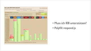
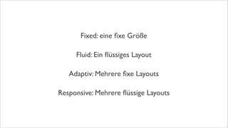
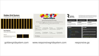
Vortrag vom 18.07.2013 im Rahmen des Langen Donnerstags in Dortmund. Thema war die technische Seite von responsive Design, sowie das vorstellen nützlicher Tools und Seiten.
Links zu den genannten Seiten und Tools gibt es gebündelt unter
www.falconwhite.de/unter-der-haube
Responsive Web Design für Mobilgeräte mit Drupal Acquia
Der Anteil an mobilen Besuchern von Webseiten steigt stetig und immer rasanter.
Eine der Lösungen dafür nennt sich "Responsive Web Design" und wird von Drupal durch verschiedenste Base Themes unterstützt. Allerdings gibt es dabei einige wichtige Dinge zu beachten, da die Möglichkeiten für Responsive Web Design fast endlos sind.
Michael Schmid von Amazee Labs hat schon mehrere Responsive Webseiten geplant und umgesetzt und wird einige der Hürden und dessen Lösungen präsentieren.
• Was ist Responsive Web Design und was kann es?
• Übersicht über die verschiedensten Responsive Themes in Drupal 7
• Probleme und Learnings nach über 10 gebauten Drupal Responsive Web Design Webseiten
Brasil tem o 7o maior número de usuários de internet no mundo, atrás apenas de países como França, Reino Unido e Itália. As mídias sociais como o Facebook ultrapassaram o Google como ferramenta de busca mais usada, com milhões de usuários ativos diariamente compartilhando vídeos e podcasts on-line. A confiança, a relevância do conteúdo para o público e a velocidade são fatores cruciais para o sucesso de negócios nas mídias sociais.
Este documento describe las etapas clave de una estrategia, incluyendo la definición del objetivo, el desarrollo de tácticas, la implementación y la gestión y optimización mediante el seguimiento de métricas. Explica las fases de planeación ejecucional, implementación y producción, y control de gestión y optimización, además de proporcionar ejemplos de métricas de redes sociales y YouTube que pueden usarse para mejorar la estrategia.
El documento presenta el programa del 45o Congreso Anual de Confecámaras que se llevará a cabo del 3 al 5 de septiembre. El congreso abordará temas como la globalización, el crecimiento sostenible, la competitividad, las apuestas empresariales para la economía global, los casos de éxito de empresas estatales y una agenda para Colombia en un mercado abierto. También incluirá paneles sobre los clúster regionales y la fuerza empresarial de las regiones, así como sobre desafíos locales y retos globales.
This document discusses learning with social media and networks. It introduces Anne Marie Cunningham and her goal of connecting with others in medical education to learn together. It explores who she could connect with, including students, other professionals, regulators and industry. It also discusses some potential barriers to learning in networks, such as openness, identity, anonymity, power, control and trust. Finally, it encourages being generous, thinking the best of people, using emoticons, and continuing the journey with social media and networks.
Este documento resume la reunión de padres del Colegio San Agustín sobre la 3a evaluación del curso 2012/13. Se revisan los proyectos y resultados de la 2a evaluación, e incluyen los proyectos planificados para la 3a evaluación en las asignaturas de conocimiento del medio, lengua y matemáticas. También se mencionan otras actividades como el proyecto EME, el Día del Libro y el festival de fin de curso.
Flyer TGV Lyria Lyriacorner - high speed train- Switzerland FranceTom Train
Flyer TGV Lyria sur le Lyriacorner:
Voyageur 1ère classe avec un Billet Lyria FLEX ou Abonné ? Profitez d’un accueil dédié, d’une collation et d’un accès Wi-Fi au sein du Montreux Jazz Café à Paris Gare de Lyon!
Réservez TGV Lyria dans votre agence de voyage agréée SNCF.
MUTATION - Objets et corps connectés : de la science-fiction dans nos réalité...Nurun
Annoncé comme le sujet numérique de 2013 par « The Economist », quelle impact réel les objets connectés ont-ils sur les consommateurs ? Et sur nos métiers ? Rendue possible par une convergence de facteurs technologiques, industriels et humains, la connectivité partout, avec tout et en tous tempsmodifie profondément le rapport à l'objet et au corps. En multipliant les capteurs et en permettant à chacun d'évaluer ses performances, l'Internet des objets ouvre des chantiers majeurs. Opportunité ou menace ? Liberté ou aliénation ?
Grégoire Baret, Vice-président exécutif (Nurun), propose un éclairage de l’internet des objets par l’interface. Comment les principes d’interface utilisateur et de design s’appliquent-ils aux produits connectés, à son environnement proche, aux corps ? Martin Husar, Directeur marketing digital et innovation (Sanofi) partage les retours sur expérience concrets de Sanofi: l’application des principes du design thinking et des objets connectés dans le secteur du corps et de la santé, et le nouveau cadre de responsabilité que ces mutations impliquent.
El documento describe algunas de las tradiciones y costumbres de Fuente Álamo de Murcia en fechas señaladas como la Navidad y el día de San Juan, incluyendo el canto de villancicos por las calles y las hogueras, respectivamente. También menciona la tradición de comer tostones en Todos los Santos.
The document discusses how social media and networks can help medical educators develop. It introduces Natalie Lafferty and Anne Marie Cunningham who will discuss their workshop on this topic. They will provide an introduction and allow questions from attendees. Social media strategies for medical education will be discussed, including using hashtags for specific classes or specialties. Cooperation and collaboration through social networks is emphasized.
Soap operas are TV series that focus on the daily lives and relationships of a group of characters. They depict family situations and interactions between couples as well as with their external social circles. While some aspects of soap operas seem unrealistic, they can serve as a distraction from everyday problems and allow actors to improve their skills. A new related term, "Facebooker," refers to a person who frequently uses the Facebook social network to contact friends and find information.
This document provides examples of using the simple future tense in Spanish to talk about what one is going to do. The simple future is formed by using the verb "ir" plus "a" plus the infinitive of the main verb. Several example sentences are given that demonstrate using the simple future to say things like "I am going to go to the museum" or "We are going to finish the homework." The simple future allows one to discuss planned or predicted future actions in Spanish.
Mittlerweile als moderne Technik etabliert, beschreiben zahlreiche Tutorials Umsetzungsvorschläge für Responsive Webdesign; dennoch stößt man in Projekten mit einem skalierbaren Layout auf immer gleiche Schwierigkeiten. Häufig haben mobile Geräte eine deutlich schwächere technische Ausstattung als der heimische Desktoprechner, sodass Fragen der Performance auf unterschiedlichen Devices in den Vordergrund gerückt werden. Gerade bei Bildern tauchen Begriffe wie "Responsive Images" oder "Adaptive Images" immer wieder auf. Welche Lösungen wann Sinn ergeben und wie man mit Retina-Screens umgeht, wie der aktuelle Stand des HTML5-Responsive-Image-Elements ist und wie man eine schlanke Bilder erstellt, werden in der Präsentation gezeigt.
Responsive Webdesign ist grad der heiße Scheiß, allerdings ist Responsive Webdesign mehr, als eine Desktopwebsite in eine mobile Ansicht zu quetschen. Es muss ein neuer Prozess her. Der alte Workflow "Auftrag bekommen > Recherche > Design erstellen > Abnahme > Design umsetzen" funktioniert so nicht mehr. Im Responsive-Webdesign-Prozess müssen alle Beteiligten eines Webprojekts von der ersten Sekunde an enger zusammenarbeiten. Zudem müssen frühzeitige und häufige Testphasen und Implementierungsstrategien gefunden werden.
There and back again - Responsive Webdesign mit WordPress Michael Oeser
There and back again - Responsive Webdesign (RWD) mit WordPress - Vom Desktop zum Smartphone und wieder zurück
Präsentation anlässlich der Wordpress Konferenz am 05.03.2013 in Zürich
Das Konzept: Für jeden verständlich und übersichtlich, gemacht für Designer, Template-Entwickler und IT.Alle Anforderungen, alle Besonderheiten für mobile Optimierung müssen spezifiziert sein und dabei soll alles auch noch so einfach wie möglich aufbereitet sein. Gar nicht so einfach, oder?
Bootstrap ist ein Open-Source-Framework von Twitter, das eine Reihe von Hilfsmitteln für die Gestaltung von Websites und Webanwendungen bereitstellt. Die Gestaltungsvorlagen basieren auf HTML und CSS und beinhalten Formulare, Buttons, Tabellen und viele andere Oberflächenelemente. Dieser Vortrag gibt eine Einführung und weitere wertvolle Tipps aus der Praxis.
Cross-Apps-Entwicklung für iPhone, Android und Co.GFU Cyrus AG
Kurzbeschreibung
Beschreibung: Mit der Veröffentlichung von iPhone, iPod Touch sowie iPad und dem iPhone OS hat Apple den Markt für mobile Endgeräte massenfähig gemacht. Google liefert mit dem Android-Betriebssystem ebenfalls eine stetig wachsende Plattform. Einer der Erfolgsfaktoren ist der auf beiden Systemen verfügbaren Browser "Mobile Safari" bzw. die technologische Basis WebKit. Diese freie HTML-Rendering-Bibliothek wird nicht nur von Apple und Google eingesetzt, sondern auch von anderen Unternehmen, wie Nokia, Adobe und Blackberry verwendet. Dozent: Peter Hecker, GFU Cyrus AG
Inhalt
- Einführung und Motivation
- Die WebKit-Plattform
- Überblick "mobile" Frameworks
- Zusammenfassung und Fazit
Ein großer Bestandteil von Webseiten ist nach wie vor Text. Die weitreichende Unterstützung von Webfonts in modernen Browsern gibt uns die Möglichkeit, Schriftarten unserer Wahl für die Auszeichnung von Text zu nutzen. Allerdings gibt es auch Fallen bei der Verwendung von Webfonts, die gerade auf mobilen Geräten auftreten können. Lösungswege und Tipps für die Verwendung von Schrift im Responsive Webdesign. Zudem zeigt der Vortrag neue Möglichkeiten in CSS3.
Responsive Mit Irhem Webseiten (German Edition)Koombea
Responsive Mit Irhem Webseiten (German Edition)
Was ist responsive & warum? Welche Option sollten Sie wählen?
Warum brauchen wir performance? Optimierung für Performance
Responsive Web Design is a buzzword. Everyone has heard about it but most do not exactly know what it is in detail. In the first section this talk covers an introduction in responsive webdesign and what are the main technical aspects and workflow changes. the second part handles a success story of the real world project how to transform a non responsive site into a fluid one.
This talk was held on the PHP Usergroup Düsseldorf in April 2014.
Ähnlich wie Responsive Webdesign - Unter der Haube (20)
3. "Fluid grids, flexible images, and media
queries are the three technical ingredients
for responsive web design, but it also
requires a different way of thinking."
- Ethan Marcott
Was war das nochmal?
Responsive Webdesign
23. • Fokus auf das Wichtigste
• Technische Probleme früher erkennen
• Performance
• Auch der Desktop profitiert
"Der erste MediaQuery ist kein MediaQuery."
- Bryan Rieger
54. "Images are probably the fattest, lowest hanging fruit, so
yeah… don’t give up. Do something, anything! Try to shave off
500ms and increase revenue 20%. Make your client rich.
Sell them the fastest website ever..."
- Dave Rupert
80. Responsive Design Weekly Responsivehero.com
Buch: Responsive Webdesign (DE) Buch: Mobile First (EN)
Podcast: Shop-Talk Show Podcast: Team Treehouse Show