Als PDF, PPTX herunterladen

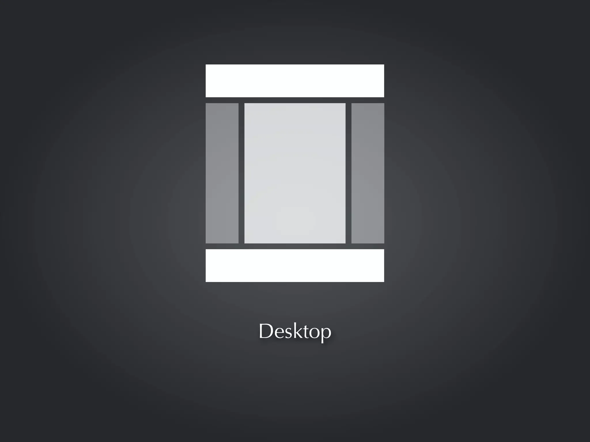
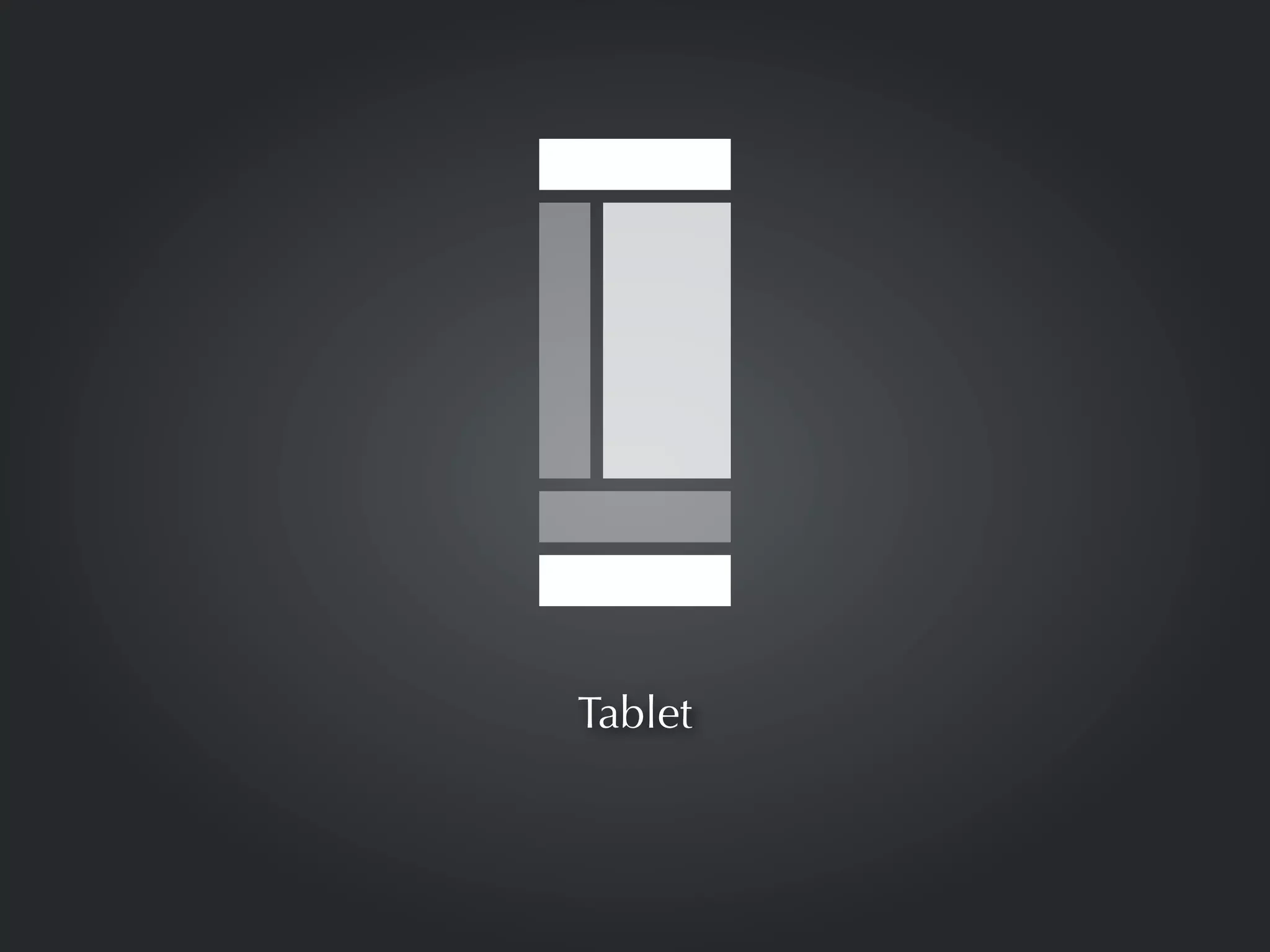
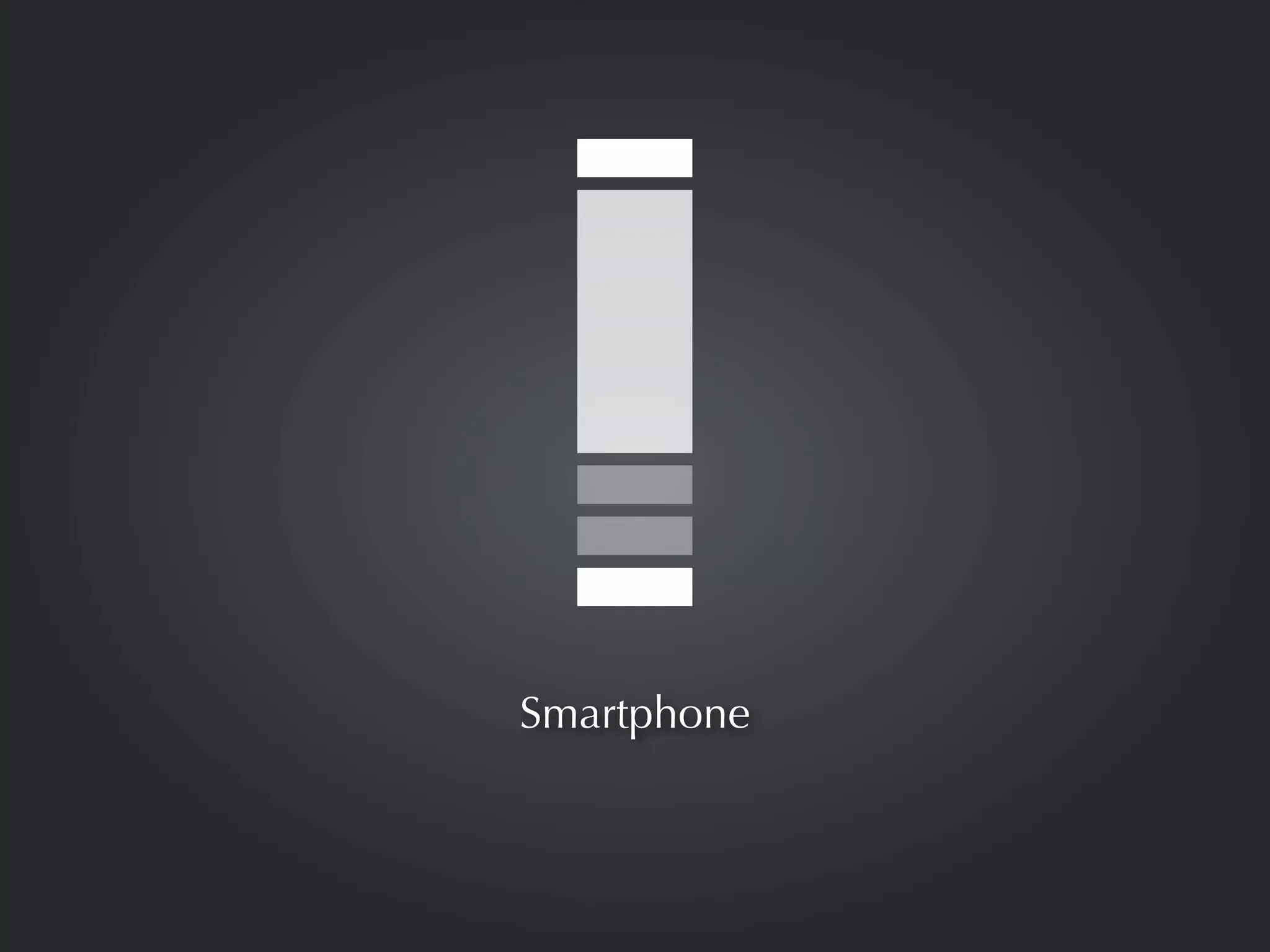
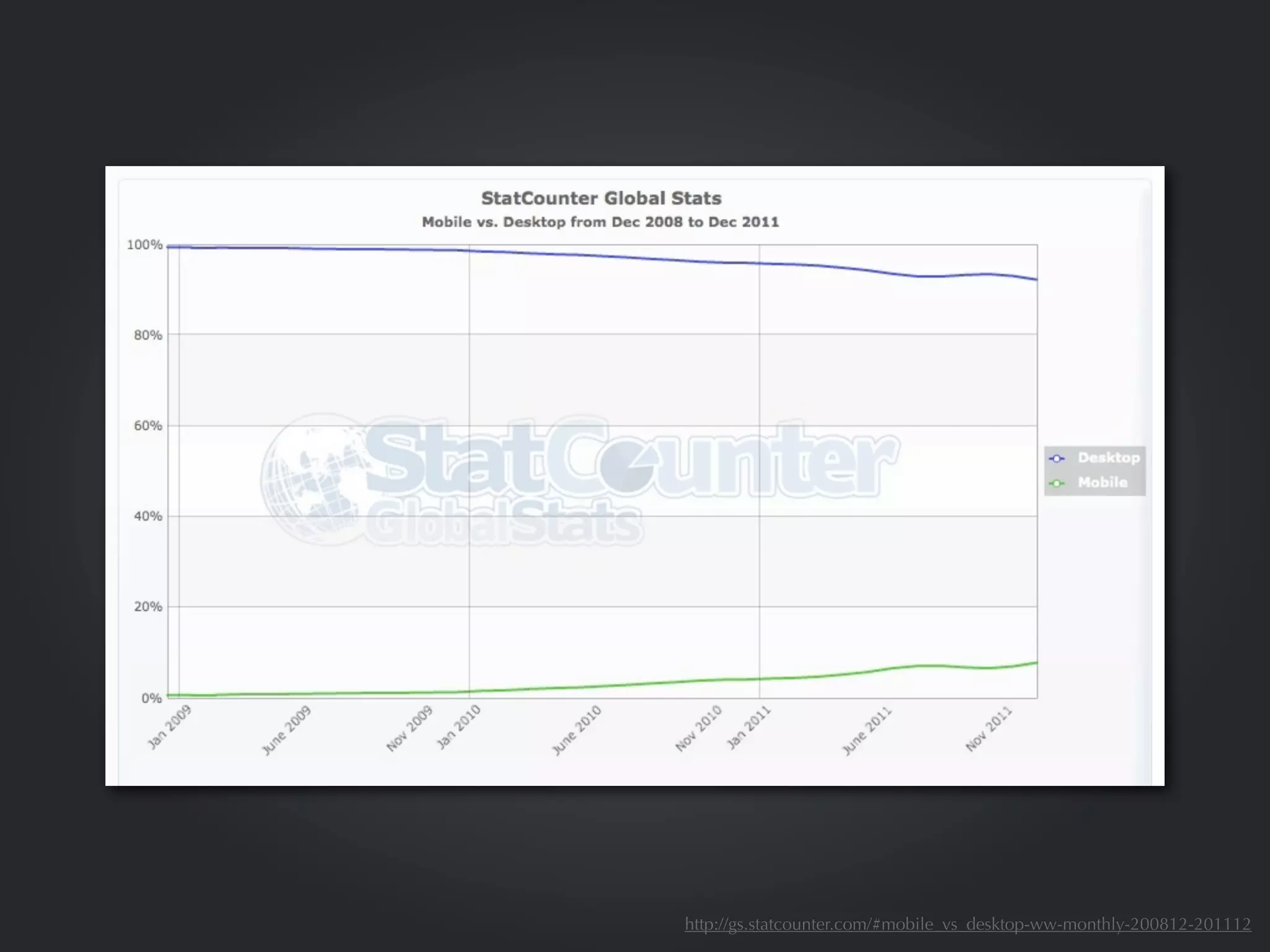


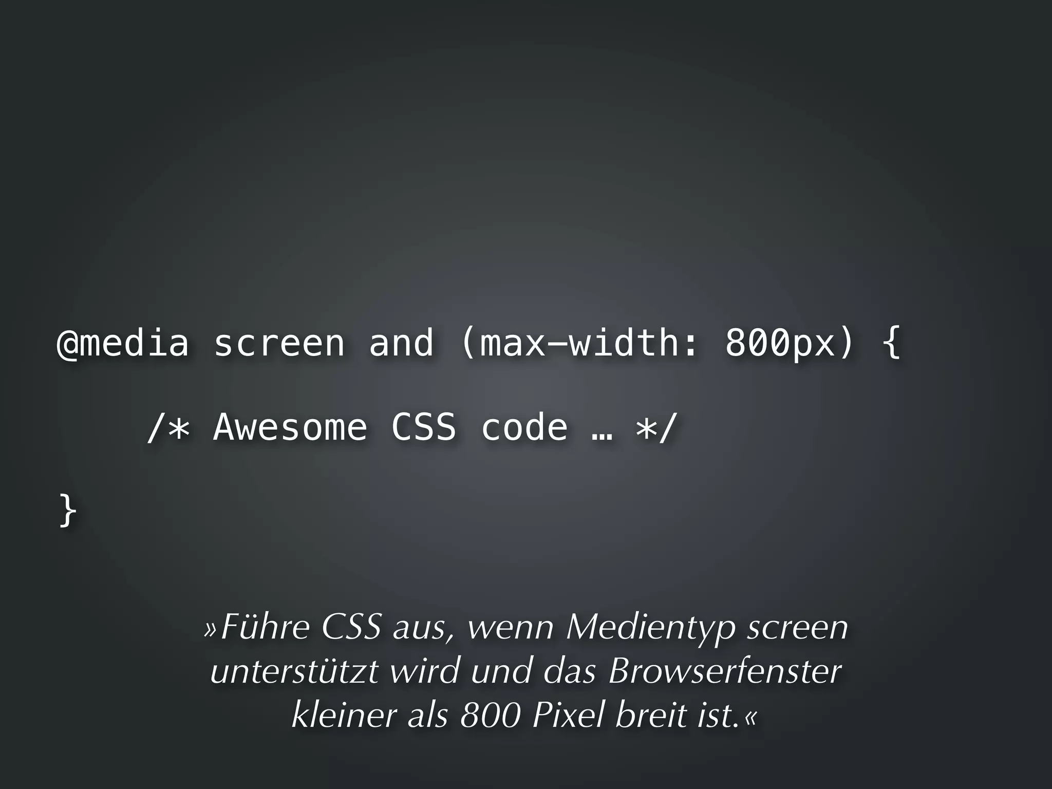
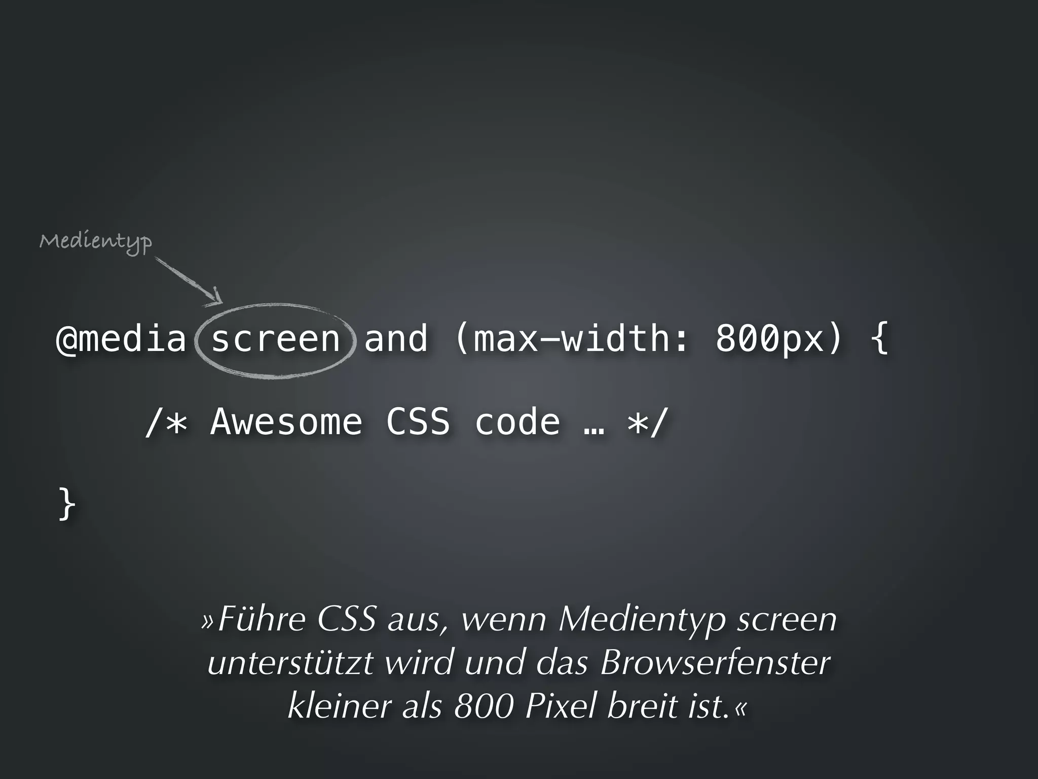
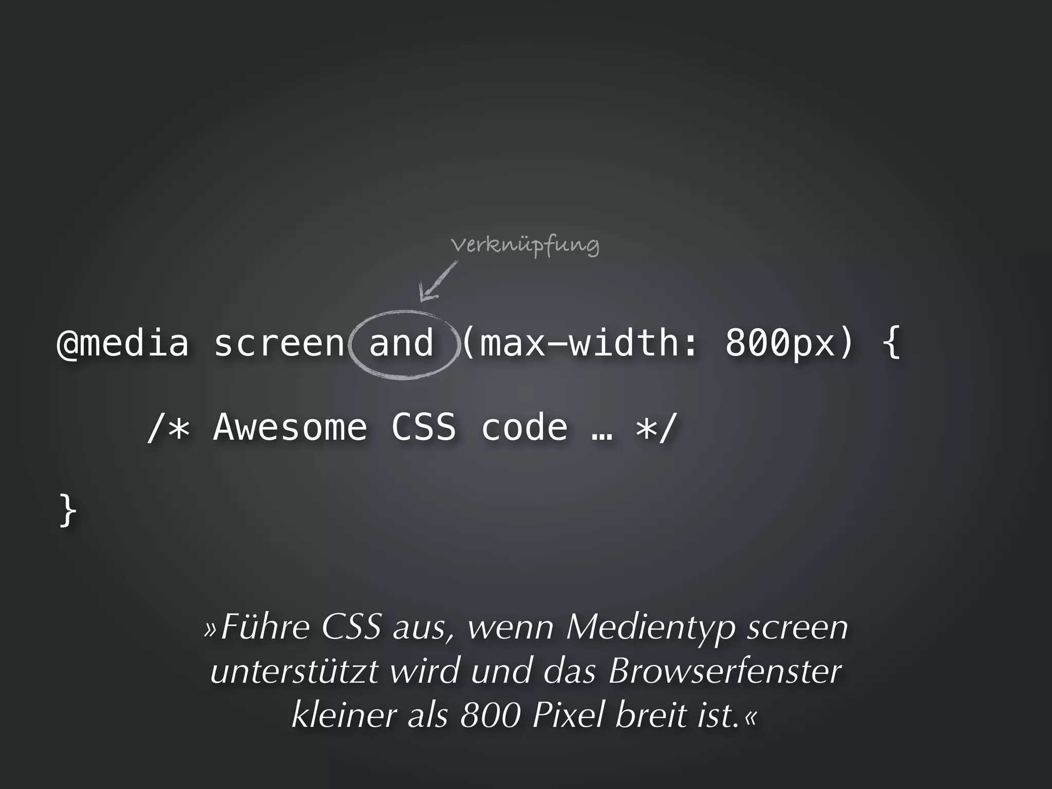
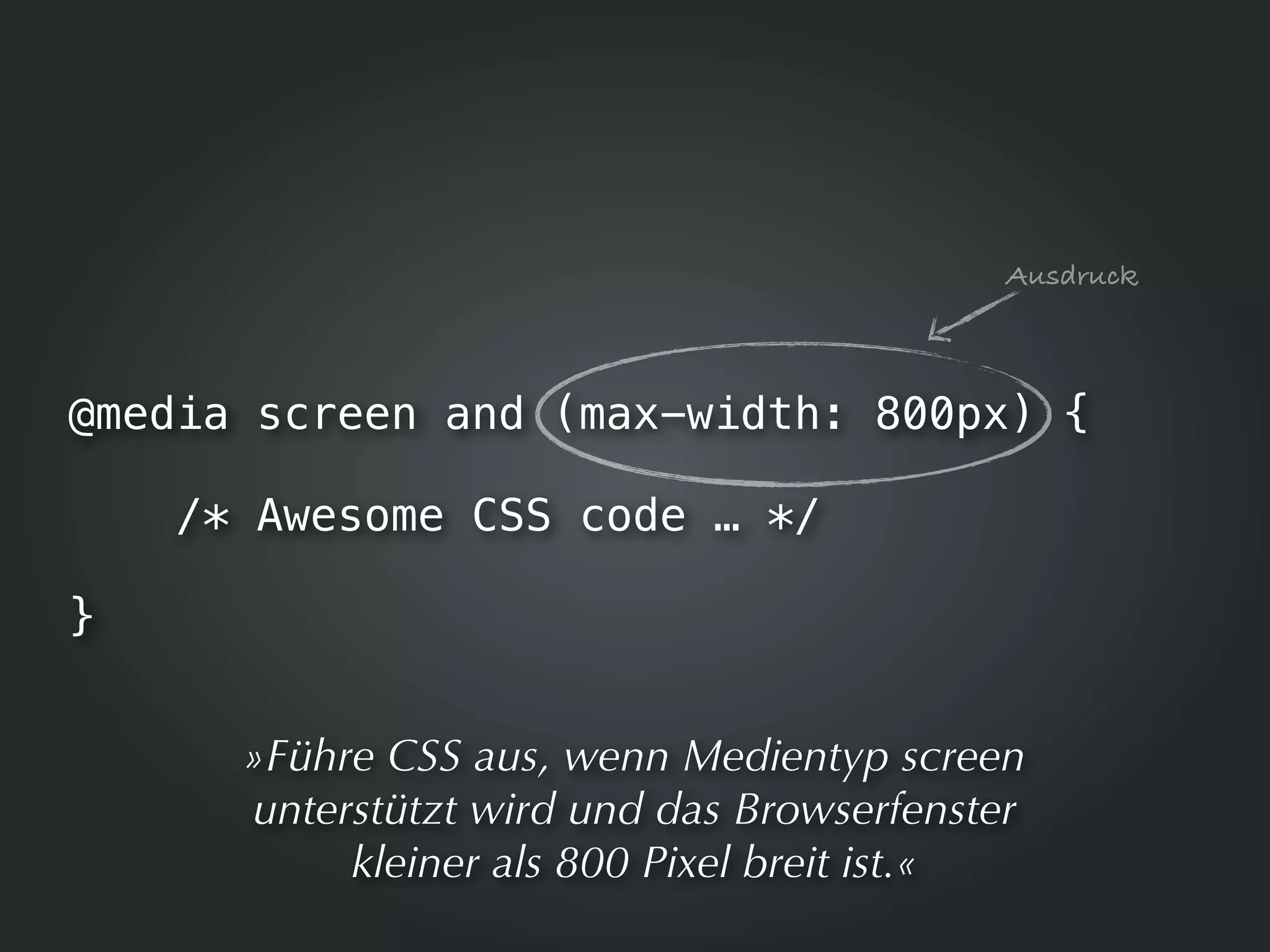
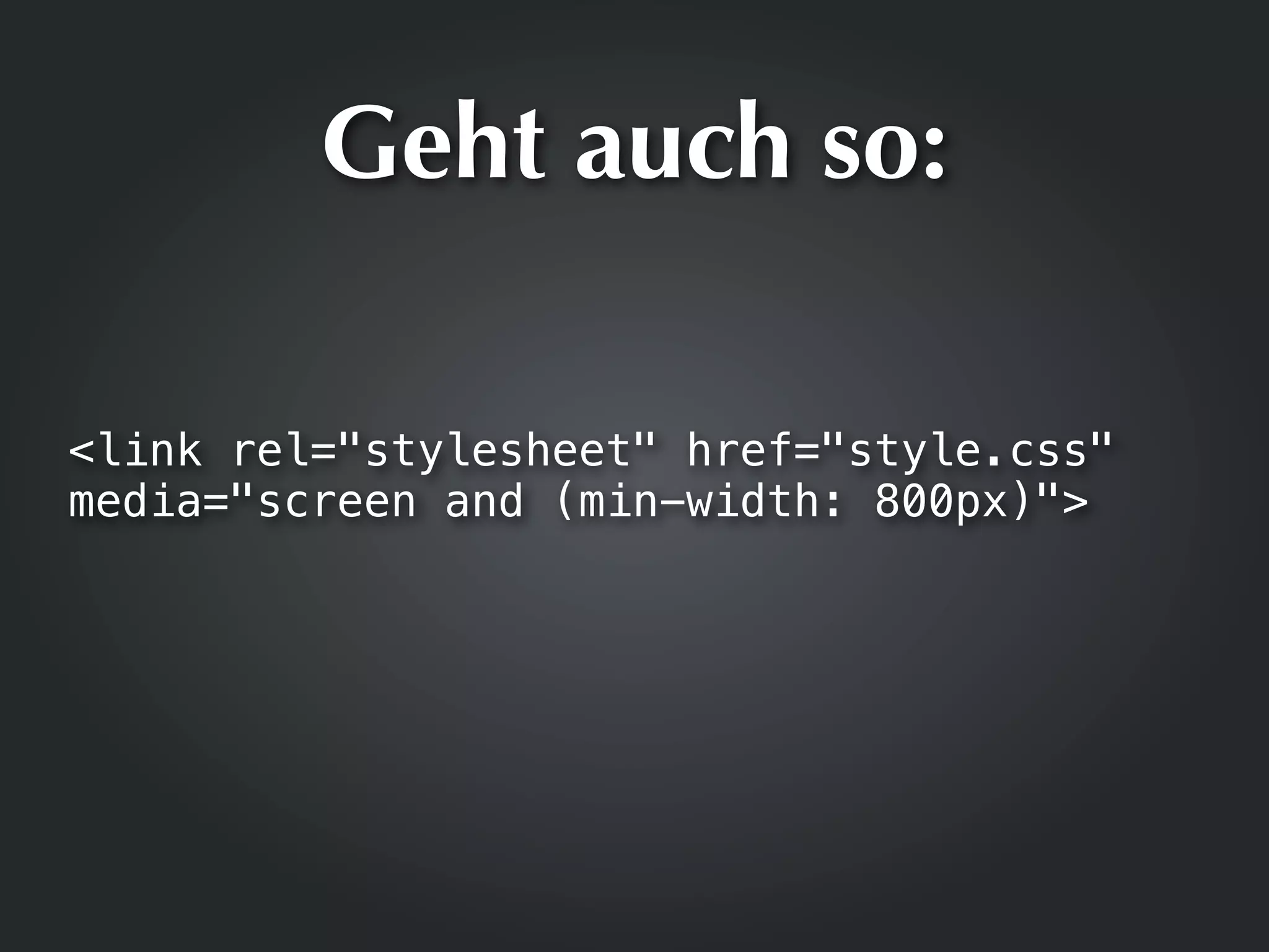
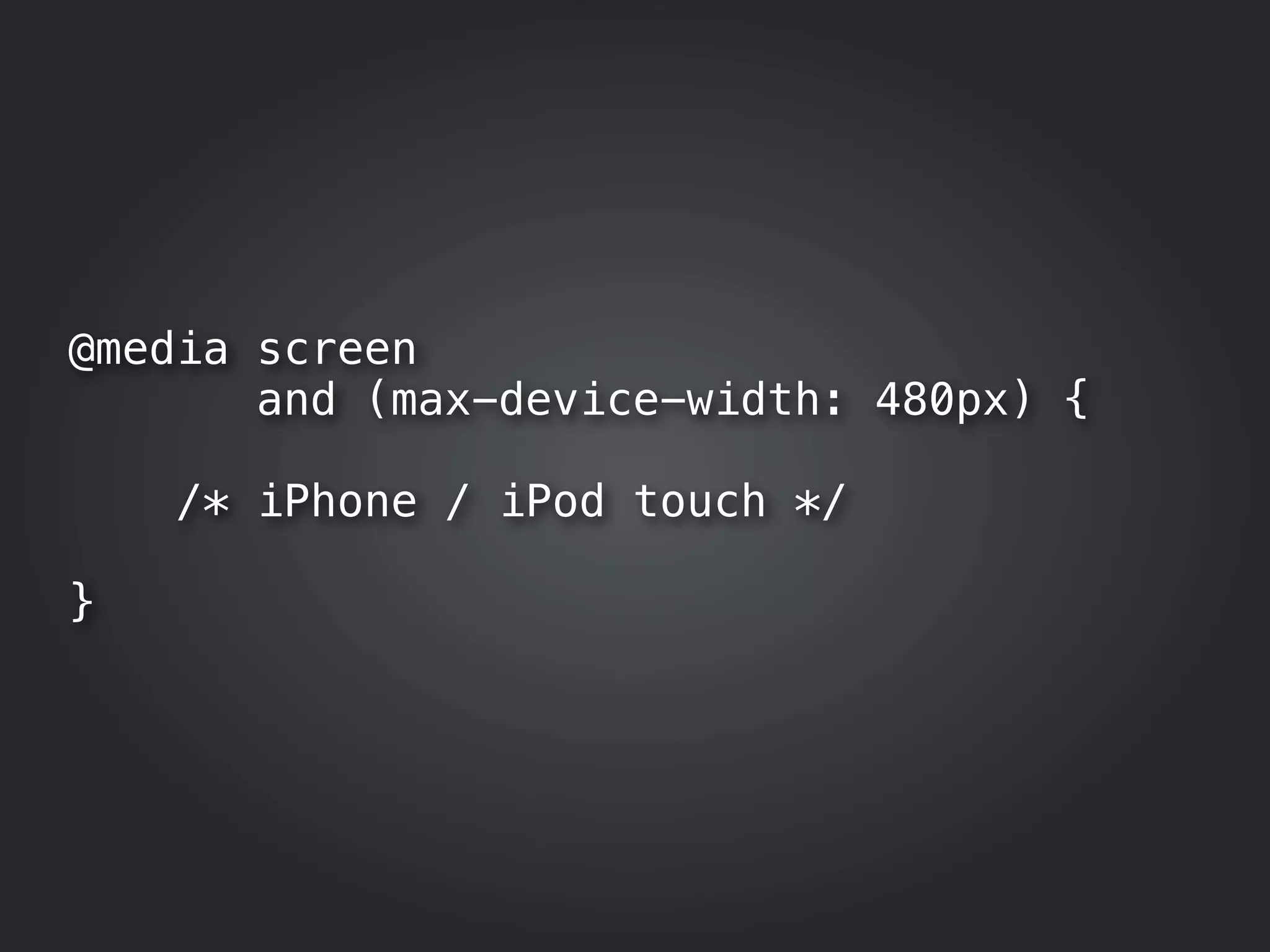
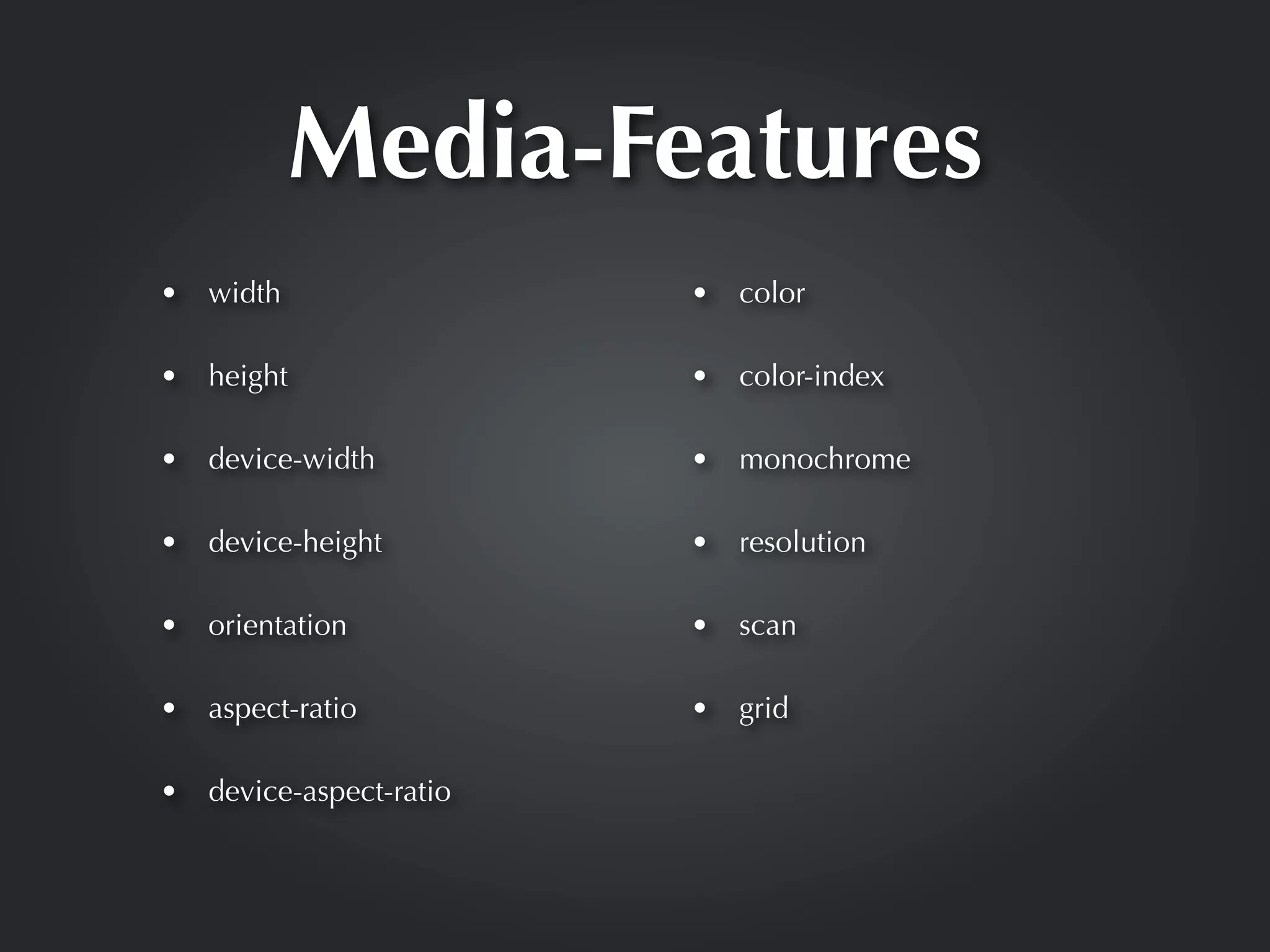
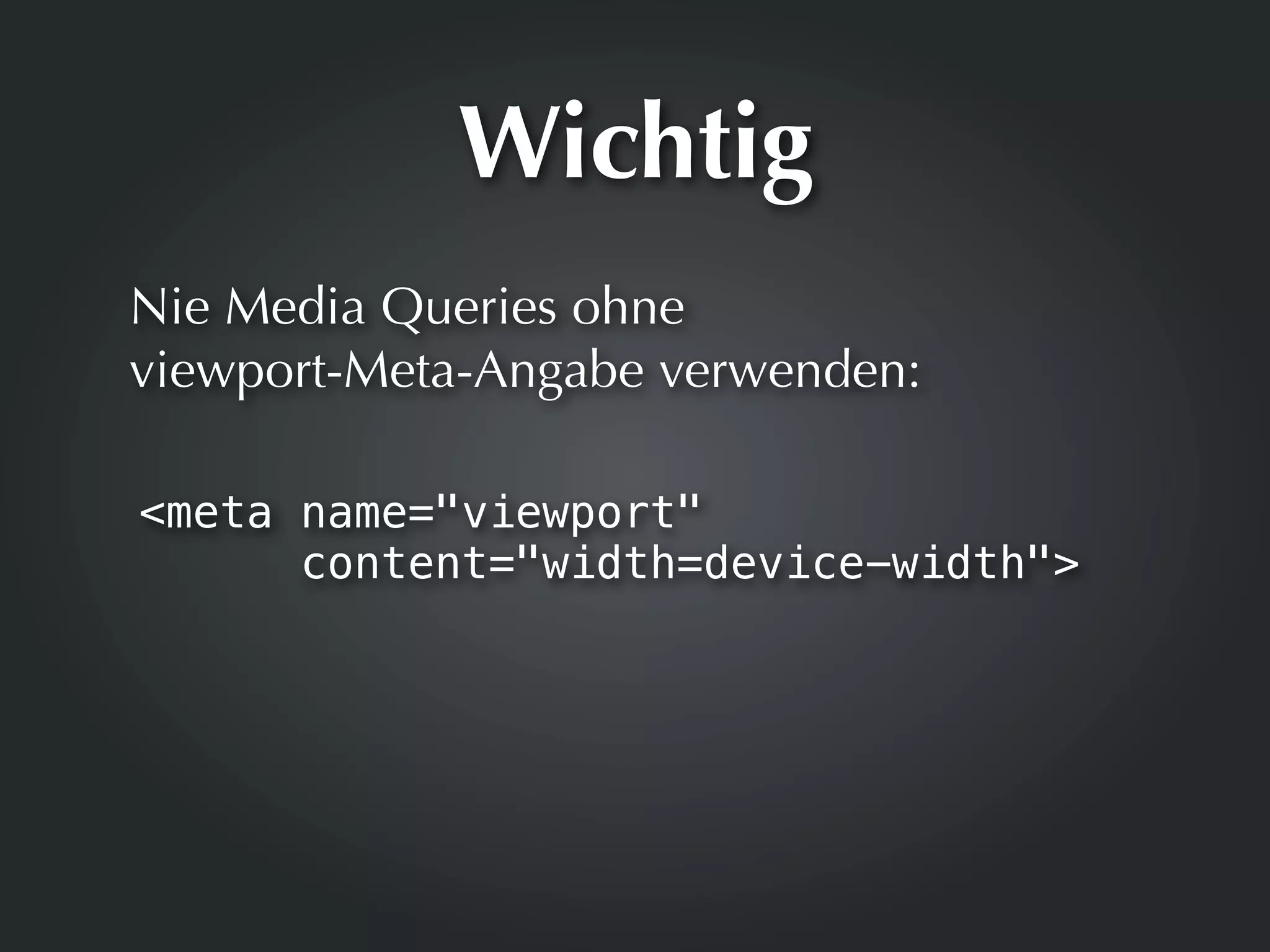
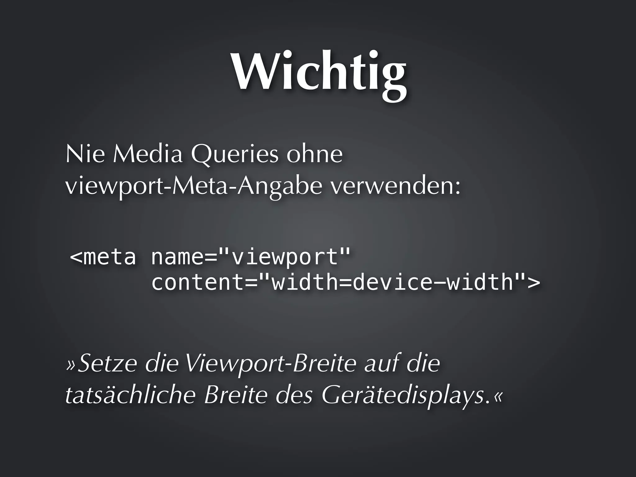
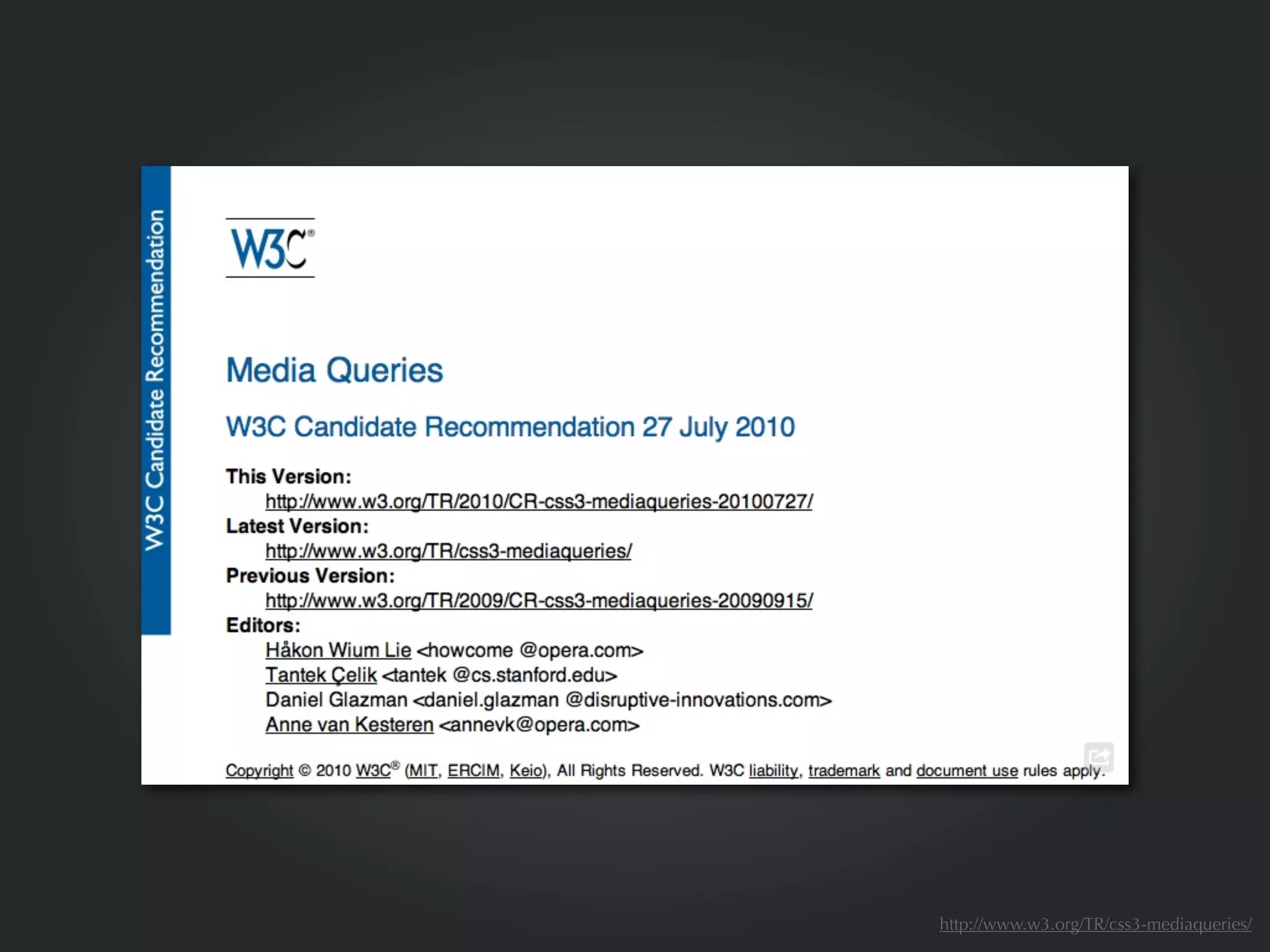


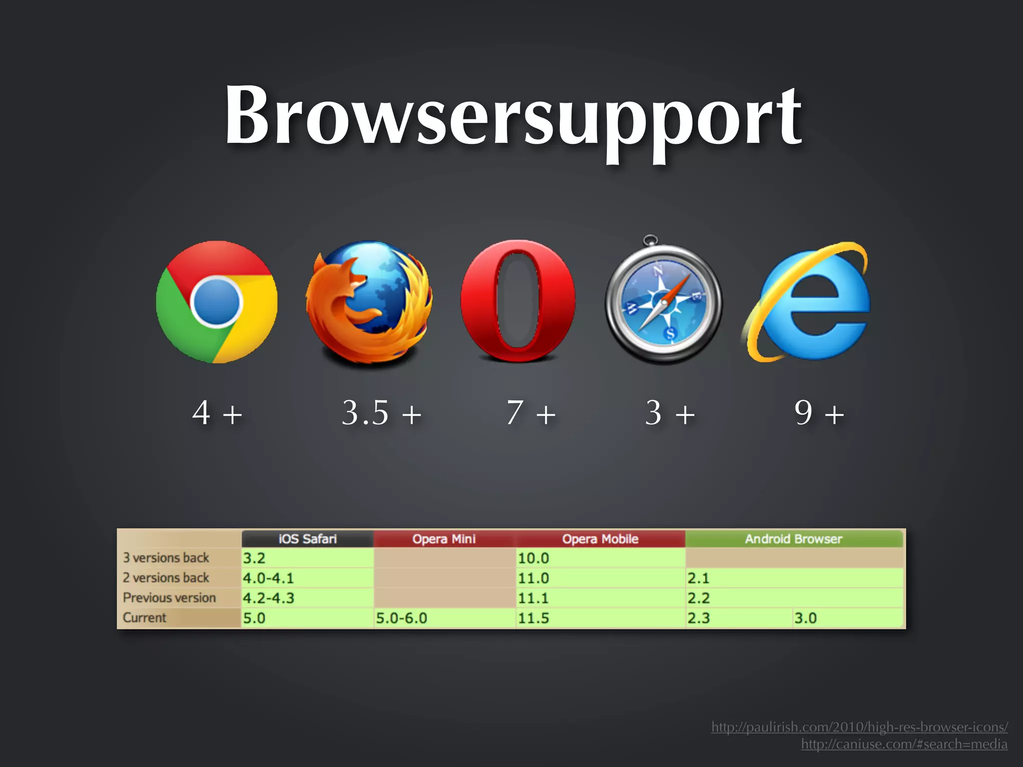
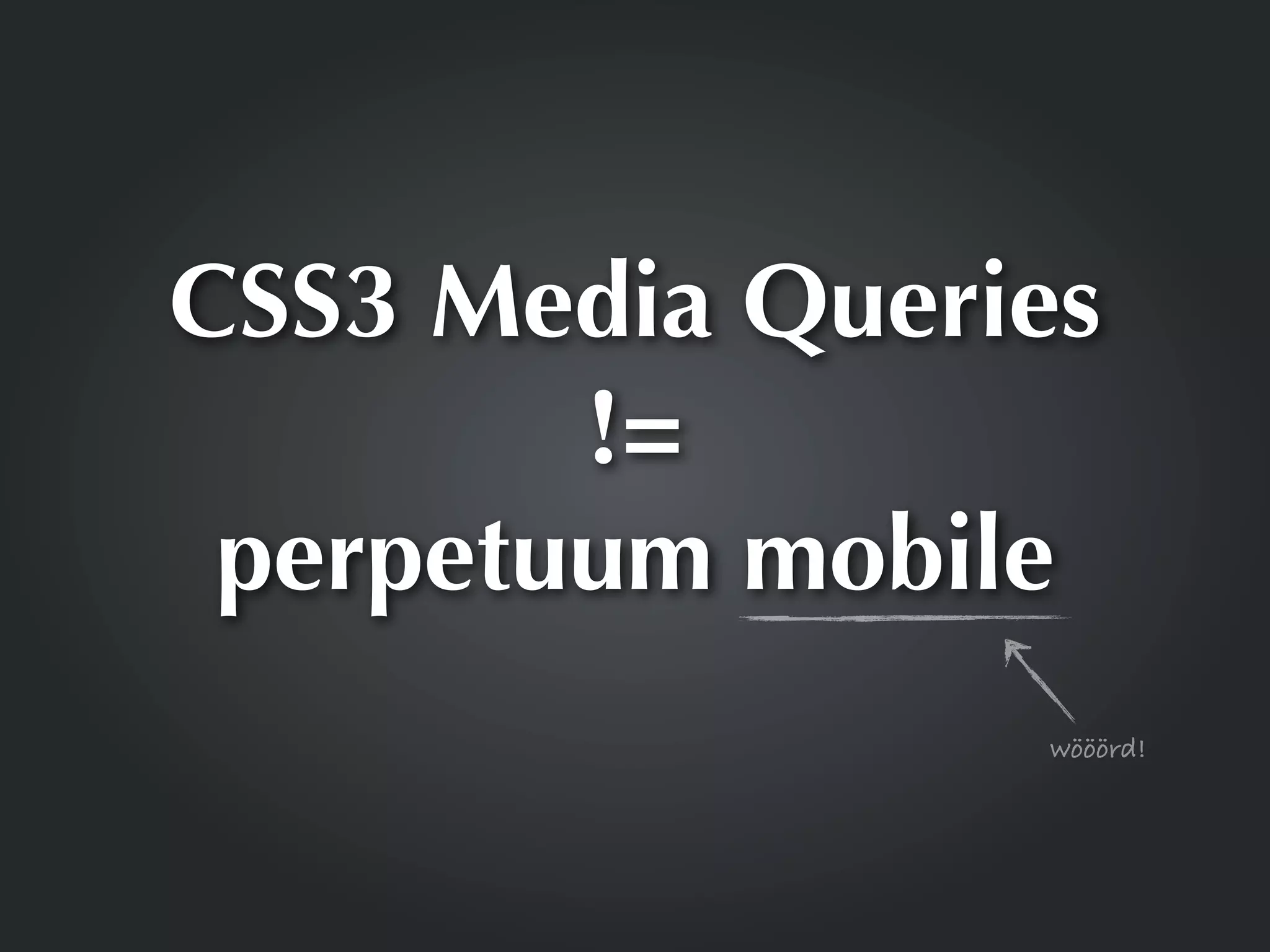
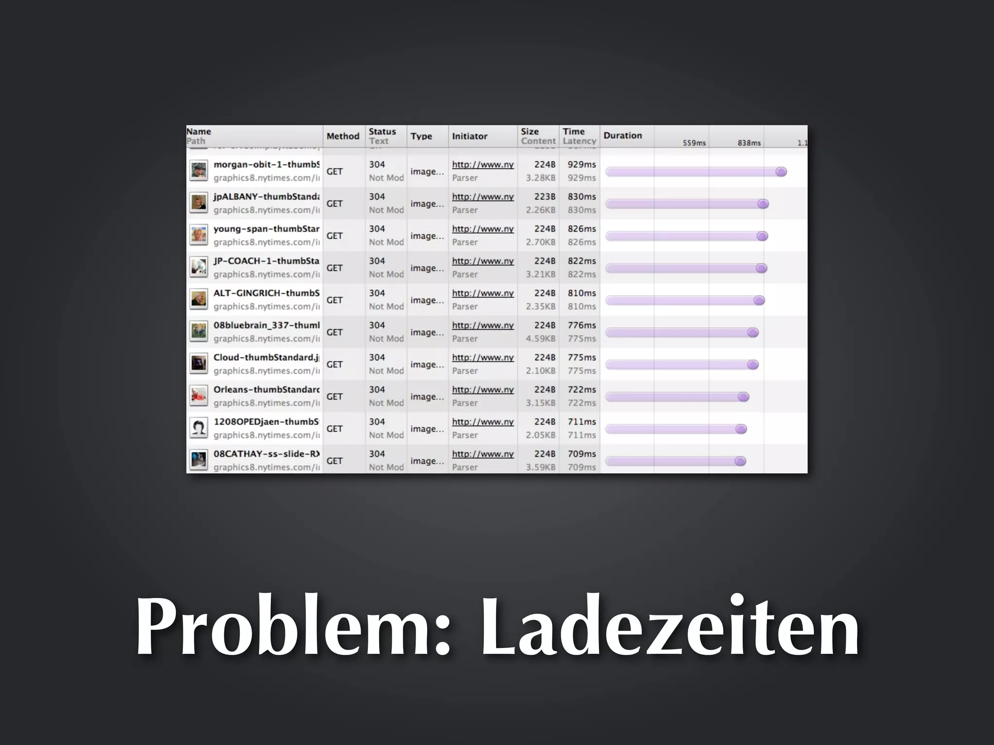
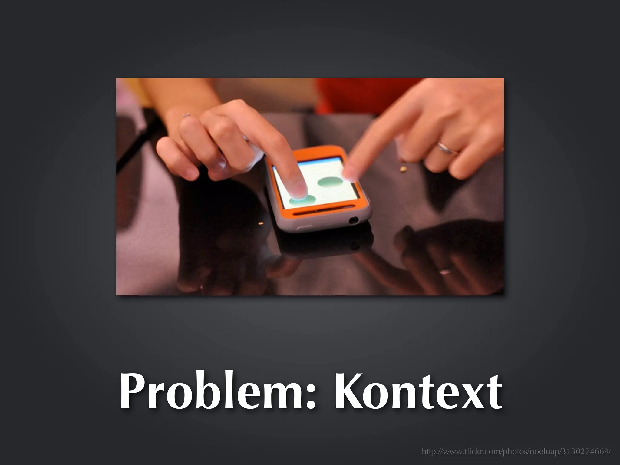
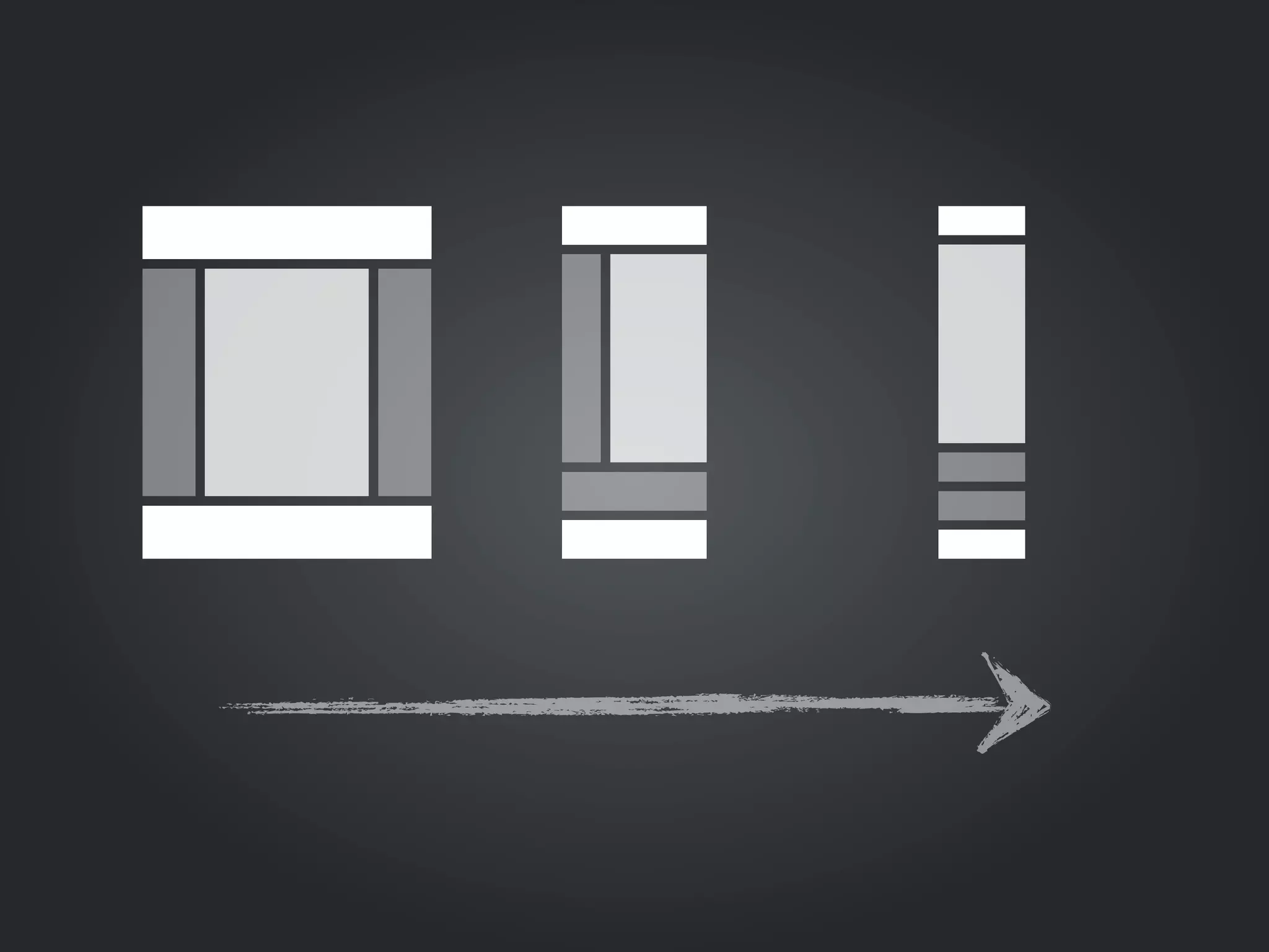


Das Dokument behandelt die Nutzung von CSS3 Media Queries zur Erstellung responsiver Webdesigns, die auf verschiedene Geräte wie Desktops, Tablets und Smartphones abgestimmt sind. Es beschreibt die Syntax der Media Queries sowie deren Anwendung und die Notwendigkeit, die Viewport-Meta-Angabe zu verwenden. Zudem werden verschiedene Beispiele und unterstützte Browserthematisiert, samt einem Hinweis auf die wachsende Nutzung mobiler Geräte.


![[2012 02 03]clean_code 4장](https://cdn.slidesharecdn.com/ss_thumbnails/20120203cleancode4-120216035241-phpapp02-thumbnail.jpg?width=640&height=640&fit=bounds)