Als PDF, PPTX herunterladen


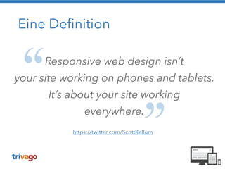


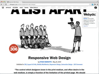


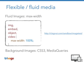
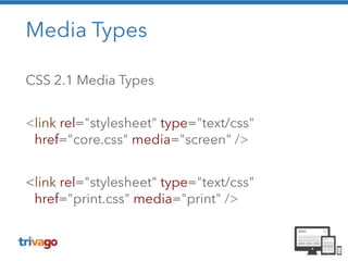


Das Dokument beschreibt die Prinzipien des Responsive Webdesigns, das die Anpassung von Webseiten an verschiedene Bildschirmgrößen und Geräte ermöglicht. Es wird auf die Notwendigkeit von flexiblen Layouts, relativen Maßen, flexiblen Medien und Media Queries eingegangen, um eine eine konsistente Benutzererfahrung zu gewährleisten. Zudem werden Verbesserungen und Best Practices für eine effektive mobile Strategie hervorgehoben.