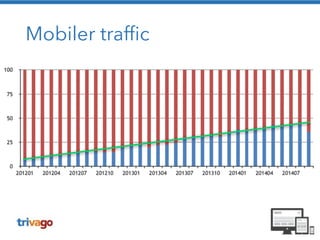
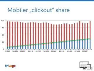
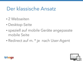
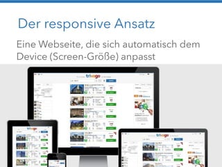
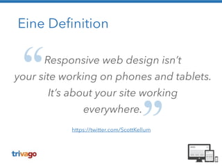
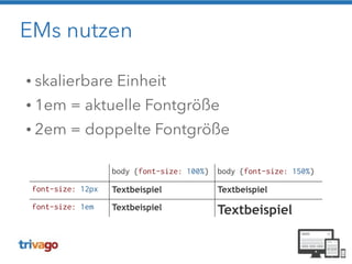
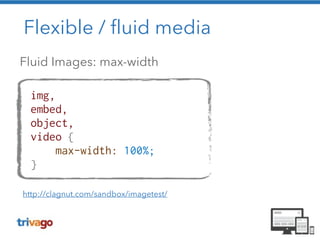
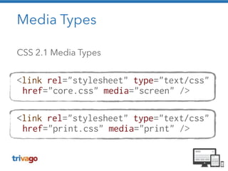
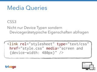
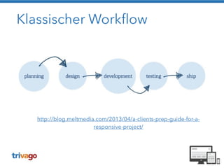
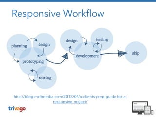
CONFERENCE EDITION 
Christoph Reinartz
@pistenprinz
Die Ausgangslage 
(c) Senator Film Verleih
https://www.flickr.com/photos/glenscott/509720363
https://www.flickr.com/photos/lukew/10430507184/
Abweichung von Ideal Parametern
Mobiler traffic
Mobiler „clickout“ share
Der klassische Ansatz 
• 2 Webseiten 
• Desktop-Seite 
• speziell auf mobile Geräte angepasste 
mobile Seite 
• Redirect auf m. * je nach User-Agent
Die mobile Site...
Die mobile Site...
Bullshit
Bullshit 
Bullshit 
Bullshit 
Bullshit 
Bullshit
Bullshit 
Bullshit 
Bullshit 
Bullshit 
Bullshit 
Kein Bullshit
https://www.flickr.com/photos/janitors/10081142374
https://www.flickr.com/photos/scaar/8473324580
https://www.flickr.com/photos/shebalso/12341492965
Der responsive Ansatz 
Eine Webseite, die sich automatisch dem 
Device (Screen-Größe) anpasst
Beispiel: The Boston Globe 
• Full „fluid“ responsive 
• fluid innerhalb der Breakpoints 
• funktioniert gut bei textlastigen Seiten 
http://upstatement.com/blog/2012/01/how-to-approach-a-responsive-design/
Beispiel: trivago 
• Sprungstufen-basiertes Layout 
• adaptives Layout 
• innerhalb der Breakpoints fixe Darstellung 
• ohne kompletten Relaunch möglich
Desktop, iMac, Laptop
Landscape Tablet, Netbook
IPad, Tablets
Filterleiste einblendbar
Smartphone
Eine Definition 
Responsive web design isn’t 
your site working on phones and tablets. 
It’s about your site working 
everywhere. 
https://twitter.com/ScottKellum
Ich würde sagen 
dat passt! 
(c) Senator Film Verleih
Alter Kontext 
MODERNER BROWSER 
FOKUSIERT 
STATIONÄR 
BEQUEM 
SCHNELLE 
VERBINDUNG 
SCHNELLE 
CPU 
EFFIZIENTE EINGABE
960 
https://www.flickr.com/photos/tomwachtel/14015354802
2007 
https://www.flickr.com/photos/dahlstroms/6750733205
http://maddesigns.de/responsive-workflow/#11
Android Fragmentation 
http://bradfrostweb.com/blog/web/responsive-web-design-missing-the-point/
https://www.flickr.com/photos/adactio/5818096043
Zutaten nach dem Rezept 
von Ethan Marcotte 
! 
• Relative Maße 
• Ein flexibles gridbasiertes Layout 
• Flexible Images und Medien 
• Media Queries
EMs nutzen 
• skalierbare Einheit 
• 1em = aktuelle Fontgröße 
• 2em = doppelte Fontgröße 
body {font-size: 100%} body {font-size: 150%} 
font-size: 12px Textbeispiel Textbeispiel 
font-size: 1em Textbeispiel Textbeispiel
Sieh das mal relativ! 
! 
! 
target / context = result 
Erstellung relativer Maße: Fonts / Grids
Flexible Grids / Maße 
960px 
200px 
target / context = result 
(200 / 960) * 100 = 20,83%
Flexible / fluid media 
Fluid Images: max-width 
img, 
embed, 
object, 
video { 
max-width: 100%; 
} 
http://clagnut.com/sandbox/imagetest/
Flexible / fluid media
Media Types 
CSS 2.1 Media Types 
! 
<link rel="stylesheet" type="text/css" 
href="core.css" media="screen" /> 
! 
<link rel="stylesheet" type="text/css" 
href="print.css" media="print" />
Media Queries 
CSS3 
Nicht nur Device Typen sondern 
Devicegerätetypische Eigenschaften abfragen 
! 
<link rel="stylesheet" type="text/css" 
href="style.css" media="screen and 
(device-width: 480px)" />
Media Queries 
Mehrere Eigenschaften in einer Query 
! 
@media screen and (max-device-width: 480px) 
and (resolution: 192dpi) { 
.column { 
float: none; 
} 
}
Viewport 
https://www.flickr.com/photos/mendhak/2252824493
Viewport-Metatag 
<meta content="width=device-width, 
initial-scale=1.0" name="viewport" /> 
Mit Viewport-Metatag 
viewport-width = device-width 
! 
Ohne Viewport-Metatag 
Default-Canvas ~980px 
http://bkaprt.com/rwd/29
Klassischer Workflow 
http://blog.meltmedia.com/2013/04/a-clients-prep-guide-for-a-responsive- 
project/
Responsive Workflow 
http://blog.meltmedia.com/2013/04/a-clients-prep-guide-for-a-responsive- 
project/
59 
Prototype 
https://www.flickr.com/photos/the-magic-tuba-pixie/5806342006
Prototype 
A Prototype is worth 
a thousand meetings
Aus der Praxis 
(c) Senator Film Verleih
A/B Testing 
https://www.flickr.com/photos/esparta/4482887906
Der User schlägt zurück
Der User schlägt zurückNicht mit 
uns !
Der User schlägt zurück 
https://www.flickr.com/photos/95284782@N06/8880500036
Jawohl, 
dat passt! 
(c) Senator Film Verleih
The Truth… 
Your visitors don’t give 
a shit if your site 
is responsive. 
http://bradfrostweb.com/blog/web/responsive-web-design-missing-the-point/
So doch 
nicht !!
Mobile Strategie 
You May Be Losing Users 
If Responsive Web Design Is Your Only 
Mobile Strategy 
http://www.smashingmagazine.com/2014/07/22/responsive-web-design-should-not-be-your-only-mobile-strategy/
Page Sizes 
72% of responsive websites deliver the 
same number of bytes regardless of 
screen size, even on slow mobile network 
connections. 
http://www.guypo.com/uncategorized/real-world-rwd-performance-take-2/
Den Ferrari nicht schrotten! 
http://www.mobile-zeitgeist.com/2013/08/07/warum-responsive-webdesign- 
schrott-ist/
Verbesserungen 
https://www.flickr.com/photos/91173606@N00/3448611327
Gleiche URL, aber andere Struktur 
https://www.flickr.com/photos/chrisdlugosz/3402955869
Mobile First Ansatz wählen 
https://www.flickr.com/photos/pixel_boogie/3451813645
Content First 
https://www.flickr.com/photos/klara/4236116910
Performance messen / verbessern 
https://www.flickr.com/photos/aussiegall/286709039
Auf echten Devices testen 
https://www.flickr.com/photos/hysysk/4042285394
Conditional loading 
https://www.flickr.com/photos/webethere/8708630443
Responsive Images
Responsible RWD
Responsible RWD 
http://bradfrostweb.com/ 
blog/post/beyond-squishy-the- 
principles-of-adaptive-design/
Ich habe fertig! 
!
Danke! Prosit! 
(c) Senator Film Verleih
Vielen Dank an Senator Film Verleih

Was nicht passt wird responsive gemacht - Conference Edition