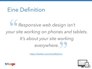
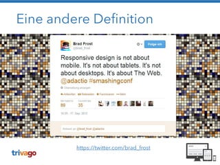
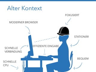
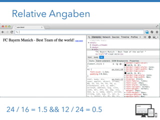
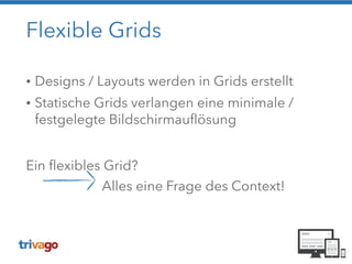
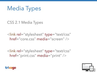
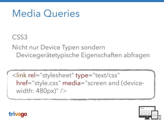
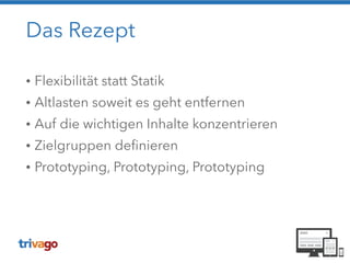
Christoph Reinartz
PHP Usergroup Düsseldorf - April 2014
Der Hauptdarsteller
• “Hello Website“ seit 2001
• Entwicklungslizenz seit 2010
• Frontend-Dev bei trivago seit 2012
!
@pistenprinz
#goveggie #miasanmia
Teil 1: Der Bauplan
http://bradfrostweb.com/blog/post/a-response-to-
responsive-web-design-is-not-the-future/
May the force be with you
Auf jedes
Device Dein
Design passen
muss!
Alles klar!?
Auf all den Geräten
soll dat laufen?
Abweichung von Ideal Parametern
Die mobile Site...
Bullshit
Bullshit
Bullshit
Bullshit
Bullshit
Eine Definition
Responsive web design isn’t
your site working on phones and tablets.
It’s about your site working
everywhere.
https://twitter.com/ScottKellum
Eine andere Definition
https://twitter.com/brad_frost
!
Ja guck ma hier! Dat
passt selbst auf der
Möhre da!
Alter Kontext
MODERNER BROWSER
FOKUSIERT
STATIONÄR
BEQUEM
SCHNELLE
VERBINDUNG
SCHNELLE
CPU
EFFIZIENTE EINGABE
http://maddesigns.de/responsive-workflow/#11
Zutaten nach dem Rezept 

von Ethan Marcotte
!
• Relative Maße
• Ein flexibles gridbasiertes Layout
• Flexible Images und Medien
• Media Queries
Sieh das mal relativ!
!
!
target / context = result
Erstellung relativer Maße: Fonts / Grids
Relative Angaben
24 / 16 = 1.5 && 12 / 24 = 0.5
Live Demo - Teil 1
Pixel Angaben vs. relative Angaben in em
!
https://github.com/creinartz/wnpwrg
Flexible Grids
• Designs / Layouts werden in Grids erstellt
• Statische Grids verlangen eine minimale /
festgelegte Bildschirmauflösung
!
Ein flexibles Grid? 

Alles eine Frage des Context!
Flexible / fluid media
Fluid Images: max-width
http://clagnut.com/sandbox/imagetest/
img,
embed,
object,
video {
max-width: 100%;
}
Background-Images: CSS3, MediaQueries
Media Types
CSS 2.1 Media Types
!
<link rel="stylesheet" type="text/css"
href="core.css" media="screen" />
!
<link rel="stylesheet" type="text/css"
href="print.css" media="print" />
Media Queries
CSS3
Nicht nur Device Typen sondern
Devicegerätetypische Eigenschaften abfragen
!
<link rel="stylesheet" type="text/css"
href="style.css" media="screen and (device-
width: 480px)" />
Media Queries
Mehrere Eigenschaften in einer Query
!
@media screen and (max-device-width: 480px) and
(resolution: 163dpi) { 

.column {
float: none;
}
}
Viewport-Metatag
<meta content="width=device-width, initial-
scale=1.0" name="viewport" />
Mit Viewport-Metatag
viewport-width = device-width
!
Ohne Viewport-Metatag
Default-Canvas, Scaling
http://bkaprt.com/rwd/29
Live Demo - Teil 2
Layout Beispiel:
was nicht passt… wird responsive gemacht
!
https://github.com/creinartz/wnpwrg
Responsive Images
Responsive Images
Responsive Images
• Optimized images
• Bitte ohne Hipster-JavaScript-Kram
• Cache / CDN
• Simple Code
• Fast
• Art Direction
Art Direction? Wat is dat?!
Art Direction!
Responsive Images - Techniken
• CSS Backgrounds

Art Direction, Schnell, CDN/Caching, NoJS
• SVG

Art Direction, CDN/Caching, NoJS

Code!!!
• RESS, Picturefill…


Eine neue Hoffnung: <picture>
<picture> 

<source media="(min-width:601px)"
srcset="med.png 1x, med2x.png 2x">


<source src="small.png"> srcset="med.png 1x,
med2x.png 2x">


<!-- image fallback --> 

<img src="med.png" alt="Horst"> 

</picture>

http://responsiveimages.org/
Kein Browser-Support
Responsible RWD
http://bradfrostweb.com/
blog/post/beyond-squishy-
the-principles-of-adaptive-
design/
Responsible RWD
Klassischer Workflow
http://blog.meltmedia.com/2013/04/a-clients-prep-guide-for-a-
responsive-project/
Responsive Workflow
• Flexible Layouts entstehen im Browser
• HTML & CSS statt Photoshop
• Es gibt keine statischen Entwürfe mehr
• Content First: Die Layouts zeigen echte Inhalte
• Keine Bilder von Webseiten erstellen
Responsive Workflow
http://blog.meltmedia.com/2013/04/a-clients-prep-guide-for-a-
responsive-project/
Ein Praxisbeispiel
Responsive oder mobile Site
• Parallel-Entwicklung
• Performance?
• Code-Redundanz
• Erhöhter Wartungsaufwand
Den Ferrari nicht schrotten!
http://www.mobile-zeitgeist.com/2013/08/07/warum-responsive-
webdesign-schrott-ist/
Die alternative Route
Sprünge statt fluid
• Aufwände reduzieren
• Breakpoints definieren
• Möglichst wenig Layout-Switches
„Full“ fluid – „Full“ responsive?
• Wie sollen sich die Elemente verhalten?
• Bei komplexen Designs führt dies oft zu
Aufwands- und Spezifikationsexplosionen
• Geschäftskritische Bereiche beachten
• Wie ist das Userverhalten?
Desktop, iMac, Laptop
Landscape Tablet, Netbook
IPad, Tablets
Filterleiste einblendbar
Smartphone
Kritische Elemente bedienbar
Das Rezept
• Flexibilität statt Statik
• Altlasten soweit es geht entfernen
• Auf die wichtigen Inhalte konzentrieren
• Zielgruppen definieren
• Prototyping, Prototyping, Prototyping
Vorsicht bei…
• Schlecht strukturiertem Code
• Legacy-Code
!
Es muss eine gewisse Code-Qualität vorliegen,
ansonsten …
Timeline Flat-Design
Flat Design Prototype
2 Wochen
Flat Design Implementierung
3 Wochen
Timeline RWD
RWD Konzeption
2 Wochen
RWD Prototype
3 Wochen
RWD Implementierung
3 Wochen
Ich habe fertig!
!
Danke! Prosit!

Was nicht passt wird responsive gemacht