77-mal heruntergeladen


![Michael Jendryschik [email_address] [email_address] twitter.com/jendryschik www.facebook.com/jendryschik www.xing.com/profile/Michael_Jendryschik](https://image.slidesharecdn.com/cssmediaqueries-101017105149-phpapp02/85/CSS-Media-Queries-WebTech-Conference-2010-48-320.jpg)

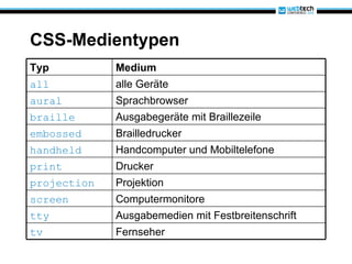
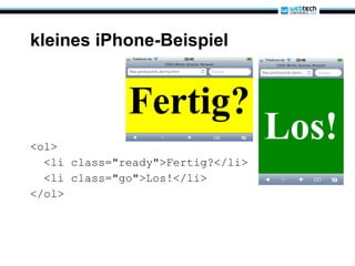
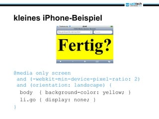
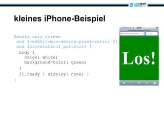
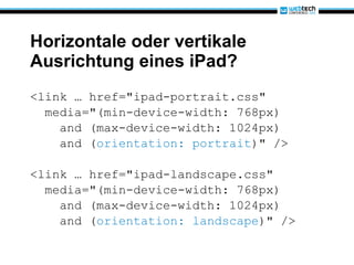
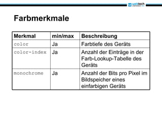
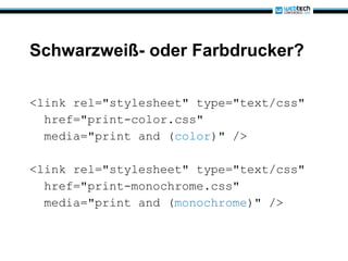
Das Dokument erläutert die Nutzung von CSS Media Queries zur Anpassung von Webseiten an verschiedene Ausgabemedien wie Drucker, Monitore und mobile Geräte. Es beschreibt die Grundlagen, die Syntax und zeigt Beispiele für verschiedene Anwendungen von Media Queries, um spezifische Styles je nach Geräteeigenschaften zu definieren. Zudem werden wichtige Medienmerkmale und deren Nutzung zur gezielten Anpassung von Webinhalten erklärt.


