53-mal heruntergeladen


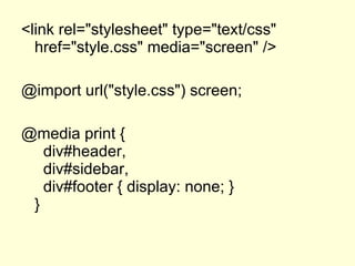


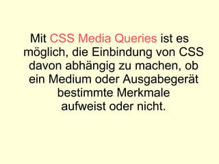


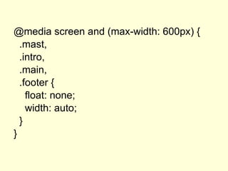


Der Artikel behandelt die Grundlagen und die Syntax von CSS-Media-Queries, die es ermöglichen, CSS basierend auf den Eigenschaften von Medien und Ausgabegeräten anzuwenden. Es werden verschiedene Medientypen und Merkmal-Kombinationen vorgestellt, um Regeln für unterschiedliche Bildschirmgrößen und Gerätetypen zu definieren. Zudem werden Beispiele für die Anwendung von Media Queries gegeben, einschließlich spezifischer Regeln für Drucker, mobile Geräte und verschiedene Bildschirmformate.


