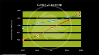
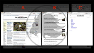
Responsive Web Design
Virtualtrends
Wo stehen wir?
Quelle: http://wallpaperswide.com/road_to_death_valley-wallpapers.html
Das ist das Web.
Quelle: http://www.flickr.com/photos/adactio/sets/72157627691092806/with/6153459388/
Quelle: http://www.androidtapp.com/preview-of-lg-google-tv/lg-google-tv/
Quelle: http://www.superiormediasolutions.net/engagement-levels-iphone-vs-ipad-know-thy-user-and-now-know-thy-device/#.UQfPMUpJbAA
Quelle: http://bydragonfly.com/
Quelle: http://www.flickr.com/photos/kiwanja/3169447879
http://www.popphoto.com/gear/2012/05/first-video-recorded-google-glasses
7,0Milliarden
die Anzahl der Menschen
auf der Welt…
laut Prognosen sollen es 2050 dann 9.5 Milliarden Menschen sein
Quelle: http://www.internetworldstats.com/stats.htm
2,4Milliarden
die Anzahl der Internetnutzer
auf der ganzen Welt…
das sind ~ 35% der Erdbevölkerung und eine Zuwachsrate seit 2000 von > 550%
Quelle: http://www.internetworldstats.com/stats.htm
>1Milliarden
die Anzahl von Smartphones in
Nutzung auf der Welt…
jedes vierte „Handy“ ist ein Smartphone.
Quelle: http://en.wikipedia.org/wiki/List_of_countries_by_number_of_mobile_phones_in_use
86% mobiler Internetnutzer nutzen ihre
mobilen Geräte von zu Hause aus…
Kein Hype, sondern ein Bestandteil.
Quelle: http://tag.microsoft.com/community/blog/t/the_growth_of_mobile_marketing_and_tagging.aspx
Der Markt wird überschwemmt mit neuen Geräten…
Innerhalb von zwei Monaten erschienen diese neuen Geräte:
4"-5" Smartphones
• Apple iPhone 5 (4" Apple iOS 6.0)
• Nokia Lumia 920 (4.5" Microsoft Windows 8)
• HTC Windows Phone 8X (4.3" Microsoft Windows 8)
• HTC Windows Phone 8S (4.0" Microsoft Windows 8)
• Motorola Droid RAZR HD (4.7" Google Android 4.0)
• Motorola Droid RAZR M (4.3" Google Android 4.0)
• TBD: LG Nexus 4 (4.7" Google Android 4.2)
5"-6" Phone/Tablet Hybrids
• Samsung Galaxy Note II (5.5" Google Android 4.0)
7"-8" Tablets
• iPad Mini (7.9" Apple iOS 6.0)
• Kindle Fire HD (7" Google Android 4.0 modified)
• Kindle Fire (7" Google Android 4.0 modified)
20"-30" Desktops
• Sony Tap 20 (20" touch screen Microsoft Windows 8)
• 21.5-inch iMac (21.5" Apple OSX 10.8)
• 27-inch iMac (27" Apple OSX 10.8)
9"-10" Tablets
• iPad Gen 4 (9.7" Apple iOS 6.0)
• Microsoft Surface Tablet (10.6" Microsoft Windows 8)
• Kindle Fire HD (8.9" Google Android 4.0 modified)
• Lenovo ThinkPad Tablet 2 (10.1" Microsoft Windows 8)
• Acer Iconia Tab W510 (10.1" Microsoft Windows 8)
• Dell Latitude 10 (10.1" Microsoft Windows 8)
• Dell XPS 10 (10.1" Microsoft Windows 8)
• Asus Vivo Tab RT (10.1" Microsoft Windows 8)
• TBD: Nexus 10 (10" Google Android 4.2)
11"-17" Laptops & Convertibles (Tablet/Laptop)
• 13" MacBook Pro with Retina (13" Apple OSX 10.8)
• Lenovo IdeaPad Yoga 13 (13.3" Microsoft Windows 8)
• Lenovo ThinkPad Twist (12.5" Microsoft Windows 8)
• Toshiba Satellite U925T (12.5" Microsoft Windows 8)
• Dell XPS 12 (12.5" Microsoft Windows 8)
• Lenovo IdeaTab Lynx (11.6" Microsoft Windows 8)
• Samsung ATIV Smart PC 500T/700T (11.6" Microsoft Windows 8)
• Acer Iconia W700 (11.6" Microsoft Windows 8)
• Sony Vaio Duo 11 (11.6" Microsoft Windows 8)
• Samsung Chromebook (11.6" Google Chrome OS)
Mobile vs. Desktop
Quelle: http://tag.microsoft.com/community/blog/t/the_growth_of_mobile_marketing_and_tagging.aspx
Internetnutzer(Millionen)
2007 2009 2011 2013 2015
400
800
1200
1600
2000
Okay, was bedeutet das?
Neuen Anforderungen
unterschiedlichste Auflösungen
verschiedene OS & Browser
variierende Geschwindigkeit
(LAN, WLAN, GPRS, EDGE, 3G, LTE)
unabhängige Orte/Kontexte
damit verbunden: Zeit/Kosten
Quelle: http://wtfmobileweb.com
Quelle: http://wtfmobileweb.com/
:-(
Quelle: http://vitamintalent.com/extra/infographics-viewer/so-you-think-you-can-build-a-website.htm
Responsive Web Design
Seperate Mobile Website – Responsive Web Design
Seperate Mobile Website
Pflegeaufwand
hoher Kostenaufwand
main.css
template.css
widget.css
Chrome
Firefox
Safari
InternetExplorer
Produktinfos
Newsartikel
m.main.css
m.template.css
m.widget.css
iPhone4,
iPhone5
Galaxy SIII
Nexus 4
m.Produktinfos
m.Newsartikel
URL Management
http://www.example.com http://m.example.com

  
http://www.example.com http://m.example.com

  
A B C
Suchmachinenoptimierung
Quelle: https://developers.google.com/webmasters/smartphone-sites/details
…
Responsive Web Design
Content

Content
Core
Themen
Stil Nachricht
Ton
Prioritäten Aufteilung
Anordnung
Quelle: http://www.listofimages.com
UX
User eXperience
Navigation
Menue Einz
Menue Zwei
Menue Drei
Menue Vier
Menue Fünf
Menue Sechs
Company GmbH
Hallo, wir sind das weltweit
größte Unternehmen für
Demotexte und Demobilder.
off-canvas navigation
Company GmbH
Hallo, wir sind das weltweit
größte Unternehmen für
Demotexte und Demobilder.
Menue Einz
Menue Zwei
Menue Drei
Menue Vier
Menue Fünf
Menue Sechs
dropdown navigation
Touch & Gesten
http://www.lukew.com/ff/entry.asp?1071
Tap
Doppel-Tap
Drag
Flick, Swipe, Wischen
Maus - click Finger - swipe
Feature Detection
GEOlocation
Wieviel kostet Responsive Webdesign?
Die Antwort: 13,47€
Hä?
Fakt ist, Responsive Design kostet mehr…
Fakt ist, Responsive Design kostet mehr… als nichts zu tun.
Mobile vs. Desktop
Quelle: http://tag.microsoft.com/community/blog/t/the_growth_of_mobile_marketing_and_tagging.aspx
Internetnutzer(Millionen)
2007 2009 2011 2013 2015
400
800
1200
1600
2000
Mobile Welt
immer mehr Smartphones & Tablets
~ 2014 mehr mobile Nutzer als Desktop
Neue Anforderungen
unterschiedliche Auflösung
variierende Geschwindigkeiten
Anpassungsfähiges Design
Website wächst mit
Content ist König
hochwertiger Inhalt
User Experience
touch Gestiken
gerätespezifische Funktionen
  
 

 

Responsive Web Design
Virtualtrends

Digital Media Night - Responsive Web Design