Responsive Web Design
•
1 gefällt mir•528 views

Intro to Responsive Web Design for librarians

Empfohlen
Empfohlen
Weitere ähnliche Inhalte
Was ist angesagt?
Was ist angesagt? (19)
Andere mochten auch
Andere mochten auch (20)
Ähnlich wie Responsive Web Design
Ähnlich wie Responsive Web Design (20)
Kürzlich hochgeladen
Kürzlich hochgeladen (20)
Responsive Web Design
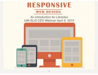
- 1. 1 An introduction for Libraries UW-SLIS CES Webinar April 6, 2015
- 2. TODAY’S AGENDA • What is Responsive Web Design? • Definition & History • How do I DO Responsive Web Design? • Tips & Tricks & Jargon • Where do I go to learn more about Responsive Web Design? • Resources, Bibliography, SLIS/CES web course 2
- 3. WHAT IS RESPONSIVE WEB DESIGN? • Responsive web design (RWD) is an approach to web design aimed at crafting sites to provide an optimal viewing experience—easy reading and navigation with a minimum of resizing, panning, and scrolling—across a wide range of devices (from desktop computer monitors to mobile phones). [Wikipedia, the free encyclopedia] 3
- 4. WHAT IS RESPONSIVE WEB DESIGN? • Responsive web design (RWD) is an approach to web design aimed at crafting sites to provide an optimal viewing experience—easy reading and navigation with a minimum of resizing, panning, and scrolling—across a wide range of devices (from desktop computer monitors to mobile phones). [Wikipedia, the free encyclopedia] “adapts the layout to the viewing environment by using fluid, proportion-based grids” 3
- 5. WHAT IS RESPONSIVE WEB DESIGN? • Responsive web design (RWD) is an approach to web design aimed at crafting sites to provide an optimal viewing experience—easy reading and navigation with a minimum of resizing, panning, and scrolling—across a wide range of devices (from desktop computer monitors to mobile phones). [Wikipedia, the free encyclopedia] “adapts the layout to the viewing environment by using fluid, proportion-based grids” “flexible images” 3
- 6. WHAT IS RESPONSIVE WEB DESIGN? • Responsive web design (RWD) is an approach to web design aimed at crafting sites to provide an optimal viewing experience—easy reading and navigation with a minimum of resizing, panning, and scrolling—across a wide range of devices (from desktop computer monitors to mobile phones). [Wikipedia, the free encyclopedia] “adapts the layout to the viewing environment by using fluid, proportion-based grids” “flexible images” “CSS3 Media Queries” 3
- 7. WHAT IS RESPONSIVE WEB DESIGN? • Responsive web design (RWD) is an approach to web design aimed at crafting sites to provide an optimal viewing experience—easy reading and navigation with a minimum of resizing, panning, and scrolling—across a wide range of devices (from desktop computer monitors to mobile phones). [Wikipedia, the free encyclopedia] “adapts the layout to the viewing environment by using fluid, proportion-based grids” “flexible images” “CSS3 Media Queries” <meta name=“viewport" content="width=device-width"> 3
- 9. HOW WE GOT TO RESPONSIVE • Choices: • Mobile site • App • Responsive
- 10. HOW WE GOT TO RESPONSIVE • Choices: • Mobile site • App • Responsive
- 11. HOW WE GOT TO RESPONSIVE • Choices: • Mobile site • App • Responsive
- 12. HOW WE GOT TO RESPONSIVE • Choices: • Mobile site • App • Responsive
- 13. HOW WE GOT TO RESPONSIVE • Choices: • Mobile site • App • Responsive
- 16. VIEWPORT META TAG • Magic! Sort of • Tells browser to adjust to size of device <meta name="viewport" content="width=device width” />
- 17. VIEWPORT META TAG • Magic! Sort of • Tells browser to adjust to size of device <meta name="viewport" content="width=device width” />
- 18. VIEWPORT META TAG • Magic! Sort of • Tells browser to adjust to size of device <meta name="viewport" content="width=device width” />
- 19. VIEWPORT META TAG • Magic! Sort of • Tells browser to adjust to size of device <meta name="viewport" content="width=device width” />
- 22. FLUID LAYOUTS • Escaping the CSS box model! <div id=”outerwrap"> <div id="header"> <div id=“bodycontent”> <div id="footer"> • Grid • Makes content columns swing below each other to fit on smaller, narrower, screen
- 25. SECRET OF COLUMNS • New HTML5 element <section> Defines a section in the document • Sizing done in CSS • Col and span aren’t only for tables anymore • Table is a display property in CSS3 that says, “Let the element behave like a <table> element”
- 26. SECRET OF COLUMNS • New HTML5 element <section> Defines a section in the document • Sizing done in CSS • Col and span aren’t only for tables anymore • Table is a display property in CSS3 that says, “Let the element behave like a <table> element”
- 27. SECRET OF COLUMNS • New HTML5 element <section> Defines a section in the document • Sizing done in CSS • Col and span aren’t only for tables anymore • Table is a display property in CSS3 that says, “Let the element behave like a <table> element”
- 28. SECRET OF COLUMNS • New HTML5 element <section> Defines a section in the document • Sizing done in CSS • Col and span aren’t only for tables anymore • Table is a display property in CSS3 that says, “Let the element behave like a <table> element”
- 32. CSS3 MEDIA QUERIES • Used to mostly be screen or print • Hide nav when printing @media print { #navigation { display: none; } }. • [W3Schools] Media queries look at the capability of the device, and can be used to check many things, such as: • width and height of the browser window • width and height of the device • orientation (is the tablet/phone in landscape or portrait mode?) • Resolution • You can also have different stylesheets for different media
- 44. TOOLS • Bootstrap • Word Press Responsive themes • All sorts of code generators & downloads – • Responsive Grid System http://www.responsivegridsystem.com/ • GitHub - https://github.com/search?utf8=%E2%9C %93&q=responsive+web+design
- 45. TOOLS • Bootstrap • Word Press Responsive themes • All sorts of code generators & downloads – • Responsive Grid System http://www.responsivegridsystem.com/ • GitHub - https://github.com/search?utf8=%E2%9C %93&q=responsive+web+design
- 57. RESOURCES, WEBSITES • W3Schools Responsive http://www.w3schools.com/ html/html_responsive.asp
- 58. RESOURCES, WEBSITES • W3Schools Responsive http://www.w3schools.com/ html/html_responsive.asp
- 59. RESOURCES, WEBSITES • W3Schools Responsive http://www.w3schools.com/ html/html_responsive.asp
- 60. EVEN MORE - • A List Apart - http://alistapart.com/ • Content Strategy for the Web – 2nd ed. 2012 book, Kristina Halvorson http://contentstrategy.com/ • usability.gov http://www.usability.gov/what-and-why/ content-strategy.html • CES web course "Designing Mobile & Responsive Experiences” starts June 1 http://www.slis.wisc.edu/ continueed-DesignMobile.htm
- 61. THANK YOU! QUESTIONS? “But that kind of design thinking doesn’t need to be our default. Now more than ever, we’re designing work meant to be viewed along a gradient of different experiences. Responsive web design offers us a way forward, finally allowing us to “design for the ebb and flow of things.” Ethan Marcotte