IEEE Happiness an inside job asoman 2017
•Als PPTX, PDF herunterladen•
4 gefällt mir•1,488 views

turnover prediction

Empfohlen
Weitere ähnliche Inhalte
Was ist angesagt?
Was ist angesagt? (20)
Ähnlich wie IEEE Happiness an inside job asoman 2017
Ähnlich wie IEEE Happiness an inside job asoman 2017 (20)
Mehr von Jose Berengueres
Mehr von Jose Berengueres (20)
Kürzlich hochgeladen
Kürzlich hochgeladen (20)
IEEE Happiness an inside job asoman 2017
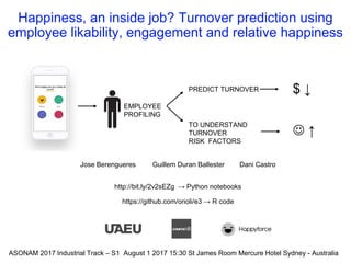
- 1. Happiness, an inside job? Turnover prediction using employee likability, engagement and relative happiness Jose Berengueres Guillem Duran Ballester Dani Castro http://bit.ly/2v2sEZg → Python notebooks https://github.com/orioli/e3 → R code EMPLOYEE PROFILING ASONAM 2017 Industrial Track – S1 August 1 2017 15:30 St James Room Mercure Hotel Sydney - Australia PREDICT TURNOVER TO UNDERSTAND TURNOVER RISK FACTORS $ ↓ ↑
- 3. Monitoring happiness with an app (user flow)
- 4. Motivation Duran&Berengueres 4 PREDICTION WEEKS Employee-Company features Employee individual features Graph features CHURN ? Company-wide features 1. 250+ papers on customer churn, few papers on employee churn 2. Predict churn to reduce HR costs, plan, visualize… 3. What is the relation between Happiness and Churn? 4. What is the appropriate unit of analysis? 5. Identify turnover risk factors ASONAM 2017
- 5. About
- 6. About
- 7. About
- 8. About
- 9. About
- 10. Outline Duran&Berengueres 10ASONAM 2017 1. The dataset 2. Exploring the data 3. Feature engineering 4. Modeling turnover 5. Conclusions
- 11. Dataset – size Duran&Berengueres 11 Table (Rows) Feed-back UI flow Happiness votes (221k) How happy are you at work today? - 4: Great - 3: Good - 2: So-so - 1: Pretty Bad 1stscreen Comments (29.5k) Comment box (optional) 2nd screen Likes (284k) Dislikes (52k) Anonymous forum Users can: - view comments - like a comment - dislike a comment 3rd screen ASONAM 2017
- 13. Recap • Votes, comments, interactions • 34 companies • Span 2 years • 3,881 employees of which 238 or 6% churned Duran&Berengueres 13ASONAM 2017
- 14. Outline Duran&Berengueres 14ASONAM 2017 1. The dataset 2. Exploring the data 3. Feature engineering 4. Modeling turnover 5. Conclusions
- 15. App usage, periodicity & growth Duran&Berengueres 15ASONAM 2017
- 16. Duran&Berengueres ASONAM 2017 16 MORE HAPPYLESS HAPPY The bias towards “good”
- 17. The effect of weekday on happiness Duran&Berengueres 17 Kolmogorov p < 1e-10 ASONAM 2017
- 18. The effect of weekday on likes received on a comment Ballester&Berengueres #pyDataBCN2017 18 Kolmogorov p < 0.00000000001
- 20. Recap • Visualize the data to filter out outliers • Strong influence of weekday • Weekends = happiness Duran&Berengueres 20ASONAM 2017
- 21. Outline Duran&Berengueres 21ASONAM 2017 1. The dataset 2. Exploring the data 3. Feature engineering 4. Modeling turnover 5. Conclusions
- 22. List of features (N ~100) Ballester&Berengueres 22 • Individual features (N=13) • reported happiness: mean, standard deviation (sd), length of employee comments (in chars): sum, mean, sd. • count of comments posted per day of observation, count of chars written per day of observation • likes given in the forum: sum of all likes, mean (per day the app was used), sd (per day the app was used). • count of likes + dislikes received by the employee’s posted comments in the forum, ratio of likes to likes + dislikes (likability). • Company-wide features (N=18 +34 dummy) aka entity faceted features (ASONAM 2016) • Same at company level • Easier to interpret than clustering dummy variables… • Counter intuitive • Employee-Company features • Individual features normalized by company average • Social graph features (next page)
- 23. Three main ways to connect likes on a comment 23 Undirected (1) Directed (2) Feature Likability = Likes / Interactions Feature Interactions = Likes + Dislikes
- 24. Intra company interactions Duran&Berengueres 24 networkx Hated people is blue node Node size = mean happiness Edge is L-ratio between 2 ppl
- 25. Happiness as a graph Duran&Berengueres 25 Company D Company K churn
- 26. Modeling churn - Representing NMF 1 Duran&Berengueres 26 Viz 1st component of the Non negative matrix factorization of the adjacency matrix of the graph
- 27. Modeling churn - Representing NMF 1 Duran&Berengueres 27 Effect of discretizing the first component into three values, low as blue, neutral as black, and high as orange
- 28. Outline Duran&Berengueres 28ASONAM 2017 1. The dataset 2. Exploring the data 3. Feature engineering 4. Modeling turnover 5. Conclusions
- 29. Filtered employees & churn Duran&Berengueres 29 employees who quit are big, and red
- 30. Prediction performance GBM model (test set) P@50>75% 30Duran&Berengueres 0 100 200 300 0 100 200 300 YN -4 -2 0 2 pred count churn Y N @50
- 31. Top features that predict turnover Duran&Berengueres 31 TOP FEATURES TYPE Influence (a) Likability Employee* 33 (b) Posting frequency Company 9.6 (c) Relative Happiness EC 4.2 (d) Relative Variability of Happiness EC 2.4 (e) NMF Comp. 1 Social 2.2 (f) Mean Happiness of the employee. Employee 1.8
- 32. Scatter of two features 32Duran&Berengueres 0.0 0.5 1.0 1.5 2.0 0.0 0.5 1.0 1.5 2.0 YN 0.00 0.25 0.50 0.75 1.00 F1: Employee Likability F3:RelativeStabilityofHapiness
- 33. “Likable” employees churn 3 times less (all sets) 33Duran&Berengueres
- 34. Outline Duran&Berengueres 34ASONAM 2017 1. The dataset 2. Exploring the data 3. Feature engineering 4. Modeling turnover 5. Conclusions
- 35. Influence of feature group in prediction Duran&Berengueres 35
- 36. Interpreting the predictive model as a medical test Duran&Berengueres 36 Turnoverb Yes (116) No (1828) Prediction output on test seta Positive (50) True Positives 41 False Positives 9 Negative (1894) False Negatives 75 True Negatives 1819 Sensitivity, the proportion of employees that turnover and who tested positive in the test is 35% (TP / (TP+FN) ) Specificity, the proportion of employees who stay and who tested negative is 99.5% Data geek Nurse
- 37. Motivation (flash back) Duran&Berengueres 37 1. 250+ papers on customer churn, few papers on employee churn 2. Predict churn to reduce HR costs, plan, visualize… 3. What is the relation between Happiness and Churn? 4. What is the appropriate unit of analysis? 5. Identify turnover risk factors ASONAM 2017
- 38. Conclusions • Prediction performance • P@50 ~75% (in medical terms Sensitivity = 35%) • Relation between Happiness and Churn? • Raw happiness (f) not correlated with turnover • What is the appropriate unit of analysis? • The top features not independent of peers • Environment > Individual (BF Skinner) • Top Risk factors • Likeability top feature (25% have low likeability) • Engaged company • Relative Happiness • Surprises • Raw happiness not correlated • Positivity of employee (# likes given to others) not correlated • Entity faceted features work! TOP FEATURES TYPE (a) Likability Employee* (b) Posting frequency Company (c) Relative Happiness EC (d) Relative Variability of Happiness EC (e) NMF Comp. 1 Social (f) Mean Happiness of the employee. Employee
- 40. Machine Learning - The GBM Ballester&Berengueres #pyDataBCN2017 40 Straighforward improvements: ● Data balancing → 10% churn ● Data augmentation → 1000 employees ● Metaparameter tuning → Default parameters ● Advance feature selection → + 200 features ● XGBOOST (+10% kaggle)
- 41. Network analysis - Extracting features Ballester&Berengueres #pyDataBCN2017 41 Descriptive features: - Number of nodes/edges → Number of employees/interactions - Degree → Different interactions an employee has Centrality features: - Betweenness → Influence of a given employee - Closeness → Different interactions an employee has Clustering features: - Non Negative Matrix Factorization → Reduce information in n comp. - PCA on adjacency matrix → Reduce information in n comp - Community → Find communities inside the graph* - Filtering: MST, MPFG → Keep most important nodes*
Hinweis der Redaktion
- Here we analyze social network data from a mobile phone application in order to predict employee turnover as an indicator of employee happiness.
- Let’s start talking about the source of our data. For 2 years / Happyforce has been helping companies with an app that they deploy to understand its workforce better. This app is meant to be used by employees to provide feedback to both their company and their peers. (15s)
- From an employee perspective, there are three three main features that can be used by the employees: First, the employees can vote based on their happiness level. They can also give feedback as anonymous comments, that can be read by other employees of the same company, The comments, will be posted on a company forum, where the employees/ can anonymously like or dislike other peers comments.(22s) (1:15 min)
- We use 4 kinds of features to predict churn within 3 months and we are interested in the following…
- Here we can see the amount of data that has been collected during the last two years corresponding to each one /of the app features. This data is stored in 4 different csv files, each one containing different types of information. (14s)
- The votes csv contains the happiness vote related information. It not only contains/ the numeric value of the votes/ issued by an employee, but also the date/ in which the vote was issued. In order to uniquely identify an employee, all the csv contain the same two columns: An integer identifying the employees, and an identifier of the company that they belong. *Note that the employee number can be repeated in different companies, so if we want to be able/ to uniquely identify an employee we will have to use the emplee/ and companyAlias tuple. Regarding the comments information, the content has been anonymized while maintaining its original number of characters. You can also find a column containing /the date the comment was posted, and the number of likes and dislikes/ the comment received. There is also a csv file available containing the likes and dislikes/ an employee gave to a comment. It is possible to know which employee liked or disliked a given comment, but we have no timing information/ about when that happened. (55)
- This talk will cover some of the aspects that have to be taken into account when building a churn risk model, such as: [c] What kind of information we have available. [c] How the data looks like. [c] How we can use graph theory, to gain insight on our dataset [c] How to build machine learning models to predict/ and explain employee churn. [c] And finally, we’ll have a look at the notebooks used to perform this analysis. (28s)
- This chart /shows the count of votes /issued daily /grouped by companies. Most of the votes were cast during business days, and this is the reason why /we can see some small dips,/ corresponding to weekends. It also shows a growing trend both in the number of companies, /that signed up in the app, and the number of votes that were issued. (25s)
- This is the votes information representing the answer to the question [1] “How happy are you today at work?”, and its answer [2] represents a numerical value ranging from 1 to 4. Note that there is no neutral answer, and therefore people tend to choose/ 3 over 2 /to account for neutral happiness. It turns out/ that is easier to say/ “I’m good” /rather than “meh” (26s) + or maybe / this bias effect/ it is because the first two don’t have name and people gets confused about what they mean.
- [1]This radar chart shows the average employee happiness on a given week day. [2]The surprise here is that Tuesday, not Monday is the least happy day. [3] However, the biggest drop in happiness /is from Sunday to Monday (20s)
- *** popular wisdom says… “You should never accept / a job interview/ on a monday/ nor a friday”. Well, the same is true/ when posting a comment… ***This radar chart shows the number of likes/ that a comment has received /depending on the day of the week/ that it was posted. On average a comment receives/ 7.5 likes. However, the day the comment is posted /has a great influence on the number of likes/ that it will receive. A comment posted on a monday will receive on average *1.5 likes less than one written on Sunday. Monday and Fridays are the “worse” days to post /(if you want to be liked). (45s)
- To conclude our exploratory data analysis we will plot a timeline for the churn information extracted from the fourth csv file. In this figure it is possible to see / a timeline describing the number of employees that quit grouped by companies. It is possible to notice that at least three things about the displayed data that could make our model fail. First , A group of employees churned in June fourteen(14). After that/ no employes churned until March fifteen(15). You can also see how until january sixteen, all the employees that churned /belonged only to one company. And finally, you can see a whole company churning the same day ,on March seventeen. These irregularities mean that if we want to build a consistent machine learning model, we will need to do some data cleaning. (50-55s) (2:50)
- As we are seeing some inconsistencies /in the database, we will use graph theory to build an alternate representation / of the dataset. This way it will be easier to see what is really going on with the data. (13s)
- There are several kinds of features that we can extrat. Individual features: These features depend only on the information related to an employee such as descriptive statistics of reported votes, number and length of the comments written or likes and dislikes given and received. We also have company wide features, that are extracted using the same method used to extract the individual features but grouping the data by company instead of grouping it by employee. The Employee-company features are the individual features normalized by the company average. This way we can relate an employee to its peers data. There is also possible to extract new features using graph theory.
- For example, one of the most simple / yet effective representation is the undirected graph of interactions. (Interactions are the likes + dislikes.) where the weight/ of each vertex is proportional to the number of likes plus the number of dislikes / that two employees / gave each other. (likability = likes / likes + dislikes) In this example, the direction of the connections is not relevant. It will be relevant/ if we choose to represent our data as a directed graph. This means,/ that employee A liking employee B will not be the same as/ employee B liking A. There can also assign / different weights to the edges, For example/ instead of the number of interactions, we could weight each vertex using the ratio of likes to the total number of interactions. For the record,/ we call this quantity Likability There are many more possibilities when building a graph representation. Another way to define our edges could be to link two employees if they liked/ or disliked the same comment. Once the graph is created we can use bokeh to represent it. (60s)
- In the following plot /you can see how /the different employees of a company/ interacted among each other. We have also used/ line and marker properties/ to highlight different aspects/ of the dataset. When representing each node, /we have used the size and color properties of the plot to display information about our data. Each node,/ that represents an employee, is colored according to the ratio of /likes to interactions/ that their comments received. This is,/ its likability [c] Nodes that have no information available / about the likes received are represented/ as transpárent circles, while the other employees/ are coloured from blue, /used to represent low values, to red/ to represent high values. The size of the node,/ is proportional/ to the mean happiness votes/ recorded for each employee, while the nodes displayed as points, have no vote information available. We have also colored the edges proportionally to likability between to employes. A red edge will indicate a high proportion of dislikes while a green edge / will indicate a high likability. Using this representation it is easy to see that a lot of information is missing. If we dig deeper we will discover that all that missing information belongs to either churned employees that were partially deleted from the database, or employees who barely used the app. This means that if we want to build an unbiased classifier we will need to filter out all the employees with missing information. If we didn’t do that we would find that our classifier would be trained to spot missing data instead of churned employees. #mola, no tocar (90s) Regarding employees, each node is colored based on the ratio of likes and dislikes an employee received, ranging from blue for the lowest, to red for the highest likes to dislikes ratio. The employees represented by a transparent node did not receive any likes nor dislikes. The size of each node is proportional to the mean happiness level of an employee. All the nodes that are represented by an extremely small circle do not have any vote information available. ---------------------------------------------------------------------------------------------------------------------------------------------------------------------------------------------------------- We have created a graph with networkx that shows: Node color: ratio of likes/dislikes received. from blue(low) to red(high). Hated people is blue. No color means that they have no likes recorded. The ratio of likes/dislikes as edges. Green is higher and red is lower. Size is a function of happiness. Bigger is happier. No size means nan. We can see that a lot of information is missing. This information corresponds either to churned employees who were deleted from the database, or unreliable employees who barely used the app. Clearly some filtering is needed
- In this slide we can see how some of the companies look like / once the filtering process is done. We have used the same coloring scheme for the edges as the one used in the previous slide, but in this case we colored each node / according to its churn information. We can see that/ the resulting company graph/ has only one component, and the employees /that will churn during the observation period are colored in red. (25s)
- One of these graph features, /is Non negative matrix factorization/ or en em ef(NMF) that is a clustering technique /applied to the adjacency matrix of a graph Here /we can see a graph feature/ extracted using the NMF, / NMF could be though /as a kind of principal component analysis for graphs, that allows us to reduce / the information from/ the adjacency matrix /into the number of components that we choose. The NMF divides the graph into different components each component representing a different cluster or group of employees In this plot,/ the value of the first component is represented using a colormap /ranging from blue/to represent low values / to red/to represent high ones (55s) --------------------------------------------------------------------------------------------------------------------- For example, in the following plot we can see represented the first NMF clustering component of a company graph. This value indicates how much a given node belongs to that component. As this is a continuous value, one could establish a threshold to consider a node part of a group, or even apply a discretization process to each component in order to find subgroups inside a graph. To conclude with our features engineering process, we can see how the values on the first component can be discretized to emphasise different subgroups in a graph.
- The resulting components/ of the NMF / are continuous values. This values indicates how much that node/ belongs to the cluster. Sometimes/ it is useful to discretize those values into bins. This way /it may be easier to discover/ new communities in the graph. In this plot, you can see the effect of discretizing the first component into three values, low as blue, neutral as black, and high as orange (30s)
- This talk will cover some of the aspects that have to be taken into account when building a churn risk model, such as: [c] What kind of information we have available. [c] How the data looks like. [c] How we can use graph theory, to gain insight on our dataset [c] How to build machine learning models to predict/ and explain employee churn. [c] And finally, we’ll have a look at the notebooks used to perform this analysis. (28s)
- Here we can see,/ all the companies in the dataset/ where the employees who quit are big, and red/ so they are easier to spot. (10s) #possible afegir una frase per omplir (4:35)
- This density plot shows /how the employees that will churn, and those who won’t are distributed according to its likability. We can see that this feature is really relevant because employees with high likability are far /less likely to churn (15s) (4:35)
- What features do you think help predict turnover? In this table we have the most relevant features of our model. (E) Likability: defined as the count of likes received / number of intereactions on the all the comments/ written by an employee in the anonymous forum. (C) Posting frequency: Is the Average number of comments posted per day,/ and per company. This is a company-wide feature. (E) Relative Happiness: Is the employee mean happiness vote/ divided by the company average happiness (D) Relative Variability of Happiness: Standard deviation of employee happiness / (divided by) standard deviation of the company to which the employee belongs. (A) NMF Clustering is the social network feature that we represented in the previous slides (B) and Mean Happiness/ is the mean of the happiness votes of the employee Which of the above features do you think is more relevant to predict the employees’ churn? Any guesses? Well, / it is curious to find out that likability is the most relevant feature to look at when predicting employees’ churn. Because it is not a feature that depends on the individual, but a feature that depends on the opinion of other employees. (85-95s) #compara amb happiness votes a priori mes relevant NEED TO FINISH Once we have fit our model, evaluating the feature importances can give us additional insight on how our data is structured. Happiness inside a job is a complex emotion that can be influenced by many external things
- This density plot shows /how the employees that will churn, and those who won’t are distributed according to its likability. We can see that this feature is really relevant because employees with high likability are far /less likely to churn (15s) (4:35)
- This talk will cover some of the aspects that have to be taken into account when building a churn risk model, such as: [c] What kind of information we have available. [c] How the data looks like. [c] How we can use graph theory, to gain insight on our dataset [c] How to build machine learning models to predict/ and explain employee churn. [c] And finally, we’ll have a look at the notebooks used to perform this analysis. (28s)
- Do not forget to measure happiness by what people do, not what they say Happiness not an inside job 1 in 4 employees “disengaged”
- Do not forget to measure happiness by what people do, not what they say Happiness not an inside job 1 in 4 employees “disengaged”
- If we want to avoid misleading our classifier, l employees: some data cleaning /and filtering is required. In order to predict /the churn risk of an employee [c]we will start by selecting/ an arbitrary prediction date and an observation period. [c]We will try to predict if an employee will quit/ after the prediction date, and during the observation period, using only data prior /to the prediction date. [c]We will only model employees Who used the app after the prediction date, who issued at least 5 votes, and who interacted with their peers/ above a threshold /of 5 likes or dislikes. (30s) #arreglar animacions
- If we want to avoid misleading our classifier, l employees: some data cleaning /and filtering is required. In order to predict /the churn risk of an employee [c]we will start by selecting/ an arbitrary prediction date and an observation period. [c]We will try to predict if an employee will quit/ after the prediction date, and during the observation period, using only data prior /to the prediction date. [c]We will only model employees Who used the app after the prediction date, who issued at least 5 votes, and who interacted with their peers/ above a threshold /of 5 likes or dislikes. (30s) #arreglar animacions
- QUIZZ TIME What features do you think where the most important in predicting which employee will quit? I have a prize for the ones who get it right.
- In this case, we have chosen a gradient boosting classifier with default parameters, an arbitrary prediction date set on X and an observation period of three months. Using this model we achieved a precision of X and an AUC of Y. We tried to keep our model simple, but its efficiency could be improved using the following techniques to correct its weakest spots: As only about 10% of the employees churned, data balancing techniques such as the one provided by the imblearn python module could come in handy to improve the f1 score of the model Using data augmentation for generating new data using different arbitrary prediction dates can reduce the variance of our model. Of course, it is also possible to perform metaparameter tuning to the gradient boosting classifier, but at the risk of overfitting. Finally, as we can generate more than 200 different features to describe our dataset, using different feature selection techniques such as X and Y could lead to an improvement of the results. If you take a look to the notebooks of this talk, you will be able to find an implementation of some of the suggested improvements that I just described.
- ##REDO In addition to happiness metric features such as… average hapines, variability, happiness comapre to comapny mean etc… we also used... There are several different ways of using graph theory to extract features from a graph representation of a dataset. Besides features such as the degree of a node, that would represent how many different employees interacted with the employee represented by that node, we could also use centrality features and clustering features. While the centrality features like the betweenness centrality and closeness centrality allows us to quantify how well connected an employee is to their peers. Centrality metrics can be seen as a measure of the relevance of an employee with respect to its colleagues, while the specific type of centrality used allow us to define different kinds of relevance. It may also come in handy to extract clustering features to represent information about the different subgroups that a given graph can have. Techniques such as Non negative matrix factorization allow us to divide a graph in n different groups, so we can obtain a set of n values that indicate how much a node belongs each one of that n groups. It could also be useful to filter the graph assigning each node a binary value describing whether a given node belongs to the reduced graph obtained after applying a filter like Minimum Spanning tree or a Maximum planar filtered graph.