App geolocation spanish industrial confidence
•Als DOCX, PDF herunterladen•
0 gefällt mir•270 views

This document describes a demo version of an application built using Google Maps API that displays industrial climate data from surveys in Spain. The application plots over 3,000 points on a map corresponding to Spanish towns, showing economic and survey data for each town. Blue points represent 260 towns that participated in industry surveys from 2005-2015, providing over 94,000 responses. Users can select towns using drop-down menus or by drawing circles or polygons on the map to view and export data for the selected towns. The creator plans to add charts and fix bugs before making the full version available in the summer.

Empfohlen
Weitere ähnliche Inhalte
Was ist angesagt?
Was ist angesagt? (15)
Ähnlich wie App geolocation spanish industrial confidence
Ähnlich wie App geolocation spanish industrial confidence (20)
Mehr von Ministerio de Economía y Hacienda.
Mehr von Ministerio de Economía y Hacienda. (20)
Kürzlich hochgeladen
Kürzlich hochgeladen (20)
App geolocation spanish industrial confidence
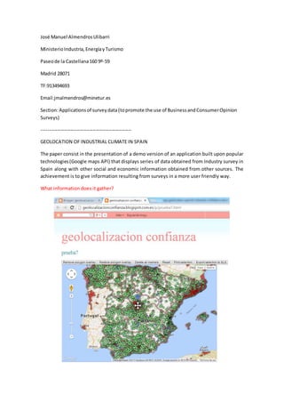
- 1. José Manuel AlmendrosUlibarri MinisterioIndustria,EnergíayTurismo Paseode la Castellana160 9º-59 Madrid 28071 TF:913494693 Email:jmalmendros@minetur.es Section:Applicationsof surveydata (topromote the use of BusinessandConsumerOpinion Surveys) -------------------------------------------------------- GEOLOCATION OF INDUSTRIAL CLIMATE IN SPAIN The paper consist in the presentation of a demo version of an application built upon popular technologies(Google maps API) that displays series of data obtained from Industry survey in Spain along with other social and economic information obtained from other sources. The achievement is to give information resulting from surveys in a more user friendly way. What information does it gather?
- 2. On the map there are marked3.245 pointscorrespondingtothe same numberof towns(green points) that have a population of more than 1.000. For all them we have gathered the following information which is provided in a infowindow when clicking on the point: (*) National share of taxes received for economic and professional activity in the relevant sector = taxes in town/ taxes in Spain for one year and for the relevant sector. Blue points are towns that have firms included in the industry sample. There are 260 towns (blue points). The replies to the industry survey from firms in these 260 towns in the period 2005-2015 is 94.000 aprox. Therefore,forthese towns we have alsothe following information which can be compared to the previously mentioned. Data for BTS questionare calculatedusing Tankan method. I.E for a given town, if there are N responses comin fron n firms in one year, the value of Q2, Q5 or Q7 is the addition of all positive answersminusthe addition of negatives responses. For Q13 the value is the average of all responses of all firms located in a given town, a given year. How does it work? Click on the following link (it works much better with Google Chrome) http://geolocalizacionconfianza.blogspot.com.es/p/prueba7.html 2005 2006 2007 2008 2009 2010 2011 2012 2013 2014 town code X Name of town X Province X Region X Longitude X Latitude X marker (green/blue) X Population (number) X X X X X X X X Unemployment (%) X X X X X X X X Motor Vehicles X X X X X X X X Broadband lines X X X X X X Manufacturing Industry Establishments X X X X X X X X Energy and water Industry establishments X X X X X X X X Building sector establishments X X X X X X X X Inter-industrial wholesale trade establishments X X X X X X X X Economic Activity Index (*) X X X X X X X X Industrial activity index (*) X X X X X X X X Commercial Index (*) X X X X X X X X Touristic Index (*) X X X X X X X X 2005 2006 2007 2008 2009 2010 2011 2012 2013 2014 order books last 3 months (Q2) X X X X X X X X X X Production expectations (Q5) X X X X X X X X X X Employment expectations (Q7) X X X X X X X X X X Capacity utilisation (Q13) X X X X X X X X X X Operational Incomes m€ (firms included in sample) X X X X X X X X X X Year Profits m€ (firms included in sample) X X X X X X X X X X
- 3. Nowyoucan selectagroup of towns by buildingaquerytothe database combining the use of dropdownmenusand/ordrawingcirclesorpoygons.Circlesare draggable andresizable (move with blue marker and resize by drawing the perimeter). Polygons can have as many sides as desired and can be build by clicking different times on the map.
- 4. To execute the selection you have to click on the area (circle or polygon) or on blue marker if the selection is made only by means of dropdown menus. Once made that the data associated to the towns of the selection are shown in a table. It is posible to export it to excel format for further analysis. You can also print it with the commands located over the map. You can also remove and restore polygons and markers. What isleft? I have to fix some bugs and add charts along with the table just to visually compare variables after the selection is executed. It could be available in summer. Besides, all this info can be added as an additional layer (kml format) to google earth very easily.