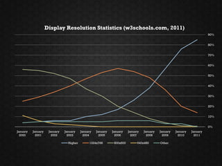
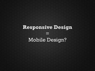
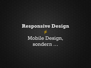
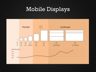
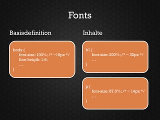
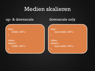
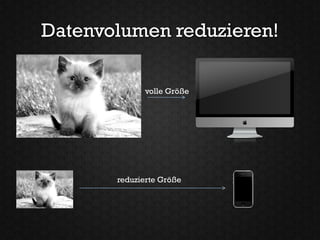
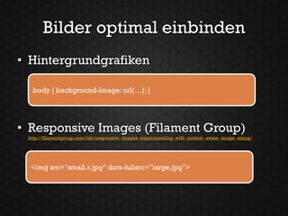
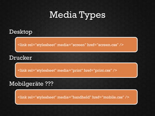
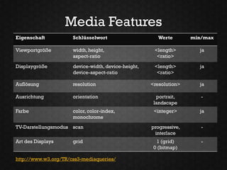
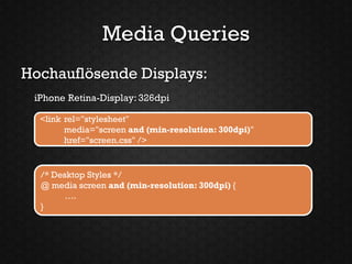
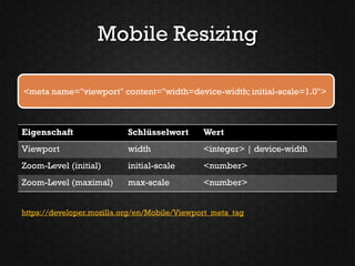
„UNWISSENHEIT IST EIN
            SEGEN!“

                   Responsive Webdesign


Dirk Jesse | Highresolution.info     Webinale 2011, Berlin
Die Welt ist im
!   Wandel!
Display Resolution Statistics (w3schools.com, 2011)
                                                                                                                           90%


                                                                                                                           80%


                                                                                                                           70%


                                                                                                                           60%


                                                                                                                           50%


                                                                                                                           40%


                                                                                                                           30%


                                                                                                                           20%


                                                                                                                           10%


                                                                                                                           0%
January   January    January   January    January   January   January    January   January   January   January   January
  2000      2001       2002      2003       2004      2005      2006       2007      2008      2009      2010      2011

                                 Higher        1024x768        800x600         640x480       Other
Quelle: http://stevenduque.com/2010/05/the-mobile-internet-era-is-upon-us/
„Es ist nicht gesagt, dass es
besser wird, wenn es anders
wird. Wenn es aber besser
werden soll, muss es anders
werden.“
Georg Christoph Lichtenberg (1742-99)
dt. Aphoristiker u. Physiker
Responsive Design
        =
  Mobile Design?
Responsive Design
        ≠
  Mobile Design,
    sondern …
… es ist Design für alle Geräte.
Responsive Design ist
flexibles, geräteunabhängiges
      Design für das Web.
http://www.alistapart.com/articles/responsive-web-design/
http://www.alistapart.com/d/responsive-web-design/ex/ex-site-FINAL.html
Rocket Science
?   oder Alter Hut
http://www.alistapart.com/articles/switchymclayout/
http://www.themaninblue.com/writing/perspective/2004/09/21/
1   Flexibles Layout
    Make %, not px!
Letztes Jahr …

                       >1024px
            ~ 768px


~ 480px
Nächstes Jahr …

                    >> 1024px
           ? px


? px
           ?
 ?
http://www.alistapart.com/articles/fluidgrids/
http://www.designinfluences.com/fluid960gs/
http://cssgrid.net/
http://www.yaml.de
2   Flexible Schriften
Mobile Displays
Fonts
Basisdefinition                    Inhalte

 body {                            h1 {
    font-size: 100%; /* ~16px */       font-size: 200%; /* ~ 32px */
    line-heigth: 1.6;                  …
    …                              }
 }


                                   p{
                                        font-size: 87,5%; /* ~ 14px */
                                        …
                                   }
3   Flexible Medien
Medien skalieren
up- & downscale       downscale only

 img {                 img {
    width: 100%;          max-width: 100%;
 }                     }

 video,                video,
 object {              object {
    width: 100%;          max-width: 100%;
 }                     }
Legacy Support
• min-width Support für IE6

  img { width: 100%; }


• Windows Image Resizing
 http://unstoppablerobotninja.com/entry/fluid-images

 JS aktiviert AlphaImageLoader (Proprietärer IE-Filter), oder …


  img { -ms-interpolation-mode: bicubic; }
Bandbreite beachten!
Datenvolumen reduzieren!

             volle Größe


       reduzierte Größe
Bilder optimal einbinden
• Hintergrundgrafiken

  body { background-image: url(…); }


• Responsive Images (Filament Group)
 http://filamentgroup.com/lab/responsive_images_experimenting_with_context_aware_image_sizing/


  <img src="small.r.jpg" data-fullsrc="large.jpg">
4   Media Queries
Media Types
Desktop

  <link rel="stylesheet" media="screen" href="screen.css" />


Drucker
  <link rel="stylesheet" media="print" href="print.css" />


Mobilgeräte ???

  <link rel="stylesheet" media="handheld" href="mobile.css" />
Media Features
Eigenschaft           Schlüsselwort                     Werte       min/max

Viewportgröße         width, height,                  <length>        ja
                      aspect-ratio                     <ratio>

Displaygröße          device-width, device-height,    <length>        ja
                      device-aspect-ratio              <ratio>

Auflösung             resolution                     <resolution>     ja

Ausrichtung           orientation                      portrait,       -
                                                      landscape
Farbe                 color, color-index,             <integer>       ja
                      monochrome
TV-Darstellungsmodus scan                            progressive,      -
                                                      interlace
Art des Displays      grid                             1 (grid)        -
                                                      0 (bitmap)

http://www.w3.org/TR/css3-mediaqueries/
Media Queries
Desktopbrowser allgemein:
 Viewport Mindestbreite: 768 Pixel

  <link rel="stylesheet"
        media="screen and (min-width: 768px)"
        href="screen.css" />


  /* Desktop Styles */
  @ media screen and (min-width: 768px) {
        ….
  }
Media Queries
Mobilgeräte allgemein:
 Viewport Maximalbreite: 480 Pixel

  <link rel="stylesheet"
        media="screen and (max-width: 480px)"
        href="screen.css" />


  /* Mobile Styles */
  @media screen and (max-width: 480px) {
       ….
  }
Media Queries
Desktop:
 Viewport Mindestbreite: 768 Pixel

  <link rel="stylesheet"
        media="screen and (min-width: 768px)"
        href="screen.css" />


  /* Desktop Styles */
  @ media screen and (min-width: 768px) {
        ….
  }
Media Queries
Hochauflösende Displays:
 iPhone Retina-Display: 326dpi

  <link rel="stylesheet"
        media="screen and (min-resolution: 300dpi)"
        href="screen.css" />


  /* Desktop Styles */
  @ media screen and (min-resolution: 300dpi) {
        ….
  }
Mobile Resizing

<meta name="viewport" content="width=device-width; initial-scale=1.0">


Eigenschaft                Schlüsselwort      Wert
Viewport                   width              <integer> | device-width
Zoom-Level (initial)       initial-scale      <number>
Zoom-Level (maximal)       max-scale          <number>


https://developer.mozilla.org/en/Mobile/Viewport_meta_tag
http://www.highresolution.info/webdesign/responsive-design/index.html
http://www.laufbild-werkstatt.de/
http://stephencaver.com/
Browser-
5   Nachhilfe
Browser-Kompatibilität
• Media Queries für FF 2, IE 6-8, Safari 2
  – jQuery-Plugin für Media Queries von 2008
    http://plugins.jquery.com/project/MediaQueries

  – JS-Library: css-mediaqueries.js
    http://code.google.com/p/css3-mediaqueries-js/
http://mediaqueri.es
„UNWISSENHEIT IST EIN
      SEGEN!“


Responsive Webdesign ist ein
Weg zum bestmöglichen Design
       für jedes Gerät.
Danke
office@highresolution.info
                 @djesse
Vortrag inspiriert durch:
                  Mike Bollinger
     http://www.slideshare.net/livefront/responsive-design-7877412


   YAML Demo „Responsive Design“
http://www.highresolution.info/webdesign/responsive-design/index.html

Unwissenheit ist ein Segen - Responsive webdesign