Tadanori Yokoo: Clash of Reality & Ideals
•
1 gefällt mir•3,865 views

1) Tadanori Yokoo was born in 1936 in Japan and grew up during a period of significant cultural transformation as the country shifted away from traditional ways following World War II. 2) He showed an early interest and talent in art and began his career designing posters and illustrations. One of his earliest major works was a 1965 self-titled poster that shocked viewers with its themes of death and confronted Yokoo with his own fears. 3) Yokoo was heavily influenced by travels to the West in the 1960s, where he experienced cultures in America and Europe firsthand. This led him to question his Japanese identity and to develop a style that blended Western and traditional Japanese influences.

Empfohlen
Weitere ähnliche Inhalte
Was ist angesagt?
Was ist angesagt? (20)
Ähnlich wie Tadanori Yokoo: Clash of Reality & Ideals
Ähnlich wie Tadanori Yokoo: Clash of Reality & Ideals (14)
Mehr von Nina Chan
Kürzlich hochgeladen
Kürzlich hochgeladen (20)
Tadanori Yokoo: Clash of Reality & Ideals
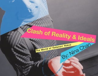
- 1. The World of Tadanori Yokoo By: Nina Chan Clash of Reality & Ideals
- 3. Clash of Reality & Ideals
- 5. Clash of Reality & Ideals Nina Chan N&C Publishing, Inc. The World of Tadanori Yokoo
- 6. Copyright © 2010 by N & C Publishing, Inc. 123 Main Street San Francisco, California Printed in the United States of America All rights reserved. Library of Congress Cataloging-in-Publication Data Chan, Nina Clash of Ideals & Reality: The World of Tadanori Yokoo/Nina Chan. The text of this book is composed in: Body Copy: Baskerville Regular (10/14) Title Page: Helvetica Neue Bold Italic (48 pt) Cover Photo: Tadanori Yokoo Book Design by Nina Chan ISBN 0-8109-3527-9
- 7. To my Mom & Dad
- 9. Introduction Page 1 Page 3 Chapter One WHO IS TADANORI YOKOO? GRAPHIC DESIGN IN POST-WWII JAPAN Page 9 Chapter Two AT THE BEGINNING Page 21 Chapter Three INTERNATIONAL AND BEYOND
- 10. tadanoriyokoo
- 11. Tadanori Yokoo is a successful graphic designer, illustrator, printmaker, and painter. Filled with creative energy and often referred to as the “Japanese” Andy Warhol, Tadanori Yokoo has left an indelible mark in the graphic design world. Yokoo’s work is highly autobiographical and largely inspired by the Psy- chedelic movement going on during the 1960s in the United States. Genres that reoccur in his art are: death, lust, surreal- ism, politics, and psychedelia. His work does not circulate only within the parameters of Japan, but has gained world wide recognition and created an international impact. Introduction
- 14. 4 Graphic Design Post-WWII Japan W orldWarIIwillalwaysbeetchedinthemindsof thecountries that partook or were affected in this gruesome war. Though Japan was not the only country devastated by the high mortality rate and bombings, the aftermath did leave twenty-three thousand homes in Tokyo, their major economic capital, destroyed, which left the country in a very unfortunate situation. However, this was a chance for Japan to reinvent themselves and thrive through adversity. This shift has marked a turn in Japan’s cultural history, a turn toward modernism, advanced technology, lifestyle and attitude change, and a new spin on art. According to Maggie Kinser Saiki, author of 12 Japanese Masters, “Japan took fewer than 15 years to move from a feudal backwater to Asia’s first modern consumer nation. Japan was reinventing itself, rising from the phoenix ashes of World War II” (Saiki 9). With the influence of the western lifestyle encroaching into the Japanese culture, people were changing the way they dressed, act, ate, to their ideals, and even the way they spend money. Saiki points out the catalyst that stemmed this new behavior was the “new architecture, new art, new technology, the rejects of things “Japanese,” rising urban landscapes, new roadways and railways, new social mores, the untenability of a nation on its knees, the insatiable desire to succeed by imitation and education” (9). The emergence of industrialism in Japan allowed graphic design to become a major profession. DESIGN AND JAPAN 4 Clash of Reality & Ideals: The World Tadanori Yokoo
- 15. Graphic Design Post-WWII Japan 5 Figure 1: a la maison de m.civecawa, 1965 Movement and Changes The 1960s was a time of activism, especially with the 1968 student strikes and anti-war protests occurring in the United States. During this time of change and liberal leanings, underground art, theatre and dance groups in Japan also participated in their own type of movement, exploring various themes, taboo and controversial, in their pieces. They chose themes revolving around sexuality, traditional and pop cultures, and the grotesque. While doing so, they integrated social and political satire and commentary. They were not afraid to speak their minds and liberate themselves as artists to express how they feel and think. Figure 1 features a poster Yokoo created for the Butoh Dance Group performance, Rose Colored Dance. It shows a mixture of traditional woodcut block prints with symbolic iconographies of Japanese underground art and pop culture. “ ” They were not afraid to speak their minds and liberate themselves as artists to express how they feel and think. MOVEMENTS AND CHANGES Chapter 1: Graphic Design Post-WWII Japan 5
- 16. Designers, who were born within the time period between 1929 and 1944, grew up exposed to the transformation Japan was going through. These designers include: Yusaku Kamekura, Kazumasa Nagai, Kiyoshi Awazu, Ikko Tanaka, Mitsuo Katsui, Issey Miyake, and of course, Tadanori Yokoo. A generation gap between these men and their predecessors has been distinguished. There is on one side of the spectrum ideals left by the “Old Japan” andontheotherside freshandinnovative “New Japan” highly influenced by the west. Postwar design in Japan essentially narrates the relationship between East and West. For Japan, the western ideals played a huge influence in their life. A lot of how the Japanese perceive design is based on what the Americans brought EAST AND WEST over. Japanese Postwar design was ultimately a way for Japan to show off to the West, by applying western style while keeping the traditional Japanese art theory, in hopes of becoming better than the West. Constructivism was a huge influence for the Japanese design movement. Phillip B. Meggs, author of A History of Graphic Design, explained that though the constructivist style was employed in Japanese design, “the systematic organization and strong theoretical foundation of constructivism is temperedbyatraditionalJapaneseinclination toward intuitive problem solving activity and a heritage of simplified emblematic form” (417). Japanese designers are drawn to central placement of images and words and having everything else organized around the middle. 6 Clash of Reality & Ideals: The World Tadanori Yokoo
- 17. So, how did Post-World War II affect Japan in terms of design and how designers felt about themselves? They were torn between the idea of what it means for them to be “Japanese.” Are they “Japanese” enough, and how is that idea defined? The 1960s in Japan was about searching and questioning. After World War II, Japan’s image became more nationalistic and symbolic. The designers growing up during this period were able to experiment with their design, not limited to any particular style. Highly influenced by the west, they mixed modern and traditional Japanese elements in their work. Japanese graphic designers attempted to maintain national traditions while incorporating international influences. The relevance between the history and events going on at the time of Post- WWII and the way the artists created their work is extremely high. The pop art, avant-garde, and psychedelic movements going on in the 1960s influenced Tadanori Yokoo. He was inspired and emulated much of that style into his work. His art is thought-provoking, complex, unique, and daring, which easily makes him one of the most compelling artists in Post-War Japan. Yokoo collaborated with important names in the high arts, dance, literature and film during the 20th century. He broke boundaries and created a world that was his. NEW JAPAN Chapter 1: Graphic Design Post-WWII Japan 7 Figure 2: “Koshimaki-Osen”, 1966
- 18. “ Because I sense the imbalance in the world around me, I unconsciously tend towards balance and symmetry.
- 20. I n 1936, Tadanori Yokoo was born into a world where culture, lifestyle, and politics were shifting. He grew up around post-war design ranging from packaging, labeling, signage, to other daily items. He lived with his parents in Nishiwaki, located in Hyogo Prefecture, which was considered a major textile area. Most of the textiles were labeled in western lettering. His parents were merchants and had a very limited education. However, they made sure to teach Yokoo a great deal about life, respect, and how to live successfully. A major thing his parents taught him was the practice of animism, which is the belief that spirits not only exist in humans but in animals and inanimate objects as well. Yokoo was quoted saying, “My parents taught me early on that I wasn’t going to accomplish much through egoism alone. They borrowed strength from the gods they sensed around them, and taught me to do this too.” GROWING UP At a young age, Yokoo’s interest in the arts was clearly evident. He was always eager to learn, grow, and discover. Yokoo did not seek any high profile careers for he just wanted to paint. He got into this profession by replicating existing paintings, designing wrapping paper for stores, ENTERING THE PROFESSION
- 21. Chapter 2: At The Beginning 11 and drawing posters for the Chamber of Commerce. In high school, he submitted his very first piece, an Art Deco-inspired poster, to an annual festival in 1954. Two years later, he was a Kobe Shimbun newspaper contributor, and by 1960, he already won multiple awards and started off his career as a stage designer for an avant-garde theatre in Tokyo. In that very year, he was also granted the invitation to join the Nippon Design Center, a group Tadanori Yokoo had wished to be a part of. Within a year, he became well-known for his design style and illustrations. “ ” My parents taught me early on that I wasn’t going to accomplish much through egoism alone. They borrowed strength from the gods they sensed around them, and taught me to do this too.
- 22. Tadanori Yokoo’s first piece that garnered high recognition was a self-titled post- er he submitted to the Persona group’s 1965 exhibition. This poster received much attention because it differed from the graphic styles of his contemporaries. He became obsessed with death after he left the Nippon Design Center and started freelancing. The poster has his name “Tadanori Yokoo” visibly shown on the top with a man right below, adorned in western clothing and holding a rose, hanging by his neck against a blue sky with a burst of red rays. The bottom corners have childhood pictures of himself and top corners contain an image of Mount Fiji erupting and a bullet train. The main statement reads, “having reached a climax at the age of 29, I was dead.” Red rays emulate a rising sun, which was considered an old-fashioned Japanese motif at the time. This rising sun motif reoccurs in most of Yokoo’s work, eventually becoming his signature style and an international symbol of Japanese pop art. This poster shocked most of his friends and confronted him with his own worst fear. While in school, he learned about western rationality. As he started to travel around the world, he became more familiar with this concept and experienced this movement first-hand. He went to the United States and Europe and was introduced to the Dada movement, the psychedelic hippie culture, and various social trends happening in the West. Yokoo had experienced culture shock, having realized the amount of “Japanese-ness” inside of him, the kind that existed prior to the war. He still held a traditional way of thinking, but after being saturated by what he saw in the West, he started to change. Figure 3 (right): “Tadanori Yokoo”, silkscreen, 1965 12 Clash of Reality & Ideals: The World Tadanori Yokoo
- 24. Yokoo reflected on himself and eventually found his goal: “to express, rather than escape, the passion and the earthy, animistic culture of his native Japan.” Yokoo’s art often depicts balance even though it may appear to be chaotic and all over the place. There is always a central focus point that draws our eyes toward the middle. He explained, “Because I sense the imbalance in the world around me, I unconsciously tend towards balance and symmetry, two methods of expressing the ideal world. Sometimes I go too far, and wish later that I’d left some images jutting out over the borders” (166). This idea of “balance” is reflected throughout his book Yokoo’s Collage Design, where he plays with the positioning of images on a gridded layout. Tadanori Yokoo also fell in love with the face of a child — the purity, innocence, and curiosity captivated him. Yokoo explains that the face is “the ideal form of a human being because one must have those elements, of innocence and purity and reverence. Of course, only young children have that face, because every time ideals collide with reality, they crumble a little. Still, as a symbol, it’s perfect.” He believed that we should see the world and objects around us through eyes of a child before the adult world corrupts and taints the youthful vision. His goal: To express, rather than escape, the passon and the earthy, animistic culture of his native Japan. “ ”14 Clash of Reality & Ideals: The World Tadanori Yokoo
- 25. Throughout Tadanori Yokoo’s career, influences and inspiration from culture, social movements, and various people are reflected in his art. Some of Yokoo’s role models include: Yukio Mishima, The Beatles, Ken Takakura, Andy Warhol, Peter Max, Tomi Ungerer, and Milton Glaser. Out of all the people on this list, Mishima has influenced Yokoo the most. Mishima’s 1963 novel, The Temple of the Golden Pavilon, captivated the young Tadanori Yokoo and inspired him to write his own autobiography. After reading Mishima’s book, he felt an instant spiritual connection with the author. They both held the same type of mindset and thinking. Mishima and Yokoo often pondered about what would happen when ideals and reality clash. They also were concerned with the link between art and life. An exhibition catalogue featured an interview with Mishima discussed the effect of Yokoo’s inner world clashing with outer reality. Mishima responds: Yokoo’s work has all the unbearability of the Japanese. His work angers people, and scares them, with its vulgar colors. It’s scary how much his common billboard colors resemble the Coca Cola ones. Yet while average people don’t want to look at them, it makes them look. What makes Yokoo’s work not just the art of a madman is his interest in the world around him. For example, the parody he achieves through the brutal treatment of the common. In his ruinous working of his inner world, the vulgar is scorned. It is not just the inner world, however. In exploding outward, it becomes a parody that makes us laugh. It is this that makes it healthy. Even do, even if he becomes international, I hope he doesn’t let go of the strange map of our Japan. INFLUENCES YUKIO MISHIMA
- 26. After Yukio Mishima passed away, Yokoo retreated to a very emotional territory. He produced many posters of the late novelist. One in particular is featured in Figure 4 to the right. The poster showed Mishima beneath a hand with the finger cut off. This is in reference to the finger cutting ceremony by some Japanese cults. The hand is surrounded by splattered red blood. Mishima was a part of a samurai cult and participated in a suicide ritual of plunging a sword into his stomach. Mishima’s death caused a great deal of pain for Yokoo, so at one point he decided to completely stop work to reflect on life. He was afraid of death, and through his travels in India, he reached a fascination for their culture, Buddhism, UFOs, and extraterrestrial civilizations.Hestarteddesigninghiswork around these themes, creating collages and posters of the universe and different religious symbols. Figure 4 (above): “A Ballad Dedicated to the Pinky-Cutting Ceremony”, silkscreen, 1966 Figure 5 (right): “The Aesthetic of the End”, silkscreen, 1966 16 Clash of Reality & Ideals: The World Tadanori Yokoo
- 27. Chapter 2: At The Beginning 17 During the 1960s, most Japanese illustrators were obsessed with the style of Saul Bass and Ben Shahn. However, Yokoo took another route and found inspiration through the Push Pin Studio, a New York based design company, Milton Glaser, Seymour Chwast and Peter Max. The eclecticism in their work is highly reflected in Yokoo’s earlier works. After studying their designs he believed that illustration can stand on its own and be as powerful as a painting. Yokoo’s style of drawing is similar to Chwast’s thin lines and flat colors. The 1960s San Francisco rock posters and multicolored prints Peter Max designed also influenced Yokoo. He implemented the style of clashing images and incorporating Dada photo collages into his own designs. Compared to Milton Glaser, Yokoo’s typography is eclectic and is splattered all over the place, whereas Glaser’s style is more controlled. Yokoo’s designs are excessive and include repetition of images and random fragments. Push Pin Studio Figure 6: “New York”, 1968 Figure 7: “The Wonders of Life on Earth”, 1965
- 28. The Psychedelic movement in the United States during the 1960s counterculture was the language of rock-and-roll. People were taking LSD, marijuana, and many other drugs to stimulate themselves. In turn, people used the experience they received from the drugs and transferred it to create visual art. Initially a scene appealing to American youth culture, it spread like wildfire into mainstream popular culture. According to Steven Heller, author of Anatomy of Design, “Psychedelic design was one of the first indigenous American graphic design mannerisms” (Heller 32). As a leading Japanese designer, Yokoo was infatuated with psychedelic design. The vibrant and contrasting colors, free forms, extreme stylization, repetition of symbols and motifs, and interesting use of typography drew Yokoo in. He took these traits and introduced Japan to his own kind of psychedelic style. Ironically, he ended up influencing postmodern America with his “blends of controlled anarchy, brilliant palette, neo-surrealist compositions, and graphic wit” (32). By the 1970s, the psychedelic style started to fade out of the scene, but Yokoo’s distinctive and unique personal style and traits continued to stay. PSYCHEDELIA “ ” The vibrant and contrasting colors, free forms, extreme stylization, repetition of symbols and motifs, and interesting use of typography drew Yokoo in. 18 Clash of Reality & Ideals: The World Tadanori Yokoo
- 29. Figure 8: “The Trip”, 1968 Figure 9 & 10 (Top left and bottom): “The Exhibition of Art by Henry Miller”, 1968 Figure 11 (Top Right): “The Dream Merchant Faeries”, 1968
- 32. I n 1968, Tadanori Yokoo submitted his art work, poster “Word and Image” for the first time internationally to the MOMA exhibition in New York. It was there where he succeeded over his three role models – Milton Glaser, Peter Max, and Tomi Ungerer. Yokoo won because he was able to explain rationally about his design. He believed that people should have an understanding of both the old Japanese way of thinking and the modern, rational way of thinking to be successful. Tadanori Yokoo enjoyed traveling because it enlightened him and drew much inspiration. As he traveled across the United States and Europe, he made encounters with musicians asking him to design their posters and album covers. Some notable bands include: The Beatles, Emerson, Lake and Palmer, Carlos Santana, Earth Wind andFire,andCatStevens.HewasclosefriendswithJohnLennon,aswellasYokoOno, and Carlos Santana. He created posters reflecting the time, culture, and their music. 22 Clash of Reality & Ideals: The World Tadanori Yokoo INTERNATIONAL RECOGNITION “ ” Yokoo won because he was able to explain rationally about his design.
- 33. Chapter 3: International and Beyond 23 Figure 12: “The Beatles”, 1972 Figure 13: “Emerson, Lake & Palmer”, 1972 Figure 14: “Earth, Wind & Fire”, 1976
- 34. Figure 15: “Santana Lotus”, 1974 Yokoo’s design cover, “Santana Lotus”, for Carlos Santana received multiple awards at the 6th Brno Biennal in 1974 Close-up images are examples of themes he was clearly mystified by: Buddhism, UFOs, science fiction, religion, etc. 24 Clash of Reality & Ideals: The World Tadanori Yokoo
- 35. By the 1980s, we see a strong transition in his art from hard, thick cartoon lines to a softer, more expressionist, type of design. He gained interest in the fine arts and began to paint. Yokoo believed he could discover new potential in painting. He stripped away the graphic design’s postmodern sense of abstraction and simplicity, and to focus in the details. His paintings are soft and warm, autobiographical, and mystical. They also incorporate influences from spiritualism, psychedelic posters, science fiction, Japanese aesthetics, and comic art. In the 1990s, Tadanori Yokoo, keeping up with technology, started using the computer to create and recreate his works. He redesigned some of his posters digitally and played with the arrangement of their parts. However, he believed that the use of the computer brings about more problems. He felt that creativity may be limited, due to the ease of automatically designing and deleting mistakes. It takes away the thrill and experience from actually creating art from hand. Tadanori Yokoo was nostalgic of his youthful past, which was very evident in his paintings. Yokoo “shows visible regret for lost innocence” and his work “perfectlymirrorshisgeneration–oneforwhomhistoryisclearlycutintwo:prewarand postwar” (Richie 108). However, Yokoo was so successful and renowned that government officials and academics admire him. Many of his art pieces adorn everyday objects in Japan such as cosmetics and food containers. Although he is retired now, his work still reigns and his ideals and philosophy remain strong. Tadanori Yokoo remains a young child at heart. AND BEYOND Chapter 3: International and Beyond 25
- 36. yok OO
- 37. y okOO
- 38. BIBLIOGRAPHY Arntson, Amy E. Graphic Design Basics. Australia: Thomson/Wadsworth, 2007. Print. Heller, Steven, and Mirko Ili. The Anatomy of Design: Uncovering the Influences and Inspirations in Modern Graphic Design. Gloucester, Mass.: Rockport, 2007. Print. Meggs, Philip B. A History of Graphic Design. New York: John Wiley & Sons, 1998. Print. Richie, Donald. Japanese Portraits: Pictures of Different People. North Clarendon, Ver- mont: Tuttle, 2006. Print. Saiki, Maggie Kinser. 12 Japanese Masters. New York: Graphis, 2002. Print. Yokoo, Tadanori. Tadanori Yokoo. Woodbury, N.Y.: Barron’s, 1977. Print. Special Thanks: SFPL Main Library Thanks for providing me with such useful and interesting information on Tadanori Yokoo. Professor Steve Jones Thanks for providing helpful feedback in the creation of this book. I learned a lot about layouting, the grid system, and had fun desiging. Tadanori Yokoo Thanks for your contribution to the graphic design world. Your work is incredibly inspiring and captiviating. Researching and absorbing your style and designs has enabled me to branch out of my personal design aesthetics and try something new. My style has always been simplistic and modest, while yours is eclectic, bold, and daring. I found it refreshing to see the world throughyour eyes and trying out new designs I would never have done before. Designing this book was an amazing experience and I learned a lot.