
Empfohlen
Weitere ähnliche Inhalte
Was ist angesagt?
Was ist angesagt? (20)
Ähnlich wie Id Guidelines
Ähnlich wie Id Guidelines (20)
Kürzlich hochgeladen
Kürzlich hochgeladen (20)
Id Guidelines
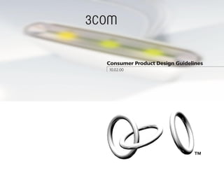
- 1. Consumer Product Design Guidelines 10.02.00
- 2. The technology backlash that many talked about for years hasn’t seemingly happened at all, at least not the way people imagined. We have not abandoned the computer and other hi-tech devices for pencil and paper and other fundamental approaches to life as some predicted. People still crave the latest and greatest. This backlash has instead materialized itself in people’s desire for more approachable and emotive design. In the past, design was driven by technological innovation. Moving forward, as technologies equalize and people’s lives become more and more inundated with technology, we need to address the increasingly complex relationship between consumers and technology. The market successes of tomorrow will be technology products and services that truly enhance experiences and add quality and richness to people’s lives. Consumerism is transitioning from product-centric to experience-centric. People are buying lifestyles and the stories, experiences and feelings that these product solutions offer. Products and services that have a cohesive quot;storyquot; and are quot;emotivequot; will thrive. You only need to look at the success and Introduction messaging of VW, Apple, and Target to see the genesis of this. 3Com’s “story” is “radical simplicity”, simplifing people’s lives through easy to use, easy to maintain, and easy to buy connectivity products. This should become the criteria for every product 3Com produces. The future of technology in the home Our environments will become simpler and less cluttered with disparate technological artifacts. There will be quot;ambientquot; technology all around us. We will begin to think less about the gadget and more about the content and benefit. Ultimately, technology and design will mimic nature in it’s incredibly complex and vast sophistication and at the same time in it’s simple and beautiful façade. Complexity on the inside = Simplicity on the outside. As technologies merge and information expands this becomes a more daunting challenge and demands collaboration across design disciplines and industries. It also requires a shift in manufacturers’ mindset from complexity and quantity to quality and simplicity. As for the physical embodiment of design, in mass, people gravitate towards products that they can relate to, that are approachable. People seem to respond most positively to familiar forms and visual metaphors…the extraction, abstraction, and application of appropriate visual elements and meanings from past objects, experiences and nature. This approach seems to create an endearing quality and mass appeal in products. Again, this is evidenced in the current successes of emotive and characterful design as well as the emerging popularity in high-tech minimalism. This formula can also add an enduring quality to the product, a sense of timelessness. The design of the 3Com HomeConnect product line is focused on simplicity and high-tech minimalism. Downplaying the complexity and simplifying it’s appearance. The end result is a suite of connectivity products that is more approachable and easier to understand.
- 3. page 5 The following sections describe the physical attributes that define the 3Com color, materials, finish HomeConnect Design Language. Following these guidelines in combination with user themes the 3Com Brand Identity and basic formula User Interaction Guidelines will build a strong and consistent brand image. pages 14-15 pages 22-23 Contents 1 2 3 4 5 6 small form factor medium form factor fundamental rules pages 16-21 large form factor camera/interactive device 123 form abc page 4 graphics, icons, labeling pages 6-13
- 4. Color, Material & Finish. Project Initiation. There is a initial product color, material, Once a new product initiative has been finish palette defined in the following Identified, the development team should guidelines. This palette serves as a tool include a product design representative. for consistency. As 3Com’s home This is the best way to insure adherence product offering matures this palette to the guidelines and will result, in the may expand appropriately. These future end, with a more refined and user- expansions and inclusions are subject centered solution. Great products require to approval by 3Com product design close collaboration from the beginning management. between all disciplines. Provide the designers and team Graphics and Product Markings. members with a PRD and design brief. Any graphics, icons, labels etc. should In order to iniate the design process it adhere to the 3Com Brand Identity is necessary to provide the design team Guidelines. There are many instances, with the appropriate information. A however, where the Brand Identity PRD and a design brief will inform the Fundamental Steps & Rules Guidelines do not apply or are not design team of all project goals and appropriate for physical product. In necessary constraints. these instances refer to the following This is a brief overview of the guidelines on Product Graphics. HomeConnect Product Remember that a “consistent” look and feel must still be maintained. Guidelines and product design process. The intention is to Use research whenever possible and appropriate. have a flexible and evolving In addition to standard market research, product design language. To consider using user/observational Graphics and Product Markings. maintain consistency, however, research. This is especially useful in Any graphics, icons, labels etc. should providing insights and a fresh perspective it is necessary to follow these adhere to the 3Com Brand Identity in regards to new product design and Guidelines. There are many instances, approved guidelines. If you architecture. It is a good way to discover however, where the Brand Identity and address unmet user needs. have questions consult the Guidelines do not apply or are not Innovation is often times inspired by this remainder of the document or appropriate for physical product. In type of research. these instances refer to the following email us at: guidelines on Product Graphics. Remember that a “consistent” look and feel must still be maintained. IDesign_Questions@3com.com. Form. 3Com’s approach to form in the design A Product Design representative of it’s physical product should echo the will respond within 24 hours. company’s overarching theme of “radical simplicity.” The ultra clean sophistication should not be subjected to superflous details and surface decoration. This high-tech minimalistic approach should help these products complement the home environment as well as better endure the “temporary” nature of high tech products. m
- 5. flared ends floating flange large, with full round generous, full radii high gloss finish tapered middle Basic Formula The most identifiable and distinct The flaring form in the main body The rounded bead edge that is Generous corner radii in one axis This page visual attribute of the design of these enclosures is another present at opposing ends is a of the product is the final core summarizes the most language is the high polish finish strong element. It is executed distinctive detail. It creates a element of the design language. pervasive visual of the plastic enclosures. In in a subtle and restrained manner visual feeling of a continuous Many times this is visualized as combination with the other core that does not feel forced or skin that wraps around the given a “lozenge”, “hot dog” or attributes of the elements it creates a highly contrived. It is seemingly more product... an elastic band. It is “racetrack” shape. This shape is product design differentiated and sophisticated natural and a result of slight essential that the execution aligned with current aesthetic in comparison to tension or stretching in the include a fully rounded edge as contemporary graphic, product language. These competitive products. This finish plastic. In combination with the illustrated above. This will avoid and furniture trends. It is also attributes may all be showcases the beautiful and high polish finish, the products any unfinished appearance. very familiar lending itself to mass present at one time subtle qualities of plastic. It is take on a more housewares-like appeal. Because of this familiarity plastic at its best. appearance. and simplicity it should retain its in a product or some relevance in design longer than appropriate subset of The use of plastic is not more complex and unrestrained guaranteed in all future designs. these. The decision products. If another dominant on inclusion or material is introduced an The key to these simple shapes exclusion of certain appropriate and complementary is in the execution of details, finish for that material will be finishes and materials. attributes should be defined. based on whether there is an obviuos and strong visual link to other HomeConnect porducts. m
- 6. The rounded bead edge that is present at opposing S M L i ends is a distinctive detail. Form The minimalistic extruded The goal of any design language is shapes shown here are a to establish a recognizable and good example of the essence distinct visual identity for a brand. of the design language. This is best executed through iconic and memorable forms in combination with quality of construction. The HomeConnect design language has established a simple, iconic form language derived from familiar geometric and graphic shapes. In combination with sophisticated Generous corner radii in one colors, textures and finishes this form axis of the product is another language takes on a feeling of high- core element of the design The slightly concave sides and language. tech minimalism. This minimalistic flaring ends give these simple approach should help HomeConnect shapes more distinction products complement their environment and be less susceptible to rapidly changing design trends. m
- 7. A L [usb network adaptor] Alternative design for translating adaptor [ Silver - PMS 877c ] [ LS029 - whiteblue ] Small Form Factor USB/Ethernet Network Adaptor The design language applied to a small form factor case. In most cases, this form factor will be used for adaptors, in-line dongles and low visibility products. The goal here is to be as understated and restrained as possible while executing the details at the same high level as more visible products in the line. m
- 8. [ Silver - PMS 877c ] [dsl modem ] [ printed label ] [ LS029 - whiteblue ] [ Silver - PMS 877c ] 4.98 3.95 2.85 1.80 0.90 0.00 .097 Medium Form Factor [ ver01 - part finish to plated silveblue satin chrome with PMS 645c graphics ] [ ver02 - part finish to be matte BS429, matte with Silver PMS 877c grtaphics ] This size is representative of a medium size, cost-effective case which would be used for products such as modems and hubs. The metalized faceplate allows for segmentation between high-end and low-end. A lower-end unit would have a non-metalized faceplate. DSL modem case m
- 9. DSL modem case with cable management stand m
- 10. Large Form Factor Flagship products and units requiring more internal real estate would occupy larger cases. Since no larger cases have been developed at this point these should be considered placeholders. As these initial larger cases and gateways Preliminary cooling tower concept become available this section will be revised. Higher-end finishes and added- value features will be more evident in these products. Vertical Gateway concept with cable management skirt m
- 11. Example of how the design language may be evolved into varying form factors Vertical Gateway concept with cable management base skirt m
- 12. More interactive products may be offered in range of colors, materials or finishes Camera Case The majority of HomeConnect products are essentially infrastructure products with little to no interface with the user after initial setup. There are a few products now and more in the future which will have higher consumer visibility and interaction. These cameras are representative of interactive products within the design language. There is also an obvious visual tie to USB Video Camera Audrey, 3Com’s first internet appliance device. As more interactive products are defined and sub-brands are created it is still critical that the consumer can identify a strong and consistent visual language with 3Com products. m
- 13. Interconnectivity between all 3Com products is a must for users. Defining added-value features that are created when 3Com products are used together is a strategic advantage as well as a compelling reason for consumers to purchase 3Com products. Audrey, a consumer focused internet appliance device. A close visual tie with the Consumer Product Design Language. m
- 14. The color palette in most cases will need to be applied in the following situations: • Plastic housings • Metal housings or exposed metal details • Graphics communications, icons and product markings Colors • Labels Materials The following page specifies what colors, materials and finishes should be Finishes used in most applications. The color palette for the 3Com HomeConnect product line consists of a primary palette and a secondary palette. Initially it is fairly limited for the purpose of reinforcing consistency and building brand recognition faster. The consistent use of color to represent the 3Com brand is a major factor in making the brand recognizable and memorable. Moreover, particular colors tend to evoke particular responses whicjh can helpsupport the values associated with the 3Com brand. m
- 15. plastics LS029 - Vapor LS190 - Grey Milky Lexan PMS 542 PMS 144 PMS 3975 A bright white with a A mid level grey. Slightly translucent Deep, rich blue Deep, rich rusty orange Deep, natural green bluish hue. Use: Alternate color on Use: Lens parts, covers Use: Accent color for Use: Accent color for Use: Accent color for Use: major body major body panels & stands that require minor plastic parts minor plastic parts minor plastic parts panels some visibility metals Palette Satin Chrome Plating Bright Chrome Plating LS190 - Rich, sophisticated Use: Accent parts and Vinyl/Powder Coat metalization for plastic structural parts such as Use: applications and metal parts. stands, brackets, etc. where metal parts Use: select high end need finishing and [see physical samples]* accent parts plating is not appropriate [see physical samples]* graphics, icons, markings PMS 877c - Silver PMS 542 - Blue PMS 442 - Steel Gray Use: Primary color for Use: Alternate color for Use: Alternate color for padprinting of 3Com icons, product icons, product logo and other product markings markings markings labels a select color palette for the communication of connectors for WAN, LAN, power, etc. PMS 542 - Blue PMS 130 - Orange PMS 382 - Green PMS 021- Red-Orange Use: Outside, WAN Use: DMZ Use: LAN, Home Use: Power Network m
- 16. graphics This section is broken down into 3 areas...graphics, icons and labels. To reinforce 3Com’s Radical Simplicity it is important to focus on the user interaction. Clear intuitive visuals are essential for commuication and easy setup. • The 3Com logo on products shall use the approved one-color artwork. Artwork in most case will be printed but may also be molded into plastics parts in some cases. [dsl modem ] • The proposed naming convention for products incorporates brackets around the product name. This implies added information as well as giving a slight techy feel to the simplified appearance of the case. Koshgarian Light is the font specified m
- 17. • 3Com logo graphics on products to be padprinted in PMS 877c. • The approved 1-color artwork should be used. • Graphics to be oriented lengthwise on product to accomodate both horizontal and vertical product orientations. On products that have only one orientation graphics should be placed right-reading. [dsl modem ] 0.375” Baseline of 3Com • Product name to appear in brackets logo to align with • Font: Koshgarian Light tangent point on • pt size: 10pt (larger product may require larger pt size) surface. [3C2257 usb adaptor] • with 3C model # naming convention m
- 18. 1 2 3 4 diagrams [home ethernet gateway] Given the confusing nature of home networking, any graphical representation of a network or instructional material should be executed in an approachable and simple style. If iconic graphics representative of the product design language can be defined this will further reinforce the consistency of the brand image. un-secure side secure side wireless pad pc1 cable/dsl modem web pda gateway DMZ pc2 external hard drive network device m
- 19. The icon examples below represent a look & feel for HomeConnect products. They are all based around a circular motif which aligns with the new 3Com “three rings” graphic identity and relates to the users mental model of a network and being connected. If possible icons should be designed in a non-directional fashion so that recognition from any angle or orientation is possible. Icons like this may be used on faceplates or connector plates of modems, gateways, hubs, etc. They will typicaly be printed or label based. Colors should follow the guidelines set forth icons in the colors section. Icons are one of the simplest and most intuitive ways to communicate meaning. Many icons are universally and cross-culturally recognized. A general guideline is to keep the icon as simple and bold as graphically possible. connector types user interface icons usb phonejack/RJ11 usb usb power alert HPNA network e ethernet web/connected ethernet LAN m to world/WAN alternate
- 20. Labels should attempt to clearly communicate the various connector types and functionality of the home network. They may help educate as well as enhance the setup experience. Given the engineering constraints of connector location in some instances, the graphic design of labels should be able to be adaptable to various spacial constraints as well as manufacturing and cost constraints. Consistency of look & feel can be maintained by using bold colors and icons with simple geometric shapes. Colors should be aligned where applicable with PC99 labels standards. Given that the home networking arena is still in its infancy and that it is still very confusing to the majority of consumers, it is critical that clear communication and positive mental models are established regarding setup and configuration. One way to help the consumer example of DSL back panel understand the installation of their home network is to establish an intuitive labeling system that clearly differentiates the various functions, connections, and realationships between devices. m
- 21. example of gateway panel serial Internet input In-home connections Secure area m
- 22. Setup Wiring • Interactive setup guides • Support products, like clever cable • Well designed setup charts organizers or cable ‘turtles’, that add • Color coded, clear cabling to customer delight • Preconfigured or modular base • Clear informatin on wiring rules sytems designed around most and ‘black magic’ common entry scenarios • Color coding has been a proven • Easy to understand network success diagnostic system • Color coded, icon based wiring • Smart system which communicates stickies that allow for identifying wire directly with 3Com regarding identity at far end from devices. problems with your desired • Possible “less wire” solutions like configuration integrating hubs and powerstrips or User more ‘lego’ like architectures Themes In an effort to make home networking more consumer- friendly the following features, areas, and themes have been identified as opportunities. Current products address few if any of these areas. Connections Interaction • Products should metaphorically • Most people don’t care about communicate what they are doing. interacting with the network, they Consider hubs that resemble just want it to work. If it doesn’t branches, or readouts that visually then they want to know where the communicate the ‘network’ better problem is occuring. • Clearly differentiate between • Falgship products, such as various ports... input, output, power, gateways, may have features such etc. as PCMCIA slots or USB peripheral • Color code cables to represent ports. These should be easily different functions accessed • An on-screen network monitor would greatly benefit diagnostics, and may appeal to people concerned with kids’ use of the internet, etc. m
- 23. Communication Icons Naming Environment • Subtle LEDS with intuitive icon • The average consumer will be • For techno-savvy people, the • HomeConnect products are for the markings are the most useful to the intimidated by a multitude of techy standard office naming of the home and thus need to reflect or average consumer especially at a acronyms. infrastructure devices may be fine fit their environment appropriately. quick glance or distance. • Icons are better than acronyms but for the average consumer they • Things ranging from a friendly • More detailed information could communicating content. are very confusing. Names such as electronic aesthetic to a more be displayed on a LCD or on the • Even with new and unfamiliar icons, “gateway” are not bad but others housewares-like look may be more computer screen. people learn to associate meanings make no sense. appealing to the consumer. • Decide on a distinct type of LED with pictures faster than letters. • Successful naming contributes to • People may want to either hide, blinking, pulsing or timing that • Icons should reflect the personality the user;s conceptual model of display, mount, etc these devices. A communicates quickly what is of the overall product line. They network functionality. flexible design should accomodate happening should be considered along with these varying needs. • Nicely designed audible tones are the aesthetic of the product to popular within reason provide a wholistic image. Upgradeability Modularity Always on Added Value Products • People tend to buy cheap with the • Case designs which accomodate • Similar to the added-value • By focusing on a handful of added- thought that something better is on a flexible and quickly changing future products, there is an opportunity to value products which truly utilize the the horizon. A “truly believable” for HomeConnect will allow 3Com offer content which utilizes the home network, 3Com could spark upgradeable solution/story may to respond faster to markert needs. always on connection and home interest in the market, helping them appeal to the consumer over Sharing cases, within reason (as long network that would compel to establish themselves as a presence competitive products and transition as it does not impact the user’s consumers to venture into in the Digital Home marketplace and them from the “cheap and needs and is appropriate), reduces HomeConnect earlier than later. compel people to get connected disposable” mindset. tooling budgets and further inforces earlier rather than later. consistency. The key is executing • For example... network smart alarm those few cases at a high level of clocks, open ports that allow quick quality and flexibility. web access, internet phones, Tivo type devices, network photo albums with thin clients, etc... m
- 24. project commissioning client dean c. brady - 3Com 3Com 3800 Golf Road Rolling Meadows, IL 60008 design direction scott wilson - IDEO chicago tel: [847] 262.5000 www.3com.com contributing designers IDEO chicago design studio scott wilson consultant marty thaler IDEO Chicago kuen chang 630 Davis Street jerry o’leary Evanston, IL 60201 kuoyong huang tel: [847] 425.6000 dickon isaacs www.ideo.com graphic design scott wilson 3D modeling jerry o’leary scott wilson m