
Empfohlen
Weitere ähnliche Inhalte
Was ist angesagt?
Was ist angesagt? (20)
Andere mochten auch
Andere mochten auch (20)
Ähnlich wie Line & Bar Graphs
Ähnlich wie Line & Bar Graphs (20)
Mehr von herbison
Mehr von herbison (20)
Kürzlich hochgeladen
Kürzlich hochgeladen (20)
Line & Bar Graphs
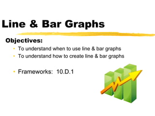
- 1. Line & Bar Graphs Objectives: • To understand when to use line & bar graphs • To understand how to create line & bar graphs • Frameworks: 10.D.1
- 2. Graphs A visual representation of a set of data Why do we put numbers in a graph? Which graph to choose?
- 3. Graph Choices Chart Type Description Column Compares values from different categories. Line Compares values from different categories. Often used to show trends and changes over time. Pie Compares relative values of different categories to the whole. Bar Compares values from different categories. Area Compares values from different categories. Similar to the line chart except that areas under the lines contain a fill color. XY (Scatter) Shows the patterns or relationship between 2 or more sets of values. Often used in scientific studies and statistical analyses.
- 4. Line Charts X axis is often date or time, while the y axis is the value being tracked. Some line charts compare 3 or 4 values being tracked.
- 5. Bar Graphs
- 7. Line Plots The count of x marks above each category tells you the number of items in that category.
- 8. Which line plot is correct?
- 9. Do Worksheets Homework: more worksheets