Pink floyd Digipack Anyalsis
•Als PPTX, PDF herunterladen•
1 gefällt mir•155 views

Digipack Anyalsis

Empfohlen
Weitere ähnliche Inhalte
Was ist angesagt?
Was ist angesagt? (20)
Andere mochten auch
Andere mochten auch (10)
Ähnlich wie Pink floyd Digipack Anyalsis
Ähnlich wie Pink floyd Digipack Anyalsis (20)
Mehr von George Lawley
Mehr von George Lawley (18)
Kürzlich hochgeladen
Kürzlich hochgeladen (20)
Pink floyd Digipack Anyalsis
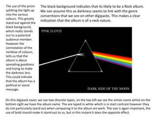
- 1. The use of the prism splitting the light up into the various colours. This greatly stand out against the black background, which really stands out to a potential audience member. However the connotation of the rainbow of colours, tells us that the album is about spreading goodness and trying to make the darkness less. This could indicate that the album has a political or social message. The black background indicates that its likely to be a Rock album. We can assume this as darkness seems to link with the genre conventions that we see on other digipacks. This makes a clear indication that the album is of a rock nature. On this digipack cover, we see two discrete types, on the top left we see the artists name whilst on the bottom right we have the album name. The are typed in white which is in start contrast however they do not particularly stand out when comparing it to the album art work. The size is again important, the use of bold should make it stand out to us, but in this instant it does the opposite effect.