How the i pad has changed us
•
87 gefällt mir•13,914 views

Presentation to the APA, London February 2011 on how iPad (and other tablets) have (will) change the way people use computers.

Empfohlen
Empfohlen
Weitere ähnliche Inhalte
Was ist angesagt?
Was ist angesagt? (20)
Andere mochten auch
Andere mochten auch (20)
Ähnlich wie How the i pad has changed us
Ähnlich wie How the i pad has changed us (20)
Mehr von cxpartners
Mehr von cxpartners (20)
Kürzlich hochgeladen
Kürzlich hochgeladen (20)
How the i pad has changed us
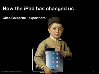
- 1. How the iPad has changed us Giles Colborne cxpartners Image: Mike Licht, NotionsCapital.com 1
- 2. Let’s begin by going back about 130 years: What on earth is this? Photo © Martin Howard, by kind permission. www.antiquetypewriters.com 2
- 3. if you said ‘it’s a typewriter’ then well done! Photo © Martin Howard, by kind permission. www.antiquetypewriters.com 3
- 4. Another early typewriter. There’s no keyboard. You select letters with a stylus. Photo © Martin Howard, by kind permission. www.antiquetypewriters.com 4
- 5. You could ‘type’ by pressing some buttons. why not arrange the buttons in a circle? Photo © Martin Howard, by kind permission. www.antiquetypewriters.com 5
- 6. At last! a recognisable typewriter. the keys are arranged in a convenient grid, the paper feeds through a roll. We’re still using this format. optimal designs aren’t always obvious. Photo © Martin Howard, by kind permission. www.antiquetypewriters.com 6
- 7. This is the xerox Alto - the first computer with windows, a keyboard and a mouse. this design is about 40 years old But it remains the template for computers today. That doesn’t mean it’s the ‘best’ design. as you saw with the typewriters, there’s no reason a computer has to look like what’s gone before. This interface may not even be particularly easy to use. 7
- 8. Cameron Moll’s video of his 4 year old son using an XO laptop (designed for children!) is painful. his son struggles to coordinate between trackpad and screen, to figure out what’s happening, or to know which button to press. After a minute’s use (guided frequently by cameron) he’s still not able to start the drawing software let alone draw a picture. keyboard+trackpad+Windows is not intuitive. (though it’s better than prior alternatives.) 8
- 9. when you watch small children with ipads, you’re struck by how quickly they take to using them. The abstract layer of the mouse (or trackpad) and keyboard has gone. Now you interact directly with the images you see on the screen. This makes a huge difference. as soon as you touch the screen, it’s clear whether something is ‘clickable’ and what it does. 9
- 10. #1 It’s changing how we interact with computers ...and that change is opening up computing to new audiences. 10
- 11. by taking design cues from the real world, you can give users strong clues about what they should do. what’s hidden in that stack of photos? maybe if i touch it... When i watch mainstream users using touchscreen tablets for the first time i’m struck by how willing they are to experiment, compared to their awkward, anxious prods at mouse or keyboard. 11
- 12. a new interface like this is exciting for designers who want to experiment. But a word of warning. when we watch mainstream users trying to use outlandish ‘minority report’ interfaces, they don’t rate them. They like the eye-candy. But they prefer to use interfaces that have simple interactions - like these photo stacks. 12
- 13. weird interfaces ≠ value add experiments belong in the lab. aficionados praise novel approaches, but be cautious about introducing new ideas to mainstream users. they are most comfortable with minimalist interfaces (Like a stack of photos to shuffle) or familiar interfaces (like a piano keyboard to play). to reach the mainstream: keep it simple or familiar. 13
- 14. design purists hate ‘crass’ interfaces like the yellow lined notepad. But mainstream users smile when they see this because they know what to do next. A strong cue that speaks clearly to users is a valuable ally (so long as your cue or metaphor doesn’t get in the way of the user’s task). 14
- 15. Tablets are also changing when we choose to interact with computers. these graphs are from readitlaterlist.com - software that lets you save web pages to look at later. This graph shows when people are saving... 15
- 16. This one shows when they are looking at saved pages on their computers... 16
- 17. and when they are reading on their iPhones... 17
- 18. ...and on their ipADs. Two Big spikes during breakfast and late evening ‘me’ time. almost the opposite of the computer. 18
- 19. #2 It’s changing where we interact with computers in other words: people use them on the sofa, in bed, and places where they wouldn’t normally use computers. You need to design for new contexts. 19
- 20. the best way to understand context is to take your designs into the real world. Omni designed omnigraffle (a drawing app) for ipad before the device was available. so they built some iPads - from they learned that wood and paper - and advanced editing on the carried them around move was a chore. So they the office to see how cut those features. it felt to use them. And they found that in meetings people wanted to share quick sketches. So they added new sketching features. all this from carrying blocks of wood. Context can tell you a lot 20
- 21. task context deborah hinman points out that context has social context several components. For instance, ipads spatial context have different social rules to PCs - they get handed around easily. temporal context it’s hard to design for all these contexts at once. instead, try to find the one that dominates, and design for that first. 21
- 22. a confession: i’m not an ipad user. i mean, i own one. but i know it’s not for me. it isn’t meant to be. 22
- 23. #3 It’s changing who uses computers it’s for mainstreamers - people who aren’t interested in computers. 23
- 24. you’re probably an expert... Experts Mainstreamers precise control easy control perfect results reliable results principles examples dismantle it avoid breaking it defer gratification instant gratification but mainstreamers have a different set of goals, attitudes and behaviours. never design by saying ‘well, i would use it to...’ 24
- 25. so, when you design for tablets like iPad: What you should do... Simplify, simplify, simplify Provide familiar, strong cues Design for interruption Prototype in the real world Build for the mainstream 25
- 26. Thanks! Giles Colborne giles.colborne@cxpartners.co.uk @gilescolborne More tips on keeping it simple (available at Amazon, B&N, etc.) 26