
Empfohlen
Weitere ähnliche Inhalte
Andere mochten auch
Andere mochten auch (20)
Ähnlich wie Altura Corporate Identity Presentation
Ähnlich wie Altura Corporate Identity Presentation (20)
Altura Corporate Identity Presentation
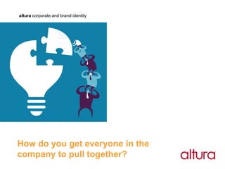
- 1. altura corporate and brand identity How do you get everyone in the company to pull together?
- 2. altura corporate and brand identity Take control of your corporate identity or brand identity
- 3. The goal is clear establish: • who you are, • where you are going, • what makes you different, then communicate and visually express with consistency
- 4. By taking control you will see • increased awareness and understanding by customers • internal alignment and buy-in from employees • people feeling and behaving in the same way
- 5. Corporate identity can • support a complete turnaround strategy • rejuvenate and increase cross selling opportunities • add value and up the share price • integrate acquired companies quickly & change culture • respond to competitive pressures & marketplace changes • prepare for social change in the future
- 6. Why companies use us because of change & because we deliver • acquisition, demerger, • re-organisation, culture, IPO, buy-out • new product/service development • repositioning & because we deliver
- 7. Who we work for • aerospace, industry, manufacturing, building supplies, engineering, finance, service sectors • young specialists like Umeco plc • global names like Sodexo & Saint-Gobain • mix of national, global & start ups
- 8. The difference we make • how you look, feel & behave to all stakeholders is made consistent • we look at every point of customer contact: • from stationery to signage, from print to digital channels • from packaging to livery • to help differentiate you from the competition
- 9. Our process • Phase 1: research, audit and architecture • Phase 2: design concepts • Phase 3: design development • Phase 4: master artwork • Phase 5: implementation • Phase 6: launch and ongoing communications • Phase 7: post launch evaluation
- 10. Our process Phase 1 Research, audit, brand foundations, architecture • research – internal and external • visual audit • Brand Foundations© Core values • what are the principles that guide • your attitudes and behaviour? Customer value proposition • customers? • their needs and problems? • what can you offer them? • costs and benefits? • is your offer different/unique?
- 11. Our process Substantiators • what do you need to support the value proposition? • structure, skills, technologies, assets, know how, geography Personality • what is your style, ethos, way of seeing and doing things? • what are the feelings people get from their relationship with you? Brand essence • what are the one or two words that capture the key benefit that the brand promises to deliver Brand architecture • design the brand architecture
- 12. Our process Phase 2 Design concepts • create a variety of visual concepts for the brand identity • Illustrate how the concepts would work with a division, subsidiary company, strapline/descriptor • Illustrate how these concepts work on a selected range of applications • test concepts if appropriate Phase 3 Design development • following selection of one concept we will fine tune the selected option • produce final detailed designs of the brand identity • illustrate how the final detailed design of the brand identity works on a selected range of applications Phase 4 Master artwork of the brand identity • convert the visuals to artwork and prepare master artwork • produce the relevant files
- 13. Our process Phase 5 Implementation • design all applications for the guidelines • printed or on-line guidelines or both • manage help desk if required Phase 6 Launch and communications • create all launch collateral • communications campaign Phase 7: Post launch evaluation • internal and external • undertake research to establish the impact of the new identity • evaluate the implementation of the new identity
- 14. Our experience Industry/Manufacturing Ashland Inc BPB plc including British Gypsum Faber Blinds Fenner plc Gypsum Recycling International Isowool Low & Bonar plc Lucy Lighting Matroc Saint-Gobain Staveley Industries plc Services Action Consulting Flour Power City Bakery Broughton Healthcare Business Co- Pilot Sodexo Tillery Valley iPP - In tegrated Pathology Partnerships Aerospace & Defence Apollo Aerospace Components BBA Telecommunications Aviation plc Ontario Airports Nortel BT plc Investments Pattonair Umeco plc Financial Eagle Star Gulf Bank Kuwait Hawksford International National Commercial Bank, Saudi Arabia Scottish Widows
- 15. Ontario Airports Investments • to create a new brand identity for the point of completion of the acquisition • to develop concepts and artwork for the new brand identity in 10 days • to produce business cards and letterhead for day 1 of business trading
- 16. • Terreal were bought by a Private equity company • New strategy for major growth • Existing identity lacked clarity in hardworking merchant environments
- 17. Umeco plc The old disparate brand identity: group divisions subsidiary companies services
- 18. Chief Executive, Clive Snowdon Umeco plc “the new corporate identity which we created is a really finely judged way of saying that what we do is about Innovation and stretching performance. But there’s a restraint in it too – nothing flamboyant. I believe it’s Superb. Unmistakable. World class”. Communicating strategy There is now a unifying theme for the group as a whole, focusing on Umeco and its 3 divisions, but allowing the flexibility to retain existing brand names. The divisions carry the divisional descriptor and the subsidiary companies carry the group and divisional descriptor - raising the profile of the group.
- 19. Umeco plc Communicating strategy The unified group corporate identity. Only one subsidiary, for commercial reasons, has retained their existing identity colours.
- 20. Umeco plc Communicating strategy The rollout of the identity was fast-track - we designed an online guidelines manual and downloads site for instant access to logotypes, artwork and templates. “These have proved to be enormously practical tools that have helped the companies make the transition with minimum pain”.
- 21. Umeco plc Communicating strategy In addition to the guidelines and downloads we also provided support in the form of a hotline for the initial implementation stage, as well as designing brochures, advertisements, website, presentations and other materials for the launch.
- 22. Umeco plc Components division Strategic repositioning of a division – Umeco components Soon after the introduction of the new group brand identity Umeco sold it’s Repair and Overhaul division to focus on supply-chain management and advanced composite materials. This led to a review of the components division which specialised in supply-chain management.
- 23. Umeco plc Components division Strategic repositioning of a division By creating many different options for service branding including the name of the division and the service brands we were able to contribute to the strategic thinking process. The result led to a restructuring of the companies in the Umeco Components division into one global brand, Pattonair, with three distinct service brands.
- 25. BPB plc Their corporate identity not keeping pace with the strategy. BPB has a portfolio full of disparate subsidiary company identitities. Global identity developed to reflect vision to become a global leader
- 26. BPB plc acquired by Saint-Gobain BPB plc were acquired in a hostile takeover by Saint-Gobain. Post acquisition a regional brand strategy was created with a vision to develop one global brand. Gyproc
- 27. Apollo Aerospace Components The old apollo visual identity Re-positioning to align to new vision and business strategy apollo was an established company in the aerospace and defence markets. New senior executive management undertook a major change programme with a focused vision and business strategy.
- 28. Apollo Aerospace Components Supporting international expansion The new positioning and corporate identity was highly successful in signaling major change at apollo. The next phase is expansion into Poland and India.
- 29. Tillery Valley Foods • a Sodexo company • brand repositioning • new name and brand identity
- 30. • a Sodexo/Labco joint venture company • brand positioning and customer value proposition • new name and brand identity
- 31. BBA Aviation plc • BBA Aviation plc • Demerger of non-core business • New name and brand identity
- 32. Scottish Widows In 1986, the world of financial services was changing and becoming more competitive. Our response was to review every aspect of our business, including how our company was promoted and our values maintained. This strategy was, at the time, probably the boldest marketing move the financial market had ever seen. The Scottish Widow was created as an icon that confronted all the negative values associated with the word ‘widow’ and presented the positive values – strength, reliability, integrity, innovation and heritage.
- 33. Chris Smosarski • An independent corporate and brand identity designer. • BA Hons in Communication design and a distinction in Advanced typography from the London College of Communication (Printing). • Chris studied the highly disciplined and structured Swiss School of typography under the guidance of Brian Grimley. • Most of the work undertaken by Chris is driven by change such as growth through acquisition, de-merger, repositioning, rationalisation, new culture, new products and services. Chris helps companies build their brands by developing brand design strategies. Clients are mainly b2b and operate in the aerospace, industrial, manufacturing, financial and service sectors. • A huge rugby fan who supports his beloved country Wales with a huge passion, runs, does Iyengar yoga and his favourate typographer was Jan Tschichold and painter is Bridget Riley.
- 34. Partners • Fios International change management & transformation specialists - Ireland, Spain, France, China, Canada, USA • Circle Research market research • Smith PR copywriting and all things PR • Lang Communications copywriting/tone-of-voice • Peter Parker website build
- 35. Fees and costs Strategy • £1,250 per day Design • £1,000 per day Bought-in costs • All bought-in costs subject to industry standard 17.5% handling charge