39. Sample Footer Text Here 12/21/2012 39
If you use
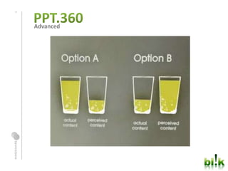
GROUPS SEEM LIKE
they can control your
2
POWER OF PROXIMITY
40. Sample Footer Text Here 12/21/2012 40
COMPUTERS
red
coke
Hot dogs
jumping
cookies
zucchini
ICE
Sea monkey
hip-hop
design TV
pink
yoga
films
laundry
41. 41
12/21/2012
Most emotional tool in your arsenal
Most underused
Sample Footer Text Here
Most inappropriately used
3
EVOKE EMOTION
42. Sample Footer Text Here 12/21/2012 42
angry
Evoke an emotional response…
65. Americans are worried now more
than ever concerning the current
economic turmoil. They are
spending less and saving more.
However, they are always looking to
enrich their lives with products that
deliver value, quality and service.
66. Save More. Waste Less: Overview
Series will come to life through
Print Media TV Video Series
66
73. Print Component
Gatefold unit will
drive to
armandhammer.com
A&H will have franchise opportunity around “10 More
Ways to Save,” focusing on saving-oriented edit Inside flap will build on content
specific to each story
73
81. Pose-Off
Experience Texting Slides
Interactive Polling
Digital Kiosk Seat
Host Content
Integration
Bonus: PSA
Concessions Beyond
Don't forget to
check out the live
Lobby Standees results at
www.E.com/pose
off to see the
winners brought
to you by Sprint
Street
Staff
Buttons
Box Office Handouts Bounce Back Text
81
82. Desk
Open Business Research
Source Planning +
Research Key
Satisfy their Segments
desire to pass
Women consider the time Segments are looking
casual game play to be entertained by
relaxing technology
• 64% of respondents cited game
Media Now • Amount spent in past 12 months
play as a way to unwind and relax, Research Community $401+ (Seg.6 161)**
while 53% play for stress relief.
• Used cell phone games in past 30
• Women account for 74% of paying days (Seg.6 228)**
casual game players.
• Women over age 40 who play • Computers can be a good source of
casual games: 67% play at least entertainment. (Seg.6 166)**
four times per week • Having fun - Having a good time
• Casual games are a $2.25 billion a
year industry. Social Gamers (Seg.6 136)**
• Internet Attitudes - A good escape
(Seg.6139)**
Now Ties Ideas Media
Current/Build: Online:
Mobile games Wild Tangent Miniclip.com,
New: Mobile: Bejeweled,
Create games NASCAR WII, Handheld Consoles: Sims,
82
83. Recall for the PSA is High
– 75% recalled the Sprint PSA
– Among those who recalled, 65% liked it very much/somewhat
– Among those who recalled is 72% had never seen it before
Likeability of PSA
(Recalled PSA; n= 218)
Recall of PSA
75% Liked it very
22%
much Likeability
65%
Liked it
44% 43%
somewhat
Aided
Neither liked nor
Unaided 34%
disliked it
31% Disliked it
1%
somewhat
PSA Disliked it very
1%
(n=291) much
erman Research Group & Screenvision
83
88. 88 Finally,
Thank you for coming.
WORKING TO GET YOU WHAT YOU WANT.
More to come…
Hinweis der Redaktion
So much out there, we are just giving you a tasteWe are always here for consultancy, as a resource to youMore training is on its way, we plan on doing a new topic once/qtr (repeats depending on demand)
New Horizons gave you the ‘How’, now we’ll give you the ‘Why’You now know how to use PPT, lets use it for our benefit nowEvery choice, whether it be size, shape, font, etc means somethingUse your gut, its better than you think We all have it, u don’t need to be an artist or anything to do so, born with it
So, basic question – what is design?How does design impact your powerpointWhy are design principles important in ppt Easier on the eyes – simpler to understand, easier to sell Imparts value More appealing Consideration - - value your audience
A way to organizing and communicating informationNOT, icing on the cake.You don’t just add the finishing touches at the endIts part of the process from the beginningA way for you to control the absorption of knowledgeThe in take of information is lead by the way you use design in your slidesIn design, there are many solutions. It’s always subjective to what you are trying to communicateEvery time u use the same slide, it maybe trying to communicate something different, so you should adjust when possible
Each has a 30 min demo followed by 15 mins to try and 15 mins to ask questionsAsk questions throughoutIf you get stuck with the how – ask NH repIf you get stuck with the why – ask bl!kWe are here for you, USE us!
Method of story telling3 things
Method of story telling
You should have your own version of 5 slides you will be creating
This may seem intimidating, but all it takes is some upfront thinking to get you here faster. Let’s dive into some techniques on how to go from the givens to the final communication
Its just the way you arrange the information on the slideInformation is everything from your text, to your images, charts…Whatever is going on the slide countsJust like anything else…you have to set it up before you play…
We are gonna go thru a few things in this sectionHow to draft basic layout – how do I place text, images or other elements on a slide the best wayWhat it means to build a true themeSetting up that layout within PPT
What do you want your audience to get in…3 seconds - If they just take a glance – or CEO level3 minutes - If they stop to read the impt parts – what do you want them to understand? – for your general client3 hours - If they need the details or come to revisit the information
FengShuiThe golden ratio or the rule of thirdsGoing beyond the traditional gridUsed in the movie, design, photography industryLeads to professional looking imagery
You have options to recompose a picture to favor the power pointsCreates energy, balance and more interest than centered imagesAlso allows space for key communication and augmenting text with image
BUILD YOUR OWN GRID
We don’t have a bell, we have images…
Make sure you ask questions, don’t be shyLike everything else in life…a little practice goes a long way. You need to do it a few times so your mind adjusts to seeing information in a new waySoon you’ll be able to do it quickly on the fly, spend the time now.
You have to pick and choose what will be at the forefront of your communication and use visual cues to help your audience get the point quickly
So what is in your design tool box?Size, color, shape, space, font, reflections, shadows, etcIts important that you know ‘why’ you are using it and what it meansThis is part of your communication strategy, don’t use what doesn’t fit
The rule of 3 applies here as well. Think about what will be communicated at each time frame
Why go to grey?If you start with neutrals it will help you identify what is truly necessary to communicateUsing neutrals will help you kill the bias around what looks pretty vs. what is necessaryI usually go to the slide master and grey everything out, so I can pick and choose
Why go to grey?If you start with neutrals it will help you identify what is truly necessary to communicateUsing neutrals will help you kill the bias around what looks pretty vs. what is necessaryI usually go to the slide master and grey everything out, so I can pick and choose
Why go to grey?If you start with neutrals it will help you identify what is truly necessary to communicateUsing neutrals will help you kill the bias around what looks pretty vs. what is necessaryI usually go to the slide master and grey everything out, so I can pick and choose
Why go to grey?If you start with neutrals it will help you identify what is truly necessary to communicateUsing neutrals will help you kill the bias around what looks pretty vs. what is necessaryI usually go to the slide master and grey everything out, so I can pick and choose
Why go to grey?If you start with neutrals it will help you identify what is truly necessary to communicateUsing neutrals will help you kill the bias around what looks pretty vs. what is necessaryI usually go to the slide master and grey everything out, so I can pick and choose
Why go to grey?If you start with neutrals it will help you identify what is truly necessary to communicateUsing neutrals will help you kill the bias around what looks pretty vs. what is necessaryI usually go to the slide master and grey everything out, so I can pick and choose
Why go to grey?If you start with neutrals it will help you identify what is truly necessary to communicateUsing neutrals will help you kill the bias around what looks pretty vs. what is necessaryI usually go to the slide master and grey everything out, so I can pick and choose
Aight, give it a shot and ask some questionsTry multiple versionExpand the possibilitiesThere are many right answersWhat works for your core communicationWhat works for your presentation style?Here are my examples
Special effects definitely garner buzz and excitement by the audience, but can also evoke a feeling of excess and gimmickIts important that you understand WHY you are using itAnd make sure it communicates something important
Demonstrate a feeling when using transitions3 types of basic transitions3 uses for animation when demoing process
Shows ease, blend, transition
Shows ease, blend, transition
Shows movement, traveling, panning, advancement
Shows movement, traveling, panning, advancement
Shows change, something new, morphing
Shows change, something new, morphing
3D, shadow, reflection, bevel, gradients, quick fxAgain use it to help draw the eye to it. Make sure it has a purpose.Helps to give a feeling of depth
When u have multiple levels, u can show depth and perspectiveShow priority/importance (reflection, shadowsCall attention (gradients, shadows)
This started on a napkin
Try out animation stylesYou don’t have to do them now in ppt, but think conceptuallyWhat COULD you do?Check your visual flow, step back and see if it really communicates what you wantHere are my examples
So we’ve gone over 3 fundamental areas in the Visual story that can immediately improve your PPT skillsBasic Layout – to help your audience follow you and find your key communication quicklyEmphasis – Techniques to call out your key communication pointsSpecial Effects – To help add some emotion and dynamic elements to help illustrate your key communication
30 mins to mess around with the three areas we discussed. Take the few slides that you have and build a deck with your own personal flair, making sure you stay true to your objectives and key communications. We are here to walk around and help you out if you have problems. If you can’t find a button – NHIf you can’t figure out design – bl!k
We ask that you take what you have and upload it to our Slideshare channel. www.slideshare.netUsername: blikPassword: mindshareblikWe are going to use this as a central place to share good ppts. This is our first step to take advantage of all the talent we have here.
Finally, we are working hard to get you guys what you want. We really believe in what we are doing and can only succeed with you help. So, thank you for coming, we hope it was helpful. Fill out the feedback forms, this class was born from reading those forms…And lastly…tell your friends, spread the word. Bl!k is da bomb!Thanks!!