Content Audit sample_Pizza Hut app
•
2 gefällt mir•5,697 views

Contents is something that could be digested by your target audiences. This sample shows you about some content mistakes contained in Pizza Hut app Hong Kong.

Empfohlen
Weitere ähnliche Inhalte
Andere mochten auch
Andere mochten auch (14)
Ähnlich wie Content Audit sample_Pizza Hut app
Ähnlich wie Content Audit sample_Pizza Hut app (20)
Mehr von Addithink
Kürzlich hochgeladen
Kürzlich hochgeladen (20)
Content Audit sample_Pizza Hut app
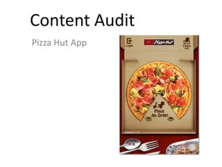
- 1. Content Audit Pizza Hut App
- 2. Usability catastrophe Imperative to fix this before product can be released Major usability problem Important to fix, so should be given high priority Minor usability problem Fixing this should be given low priority Cosmetic problem Need not be fixed unless extra time is available on project Severity Rating
- 3. Description: • Content area should provide sufficient information for users to understand either it is useful or helps them to achieve what they want. • There is “login” image at the top left of homepage. After clicking, it brings user to a login page. However, user doesn’t know the function/benefits of this “Login”. Do they need to login to complete the “Check out”? Will they get some special offers or discounts if they login? • This “Login” page can’t persuade user to register or login. Short-Term Recommendation: • Add bullet points to explain the benefits of being member and remind that check out is only completed with membership. Long-Term Recommendation: • Consider skip “Login” in check out process. Incompleteness
- 4. Description: • A site’s users should be able to easily understand the breadth of content they are looking at. • In “A-La-Carte”, there is 4 categories. Each category contains various choices. Nevertheless, user can’t figure out how many choices contained. They need to slip the page until visit the end. Short-Term Recommendation: • Since number of items would be changed frequently, display the number of page is more appropriate. For example, 1/6, 2/6. Long-Term Recommendation: • Consider using pull down menu with different categories for easier browsing. (Please check example 1) Unbounded information
- 5. Example 1 Cheese of the World (2) Supreme series (4) Seafood (2) Gourmet Pizza (3) Title bar indicates the type of pizza and how many items are available. When user click the title bar, it will expand and various pizza will be displayed. User can scroll down to check each of them.
- 6. Description: • Content should be presented intuitively that user can understand without thinking too much. • When choosing “Combo for 1”, the page shows just one item. In fact, user can combine different dishes and beverage. Click the down arrow, various choices are displayed. Some of them contain “+$x.0” that tell user they need to pay more for this dishes. Confusing presentation
- 7. Description: • Same situation is applied in choosing beverage. • However, after completion, the menu shows several number which causes confusion. The upper number is the price of this item. Below 2 numbers are unnecessary because user came across them in choosing process. It is inappropriate to repeat them in final stage. Short-Term Recommendation: • Delete the plus money besides dish and beverage. Long-Term Recommendation: • No need to use HK$42.0 as basis. It would be better allowing user to choose what they want before displaying the price. (Please check example 2)
- 8. Example 2 Choose a Main Dish Choose Beverage Use button image telling user to choose main dish and beverage.
- 9. Choose a Main Dish Choose Beverage Display various choices.
- 10. Seafood Rice Doria Tao Ti Green Tea (with Honey) - Can HK$55.0 Chose options are displayed with total price below.
- 11. Description: • There should be an indicator showing user what actions they have taken. For example, for online shopping website, after user put the item into shopping cart, the cart should display the number of items. • After choosing the item, user returns to the previous page and there is no message showed one item is added. Also, “Order List” indicates no number of items. Absent indicator
- 12. Description: • User can only check the items ordered by clicking “Order List”. • An indicator should be provided as confirming the items chose are stored in cart appropriated. Short-Term Recommendation: • Display the number or item in “Order List”. Long-Term Recommendation: • Give a popup message told user the item is stored in cart every time. Also, display the number or item in “Order List”. (Please check example 3)
- 13. Example 3 Combo for 1 HK$42 added (2) in Order List Check out A popup shows what is added, total item in cart and check out button. “Order List” should show the number of items ordered.