Eric Delmelle: Disease Mapping
•
2 gefällt mir•1,209 views

Eric Delmelles presentation for IMPRO project October 22nd 2018. www.stnimpro.fi

Empfohlen
Weitere ähnliche Inhalte
Was ist angesagt?
Was ist angesagt? (20)
Ähnlich wie Eric Delmelle: Disease Mapping
Ähnlich wie Eric Delmelle: Disease Mapping (20)
Mehr von THL
Mehr von THL (20)
Kürzlich hochgeladen
Kürzlich hochgeladen (20)
Eric Delmelle: Disease Mapping
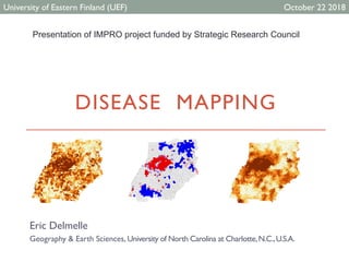
- 1. DISEASE MAPPING Eric Delmelle Geography & Earth Sciences, University of North Carolina at Charlotte,N.C.,U.S.A. University of Eastern Finland (UEF) October 22 2018 Presentation of IMPRO project funded by Strategic Research Council
- 2. Introduction • Different ways to map health related data • Scattermap • Areal data (choropleth mapping) • Cases aggregated to geographic units • Generally mapped as rates, using population at risk as a denominator • In the case of breast cancer deaths, count of cancer deaths divided by females (can be more restrictive for the age segment). Disease mapping Introduction
- 3. Rationale • GIScientists and epidemiologists are interested to map the variation of these rates across a specific region. Disease mapping • The map indicates that individuals dying from tracheal, bronchus and lung cancer are mostly concentrated in the Appalachian regions (very rural, with deprived access to care). • Very low rates Southern Idaho, and Utah, but also parts of Arizona, New Mexico and Colorado. Note that Southern Idaho and Utah are mostly Mormon, where smoking is certainly not encouraged. Introduction
- 4. Rationale Another example for the Eastern USA, just focusing on average annual rates for lung and tracheal cancer rates among males from 2011 to 2015, and using the 65+ male census population as the denominator Disease mapping Introduction
- 5. Rationale Disease mapping • Clearly we saw some patterns, very high in the Appalachian, but lower along the coast. • We also see thatVirginia has lower rates. • There could be some reasons for this, such as prevention measures that can vary by state. • Although smoking is the main factor contributing to lung cancer, living in a heavy coal-mining area such as Kentucky is found to be an additional risk factor as residents in these areas are exposed to pollution from mining activities. Introduction
- 6. Estimating spatial patterns/clusters Disease mapping • Evaluate whether regions of high rate have a tendency to cluster, using techniques such as Moran’s I. • Moran’s I will evaluate whether neighboring census units (in our case, counties) tend to exhibit similar (high, or low) values. • Adjacency matrix W; that is for each geographic unit, determine its neighbors, for instance through an adjacency matrix (0 or 1 – resulting in wij), or the number of closest neighbors (Rook versus Queen).This can easily be done within a commercial GIS or Geoda. Patterns and clustering
- 7. Estimating spatial patterns/clusters Disease mapping • Once this is complete, we can evaluate the Moran’s I. 𝐼 = 𝑁 𝑊 𝑤𝑖𝑗(𝑂𝑖 − 𝑂)(𝑂𝑗 − 𝑂𝑗𝑖 𝑂𝑗 − 𝑂 2 𝑖 With N the number of geographic units and O the rate.The term wij denotes the adjacency value between i and j and W the sum. Patterns and clustering
- 8. Estimating local spatial patterns/clusters Disease mapping • Unfortunately, the Moran’s I statistic does not tell us where clusters may be located. Anselin developed a local version of the test, taking on the same values. • The results can be particularly useful for health purposes. Patterns and clustering
- 9. Estimating local spatial patterns/clusters Disease mapping • The local Moran’s I also returns a map of its significance Patterns and clustering
- 10. Issues with rates Disease mapping • Oftentimes, assumption of normality. But not so evident when you use proportion or count. – rather use Poisson or binomial distribution…the variance may be related to the mean value. Rates Crude rate 𝑟𝑖 = 𝑂𝑖 𝑃𝑖 with 𝑂𝑖 observed count at i and 𝑃𝑖 the population at risk at i. The use of crude rates and ratios to estimate rare disease risks in small areas is often problematic since these measures are typically subject to large chance variation. Disease maps that are based directly on these crude estimates are difficult to interpret and often misleading unreliable rates that occur for sparsely populated areas and/or rare cancers
- 11. Issues with rates Disease mapping Rates Standard Mortality Rate (SMR) – also called excess or relative risk Then, the expected number of events in i 𝐸𝑖 (also noted 𝜇𝑖) is given as: Idea is to compare observed mortality rate to a national (or regional) standard. We will compare the number of events to the expected count of events. 𝜋 = 𝑂𝑖𝑖∈𝐼 𝑃𝑖𝑖∈𝐼 Reference rate 𝐸𝑖 = 𝜋 ∗ 𝑃𝑖 𝑆𝑀𝑅𝑖 = 𝑂𝑖 𝐸𝑖 SMR
- 12. Issues with rates Disease mapping Rates Population….
- 13. Issues with rates Disease mapping Rates • A very high relative risk (or SMR) could also happen if you have one case, and expect 0.1 (near 1,000). Interestingly enough, this would lead to the same SMR: (𝑂𝑖=100, 𝐸𝑖=50) and (𝑂𝑖=3, 𝐸𝑖=1.5) – same SMR. • But if I add just one case to the second scenario, I would end up with wild SMR. This suggests that the reliability of the estimates can vary widely and we need to take the reliability into account. • Probability mapping maps the probability of getting a count more ‘extreme’ than the one we actually observed – assumption is that the count in each area is Poisson distribution with mean value 𝜇𝑖
- 14. Issues with rates Disease mapping Rates • Extreme ratios associated with areas with the smallest populations. • Solutions. Disease mapping methods, usually using Bayesian inference, seek to borrow strength across areas to produce stable risk estimates. Essentially, we try to improve the reliability of observed rates by using (or “borrowing”) information from neighboring entities (Waller and Gotway 2004). • The model is fit using data, and estimates of relative risks based on posterior distributions for the random effects are derived. • The resulting estimates for disease risks in small areas are based on pooling information from related areas. • Maps based on these estimates are often more interpretable and informative (Lawson et al., 1999; Elliott et al., 2 000).
- 15. Empirical Bayesian Estimates Disease mapping EBS • Let’s suppose that we are trying to estimate the observed rate, say 𝜃𝑖 Then, we can re-write this as: • With 𝛾𝑖 and 𝜑𝑖 the mean and the variance of the prior probability distribution, respectively.The first part of Equation puts emphasis on the observed rate, while the second emphasizes prior belief. 𝜃𝑖 = 𝑤𝑖 ∗ 𝑟𝑖 + (1 − 𝑤𝑖) ∗ 𝛾𝑖
- 16. Empirical Bayesian Estimates Disease mapping EBS • The term 𝑤𝑖 is defined as follows: • So then how to get 𝛾𝑖 and 𝜑𝑖? A first estimate would be that 𝛾𝑖 = 𝛾 and 𝜑𝑖 = 𝜑 for all areas.This means that the prior is gamma distributed with two parameters 𝑣 (scale) and 𝛼 (shape).We can deduct that 𝛾 = 𝑣 𝛼 and 𝜑 = 𝑣 𝛼2. 𝑤𝑖 = 𝜑𝑖 𝜑𝑖 + 𝛾𝑖 𝑛𝑖
- 17. Empirical Bayesian Estimates Disease mapping EBS
- 18. Local Empirical Bayesian Estimates Disease mapping EBS Strength is borrowed from to correct for variance instability is localized as opposed to global (i.e., based on all observations)
- 19. Local Empirical Bayesian Estimates Disease mapping EBS Strength is borrowed from to correct for variance instability is localized as opposed to global (i.e., based on all observations)
- 20. Local Empirical Bayesian Estimates Disease mapping EBS Strength is borrowed from to correct for variance instability is localized as opposed to global (i.e., based on all observations)
- 21. Questions Department of Geography and Earth Sciences University of North Carolina at Charlotte Charlotte, NC 28223 Tel: (704) 687-5991 Email: Eric.Delmelle@uncc.edu Disease mapping