Global boostersselling
•
0 gefällt mir•391 views

This document provides an overview of visual communication and analytics. It discusses how people best remember and learn information through visual means like images and seeing things. The document outlines different techniques for visual storytelling with data like using color, proximity, and simplicity. It provides examples of how to effectively display data through charts, graphs, and simple text to clearly communicate insights and stories.

Empfohlen
Weitere ähnliche Inhalte
Was ist angesagt?
Was ist angesagt? (20)
Ähnlich wie Global boostersselling
Ähnlich wie Global boostersselling (20)
Mehr von Lee Schlenker
Mehr von Lee Schlenker (20)
Kürzlich hochgeladen
Kürzlich hochgeladen (20)
Global boostersselling
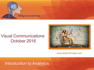
- 1. Introduction to Analytics Visual Communications October 2016 www.dsign4change.com
- 2. Introduction ©2016 L. SCHLENKER Agenda Introduction Administrative Details Business Basics The Challenges The Building Blocks
- 3. Introduction How do we remember anything?
- 4. Mind42.com ©2016 L. SCHLENKER Ideation • Begin with the theme • Write down the main concepts • Note what “proof” was offered • Define the terms • Explore the relationships between the concepts
- 5. ©2014 L. SCHLENKER H. DAMISCHH People remember 10% of what they hear, 20% of what they read, but 80% of what they see Learning The Noun Project 83% of human learning occurs visually
- 6. How effectively will you tell this story to customer ? • Disti Engagement • Disti PAM Engagement • SMB Engagement Challenges Skills Roadmap • A story begins with conflict •What business problems are we trying to solve •Transform a conflict into opportunity? • How does changing the roles move this story forward? •Is it a question of people, process or technology? •What is the next step? Introduction • Why does this situation exist? •What knowledge and skills are missing? • Who are the heros of this story?
- 7. Introduction Storytelling in business • The conflict • The context • The way forward • The happy end (a call to action)
- 8. • Disti Engagement • Disti PAM Engagement • SMB Engagement Sources ? Results ? Metrics ? Where does this story start? • Where does value come form? •Do your sponsors believe in people , process or technology? •This is your value lever • Where are they looking for proof of concept? •With individuals, with teams or with customers? •This is where you need to focus • How do they qualify success? •Efficiency, utilization, passion? •This is your happy end The Business Value Matrix™ Introduction
- 9. Proximity— we perceive objects that are close to each other as forming a group Similarity— an assortment of similar objects are perceptually grouped together Closure—letters, pictures, etc., as seen as whole even when they are not complete Symmetry— the mind perceives objects as being symmetrical around a center point Continuity— objects tend to be grouped if they are aligned within an object Imagery
- 10. •Replace the descriptive title with an active one •Add insights with text •Flip the chart on it's side •Orderthe data from greatest to least. •Eliminate unnecessary clutter •Used color strategically within the graph Horizontal Graphs http://www.storytellingwithdata.com/ Data
- 11. •Think about what you're trying to communicate •Draw attention to the data through the preattentive attribute of coulor • Push everything else into the background • By showing each trendline in its own graph prompts a different sort of data discovery Line Graphs http://www.informationisbeautiful.net/
- 12. • How can you make sense of survey responses ? • Connect the story to the data visualization via colored markers • Are there any useful comparisons to other groups that could aid in the interpretation of the results? •Is there qualitative data (that can be pulled in to help bring the data to life? •Have any specific actions been taken that are impacting the results? The Bar Graph http://www.storytellingwithdata.com/
- 13. • When representing data, we typically think tables and graphs • The 9% who responded yes are dwarfed by the 88% who don't see a need for change •Showing the numbers tcan be more powerful than burying them Simple text http://www.storytellingwithdata.com/