Peter Mylonas UX Design Portfolio
•
2 gefällt mir•752 views

This is my UX Design Portfolio

Empfohlen
Weitere ähnliche Inhalte
Was ist angesagt?
Was ist angesagt? (20)
Ähnlich wie Peter Mylonas UX Design Portfolio
Ähnlich wie Peter Mylonas UX Design Portfolio (20)
Kürzlich hochgeladen
Kürzlich hochgeladen (20)
Peter Mylonas UX Design Portfolio
- 2. CONTENTS MY UX PROCESS SKILLS AND TOOLS WORK CONTACT
- 3. MY UX PROCESS Finding the Problem Research Synthesize Design Test Finalize Defining the problem that needs to be solved is my first step in the process, without it, where would I begin? the product I am working on, find target audiences, find competitors, interview users for their pains and pleasures in hopes to find a trend. All research is crucial to the design phase. the findings from the research phase. This helps break down and prioritize all of the information, to make sure that all user needs will be addressed in the solution. Beginning with Low-Fi Wireframes, and testing with users helps create a foundation for the next step of High Fidelity. Consistent user testing is key. early, and often. That is something that I stick to carefully. Testing throughout the whole process is great, but testing early and often boosts efficiency and quality. all designs and deliverables. Chat with users and see what they think of the solution. This helps me validate that my work has had a positive impact on how users will use this going forward.
- 4. SKILLS AND TOOLS Sketch Adobe InDesign P.O.P OmniGraffle Google Sheets Google Docs Adobe Illustrator Marvel Keynote Google DriveAdobe Photoshop InVision
- 5. PROJECT // MEETUP OVERVIEW | SCREENER INTERVIEWS PERSONAS SYNTHESIS | USER FLOWS SITEMAPS SKETCHES WIREFRAMES PROTOTYPE MeetUp 9:41 AM 100% Back Gargoyle UX Meetup 8:00 PM - 11:00 PM 10 W25th St Join & RSVP Friday October 30th Rebecca Black (917) 342-5600 rblack@meetup.com RSVP MeetUp 9:41 AM 100% RSVP Will You be Attending? How Many People Will You be Bringing? RSVP RSVP Add to Calendar? Recieve SMS/Email Updates/Reminders? Yes No Yes No Yes No 0 MeetUp 9:41 AM 100% Success! Home Home
- 6. PROJECT // MEETUP PROJECT BRIEF TOOLS USED TIME MeetUp 9:41 AM 100% Back Gargoyle UX Meetup 8:00 PM - 11:00 PM 10 W25th St Join & RSVP Friday October 30th Rebecca Black (917) 342-5600 rblack@meetup.com RSVP For this project, my team and I needed to create a more efficient way for ‘Hosts’ of events to get in touch with ‘Organizers’ of events so they can easily help eachother and help the community. 14 Days to complete a high fidelity, clickable prototype with research to support our solutions and findings. OVERVIEW | SCREENER INTERVIEWS PERSONAS SYNTHESIS | USER FLOWS SITEMAPS SKETCHES WIREFRAMES PROTOTYPE
- 7. PROJECT // MEETUP SCREENER PERSONAS SYNTHESIS USER INTERVIEWS As a team, we decided it would be very beneficial to our next steps if we crafted a screener survey, to ensure we are interviewing the right candidates. With this, we hope to find the users educated views on Meetup, and find different pain points that each user runs into. From the screener responses, we carefully chose users that we would interview. Here, we were looking for people with experience attending, organizing, or hosting events. One user stated... After our interviews, we gathered our information. This helped us prioritize the features we needed to implement, as well as find trends in pain points that users have experienced. This process was critical to our next steps into design, because without a strong foundation and understanding of the problem, how would we create a functional solution? My team and I were targeting three types of users, Hosts, Organizers, and Participants of these events through ‘Meetup’. Thus, we created three separate personas to design for, and each had their own needs, pains and pleasures. OVERVIEW | SCREENER INTERVIEWS PERSONAS SYNTHESIS | USER FLOWS SITEMAPS SKETCHES WIREFRAMES PROTOTYPE “The hardest part of planning was finding a space.”
- 8. PROJECT // MEETUP USER FLOWS WIREFRAMES SKETCHES SITEMAPS Creating a flow of the steps a user currently has to take to complete a certain task was helpful to the design stage, because it gave us an in depth look at how we can make the experience as pleasant as possible. The sitemap, or in the case, “Appmap” layed out every existing screen of the current app, which lead to great discovery of how the experience could become more clear, and delightful for the users. After creating the existing User Flows and Sitemap, sketching was the next step. Coming up with multiple ideas in a short amount of time made us think of all possible solutions to the problem at hand. Sketching lead us to begin low fidelity mockups of our ideas, which went through a round of user testing. Those low fidelity mockups then became medium fidelity, and then into high fidelity, with a lot of testing in between. On the next page, you will find those mockups. OVERVIEW | SCREENER INTERVIEWS PERSONAS SYNTHESIS | USER FLOWS SITEMAPS SKETCHES WIREFRAMES PROTOTYPE
- 9. PROJECT // MEETUP WIREFRAMES OVERVIEW | SCREENER INTERVIEWS PERSONAS SYNTHESIS | USER FLOWS SITEMAPS SKETCHES WIREFRAMES PROTOTYPE
- 10. PROJECT // MEETUP WIREFRAMES OVERVIEW | SCREENER INTERVIEWS PERSONAS SYNTHESIS | USER FLOWS SITEMAPS SKETCHES WIREFRAMES PROTOTYPE
- 11. PROJECT // MEETUP SOLUTION OVERVIEW | SCREENER INTERVIEWS PERSONAS SYNTHESIS | USER FLOWS SITEMAPS SKETCHES WIREFRAMES PROTOTYPE After all of the research, and design that went into making Meetup a better experience for its users, this is what we came up with. We created a better experience for hosts and organizers to contact eachother by allowing them to send eachother push notifications when they see there is a host/organizer in the area in need of one another. This would increase the speed of how quickly these events are able to be planned, which ultimately would positively affect the participant by allowing them to have plenty of time to clear their schedules for a certain event. These feautres went through plenty of testing, and we finally nailed it and created a solution that helps all users of Meetup.
- 12. PROJECT // MEETUP https://invis.io/6S4QSW1K9 PROTOTYPE OVERVIEW | SCREENER INTERVIEWS PERSONAS SYNTHESIS | USER FLOWS SITEMAPS SKETCHES WIREFRAMES PROTOTYPE Please follow the link, and enjoy the fully functioning, clickable prototype.
- 13. PROJECT // MTA GoRide 42 Street 9:29 PM 34 Street 9:34 PM 14 Street 9:38 PM W4 Street 9:44 PM Canal Street 9:34 PM Chambers Street 9:38 PM Fulton Street 9:38 PM Sketch 9:41 AM 100% E MetroCards Maps Schedule Profile OVERVIEW | SCREENER INTERVIEWS PERSONAS SYNTHESIS | USER FLOWS SITEMAPS SKETCHES WIREFRAMES PROTOTYPE
- 14. PROJECT // MTA GoRide PROJECT BRIEF TOOLS USED TIME For this project, my team and I were assigned the task of picking an existing brand with a problem, and find the solution through user interviews, user testing, research, and design. The problem with MTA, is that it is an inconvienience to constantly remember to refill your card, and keep track of it. 14 Days to complete a high fidelity, clickable prototype with research to support our solutions and findings. OVERVIEW | SCREENER INTERVIEWS PERSONAS SYNTHESIS | USER FLOWS SITEMAPS SKETCHES WIREFRAMES PROTOTYPE
- 15. PROJECT // MTA GoRide SCREENER PERSONAS SYNTHESIS USER INTERVIEWS As a team, we decided it would be very beneficial to our next steps if we crafted a screener survey, to ensure we are interviewing the right candidates. With this, we hope to find the users educated views on using public transportation, and find different pain points that each user runs into throughout their journey. From the screener responses, we carefully chose users that we would interview. Here, we were looking for people with experience using public transportation. Finding users that have had a lot of problems refilling cards, and keeping track of their physical card was crucial, because these certain users have great suggestions for improvement. After our interviews, we took all of our recorded information, and did multiple sorting exercises that helped us prioritize our next steps into making a functional solution. These exercises included card sorting for use of certain terms, Affinity Mapping which layed out our interview notes, and a feature prioirtization process named MoSCoW (Must, Should, Could and Won’t) My team and I were targeting a few different types of users. Some users will be regular MTA Riders, and possibly in a rush to get to work, so they need a quick solution. Others will be infrequent MTA Riders, and may need a map to get around. Thus, we designed for both of those types of users. OVERVIEW | SCREENER INTERVIEWS PERSONAS SYNTHESIS | USER FLOWS SITEMAPS SKETCHES WIREFRAMES PROTOTYPE “I wish I had an Apple Watch where I could just tap it to pay” “Most of the time I forget that I need to renew, then I see insufficient fare and have to go back to the kiosk and miss 2-3 trains”
- 16. PROJECT // MTA GoRide USER FLOWS WIREFRAMES SKETCHES SITEMAPS Creating a flow of the steps a user currently has to take to complete a certain task was helpful to the design stage, because it gave us an in depth look at how we can make the experience as pleasant as possible. The sitemap, or in the case, “Appmap” layed out every existing screen of the current app, which lead to great discovery of how the experience could become more clear, and delightful for the users. This is a small snippet of the AppMap. After creating the existing User Flows and Sitemap, we went to the drawing board, and tried to create sketches of six different ideas in 2 minutes. This helped spark our creativity, and move onto the computer to create low fidelity wireframes. Sketching lead us to begin low fidelity mockups of our ideas, which went through a round of user testing. Those low fidelity mockups then became medium fidelity, and then into high fidelity, with a lot of testing in between. This time, the platform was for iOS as well as watchOS. These mockups are displayed in the coming pages. OVERVIEW | SCREENER INTERVIEWS PERSONAS SYNTHESIS | USER FLOWS SITEMAPS SKETCHES WIREFRAMES PROTOTYPE
- 17. PROJECT // MTA GoRide USER FLOWS OVERVIEW | SCREENER INTERVIEWS PERSONAS SYNTHESIS | USER FLOWS SITEMAPS SKETCHES WIREFRAMES PROTOTYPE Purchasing a MetroCard User Flow (Single Refill Transaction): MTA Home Screen Start Language Screen English Card Selection MetroCard Refill Insert Card Add Value / Time Value Payment Amounts Value Payment Type Credit Swipe Credit Card Type PIN# Charges Screen OK Card Dispensed Receipt Screen Yes Receipt PAGE ACTION Home Screen Open Apple Wallet/ Hold Near Reader Tap on Desired Card to Use Internal Action Card Slides to Top Prompted to Use Touch ID Place Finger on Touch ID Completed Try Again Using Apple Pay
- 18. PROJECT // MTA GoRide WIREFRAMES OVERVIEW | SCREENER INTERVIEWS PERSONAS SYNTHESIS | USER FLOWS SITEMAPS SKETCHES WIREFRAMES PROTOTYPE
- 19. PROJECT // MTA GoRide WIREFRAMES OVERVIEW | SCREENER INTERVIEWS PERSONAS SYNTHESIS | USER FLOWS SITEMAPS SKETCHES WIREFRAMES PROTOTYPE
- 20. PROJECT // MTA GoRide SOLUTION OVERVIEW | SCREENER INTERVIEWS PERSONAS SYNTHESIS | USER FLOWS SITEMAPS SKETCHES WIREFRAMES PROTOTYPE After all of the research, and design that went into making MTA a better experience for the user, this is our solution. We gathered that users found it difficult to remember to refill their cards, and some users even felt they may lose their MetroCard from time to time. Other users found it would be very easy to use their Apple Pay to pay their fare. Our solution was simple. Create an app that stores your card, which gives you the option to renew/ refill the card. The app also offers an Apple Watch companion app, where you can access your Apple Pay for quick and easy payment. This app went through a lot of testing, and our users found each feature to be clear, findable and beneficial to their lives.
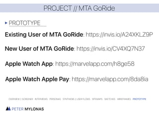
- 21. PROJECT // MTA GoRide PROTOTYPE OVERVIEW | SCREENER INTERVIEWS PERSONAS SYNTHESIS | USER FLOWS SITEMAPS SKETCHES WIREFRAMES PROTOTYPE
- 22. PROJECT // Wellthy OVERVIEW | SCREENER INTERVIEWS PERSONAS SYNTHESIS | USER FLOWS SITEMAPS SKETCHES WIREFRAMES PROTOTYPE
- 23. PROJECT // Wellthy PROJECT BRIEF TOOLS USED TIME For this project, my partner and I were tasked with helping the startup healthcare company Wellthy. Our assignment was to create a more efficient way for customers to chat with their ‘Care Coordinators’ on platform, instead of off-platform (email) like most users were doing. 4 Weeks to complete a high fidelity, clickable prototype with research to support our solutions and findings. OVERVIEW | SCREENER INTERVIEWS PERSONAS SYNTHESIS | USER FLOWS SITEMAPS SKETCHES WIREFRAMES PROTOTYPE
- 24. PROJECT // Wellthy SCREENER PERSONAS SYNTHESIS USER INTERVIEWS Before we sent out our screener, we knew we would have a slightly tough time finding the right candidates to interview that have had experience with being the care giver for sick loved ones, and we knew it would be a touchy subject for most to talk about. Our use of certain terminology was carefully selected to make sure no one felt pressured or offended about the sensitive topic. From the screener responses, we carefully chose users that we would interview. Here, as stated, we were looking for people with experience caring for a loved one, taking them to doctors appointments, keeping track of medical records, and communication with doctors, and other important medical personell. Organizing the information from our user interviews was very informative. We got the opportunity to speak with direct stakeholders of Wellthy. This gave us an amamzing inside look at how the company operates, and their goals to help their users. These interviews helped us craft our personas, as well as validate the features users wanted to see. For this project, we knew we were targeting multiple types of users. Care Recipients, people recieving care, Care Coordinators, people directing the Care Recipient’s care, and the family of the Care Recipient. OVERVIEW | SCREENER INTERVIEWS PERSONAS SYNTHESIS | USER FLOWS SITEMAPS SKETCHES WIREFRAMES PROTOTYPE “It would be great if a person of any age could be in charge of their own health.”
- 25. PROJECT // Wellthy USER FLOWS WIREFRAMES SKETCHES Creating a flow of the steps a user currently has to take to complete a certain task was helpful to the design stage. This helped us see how we needed to improve the chatting experience to keep users on platform. With this phase, we sketched multiple different ideas and tested them with our users. I had sketched an instance of the chat with bubbles, like in iOS and other chatting applications. We tested it against the existing Wellthy chat, which was more linear. Most users liked the bubbles, because “it felt familiar” , and “easy to use”. The bubbles iteration stuck, and it was time to take it to the computer to bring it to life. We went through multiple versions of it, and a lot of testing through low fidelity, all the way to high fidelity. OVERVIEW | SCREENER INTERVIEWS PERSONAS SYNTHESIS | USER FLOWS SITEMAPS SKETCHES WIREFRAMES PROTOTYPE
- 26. PROJECT // Wellthy SOLUTION OVERVIEW | SCREENER INTERVIEWS PERSONAS SYNTHESIS | USER FLOWS SITEMAPS SKETCHES WIREFRAMES PROTOTYPE After we had a great time finding users to interview, and design for, we came up with a lot of new features that would be added to Wellthy to make the experience more delightful for all users. We made the chat section more user friendly, and the ability to add family members onto the account so everyone can have a say in what is going on. Each person will have their name stamped next to their chat bubble for lack of confusion, with hover states to show their relation to the Care Recipient. The ability for users to manage the care for more than one family member is now added, and has become a clear, and findable experience. Each user was carefully thought about during our process, and each feature add went through a lot of testing to make sure it was the right fit for Wellthy. This project was a great experience all around.
- 27. PROJECT // Wellthy PROTOTYPE OVERVIEW | SCREENER INTERVIEWS PERSONAS SYNTHESIS | USER FLOWS SITEMAPS SKETCHES WIREFRAMES PROTOTYPE Full Clickable Prototype: https://invis.io/27592V1Q9