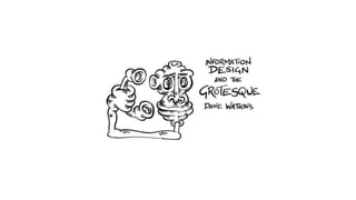
Information Design and the Grotesque

Information design (ID) aspires to an objective representation of memory, to “induce the viewer to think about the substance rather than about methodology” (Tufte), its materiality invisible to its ideas, a way to find truth in a world of shadows. ID is a dialogue where the data has become active, used rather than read. Use and usability require an efficiency that simplifies complex ideas (Nielsen, Neurath) in an attempt to create a frictionless communication of content in a world where computers are invisibly embedded into the fabric of society, silently collecting and analysing data (Weiser, 1991). With increased concerns over privacy should these processes be invisible and quiet? Could the design play with the complex ideas and its own materiality to create a discourse around the vitality of digital memory? From grottoes to cathedrals the grotesque has celebrated invention and questioned authority with a fart and a wink. Loud, funny and playful the grotesque contrasts the muted simplicity of ID, it could throttle the efficient consumption of information and create time for the consumer to consider and distinguish between layers of data. In ID the grotesque could play with its materials and induce the viewer to think about the impact of the methodology.

Empfohlen
Weitere ähnliche Inhalte
Was ist angesagt?
Was ist angesagt? (13)
Andere mochten auch
Ähnlich wie Information Design and the Grotesque
Ähnlich wie Information Design and the Grotesque (20)
Kürzlich hochgeladen
Kürzlich hochgeladen (20)
Information Design and the Grotesque
- 1. Information design and the grotesque
- 5. Windows 10
- 8. Gerd Arntz web archive www.gerdarntz.org/
- 9. Gerd Arntz Illustrations for the socialist union magazine Die Proletarische Revolution, 1928
- 18. USABILITY
- 34. Types of display design in black-on-white version: numerical design (top); analogue design (middle); ambient design (bottom) Bath University.
- 35. Conclusion: The numerical design was the all-round winner in task performance, leading to enhanced communication of energy-use changes compared to the analogue and ambient designs. Chiang, T., Natarajan, S. and Walker, I. (2012) ‘A laboratory test of the efficacy of energy display interface design’, Energy and Buildings, 55, pp. 471–480. doi: 10.1016/j.enbuild.2012.07.026.
- 36. Types of display design in black-on-white version: numerical design (top); analogue design (middle); ambient design (bottom) Bath University.
- 54. Joris Hoefnagel about 1591 – 1596 Mira Calligraphiae Monumenta
- 57. Ken Reid 1970s
- 58. f.150v Luttrell Psalter c. 1325-1335 Cylinder Complex by Basil Wolverton 1972
- 59. World War 2 Malaria leaflet by Theodor Geisel AKA Dr Seuss
- 61. Freedom Fighters comic produced by the CIA to undermine the Sandinista Government
- 62. a 16-page comic book published in 1957 by the Fellowship of Reconcilation
- 63. Boiling line
- 64. ticketing
- 70. Gerd Arntz
Hinweis der Redaktion
- My name is Dane Watkins and I am currently undertaking a practice base PhD at Falmouth and supervised by Mike Phillips at iDAT. My research is studying the use of playfulness in information design.
- It has driven the design of websites, which have sacrificed a playful experimentation for functional and utilitarian usability. The rhetoric of Information Design dictates that communication should be easy, efficient and effective.
- These ideas can be traced back to the early part of the twentieth century when Otto Neurath worked with Mary Neurath and Gerd Arntz to develop the ISOTYPE “in order to make communication easier and more effective”. Neurath aspired to a universal, objective and neutral form of communciation, the designs attempted to strip the image of all historical associations yet now they are obviously of their time.
- Another key thinker is Edward Tufte, who in his seminal book “The quantitative display of visual information” said that “Graphical excellence is that which gives the viewer the greatest number of ideas in the shortest time with the least ink in the smallest space” This sense of graphical excellence is no longer confined to the narrow world of graphs and charts.
- The journalist David McCandless has promoted information design through his blog and books. Knowledge is Beautiful is the follow up to Information is beautiful. In the introduction McCandless states that he loves the universal ideals of truth and beauty
- Aristotle said that “The chief forms of beauty are order and symmetry and definiteness, which the mathematical sciences demonstrate in a special degree.” But do we want a culture solely based on order and symmetry. Are there other examples of beauty? Venus de willendorf
- And truth as Zuckerberg, the founder of Facebook has stated is complicated.
- As digital technology converts analogue knowledge into quantifiable data the underlying principles of information design establish a greater importance and relevance.
- In the twentieth century Media corporations created spectacles to attract the viewer’s attention and stir their stupor.
- The viewer has evolved from passive reciever into active user. The focus has changed into creating efficient systems for users to probe and traverse their networks, simplicity has become key. The spectacle has been toned down as too confusing and replaced with the easiness of user centered design
- Unlike contemporary digital signage which in many cases don’t even rise to the limited expectations of information design. So could the grotesque add meaning and diversity to the limited world of information design
- As part of my practice based PhD I have been looking at how the grotesque could be used in a digital system. The Games Academy at Falmouth University wanted to track how often students were using the studio and encourage them to come in more often.
- We developed a system that logged the barcodes of their student cards
- This is the holding page, it runs on a continuous loop until something happens
- When the students logs in, their bar code is scanned
- Like all apis there are error messages if the system can’t recognise the bar code.
- The holding page could be used as a digital sign, showing news feeds
- Transport times
- The weather
- It could show the the busyness of the canteen
- Information is never that accurate nor that definite and I belive there is a case for the use of the grotesque in idioms and imagery to explain our world.