
Empfohlen
Weitere ähnliche Inhalte
Was ist angesagt?
Was ist angesagt? (18)
Andere mochten auch
Andere mochten auch (20)
Ähnlich wie Analysing existing digipaks
Ähnlich wie Analysing existing digipaks (20)
Mehr von 09evansash
Kürzlich hochgeladen
Kürzlich hochgeladen (20)
Analysing existing digipaks
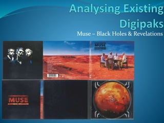
- 1. Muse – Black Holes & Revelations
- 2. Layout The Digipak follows the conventional layout, as the band and album name are on the front panel, with the track list, copyright info and barcode on the back panel, and with the booklet located in the front inside panel cover. Front panel Back panel Front Inside panel
- 3. Conventional Features Black Holes & Revelations contain many of the conventional features, that most digipaks have, including: Band and album name Tracklist Barcode Booklet Record label The booklet also follows the conventional feature of containing lyrics to the songs, presented in a clear, easy to read way. This is a convention of digipaks that has become more commonly used, as it gives the consumer another way to get more involved and interested in the album.
- 4. Theme The digipak follows an apocalyptic theme throughout, with the image on the front panel of the four horsemen of the apocalypse (relating to “Revelations” in the title – the book of revelations), sitting in a wasteland. This image is also on the first two pages of the booklet, meaning that this theme is used throughout the digipak. Inside, the CD tray shows an image of the sun, which is also the design of the Artist name on the booklet front cover. This means that it follows a space theme, as the rest of the inside panels are black, relating to “Black Holes in the title. Overall, the digipak follows an orange and black theme throughout.
- 5. Imagery The key piece of imagery on the digipak is the front and back covers (and the first two pages of the booklet). This is because they directly relate to the title of the album. The extreme long shot of the four horsemen of the apocalypse, sitting in a desolate wasteland is a reference to the book of revelations, which is part of the digipak title.
- 6. Typography On the front cover, the Artist and album name is represented, in a sans serif font, in capital letters. This typography is repeated on the booklet front cover, with the same font. This time however, the black colour is replaced with imagery of the sun.
- 7. Band Image Through the digipak, two images of the band are used, one on the inside of the actual digipak, and one inside the booklet. The images portray the band as serious musicians. They have chosen to be presented in this way as they want to be seen as professional musicians who care about making good music for their fans.
- 8. Is Genre Suggested One genre Muse are associated with is ‘space rock’. This genre is suggested through the digipak. For example, the design on the CD tray appears to be of the sun/a star, showing a direct relation to space. As well as this, the title of the album is “Black Holes & Revelations, meaning that the genre of ‘space rock’, is directly suggested in the title of the digipak.