1. Elements used in digipaks and adverts are usually very similar especially if they are both
promoting music. The most obvious element is the artist/band's name and also the title of the
album they have released so customers/fans can recognize who they are, but also take into
account the album name if they want to purchase it. They also both usually contain pictures of
the artist as you can see in this digipak the artist is all over each page but looks completely
different showing her unique and grungy style. Some contain quotes from other record labels
and press (mags and newspapers) to help promote the album and make more people want to
buy it but this digipak doesn't, but Im sure on the back page in the small print the artist's
record label will be clearly shown.
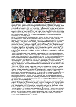
Across the 6 sections of this digipak the artist is featured on each one, but in every one she
has a different look (outfits) but they still relate to her "rockchick" and "rebel" look well
because she incorporates her own personal touches like the glitter that is splashed over each
page to make it easy on the eye for viewers. The colour scheme throughout the digipak is
mainly dark but the glitter and the props eg American flag and bright spotlights add the unique
factor to the creation. The overall concept of this digipak I believe is very arty especially the
front cover showing Ke$ha with two different sides to her face which could be indicating that
she has two sides to her personality and maybe the reason why she has so many fans. One
side linking to "Animal" and the other "Cannibal" showing she could be sweet and sultry but
could turn feisty and vicious if she wants too, this is an element to the artist which makes her
so different.
The font/text used is mainly glitter related to again show the artist's personality but also add
abit more "bling" to the boring cd cover and put her own stamp on it, also the writing looks as
though its just been written free hand and transferred onto the album, even the song list looks
really rushed but it works well with the overall layout of the digipak because everything is
spread around and nothing is perfect which is what I love about Ke$ha. Some of the writing is
also displayed on a slant which adds composition to each section too. I think the overall
digipak itself is really fun and eye catching and would make her album alot more easy to sell
because of the brilliant and professional elements included aswell as her own personal touch
added in some parts.
This digipak is the one I believe has a perfect relationship between the text and the images
because throughout each section of this digipak both the text and images contain glitter and
sparkles so they contrast well and make the digipak alot more eyecatching. Also the images
show off the artist's wacky fashion sense and the text compliments them well by being
posistioned in all different places on each of the sections, which looks slightly messy but links
back to the way in which the artist is seen by the public eye, for example she dresses in
ripped clothes and doesn't look like she has washed in days sometimes but that is exactly
how people perceive her and it doesn't affect how good her music is. The album title "Animal/
Cannibal" means the artist can be seen in two different ways and by cutting the photo in half
the cannibal could be her alter ego.
The messy layout including the explosions of colour and glitter and the outrageous outfits and
make up do relate to the dance/techno genre of music that the artist is from, also the images
that are used reflect Ke$ha's personality which is wild and feisty. The only signifier for this
artist to separate her from any other in her music genre category is her grungy and "trampy"
look and also her motives and themes that occur through all of her videos.
The main audience for this artist could be a variety of people, firstly it could be girls/women of
any age who look upto her and see her as a role model because her songs do have alot of
meaning behind them even though they are dance videos. Also she may have a large men
fan base because of Laura Mulvey voyerism theory which means women's sex appeal is
shown through the perspective of the camera.