
Empfohlen
Weitere ähnliche Inhalte
Was ist angesagt?
Was ist angesagt? (20)
Andere mochten auch
Ähnlich wie Content analysed1
Ähnlich wie Content analysed1 (20)
Mehr von Nathalie_Likutu
Mehr von Nathalie_Likutu (20)
Kürzlich hochgeladen
Kürzlich hochgeladen (20)
Content analysed1
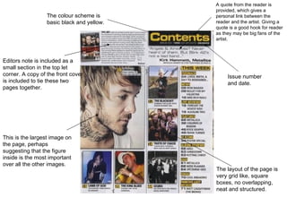
- 1. A quote from the reader is provided, which gives a The colour scheme is personal link between the basic black and yellow. reader and the artist. Giving a quote is a good hook for reader as they may be big fans of the artist. Editors note is included as a small section in the top let corner. A copy of the front cover Issue number is included to tie these two and date. pages together. This is the largest image on the page, perhaps suggesting that the figure inside is the most important over all the other images. The layout of the page is very grid like, square boxes, no overlapping, neat and structured.
- 2. Subheading in capital to separate them from explanatory text The title content is very bold and is capital letter. It is also whit text on a black background Issue and date and which help it to website at the top of stand out. the page, they stand out as it is white text on black background. The subheadings The main colour of this stands out among content page are red everything else and black and white, which guide the reader to combines very well. help find what they are looking for. Quotes used to entice the audience into reading the article, the quote is also The page number also use over the main images Q magazines main colour suggesting it must be red. This make them stand something to do with it. out against the other black text.