SlideShare ist ein Scribd-Unternehmen logo
1 von 12
Music Magazine Evaluation
For my AS media coursework I created a front page, contents page and double page spread for a music magazine which I named  ‘ E Minor ’ . The magazine was aimed at the indie/alternative genre of music and had a target audience of males and females between the ages of roughly 13-30.
The front cover of my magazine is focused of the feature band of this issue  ‘ The Ghosts ’ ; much like other music magazines do. I have edited the picture of the feature band (made the members black and white), by using Photoshop on an Apple Mac to cut around them. I had not used Photoshop before and therefore had to learn quickly the basics of Photoshop to do my coursework. The purpose of making the artists black and white is to make them stand out against the coloured background to attract the target audience, and to also comply with the band name  ‘ The Ghosts ’ , as stereotypically, ghosts are perceived to be black and white. Out of all the images I took on this photo shoot for my front cover, this one was the best one to display the indie genre of music. Indie music is known to be much more natural and raw, and the artists are perceived to be more shy and vulnerable than a genre such as Hip hop. The picture I chose for my front cover has a very nature themed and innocent background and the artists are positioned in the corner of the picture making them lesser of a centre of attention and more shy, to comply with the musical genre.  The title of the magazine attracts the target audience as it is bright, bold and is the chord of a guitar, displaying the Indie genre as it is mainly guitar based. The colour scheme of blue and red complies with the musical genre as the connotations of the colour red are normally danger and warning, and indie/rock music is associated as being dangerous and rough. The font used on the title is a cracked, ragged font. This font is used to show the stereotypically perceived attitudes of indie/alterative music; ragged, untidy, destructive etc. I used the outer and inner shadowing features on the title on Photoshop to make the title more bold and eye catching to the target audience. The banner on the bottom of the magazine cover also attracts the audience as it has other indie band names to show who is also in the issue in bright blue coloured font to contrast with the black banner. The overall look and layout of the front cover is rather neat and clean cut. This also conveys the musical genre of the magazine as the indie genre can stereotypically be associated with innocence and clean-cut images.
The  ‘ Contents ’  heading and subheadings stand out against the black background. The informal, chalkboard style font used on the heading and subheadings of the page link in with enticing my target audience, as the chalkboard writing is very stereotypical of schools and is old-fashioned, and the indie style is normally very old-fashioned and vintage-looking. I chose black and white to contrast on the headings to represent the sometimes associated dark and devil-ish related concepts of rock music. On the other hand, the black and white could also represent vintage, old-fashioned movies/photos to convey the indie genre. The editors letter in the top left hand   corner uses phrases such as  ‘ top-notch ’  and  ‘ take a peek ’ . This use of informal language reflects the musical genre my magazine represents. Indie/rock music is stereotypically perceived to be more informal than other forms of music such as classical, which is very formal.  I have also continued using the title on the front cover  The pictures I have selected to feature on my contents page are   pictures of articles featured within the magazine and their page numbers in clear, bold print for the audience to see. The pictures of live artists and concerts reflect the type of social group my magazine is aiming at; creative, live-music lovers, and these striking, eye-catching pictures will therefore attract this type of social group. I created a subscription advert to place on my contents page to conform with the conventions of real music magazines. The white, bold print contrasts with the burgundy background to make the advert eye-catching to the audience, and to possibly convince them to look further into the advert, therefore making the magazine more profit.
I designed my double page spread to feature an article of the band  ‘ The Ghosts ’  who are on the front cover. The picture I chose to cover one whole page of the double page spread was from the same shoot as the photo ’ s on the contents page and front cover. It displays the natural, less-processed idea of the indie genre, which is why I chose it. The introduction to the article is in a neutral burgundy colour and an informal font. The use of the informal font shows the informal attitudes of the magazine as a whole and shows how informal the indie/alternative genre is in comparison to a genre such as classical. Stereotypically, indie/alternative genres are not associated   with bright colours, but are associated with more neutral pastel colours. However, I couldn ’ t use a colour too light and neutral as it wouldn ’ t stand out, but I used less bright and more earthy colours to represent the natural guitar-based genre and to also match with the wood and grass effect of the images I have used. The introduction to the article uses informal phrases such as  ‘ butter wouldn ’ t melt ’  to show the informal and unserious attitudes of the magazine and to also entice my target audience of the younger generation who are stereotypically not very formal. The way in which the article was written is very much similar to that of Kerrang or NME magazine. It ’ s not quite a question and answer scenario, but a more recorded informal chat, showing again the informal attitudes of the magazine to attract my target audience. The black text is in quite a small, legible font and there is a high amount of text to image ratio. My reason for this is because my target audience are stereotypically predicted to be of a higher qualification and intelligence level; possibly ABC1.
My magazine cover is stereotypical of a normal magazine cover as it has similar conventions to that of a real music magazine. For example the feature band/artist on the front cover and a quote from their interview to entice the audience into wanting to read further, and a banner to give insight as to what other artists are featured inside the magazine and a selling line to entice buyers. The band name (The Ghosts) is in a stereotypical newspaper font to challenge the stereotypical magazine look and show the quirky side of the music genre indie/alternative. To use that font on my front cover I had to use various technology. I cut out each letter and scanned them into to my computer, before opening each letter and cutting them out in Photoshop to position them on my front cover.
My contents page is very stereotypical of a music magazine contents page. It has the contents listed, a few pictures of some articles within the magazine, an editor ’ s letter, and subscription advert, much like the popular rock magazine Kerrang ’ s contents page.
My double page spread is fairly stereotypical of a music magazine. It has images, quotes from the article, credit to the photographer and writer and an introductory paragraph to the article. I created a logo in the top corner of my double page spread to represent a standard, recognised sign for  ‘ new music ’  that regular readers would eventually recognise and instantly know what the article was going to be about. This particular Kerrang! issue does have a title in the top corner, but it only states the band name of the band featured, therefore I have developed this idea into creating a logo to represent the idea of the article on the page to be about new music/bands/artists etc.
Media Distributions I chose IPC Media as a distributor for my magazine because it has experience in distributing music magazines like mine such as NME, and will therefore have experience in selling that type of magazine as my target audience is roughly the same as NME ’ s. Also, IPC Media distributes LOOK magazine and photography magazines. I researched via questionnaire to identify the interests of my target audience, and the research came back that my target audience have a high interest in fashion and photography. This means that IPC Media have experience in selling photography and fashion magazines and will therefore more successfully attract my intended audience.  I also considered Bauer Media as a distributor, but as Bauer Media already distributed so many magazines like mine (Kerrang!, Q, Mojo etc.) my magazine might get overshadowed by the already fast-selling magazines like mine. However, on the upside, it would mean that Bauer Media would have a lot of experience in selling to my target audience. Also, Bauer Media is linked with the top-selling subscription site  ‘ greatmagazines ’  which would generate good profit for my music magazineand work as good advertisement.  I would ask that  ‘ E Minor ’  was sold in local newsagents, and supermarkets such as Sainsbury ’ s, Morrisons and Tescos. I would suggest that it was available for subscription via the IPC Media website.
I created my preliminary task (school magazine) on microsoft publisher, and my music magazine on Photoshop. My knowledge of Photoshop has increased considerably since the start of the year. For example, on my front cover I learned how to cut out the people using the lasso tool and then learned how to put different effects such as black and white on the cut out area. I also learnt how to make the magazine title stand out more by using inner and outer glow and drop shadows on Photoshop instead of just giving the title a thick, bold border like I did in my preliminary task.  I ’ ve also learnt how to set up a much more stereotypical and legible contents page, and learnt more about the codes and conventions of a real media magazine, so that I can use them on my magazine e.g. editors letter, subscription advert etc. I have also learnt to manage and use the different layers of my magazine in Photoshop to my advantage e.g. overlapping words/images.  Overall, I have progressed a lot since my preliminary task, as when I first started my coursework I had no experience of Photoshop and I have now created a professional standard magazine with it.
After asking a group of people who would be within the ranges of my target audience, I decided to improve my magazine. I changed the colour scheme, as my target audience recommended a red instead of pink, as the pink wasn ’ t very indie/rock-like. My audience also referred me to make my magazine title much bigger and more eye-catching to the audience and put more band names on the banner to cater to a wider audience. I changed the banner slightly so I could put the barcode and details at the bottom of the magazine, much like a stereotypical music magazine. My audience also recommended I made my quote bigger and more eye-catching to the audience and also add a selling line, like a stereotypical music magazine.  On the contents page, my audience suggested I change the font I used in the headings and subheadings, as it was quite formal and not conforming to the rough stereotypes of rock music; so I changed it to a more rugged  ‘ chalkboard ’  font. I also enlarged the font size of the band names in the contents like my audience recommended, to catch the eye of the reader.
Technologies  Throughout this project I have used many different forms of technology. I firstly took all of my photos using a Sony Cybershot digital camera, then uploaded them onto an Apple Mac laptop and put them on a Freecom USB memory stick. I created my magazine both at home and in school using an Apple Mac laptop at home and an Apple Mac computer in school, both of which had Photoshop Cs3 installed on them. Throughout the project I have been uploading my work to blogger, and my work had sometimes been on a powerpoint presentation, so I made an account with slideshare to upload my presentation to my blog. I had never used Blogger or Slideshare or Photoshop before, so I learned how to use those technologies.

Weitere ähnliche Inhalte

Was ist angesagt? (18)

Evaluation
EvaluationEvaluation
Evaluation
 
Evaluation
EvaluationEvaluation
Evaluation
 
Evaluation
EvaluationEvaluation
Evaluation
 
Updated Question 1
Updated Question 1 Updated Question 1
Updated Question 1
 
Music magazine evaluation
Music magazine evaluationMusic magazine evaluation
Music magazine evaluation
 
Evaluation of my music magazine
Evaluation of my music magazineEvaluation of my music magazine
Evaluation of my music magazine
 
D:\Sarai\Evaluation
D:\Sarai\EvaluationD:\Sarai\Evaluation
D:\Sarai\Evaluation
 
Evaluation
EvaluationEvaluation
Evaluation
 
Media powerpoint
Media powerpointMedia powerpoint
Media powerpoint
 
Unit 13 - Pitch Presentation
Unit 13 - Pitch Presentation Unit 13 - Pitch Presentation
Unit 13 - Pitch Presentation
 
Magazine research
Magazine researchMagazine research
Magazine research
 
AS Media Evaluation Of Music Magazine
AS Media Evaluation Of Music MagazineAS Media Evaluation Of Music Magazine
AS Media Evaluation Of Music Magazine
 
Presentation1 media as
Presentation1 media asPresentation1 media as
Presentation1 media as
 
Evaluation
EvaluationEvaluation
Evaluation
 
AS Media Evaluation
AS Media EvaluationAS Media Evaluation
AS Media Evaluation
 
Evaluation
EvaluationEvaluation
Evaluation
 
Evaluation of Music Magazine
Evaluation of Music MagazineEvaluation of Music Magazine
Evaluation of Music Magazine
 
Evaluation by Malene Riise
Evaluation by Malene RiiseEvaluation by Malene Riise
Evaluation by Malene Riise
 

Ähnlich wie Magazine evaluation

Ähnlich wie Magazine evaluation (20)

Magazine evaluation
Magazine evaluationMagazine evaluation
Magazine evaluation
 
LO 3 Proposal
LO 3 Proposal   LO 3 Proposal
LO 3 Proposal
 
Lucy Twyman - AS Media evaluation
Lucy Twyman - AS Media evaluationLucy Twyman - AS Media evaluation
Lucy Twyman - AS Media evaluation
 
Music Magazine Evaluation
Music Magazine EvaluationMusic Magazine Evaluation
Music Magazine Evaluation
 
Evau
EvauEvau
Evau
 
LO3 Proposal
LO3 Proposal LO3 Proposal
LO3 Proposal
 
Evaluation
EvaluationEvaluation
Evaluation
 
Evaulation
EvaulationEvaulation
Evaulation
 
Evaluation
EvaluationEvaluation
Evaluation
 
Magazine media evaluation
Magazine media evaluationMagazine media evaluation
Magazine media evaluation
 
Ramarna's Evaluation
Ramarna's EvaluationRamarna's Evaluation
Ramarna's Evaluation
 
As media course work- evaluation
As media course work- evaluationAs media course work- evaluation
As media course work- evaluation
 
Music Magazine Evaluation
Music Magazine EvaluationMusic Magazine Evaluation
Music Magazine Evaluation
 
Notorious Evaluation
Notorious EvaluationNotorious Evaluation
Notorious Evaluation
 
My Evaluation Presentation
My Evaluation PresentationMy Evaluation Presentation
My Evaluation Presentation
 
As media course work- evaluation
As media course work- evaluationAs media course work- evaluation
As media course work- evaluation
 
As media course work evaluation
As media course work  evaluationAs media course work  evaluation
As media course work evaluation
 
Notorious evaluation
Notorious evaluationNotorious evaluation
Notorious evaluation
 
As media course work evaluation
As media course work  evaluationAs media course work  evaluation
As media course work evaluation
 
As media course work evaluation
As media course work  evaluationAs media course work  evaluation
As media course work evaluation
 

Magazine evaluation

  • 2. For my AS media coursework I created a front page, contents page and double page spread for a music magazine which I named ‘ E Minor ’ . The magazine was aimed at the indie/alternative genre of music and had a target audience of males and females between the ages of roughly 13-30.
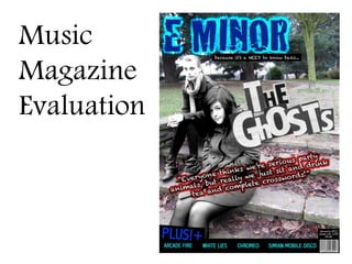
  • 3. The front cover of my magazine is focused of the feature band of this issue ‘ The Ghosts ’ ; much like other music magazines do. I have edited the picture of the feature band (made the members black and white), by using Photoshop on an Apple Mac to cut around them. I had not used Photoshop before and therefore had to learn quickly the basics of Photoshop to do my coursework. The purpose of making the artists black and white is to make them stand out against the coloured background to attract the target audience, and to also comply with the band name ‘ The Ghosts ’ , as stereotypically, ghosts are perceived to be black and white. Out of all the images I took on this photo shoot for my front cover, this one was the best one to display the indie genre of music. Indie music is known to be much more natural and raw, and the artists are perceived to be more shy and vulnerable than a genre such as Hip hop. The picture I chose for my front cover has a very nature themed and innocent background and the artists are positioned in the corner of the picture making them lesser of a centre of attention and more shy, to comply with the musical genre. The title of the magazine attracts the target audience as it is bright, bold and is the chord of a guitar, displaying the Indie genre as it is mainly guitar based. The colour scheme of blue and red complies with the musical genre as the connotations of the colour red are normally danger and warning, and indie/rock music is associated as being dangerous and rough. The font used on the title is a cracked, ragged font. This font is used to show the stereotypically perceived attitudes of indie/alterative music; ragged, untidy, destructive etc. I used the outer and inner shadowing features on the title on Photoshop to make the title more bold and eye catching to the target audience. The banner on the bottom of the magazine cover also attracts the audience as it has other indie band names to show who is also in the issue in bright blue coloured font to contrast with the black banner. The overall look and layout of the front cover is rather neat and clean cut. This also conveys the musical genre of the magazine as the indie genre can stereotypically be associated with innocence and clean-cut images.
  • 4. The ‘ Contents ’ heading and subheadings stand out against the black background. The informal, chalkboard style font used on the heading and subheadings of the page link in with enticing my target audience, as the chalkboard writing is very stereotypical of schools and is old-fashioned, and the indie style is normally very old-fashioned and vintage-looking. I chose black and white to contrast on the headings to represent the sometimes associated dark and devil-ish related concepts of rock music. On the other hand, the black and white could also represent vintage, old-fashioned movies/photos to convey the indie genre. The editors letter in the top left hand corner uses phrases such as ‘ top-notch ’ and ‘ take a peek ’ . This use of informal language reflects the musical genre my magazine represents. Indie/rock music is stereotypically perceived to be more informal than other forms of music such as classical, which is very formal. I have also continued using the title on the front cover The pictures I have selected to feature on my contents page are pictures of articles featured within the magazine and their page numbers in clear, bold print for the audience to see. The pictures of live artists and concerts reflect the type of social group my magazine is aiming at; creative, live-music lovers, and these striking, eye-catching pictures will therefore attract this type of social group. I created a subscription advert to place on my contents page to conform with the conventions of real music magazines. The white, bold print contrasts with the burgundy background to make the advert eye-catching to the audience, and to possibly convince them to look further into the advert, therefore making the magazine more profit.
  • 5. I designed my double page spread to feature an article of the band ‘ The Ghosts ’ who are on the front cover. The picture I chose to cover one whole page of the double page spread was from the same shoot as the photo ’ s on the contents page and front cover. It displays the natural, less-processed idea of the indie genre, which is why I chose it. The introduction to the article is in a neutral burgundy colour and an informal font. The use of the informal font shows the informal attitudes of the magazine as a whole and shows how informal the indie/alternative genre is in comparison to a genre such as classical. Stereotypically, indie/alternative genres are not associated with bright colours, but are associated with more neutral pastel colours. However, I couldn ’ t use a colour too light and neutral as it wouldn ’ t stand out, but I used less bright and more earthy colours to represent the natural guitar-based genre and to also match with the wood and grass effect of the images I have used. The introduction to the article uses informal phrases such as ‘ butter wouldn ’ t melt ’ to show the informal and unserious attitudes of the magazine and to also entice my target audience of the younger generation who are stereotypically not very formal. The way in which the article was written is very much similar to that of Kerrang or NME magazine. It ’ s not quite a question and answer scenario, but a more recorded informal chat, showing again the informal attitudes of the magazine to attract my target audience. The black text is in quite a small, legible font and there is a high amount of text to image ratio. My reason for this is because my target audience are stereotypically predicted to be of a higher qualification and intelligence level; possibly ABC1.
  • 6. My magazine cover is stereotypical of a normal magazine cover as it has similar conventions to that of a real music magazine. For example the feature band/artist on the front cover and a quote from their interview to entice the audience into wanting to read further, and a banner to give insight as to what other artists are featured inside the magazine and a selling line to entice buyers. The band name (The Ghosts) is in a stereotypical newspaper font to challenge the stereotypical magazine look and show the quirky side of the music genre indie/alternative. To use that font on my front cover I had to use various technology. I cut out each letter and scanned them into to my computer, before opening each letter and cutting them out in Photoshop to position them on my front cover.
  • 7. My contents page is very stereotypical of a music magazine contents page. It has the contents listed, a few pictures of some articles within the magazine, an editor ’ s letter, and subscription advert, much like the popular rock magazine Kerrang ’ s contents page.
  • 8. My double page spread is fairly stereotypical of a music magazine. It has images, quotes from the article, credit to the photographer and writer and an introductory paragraph to the article. I created a logo in the top corner of my double page spread to represent a standard, recognised sign for ‘ new music ’ that regular readers would eventually recognise and instantly know what the article was going to be about. This particular Kerrang! issue does have a title in the top corner, but it only states the band name of the band featured, therefore I have developed this idea into creating a logo to represent the idea of the article on the page to be about new music/bands/artists etc.
  • 9. Media Distributions I chose IPC Media as a distributor for my magazine because it has experience in distributing music magazines like mine such as NME, and will therefore have experience in selling that type of magazine as my target audience is roughly the same as NME ’ s. Also, IPC Media distributes LOOK magazine and photography magazines. I researched via questionnaire to identify the interests of my target audience, and the research came back that my target audience have a high interest in fashion and photography. This means that IPC Media have experience in selling photography and fashion magazines and will therefore more successfully attract my intended audience. I also considered Bauer Media as a distributor, but as Bauer Media already distributed so many magazines like mine (Kerrang!, Q, Mojo etc.) my magazine might get overshadowed by the already fast-selling magazines like mine. However, on the upside, it would mean that Bauer Media would have a lot of experience in selling to my target audience. Also, Bauer Media is linked with the top-selling subscription site ‘ greatmagazines ’ which would generate good profit for my music magazineand work as good advertisement. I would ask that ‘ E Minor ’ was sold in local newsagents, and supermarkets such as Sainsbury ’ s, Morrisons and Tescos. I would suggest that it was available for subscription via the IPC Media website.
  • 10. I created my preliminary task (school magazine) on microsoft publisher, and my music magazine on Photoshop. My knowledge of Photoshop has increased considerably since the start of the year. For example, on my front cover I learned how to cut out the people using the lasso tool and then learned how to put different effects such as black and white on the cut out area. I also learnt how to make the magazine title stand out more by using inner and outer glow and drop shadows on Photoshop instead of just giving the title a thick, bold border like I did in my preliminary task. I ’ ve also learnt how to set up a much more stereotypical and legible contents page, and learnt more about the codes and conventions of a real media magazine, so that I can use them on my magazine e.g. editors letter, subscription advert etc. I have also learnt to manage and use the different layers of my magazine in Photoshop to my advantage e.g. overlapping words/images. Overall, I have progressed a lot since my preliminary task, as when I first started my coursework I had no experience of Photoshop and I have now created a professional standard magazine with it.
  • 11. After asking a group of people who would be within the ranges of my target audience, I decided to improve my magazine. I changed the colour scheme, as my target audience recommended a red instead of pink, as the pink wasn ’ t very indie/rock-like. My audience also referred me to make my magazine title much bigger and more eye-catching to the audience and put more band names on the banner to cater to a wider audience. I changed the banner slightly so I could put the barcode and details at the bottom of the magazine, much like a stereotypical music magazine. My audience also recommended I made my quote bigger and more eye-catching to the audience and also add a selling line, like a stereotypical music magazine. On the contents page, my audience suggested I change the font I used in the headings and subheadings, as it was quite formal and not conforming to the rough stereotypes of rock music; so I changed it to a more rugged ‘ chalkboard ’ font. I also enlarged the font size of the band names in the contents like my audience recommended, to catch the eye of the reader.
  • 12. Technologies Throughout this project I have used many different forms of technology. I firstly took all of my photos using a Sony Cybershot digital camera, then uploaded them onto an Apple Mac laptop and put them on a Freecom USB memory stick. I created my magazine both at home and in school using an Apple Mac laptop at home and an Apple Mac computer in school, both of which had Photoshop Cs3 installed on them. Throughout the project I have been uploading my work to blogger, and my work had sometimes been on a powerpoint presentation, so I made an account with slideshare to upload my presentation to my blog. I had never used Blogger or Slideshare or Photoshop before, so I learned how to use those technologies.