SlideShare ist ein Scribd-Unternehmen logo
1 von 7
Development of my Front Cover
By removing the blemishes of the models using the clone tool and increasing the brightness and contrast I was able to create a more professional looking cover image that resembled covers of existing music magazines.  In many magazines the contrast is increased giving a surreal glow to the models, ‘Q’ magazine does this frequently. Original image I deliberately selected the female lead vocals, I wanted my product to focus on celebrating the female figure which is uncommon in today's magazine production and is focussed primarily on men. The female model wears the a ‘urban outfitters’ outfit that creates the urban feel to the product. Between the two male models in the background you can easily distinguish between the drummer and the guitarist simply by their appearance. The model on the left is clearly the drummer from his butcher, harder appearance and short cut hair.
I experimented with a variety of names for the magazine, “Revolution”, “Echo”, and “Urban” were names I was considering. However, I feel ‘Pulse’ reflects the current urban style and can be associated with the current street dancing phenomenon by echoing the sound of a heart-beat. This can be compared to the title of ‘Kerrang’ magazine, the heading is onomatopoeic and refers to the noise a guitar makes when a power chord is struck.
The borders of my product resemble the layout of your average ‘kerrang’ magazine which usually give information on tour dates and bands included in the issue. The band name “white noise” reflects a thrash/punk band, the demographics of the cover begin to become more obvious from the thrash/distorted and interesting fonts that will appeal to teenagers between the ages of 14 and 19. Psycho-graphically, it will appeal to indivualists, generally teenagers who will find more entertainment in a punk/indie/rock magazine due to the variety, the magazine does not concentrate entirely on mainstream music, (although elements of mainstream styles are obvious throughout) making the readers aspiring to go against the flow. ‘Anti-authority rebels’ and ‘YAKS’  (young, adventurous, keen and single) will be particularly drawn to the magazine, the rebels due to it’s rebellious and trashy appearance and the YAKS because it is a little different to your everyday main-stream magazine, they will not be drawn to it due to their single status though it could potentially influence the time they have to read such a magazine. Others the magazine could appeal to are:   ,[object Object]
“Fun/AticsAspirational, fun-seeking, active young people”Who does the Magazine Appeal to?
Next I put in a different image of the model from my double page spreads, the images of “Parma Petit”, “Dominique” and “White Noise” are very contrasting, showing the magazine will be diverse.
The ‘free poster  special’ area  of  the cover is bold and stands out due to the contrast from the colour scheme of the cover. I made it by creating a graffiti, distorted red paint stroke using a combination of the paintbrush and eraser tool. The text was done using the text tool and finally I created a drop shadow.  ‘Free Poster Special’ on the cover of Kerrang Magazine.

Weitere ähnliche Inhalte

Andere mochten auch

Andere mochten auch (11)

The Dynamics of Proactive Thinking
The Dynamics of Proactive ThinkingThe Dynamics of Proactive Thinking
The Dynamics of Proactive Thinking
 
Developing a Winning Sales Force
Developing a Winning Sales ForceDeveloping a Winning Sales Force
Developing a Winning Sales Force
 
Effective Supervision and Staff Leadership
Effective Supervision and Staff LeadershipEffective Supervision and Staff Leadership
Effective Supervision and Staff Leadership
 
Effective Sales Leadership through Coaching
Effective Sales Leadership through CoachingEffective Sales Leadership through Coaching
Effective Sales Leadership through Coaching
 
Utilizing Assertive Communication to Achieve Win-Win Results
Utilizing Assertive Communication to Achieve Win-Win ResultsUtilizing Assertive Communication to Achieve Win-Win Results
Utilizing Assertive Communication to Achieve Win-Win Results
 
Creating a Winning Sales Mindset
Creating a Winning Sales MindsetCreating a Winning Sales Mindset
Creating a Winning Sales Mindset
 
7 Things Parents Need to Know about Educating Their Children
7 Things Parents Need to Know about Educating Their Children7 Things Parents Need to Know about Educating Their Children
7 Things Parents Need to Know about Educating Their Children
 
The 10 Essentials of Entrepreneurship
The 10 Essentials of EntrepreneurshipThe 10 Essentials of Entrepreneurship
The 10 Essentials of Entrepreneurship
 
Pequesyanimales
PequesyanimalesPequesyanimales
Pequesyanimales
 
Animales Tiernas
Animales TiernasAnimales Tiernas
Animales Tiernas
 
Pastelesrusos
PastelesrusosPastelesrusos
Pastelesrusos
 

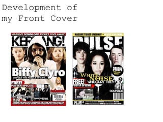
Development of my front cover

  • 1. Development of my Front Cover
  • 2. By removing the blemishes of the models using the clone tool and increasing the brightness and contrast I was able to create a more professional looking cover image that resembled covers of existing music magazines. In many magazines the contrast is increased giving a surreal glow to the models, ‘Q’ magazine does this frequently. Original image I deliberately selected the female lead vocals, I wanted my product to focus on celebrating the female figure which is uncommon in today's magazine production and is focussed primarily on men. The female model wears the a ‘urban outfitters’ outfit that creates the urban feel to the product. Between the two male models in the background you can easily distinguish between the drummer and the guitarist simply by their appearance. The model on the left is clearly the drummer from his butcher, harder appearance and short cut hair.
  • 3. I experimented with a variety of names for the magazine, “Revolution”, “Echo”, and “Urban” were names I was considering. However, I feel ‘Pulse’ reflects the current urban style and can be associated with the current street dancing phenomenon by echoing the sound of a heart-beat. This can be compared to the title of ‘Kerrang’ magazine, the heading is onomatopoeic and refers to the noise a guitar makes when a power chord is struck.
  • 4.
  • 5. “Fun/AticsAspirational, fun-seeking, active young people”Who does the Magazine Appeal to?
  • 6. Next I put in a different image of the model from my double page spreads, the images of “Parma Petit”, “Dominique” and “White Noise” are very contrasting, showing the magazine will be diverse.
  • 7. The ‘free poster special’ area of the cover is bold and stands out due to the contrast from the colour scheme of the cover. I made it by creating a graffiti, distorted red paint stroke using a combination of the paintbrush and eraser tool. The text was done using the text tool and finally I created a drop shadow. ‘Free Poster Special’ on the cover of Kerrang Magazine.
  • 8. All American Rejects are a popular American rock band, the lead singer Tyson Ritter has a distinctive style which my model Josh reflects well. This band are fairly different from Blink_182, I wanted to mix and match a variety of iconic bands to emphasise the diversity of the magazine. Tyson Ritter: All American Rejects Travis Barker: Blink_182 I wanted the drummer of my cover band to resemble iconic drummer Travis Barket from Blink_182. It was easy to photograph my model this way seeing as he has very similar features to the drummer. Blink_182 are a renowned pop-punk band, which will help get across the style of magazine. Completely different from Travis Barker and Tyson Ritter, Beyonce Knowles is one of the biggest names in music and has used a variety of music styles. My female Model has some of the distinguishing characteristics of the music artist, again, reflecting the diversity of the magazine. Beyonce Knowles