1. F-Shaped Score Analysis
A content analysis method for website homepage design strategy – with an example analysis for telecom company website homepages
Charles Chen (Chen Qi Liang)
wwwins Isobar Taiwan Inc., Taipei, Taiwan. Email: charles.chen@isobar.com
Introduction F-Shaped Score Analysis An analysis for telecommunication company website homepages
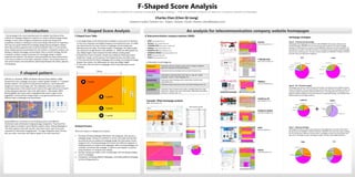
The homepage is the most important part of a website. But there are few F-Shaped Score Table 8 Telecommunication company websites (2009):
methods for webpage designers or planners to create a valid homepage design Homepage strategies
strategy. In some cases, designers and planners would only doing some • A: A triangle shape on the left-top area of website. A-area score is 5 because • AT&T http://www.att.com/
Verizon Type A – Promote-driving strategy
LOGO tools
Product site channels
competitors analysis or looking for some visual-design references for inspiration. it’s the most important and highest frequency visual attention area. It’s width • Verizon http:// www.verizon.com
5 point
Product catelogy Services
http:// www.verizon.com Homepages that weighting score more than 65% PROMOTE information called promote
This may not a good method for homepage design because designers seldom was determined by the main content on webpage, and the height was • T-Mobile (US) http:// www.t-mobile.com/ Promoting Info.
Promoting Info.
Promoting Info. driving homepage. PROMOTE is the most important information for this type homepage
3 point
think about business goal but their visual and aesthetic taste. In some another determined by the safety “first folder height” of webpage. The safety height • Telekom http://www.telekom.com/ strategy. For attracting more consumer, these PROMOTE information chucks are graphic and
cases, website planners would stand out and conduct a competitor analysis, and was referred to Google Browser Size (Bowden, A. ,2009), the 90% people can • Vodafone UK http://vodafone.co.uk
Hot services
Account Tools
Services 2 point Promoting Info.
Promoting Info.
Promoting Info.
Promoting Info.
with dynamic animation. The AT&T and Verizon homepage fall into this type. Both homepage
develop a website homepage communication idea or content strategy. But the had the same content priority: the top 3 content category are PROMOTE, PRODUCT, SERVICE
•
Company News
1 point
view 500px height in their browser first fold without scrolling down. Vodafone Global http://www.vodafone.com/ Company/Website Info.
and both share over 80% layout weighting.
competitor analysis conduct by planners for homepage design is always • B: Beside the A-area of website. People may looking for following content • KDDI http://www.kddi.com/
subjective and arbitrary. The planner’s personal preference about look and feel beside the F-shape, so this area has more frequency than any other areas. • Telstra http://www.telstra.com LOGO
tools
AT&T Verizon
5 point
is too easy to embed in a free-style competitor analysis. This situation forms an • C: This area this the first fold of webpage with scrolling. According the Google Compan Product
Branding Info.
T-Mobile (US)
even worse tension and contradiction relationship between the clients, planners
Company Info.
y Info. catelogy
http:// www.t-mobile.com
Browser Size statistic, the 60% people can view upto 600px height. 6 information chunk categories: 3 point
Company News
Company, 6% Product, 13% Company, 6%
and designers. • D: This area is the rest area of a webpage. Area D may take long on some
Company Info.
Company PR
Service, 7%
Product, 8%
Information about its products, goods, and its category navigation 2 point
Company Info.
webpage. PRODUCT Company PR
Branding, 2% Service, 12%
system for consumer to find their products. 1 point
Branding Info. Tools, 6% Branding, 0%
744 px
F-shaped pattern
PROMOTE Information about promoting events and advertising banners. Company News
Tools, 5%
TOOLS Information or functional items, like “sign-in”,” sign-up”, “forget
Promote, 69%
password”, “search”, “select language”, etc… Company Info.
Promote, 66%
Eyetools Inc. (Eyetools, 2006) and Nielsen Nerman Group (Nielsen, 2006) Information about branding, public relationship, business social
BRANDING
A 5 point
LOGO
tools
showed that users’ webpage scanning in a called “golden triangle” or “F-shaped” responsibility, etc…
Product catelogy5 point Services
Telekom
behavior pattern. The research conducted by Eyetools Inc. was mainly with Information about consumer services, faq, online helping center, etc…
http://www.telekom.com
Google.com search result page, and “the implication of this can patterns for
SERVICE Promoting Info. 3 point
Promoting Info.
Type B - PR + Promote strategy
Homepages that have to contain company information, and divide into two different domain
490 px
marketing purpose is that viewers tend to look at the upper-left portio of search Information about company information, copyright statements, legal
2 point
COMPANY
Product catelogy
tools
names and websites. One is promote-driving, just the same with Type-A strategy; another one
results and ignore sponsors’ links in the right column.” (Duchowski, 2007). statements, address and contact information, stakeholder information,
1 point
is purely company and public relationship information. This happened if this company was a
600 px
Company/Website Info.
Nielsen(2006a) also inquiry other webpage besides search engine result sitemaps or website index, etc… global foundation holding and many local telecomm marketing brandings. Two websites have
B
page(SERP), and found that triangle shape is very general phenomenon in different objective and target audience.
3 point
tools
LOGO
different types of webpage scanning behavior. 5 point tools
Company Info.
Company Info.
Vodafone UK
vodafone.uk
Example: AT&A homepage analysis Branding Info.
3 point
http://vodafone.co.uk vodafone
AT&T http://www.att.com Company, 2% Promote, 0.0%
Tools, 2.0%
2 point Info. Service, 14%
Company News Company
Product, 0.0%
Product, 18%
C
+
1 point
AT&A homepage scoring table
Company Info.
Branding, 0%
2 point Block Score % Company,
40.7%
Tools, 7%
Product
Product
40
95
2.5%
6.0%
LOGO
5 point
Product catelogy Services
tools
Vodafone Global
Promote 780 49.0%
tools
http://www.vodafone.com
D
Promoting Info. Account Tools
Branding, 57.3%
Promote 266 16.7%
1 point Tools 60 3.8%
Products Index
3 point
Services Service, 0.0%
Tools 33 2.1% Promote, 59%
Promoting Info. Promoting Info.
Branding 33 2.1% Services
2 point Product site
channels
Service 33 2.1%
Georg (2009) also conducted an eye-tracking research with different Service 84 5.3%
1 Company/Website Info.
point
Product 70 4.4%
information tasks (information foraging & page recognition). They found the Company 42 2.6%
salient regions of people’s visual attention patterns when viewing Webpages is Analysis Process Company 57 3.6% Product site channels Services tools
Type C – Balanced strategy:
KDDI
LOGO
Total 1592
“the three regions center-left, top-left, and center-center seem to be most 5 point Product Services
Homepages that fall into Type C only contain less 45% weighting of promotion information.
tools
http://www.kddi.com
Promoting Info.
Company/Website
important for information foraging tasks.” For page recognition tasks “the top- Product 205 12.9% Info.
There are 3 steps in F-shaped score analysis: Promote 1046 65.7%
Services
3 point
But the priority of PROMOTE, PRODUCT, SERVICE, COMPANY is the same with Type A strategy,
left, top-center, and center-left regions appear to be most important”.
Product catelogy
Tools 93 5.8% but the sharing rate is different. Because Type C homepages contain more information than
Branding 33 2.1%
1. Chucking: Chucking webpage information into categories. One can put a Service 117 7.3%
Company/Website
Info.
Promoting Info.
2 point Promoting Info.
Type A & C, the length of Type C homepage is longer that Type A & B (KDDI & Telestra).
Company 99 6.2% 1 point
webpage design, mockup or wireframe on to the score table directly. But I tools Product catelogy
recommend one can analyze his webpage design into information chucks AT&T Promoting Info.
KDDI
Product site channels Website Info. Telstra
categories first. Chucking webpage information into different categories is LOGO
tools
Company, 6% Product, 13%
helping analyzer to compare more webpages. After chucking webpage, one 5 point Product catelogy Account Tools Service, 7%
Branding, 2%
could get a wireframe-like webpage. It’s good to web designer or planner Branding Info.
Tools, 6%
LOGO
5 point channels
Product site
tools
Services
Company, 11%
using wireframe in F-shaped score analysis. Promoting Info.
Promoting Info. Telstra Company, 15%
Promoting Info.
2. Scoring: Putting score table on the chucked page. And calculating category Promoting Info.
3 point
Product catelogy
http://www.telstra.com
Product, 25%
3 point Service, 12% Product, 28%
scores in webpages.
Branding Info.
Promote, 66%
Hot services Branding, 0% Service, 14%
2 point Tools, 7%
3. Comparing: Comparing different Webpages, and finding different webpage Promoting Info. 1 point
Promoting Info.
Branding, 5% Promote, 33%
content strategy patterns. Company/Website Info. Company/Website Info.
Promote, 42%
Tools,
8%
2 point Product site channels
Services
Branding Info.
Hot services Products Index Services Company Info. Company/Website Info.
Website Info. Promoting Info.
Services
Company/Website Info.
1 point Tools
Website Info.
Website Info.