
Empfohlen
Weitere ähnliche Inhalte
Andere mochten auch
Ähnlich wie Your Website Sucks. (And You're Awesome.)
Ähnlich wie Your Website Sucks. (And You're Awesome.) (20)
Kürzlich hochgeladen
Kürzlich hochgeladen (20)
Your Website Sucks. (And You're Awesome.)
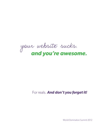
- 1. your website sucks. and you’re awesome. For reals. And don’t you forget it! World Domination Summit 2012
- 2. This Workbook Belongs to the Fantabulous: {Your Name} who just happens to be: {Insert Awesomized Title Here}
- 3. Section One: Your Core Values. Boo-ya. Chances are, you’ve discovered what your core values are time and time again. You’ve done the worksheets. You’ve gone through coaching (or are a coach!) to discover your innermost workings. And that’s rockin’. But they don’t mean anything in the context of your website if you’re ignoring them when selecting colour palettes, texture, patterns, and typography. In fact, by ignoring (or under- utilizing) them, you’re doing your site a pretty enormous disservice. The context gets completely lost. Or, worse, it’s fucked five ways to next Saturday. (Gasp. FUBAR, even!) So, we’re going to take a few minutes to work through your core values. First, you’re going to take a look at the (very) long list of core values that I’ve provided and select your top twenty. Second, you’re going to ask yourself a few key questions to drive down those core values to your top ten. And finally, for the sake of your visual language’s simplicity, you’ll narrow it down to five. Read on, you crazy diamond.
- 4. Write down 20 values in the space below. Choose what feels good to you. Go with your gut. First instinct. Don’t edit. Remember to use the Big Shiny List that’s at the end of this section! 1 2 3 4 5 6 7 8 9 10 11 12 13 14
- 6. From the list of words above, choose the ten values that are most important to you. You’re not losing pieces of yourself, sweetness. You’re merely prioritizing one over the other. It’s important when you piece together your visual language. Assign numbers to your Top Ten. Doesn’t need to be ordered. It’s just how we’re going to keep track of who’s in the final five. Why did you choose those ten over the other? From the list of 10, choose only 5 of the most important. You can mark them with checkmarks, just for the sake of posterity. Why did you choose those five over the other?
- 7. From the list of 5 reduce to 3 values, if you can. If you can’t, that’s cool too! Why are these your final choice? If you managed to get to the final three, you’re friggen amazing! It took me years to get to my final three. (Seriously. If you only knew.) List ‘em here. 1. 2. 3.
- 8. The Big Shiny List o’ Values Abundance Audacity Cleanliness Craftiness Acceptance Availability Clear-mindedness Creativity Accessibility Awareness Cleverness Credibility Accomplishment Awe Closeness Cunning Accuracy Balance Comfort Curiosity Achievement Beauty Commitment Daring Acknowledgement Being the best Compassion Decisiveness Activeness Belonging Completion Decorum Adaptability Benevolence Composure Deference Adoration Bliss Concentration Delight Adroitness Boldness Confidence Dependability Adventure Bravery Conformity Depth Affection Brilliance Congruency Desire Affluence Buoyancy Connection Determination Aggressiveness Calmness Consciousness Devotion Agility Camaraderie Consistency Devoutness Alertness Candor Contentment Dexterity Altruism Capability Continuity Dignity Ambition Care Contribution Diligence Amusement Carefulness Control Direction Anticipation Celebrity Conviction Directness Appreciation Certainty Conviviality Discipline Approachability Challenge Coolness Discovery Articulacy Charity Cooperation Discretion Assertiveness Charm Cordiality Diversity Assurance Chastity Correctness Dominance Attentiveness Cheerfulness Courage Dreaming Attractiveness Clarity Courtesy Drive
- 9. Duty Fascination Helpfulness Kindness Dynamism Fashion Heroism Knowledge Eagerness Fearlessness Holiness Leadership Economy Ferocity Honesty Learning Ecstasy Fidelity Honor Liberation Education Fierceness Hopefulness Liberty Effectiveness Financial Hospitality Liveliness Efficiency independence Humility Logic Elation Firmness Humor Longevity Elegance Fitness Hygiene Love Empathy Flexibility Imagination Loyalty Encouragement Flow Impact Majesty Endurance Fluency Impartiality Making a difference Energy Focus Independence Mastery Enjoyment Fortitude Industry Maturity Entertainment Frankness Ingenuity Meekness Enthusiasm Freedom Inquisitiveness Mellowness Excellence Friendliness Insightfulness Meticulousness Excitement Frugality Inspiration Mindfulness Exhilaration Fun Integrity Modesty Expectancy Gallantry Intelligence Motivation Expediency Generosity Intensity Mysteriousness Experience Gentility Intimacy Neatness Expertise Giving Intrepidness Nerve Exploration Grace Introversion Obedience Expressiveness Gratitude Intuition Open-mindedness Extravagance Gregariousness Intuitiveness Openness Extroversion Growth Inventiveness Optimism Exuberance Guidance Investing Order Fairness Happiness Joy Organization Faith Harmony Judiciousness Originality Fame Health Justice Outlandishness Family Heart Keenness Outrageousness
- 10. Passion Recognition Shrewdness Timeliness Peace Recreation Significance Traditionalism Perceptiveness Refinement Silence Tranquility Perfection Reflection Silliness Transcendence Perkiness Relaxation Simplicity Trust Perseverance Reliability Sincerity Trustworthiness Persistence Religiousness Skillfulness Truth Persuasiveness Resilience Solidarity Understanding Philanthropy Resolution Solitude Unflappability Piety Resolve Soundness Uniqueness Playfulness Resourcefulness Speed Unity Pleasantness Respect Spirit Usefulness Pleasure Rest Spirituality Utility Poise Restraint Spontaneity Valor Polish Reverence Spunk Variety Popularity Richness Stability Victory Potency Rigor Stealth Vigor Power Sacredness Stillness Virtue Practicality Sacrifice Strength Vision Pragmatism Sagacity Structure Vitality Precision Saintliness Success Vivacity Preparedness Sanguinity Support Warmth Presence Satisfaction Supremacy Watchfulness Privacy Security Surprise Wealth Proactivity Self-control Sympathy Willfulness Professionalism Selflessness Synergy Willingness Prosperity Self-reliance Teamwork Winning Prudence Sensitivity Temperance Wisdom Punctuality Sensuality Thankfulness Wittiness Purity Serenity Thoroughness Wonder Realism Service Thoughtfulness Youthfulness Reason Sexuality Thrift Zeal Reasonableness Sharing Tidiness
- 11. Section Two: Metaphorically Speaking You wouldn’t think that metaphors would have any place in designing your website, amirite? I used to think the same thing — it was all Photoshop and slicing for HTML back in the early days. When I discovered the power of metaphors, let alone visual metaphors, it was a game changer. Bet you a tattoo that it’ll be a game changer for your website, too. In this section, we’re going to explore written language in order to craft your visual language. First: word and concept association — whatever you think of when you look at your core values, you write that down. No editing! Second: we’ll take the word and concept association and translate them into visuals. Tasty, tasty visuals.
- 12. a few things that come to mind Core value: Leads me to thinking about: Core value: Leads me to thinking about: Core value: Leads me to thinking about: Core value: Leads me to thinking about:
- 13. Core value: Leads me to thinking about: Visually Speaking Core value: A few visuals: Core value: A few visuals: Core value: A few visuals:
- 14. Core value: A few visuals: Core value: A few visuals:
- 15. Section Three: Your Website’s Feelings Your website has feelings — real, palpable emotions that are conveyed through colour, typography, layout style, and writing voice. When I first started designing websites, I never thought about its feelings or the context behind it. It was just an artistic expression of colour, type, and pattern. Sometimes, I could justify why I was doing something. Most often, I couldn’t. By taking emotional context into consideration, your website will be able to engage your Perfect People. But before we get into the juiciness of colour, type, pattern, layout, and all that visual jazz... we need to create a visual representation of how you want your website to feel. And we’ll do that with pictures. Yay pictures! However, since we’re at WDS and I couldn’t carry 100+ magazines with me across the border (well, on the train, really), we’re going to have to skip this portion. However, when you get home (or back to your hotel room, even), use your core values to drum up your website’s mood board. Pinterest is a helluva tool, as is ImgSpark.com and good ol’ paper cutting and pasting. True story. When you’re finished, keep that representation close at hand when you’re ready to get your hands on the website. It’s pretty damn crucial.
- 16. Section Four: Colour You Awesome Colours are an evocative method of communication that often happens on a subconscious level. We all know basic colour theory. Elementary school art class was an excellent provider of glue, glitter, and the egregiously useful colour wheel. We’re taught that red, yellow, and blue make up the primary colours while orange, green, and purple make up the secondary colours; all the other colours (like indigo, magenta, and sea-foam) are considered tertiary. Personally, I loved learning about colour when I was little. It helped me understand why my mother didn’t want me wearing certain colours together. Something about it hurting her eyes didn’t really persuade me not to pair purple, blue, and orange; it seemed perfectly rational to be bright until I learned that there was an actual science behind colour. Colours and their meanings has also been something of a hot topic for me. They permeate every culture in a variety of ways. In one culture, white may suggest purity and innocence. In another, it means death. And while cultural connotation is just one way of gauging colour, it’s often the most effective. It provides perspective. If your target market is a particular cultural heritage, then adhering to that culture’s perception of colour is very important. It also acts as the backbone of your identity; as a visual representation of who you are and what you do. When people ask you about your favourite colours, do you know why they’re your favourites?
- 17. An introduction to colour psychology White: purity, innocence, and perfection. White is also used lots for charities and non-profit organizations to denote something good and positive. Black: power, elegance, and wealth. Black is a staple of many designs as it makes a bold statement. That and it’s damn good as a colour for content. Green: nature, growth, and harmony. Green is often used in medical logos, as well as eco-friendly products. In web design, it attracts youthful audiences. Blue: calm, creativity, and intelligence. Blue is reminiscent of Earth and water. It’s beautiful and tranquil. If you’re selling food, avoid this colour as it suppresses appetite. Purple: prestige, royalty, and luxury. It combines the tranquility of blue with the passion and energy of red. It’s often used in children’s products. Red: passion, pride, and strength. Red increases enthusiasm and energy. It also encourages action and confidence. Use red to draw attention to elements. Orange: youth, warmth, and fun. Orange is a polarizing colour that people either love or hate. It stimulates appetite and mental activity. Yellow: optimism, enlightenment, and happiness. Yellow stimulates creativity and encourages communication.
- 18. All About the All about the colour wheel! Colour Wheel Chances are good that you’re familiar with the colour wheel. It’s a visual representation of primary, secondary, and tertiary colours within the colour spectrum. The wheel is an excellent tool to find which colours play nicely with others. If my mama had used a colour wheel to demonstrate why that rather lurid combination of colours I so enjoyed was oh-so-wrong... I might’ve spared myself the tears and angst over nothin’. I still think I looked like a fashion supastar. Childhood colour faux pas aside, the colour wheel’s power is indisputable. You can choose your dominant colour, run your finger along the wheel, and find its neighbours, its opposites, and a whole lot of visual harmony in the process.
- 19. There are five major colour schemes: monochromatic, analogous, complementary, split complementary, and triadic. Monochromatic: all colours fall into the same group. There is an unquestionable elegance to using all of one colour, whatever that colour may be. It’s clean and minimalist. Analogous: uses colours that are adjacent to one another on the colour wheel. One colour is chosen as dominant, while the others enrich the palette. Although similar to the monochromatic scheme, an analogous scheme is far more powerful. Complementary: uses colours that are on opposite ends of the colour wheel. It creates strong tension through high contrast. It’s high energy and bold. Split Complementary: a variation of the complementary colour scheme. It uses and additional contrasting colour to the dominant colour, which maintains the high contrast without the tension. It’s not exactly demure but it does lend itself well to brands that are bold without being overly energetic. Triadic: uses three colours equally spaced around the colour wheel. It creates harmony, balance, and visual contrast. The triadic scheme is incredibly popular amongst artists and creatives for the options that it presents.
- 20. My Ideal Colours Colour Name Reasoning
- 21. Section Five: Sweet, sweet typography Ever notice how something totally heinous can look perfectly harmless with the right typeface? Imagine what it can do for your awesome self! There’s far too much stock typography going on around the internet. I’m a huge fan of Helvetica and Georgia but with the advances in type on the web, we need to be branching out and choosing some different typefaces that really represent our core values. (If Geogia or Helvetica really do represent you, do it up! Otherwise, look elsewhere.) We’re going to go through the different classifications of type, excluding the more esoteric ones (like humanist serifs — no need to get into that, unless you’re already a typophile, like yours truly.) Once you’ve got a good grasp on that, I’ll show you how to find your perfect typeface and then how to pick complementary type. Oh, it’s on. This is one of the best bits!
- 22. Typeface Classifcation. Woo! Let’s introduce you to the three different kinds of typefaces. Classification is handy. Serif. Serif. Serif. Serif. All serif typefaces fall into four categories: Old Style (Garamond), Transitional (Times New Roman), Modern (Bodini), and Slab (Museo). Serifs are recognizable by their “serifs” — the ligatures have extra bits in contrast with... Sans-Serif. Sans-Serif. Sans-Serif. Just as its name suggests, sans-serif typefaces are bereft of the serif ligatures. These fall into three categories: Geometric (Futura), Grotesk (Akzidenz Grotesk), and Humanist (Helvetica). Script. Script. Just as it sounds, script is usually either formal calligraphy (Aphrodite) or handwritten (Nothing You Could Do) typefaces. Well-crafted scripts are both scalable and readable. There are seven other type classifications but let’s not get carried away. These are the best so let’s stick to it and figure out how to choose the right one.
- 23. Choosing the “One”. (Ones?) Now that we’ve determined what kinds of typefaces there are, how the hell do you get around to choosing which one is going to work with your site? Flip back to your chosen core values. Remember: these are the emotions that you’re looking to convey in your digital realm — don’t run off into outer space on us. Each typeface has a personality that’s aching to be revealed. Let’s say that your core values are: joy, patience, and community. Joy means that we need a vibrant typeface that makes us smile from ear to ear. Patience needs more temperance — something that allows us to sigh deeply. And finally, community brings it all together. Joyful — Cassia What do you feel when you look at Cassia? If it’s Joy, then we did our job. Are you smiling? I sure hope so! (Do you need a hug? Those are free.) Now that we’ve got our Joyful typeface, we need something to pair with it. So let’s get into how to pair typefaces the right way. (Because yes, there is a not-so-right way.)
- 24. Complementary Excellence The one thing to remember when pairing typefaces is to keep one thing consistent and let one thing vary. There are a number of ways to tackle this. (Big thank you to H&FJ for these examples!) Use typefaces with complementary moods to evoke an energetic, upbeat air. It’s the interplay between fonts that gives them energy. The more distant the moods in a your chosen typefaces, the spicier the design will be. Here, three fonts with distinctive silhouettes have been chosen for their contrasting dispositions: the unabashed toughness of Tungsten is a foil for both Archer’s sweetness, and the cheekiness of Gotham Rounded.
- 25. Mix typefaces from the same historical period whose families have different features. Three type families with nineteenth century roots, thrown together in a cheerful typographic riot. Choosing type families with different features helps prevent redundancy: here, the brawny variations of The Proteus Project are reserved for headings, Sentinel’s six weights of romans and italics recommend it to text, and Knockout’s nine different widths helps the sans-serif fill in the cracks. Mix typefaces with similar proportions and give each a different role.
- 26. Cassia needs a friend (or two) in the form of a typeface. Let’s choose one that fits our values and the uses the techniques we just learned. Refresher for our core values: joy, patience, and community. Cassia: cheeky, joyful, irreverant Geosans: wise, calm, patient We’ve used complementary moods as well as an obvious contrasting pairing of serif and sans-serif typefaces. Cassia satisfies our need for joy and irreverance. Geosans exercises temperance and contemplates quietly. Although we don’t have time for you to run online and find your perfect type, take a few minutes (an hour, if you’re already a typophile) to check out the selection on myfonts.com, which is my font search engine of choice. My Typefaces Primary Typeface: Complementary:
- 27. Section Six:Texture, Pattern, & Visual Goodies Not everyone loves texture or pattern. In fact, I know some people that are downright allergic to such things. They prefer minimalist approaches and, y’know what, if you fit into that camp, you can ignore this section. Why? Because there’s no sense in forcing it, sweetness. For those of us that love texture and pattern, let’s see some examples. Remember that our core values are still: joy, patience, and community. Joy! Patience. Community. See what I did there? So can you. There are plenty of royalty-free texture and stock- photography places on the interwebs. I suggest you go and ask the Wise Sage known as Google for the best ones.