
Empfohlen
Weitere ähnliche Inhalte
Andere mochten auch
Andere mochten auch (12)
Photographic Compositional Elements
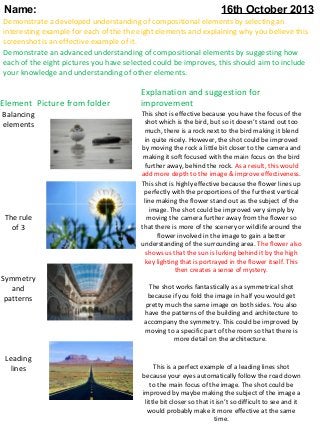
- 1. Name: 16th October 2013 Demonstrate a developed understanding of compositional elements by selecting an interesting example for each of the the eight elements and explaining why you believe this screenshot is an effective example of it. Demonstrate an advanced understanding of compositional elements by suggesting how each of the eight pictures you have selected could be improves, this should aim to include your knowledge and understanding of other elements. Element Picture from folder Balancing elements The rule of 3 Symmetry and patterns Leading lines Explanation and suggestion for improvement This shot is effective because you have the focus of the shot which is the bird, but so it doesn’t stand out too much, there is a rock next to the bird making it blend in quite nicely. However, the shot could be improved by moving the rock a little bit closer to the camera and making it soft focused with the main focus on the bird further away, behind the rock. As a result, this would add more depth to the image & improve effectiveness. This shot is highly effective because the flower lines up perfectly with the proportions of the furthest vertical line making the flower stand out as the subject of the image. The shot could be improved very simply by moving the camera further away from the flower so that there is more of the scenery or wildlife around the flower involved in the image to gain a better understanding of the surrounding area. The flower also shows us that the sun is lurking behind it by the high key lighting that is portrayed in the flower itself. This then creates a sense of mystery. The shot works fantastically as a symmetrical shot because if you fold the image in half you would get pretty much the same image on both sides. You also have the patterns of the building and architecture to accompany the symmetry. This could be improved by moving to a specific part of the room so that there is more detail on the architecture. This is a perfect example of a leading lines shot because your eyes automatically follow the road down to the main focus of the image. The shot could be improved by maybe making the subject of the image a little bit closer so that it isn’t so difficult to see and it would probably make it more effective at the same time.
- 2. Element Background Viewpoint Framing Picture from folder Explanation and suggestion for improvement Again, this is exactly what a background shot should look like, it should have a black muted out background and a feature/subject of the image should be standing out. So, as an example, this works very well. However it could be improved by making the man’s face a bit less shadowed so that it is more defined and standing out to the viewer rather than kind of lurking like it is at the moment. I personally, don’t think that this viewpoint shot is very effective. It’s looking up at the building so because the building is so big you don’t really see much detail. I think the shot could be improved by the shot being taken from the top looking down to the ground because then you will have the same image, just the other way round whilst allowing the detail of the old building to be captured in the shot much better than it is being captured at the moment from the ground. I would also get rid of the Dutch angle and make the photo level so that it’s more clear and remove the double focus of the ruin on the left over the top of the camera. This shot is highly successful because it does exactly what a framing shot is supposed to do. The camera is inside a cave and is looking out to the subject of the image which is the old temple. It makes the temple stand out and adds to the dramatic effect that is being aimed for because it’s as though you’ve just walked through the cave and have found this amazing temple. The shot could be improved by being a little bit closer so that the temple itself has more depth or put people in the shot going towards the temple. Depth This shot gives us a great amount of depth due to the layers that are created by the trees and the different colours they are. Some are green, some are yellow and this breaks the image up to make it seem as though it’s all getting further away creating new dimensions to an otherwise rather plain image. This shot could be improved by maybe having people walking alongside the trees to add even more depth and show just how far back down the path the trees go!