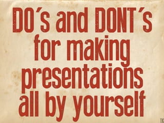
Infographics pt.3: „For a fistful of Dollars“ – DO's and DONT's for making presentations all by yourself
•
0 gefällt mir•165 views

Useful Tips and Tricks on how you can make a neat Presentation on your own, just „for a fistful of Dollars“ ;) (Refering to „Infographics pt.1 - The Good, the Bad and the Ugly“ and „Infographics pt.2 - The Magnificent Seven“)

Empfohlen
Empfohlen
Weitere ähnliche Inhalte
Mehr von Tim Karsko
Mehr von Tim Karsko (19)
Kürzlich hochgeladen
Kürzlich hochgeladen (20)
Infographics pt.3: „For a fistful of Dollars“ – DO's and DONT's for making presentations all by yourself
- 1. DO's and DONT's for making presentations all by yourself TK
- 2. This is part three of a three parted presentation concerning infographics and presentations K TK
- 3. Look for the first part (about good and bad examples of inofgraphics) under the title of: K TK
- 5. Or the second part (about the seven most used styles of infographics ) under the title of: K TK
- 6. K TK
- 7. Part three is about how to make nice presentations all by yourself, without paying any expensive designers, so that you can do it just...K TK
- 8. TK
- 12. Use a grid ! K TK
- 13. Use a grid ! for example... K TK
- 14. 1024 x 768 pixelsK TK
- 15. Devidable by 4 or 6K TK
- 16. 16 x K TK
- 17. 16 x 12 partsK TK
- 18. partitioned 4 x 4 TK
- 19. K TK
- 20. Looks like: K TK
- 21. K TK
- 22. Use it for easy aligning K TK
- 23. So things like this: K TK
- 24. Won't happen annymore :) K TK
- 26. A very, very, very old but still working way (came from book printing) to get a nice frame for your presentation K TK
- 27. K TK
- 28. K TK
- 29. K TK
- 30. K TK
- 31. TK
- 32. K TK
- 33. scaleable K TK
- 34. K TK
- 35. K TK
- 36. K TK
- 38. Very useful if your presentation is consisting of mainly big pictures with just not too much copy in it K TK
- 39. divided 3 by 3 K TK
- 40. > hot < fixing points K TK
- 41. K
- 43. Some Copy...
- 44. Lines TK
- 45. Make lines visible... 8 pt 8 pt 8 pt K TK
- 46. ...too thin... 8 pt 1 pt8 pt 1 pt8 pt 1 pt K TK
- 47. ...just won't work! 8 pt 1 pt8 pt 1 pt8 pt 1 pt K TK
- 48. Take different widths... 8 pt 8 pt 22 pt K TK
- 49. ...to make the difference... 8 pt 5 pt8 pt 4 pt22 pt 3 pt K TK
- 50. ...easy to recognize. 8 pt 5 pt8 pt 4 pt22 pt 3 pt K TK
- 51. Use maximum 2 line widths 8 pt 8 pt 18 pt TK
- 52. ...more are just... 8 pt 1 pt8 pt 24 pt18 pt 8 pt K TK
- 53. ...distracting. 8 pt 1 pt8 pt 24 pt18 pt 8 pt K TK
- 54. Alternative for outlines: K TK
- 55. Try colours instead :) K TK
- 56. Arrows TK
- 57. Use one style of ending... K TK
- 59. ...could be missleading. K TK
- 61. Bored of arrows ? Step 1 Step 2 Step 3 K TK
- 62. Why not try shapes ? Step 1 Step 2 Step 3 Step 1 Step 2 Step 3 K TK
- 63. Shapes TK
- 65. ...should be used for... NY ? Q NY ? Q K TK
- 67. More than 4 shapes... K TK
- 68. ...are just too much... K TK
- 71. Use colour instead K TK
- 72. Use colour instead K TK
- 73. Another better practice: K TK
- 74. Try images instead K TK
- 75. Try images instead K TK
- 76. Size TK
- 77. Size means importance... More important Not important K TK
- 78. ...the bigger the size... More important More important Not important Not important K TK
- 79. ...the more important it is. More important More important Not important Not important K TK
- 80. GiraffeMouse Size is also relationship K TK
- 81. Giraffe GiraffeMouse Mouse For example: K TK
- 82. Giraffe GiraffeMouse Mouse Somehow obvious ;) K TK
- 83. Descriptions too long? Mouse Mouse with an umbrella TK
- 84. Best practice: Substitutes Mouse A B Mouse with an umbrella A: Mouse B: Mouse with an umbrella K TK
- 85. Best practice: Substitutes Mouse A B Mouse with an umbrella A: Mouse B: Mouse with an umbrella K TK
- 86. Size means also hierarchy MouthNoseEyes Face K TK
- 87. So this should be better: MouthNoseEyes Face MouthNoseEyes Face K TK
- 89. Nesting TK
- 90. Not too much on one slide K TK
- 91. Because nobody gets it! K TK
- 92. Better practise: Split it up! K TK
- 93. In as much little pieces... K TK
- 94. ...as you need... K TK
- 95. ...to make it clear... K TK
- 96. ...and easy to understand. K TK
- 97. Colour TK
- 98. Your colour options are: Background Lines & Fillings Copy & HighlightsK TK
- 99. Don't use coloured arrows K TK
- 100. dashed are better too see K TK
- 101. from far or in black&white K TK
- 102. Exception: Big arrows K TK
- 104. ...and / or Borders... K TK
- 105. ...give you: Big choice ! With you combos three get work only will to colours enough with K TK
- 106. Colour can be helpful... Yes Yes Yes No No t.b.d t.b.d t.b.d t.b.d K TK
- 107. ...to make things obvious... Yes Yes Yes No No t.b.d t.b.d t.b.d t.b.d Yes Yes Yes No No t.b.d t.b.d t.b.d t.b.d K TK
- 108. ...and faster to detect. Yes Yes Yes No No t.b.d t.b.d t.b.d t.b.d Yes Yes Yes No No t.b.d t.b.d t.b.d t.b.d K TK
- 109. Yes Yes Yes No No t.b.d t.b.d t.b.d t.b.d Be aware about b&w print TK
- 110. Yes Yes Yes No No t.b.d t.b.d t.b.d t.b.d Yes Yes Yes No No t.b.d t.b.d t.b.d t.b.d Colours may not work... K TK
- 111. Yes Yes Yes No No t.b.d t.b.d t.b.d t.b.d Yes Yes Yes No No t.b.d t.b.d t.b.d t.b.d ...so you may use... K TK
- 112. Yes Yes Yes No No t.b.d t.b.d t.b.d t.b.d Yes Yes Yes No No t.b.d t.b.d t.b.d t.b.d ...borders and contrast. K TK
- 113. No pale colours in front... 10% black K TK
- 114. ...they tend to fade out... 30% black 10% black K TK
- 115. ...so better be safe ;) 30% black 10% black K TK
- 117. ...gradients & shadows... K TK
- 119. ...can't show them at all ! K TK
- 120. Dark on brightK TK
- 121. Is always good to read and has enough contrast so that you don't have to care about the projector or any other lightning conditions... K TK
- 122. Bright on darkK
- 123. Is of course very sexy but doesn't work in every case, sometimes it just depends on your projector and could be a big... TK
- 124. Bright on darkK
- 125. Fonts TK
- 126. Don't let your presentation become an optician test because it's a K TK
- 127. K
- 128. Just try to make everything easy to read and don't use... TK
- 129. Too much info or text, K TK
- 130. Too much info or text, like this for example would be too much and is even though not as easy to read as it should be. Therefore, please be kind with your clients and: Cut the crap !K TK
- 131. Not too much info or text, like this for example would be too much and is even though not as easy to read as it should be. Therefore, please be kind with your clients and: Cut the crap !K TK
- 132. Cut the Crap !K TK
- 133. Don't use fancy Fonts Zapfino Curlz MT Copperplate Papyrus Comic Sans ... TK
- 134. Funny but not very useful Zapfino Curlz MT Copperplate Papyrus Comic Sans ... Frutiger Helvetica Futura Univers Arial Gill Sans K TK
- 135. Use Fonts with many styles Zapfino Curlz MT Copperplate Papyrus Comic Sans ... Frutiger Helvetica Futura Univers Arial Gill Sans K TK
- 136. Use only one font family C D A b K TK
- 137. It's distracting, so: C D A b BA C D K TK
- 138. Don't mix it up C D A b BA C D K TK
- 139. One Font is enough... Frutiger Helvetica Univers TK
- 140. ...in just two styles... Frutiger Helvetica Univers Frutiger Roman Frutiger Black Helvetica Roman Helvetica Bold Univers Roman Univers Black K TK
- 141. ...for example Frutiger... Frutiger Frutiger Roman Frutiger Black K TK
- 142. ...in just two Sizes : Frutiger: Headline 80pt Copy: The lazy dog... 40pt Chapter 80pt Subhead 40pt Copy: The lazy dog... 40pt Markings 40pt K TK
- 143. What about italic ? Frutiger: Headline Copy: The lazy dog... Chapter Subhead Copy: The lazy dog... Markings K TK
- 144. Not realy recognizable ! Frutiger: Headline Copy: The lazy dog... Chapter Subhead Copy: The lazy dog... Markings K TK
- 145. Frutiger: Headline Copy: The lazy dog... Chapter Subhead Copy: The lazy dog... Markings The problem with versal... TK
- 146. Frutiger: Headline Copy: The lazy dog... Chapter Subhead Copy: The lazy dog... Markings Versal is hard to read K TK
- 147. The quick brown fox jumps over the lazy dog. Headline Copy: The lazy dog... Chapter Subhead Copy: The lazy dog... Markings Use it just for short lines K TK
- 148. The quick brown fox jumps over the lazy dog. The quick brown fox jumps over the lazy dog. Headline Copy: The lazy dog... Chapter Subhead Copy: The lazy dog... Markings And never for long-copy K TK
- 149. The quick brown fox jumps over the lazy dog. The quick brown fox jumps over the lazy dog. Headline Copy: The lazy dog... Chapter Subhead Copy: The lazy dog... Markings Never. K TK
- 150. Don't mix font styles A B TK
- 151. Use only one style... A B A B A B K TK
- 152. ...for only one theme. A B A B A B K TK
- 153. Don't mix up lettersizes, A A BC A ABC K TK
- 154. ...because it is very... A ABC A A BC A ABC K TK
- 155. ...very confusing. A ABC A A BC A ABC K TK
- 157. Firstsquare A: First square A CB Secondsquare B: Second square Thirdsquare C: Third square Try to use substitues K TK
- 158. Firstsquare A: First square A CB Secondsquare B: Second square Thirdsquare C: Third square Much more comfortable K TK
- 159. Firstsquare First square Secondsquare Second square Thirdsquare Third square Or maybe some colours K TK
- 160. Don't play with your copy Fir st cir cle Seco nd c ircle K TK
- 161. Again: Try substitues... A: First circle A B B: Second circle Fir st cir cle Seco nd c ircle K TK
- 162. ...or maybe... A: First circle A B B: Second circle Fir st cir cle Seco nd c ircle K TK
- 163. ...some colours. First circle Second circle Fir st cir cle Seco nd c ircle K TK
- 164. Result TK
- 165. Keeping all this in mind, you won't K TK
- 166. K
- 167. ...and will be able to make a nice presentation on your own, just... TK
- 169. ;)K TK
- 170. This presentation was made by Tim Karsko Hope you liked it :) K TK
- 171. All Rights are FreeOR situated bytheauthorsK TK