
Empfohlen
Weitere ähnliche Inhalte
Was ist angesagt?
Was ist angesagt? (20)
Andere mochten auch
Ähnlich wie NEW. How effective is the combination of my main
Ähnlich wie NEW. How effective is the combination of my main (20)
Mehr von thedawnishere
Kürzlich hochgeladen
Kürzlich hochgeladen (20)
NEW. How effective is the combination of my main
- 1. How effective is the combination of my main product and ancillary tasks? Monika Polak
- 2. Due to a drop of record sales in recent years which is caused mainly by illegal downloading, it’s important for a band to have a strong brand and image through the consistency of themes. Before I created my main and ancillary products I analysed the real existing ones (Green Day), to get that feel of what the audience would expect and I’ve learned about the conventions typical for rock genre. Through the textual analyse of ‘Brand New Eyes’ by Paramore I’ve also understood the importance of the supporting texts and how they all bounce off of one another, making it important my texts all relate and are effective. I tried to keep in similar style and colour scheme. Bright colours + contrast + bold; makes it outstanding, freaky and crazy. I used same themes throughout my print work to make a connection- it would make it easier for the target audience to link it together; when they see an advert in the magazine and they really want to get a CD, by using same theme and editing I made it easy for them to recognise the right CD.
- 3. Link between video and print – newspaper theme and Ransom. Lady Gaga
- 4. Ransom is the practice of holding a prisoner to extort money or property to secure their release, or it can refer to the sum of money involved. From it: Ransom note is message formed from words or letters cut randomly from a magazine or newspaper in order to avoid using recognisable handwriting- threats/ kidnap letter etc. link between print and video (paper dress; digipak fonts; ‘murder’ theme, violence etc.)
- 5. Fonts are significant for a band; it’s like signature, shows their character and reflects the genre. Here and throughout the whole digipak I used font called planned obsolescence planNed ObsoleScencE - where letters are all different. I used it, as it makes me think about Ransom note. I placed the band’s name in the middle- to keep symmetry and it is also on vocalist’s eyes – to cover her them, to make it look like blindfold. All that goes well with the album title ‘murder city’. I used vocalist’s full sized face to promote her and the band. Colour scheme and editing is same as the one used on digipak; by adding colourful flashes in my music video I made a connection between it and the print work.
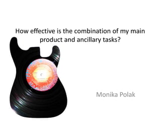
- 6. With my print work I used vinyl disks to reflect individuality of a lost music era and used it as art.
- 7. For the CD front cover I decided to use a picture of a hand covered with blood. It highlights the genre; blood links to the ‘murder city’ name of the album; the songs are about all the bad things such as affair, murder etc. It also links to the music video- some scenes are on the cemetery. A girl killed a guy and now he’s buried. I think my digipak, magazine advert and the video itself are what my target audience would expect it to be.
- 8. For the back panel of the digipak I used band’s picture. And vinyls again as the background. I added music recording companies’ logo and bar code to make it look realistic. On the inside panel I added a short message from the band to make it more personal. It links with the video, as there she’s telling us a story from her life.
- 9. What my friends think about it? Aaron says: “Very effective, the way you used some of the effects and colour type things, goes well with the poster. and with the video not been like it all the way through it made it effective because it was enjoyable to watch” Jordan says: “Very! they're kind of zany pop punkyindi-ishimagery; bright and vibrant; weird in a good abstract crazy way” Ryan says: “the cd cover gave a good impression and made me expect the video to be in some same theme, which it was” That shows that the combination of my main product with ancillary tasks was effective, as people recognised the genre and they could easily link the video with prints. Yaay !