
Empfohlen
Weitere ähnliche Inhalte
Was ist angesagt?
Was ist angesagt? (20)
Andere mochten auch
Andere mochten auch (16)
Ähnlich wie Printscreen front magazine
Ähnlich wie Printscreen front magazine (20)
Printscreen front magazine
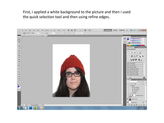
- 1. First, i applied a white background to the picture and then i used the quick selection tool and then using refine edges.
- 2. I pasted the copied and pasted the picture onto my magazine base and adjusted the lighting and contrast on the image.
- 3. Next, i add the masthead onto my image of my magazine, My magazine title is called ‘The P’ and i used yellow writing to give a bold look to it.
- 4. Next, i add smaller text just below my mast head to tell the readers what issue and date it was sent out towards.
- 5. Then i add the magazines slogan below the mast head and write my first major story in the front cover and put the text in black and in a stroke effect to look bold.
- 6. I write the second story and do the same font, size and style as the first story.
- 7. On this layer, i add a barcode in the far bottom left corner of the front page.
- 8. I add the first title of the story using a bigger font, grey font colour, and the stroke effect to make it bold.
- 9. In the far right corner i have rotated the text to suite a little add on for the readers, i colour the font in grey.
- 10. I do the second story title by using the same techniques as the first one .
- 11. I add the description text with the second story title.
- 12. Add yet another grey story title for the third one...
- 13. ...And the fourth story title.
- 14. For the fourth story title, i add its description in black as the other story descriptions.
- 15. Just right above the barcode, i add the price of my magazine in a smaller font so it does not get in the way of the other text.
- 16. Finally, i add yellow text to the corner with the other smaller grey text.