
Empfohlen
Weitere ähnliche Inhalte
Was ist angesagt?
Andere mochten auch
Andere mochten auch (9)
Ähnlich wie Modeling Healthy Habits
Ähnlich wie Modeling Healthy Habits (20)
Modeling Healthy Habits
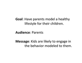
- 1. Goal: Have parents model a healthy lifestyle for their children. Audience: Parents Message: Kids are likely to engage in the behavior modeled to them.
- 2. For my first slide I decided that I wanted to try and use a visual to impact parents and make them think about what they were modeling to their children. The following slide was my first attempt at a design. I didn’t end up being very happy with this slide. I think it comes on too strong and I think the picture is way to large.
- 4. The next revision was when we were playing with contrast. I wanted to show the contrast between what we say to our children and what we actually do. My intent was to show that while we sit around watching TV or playing on our computers, we tell our kids to go outside. I was thinking about how when we were kids we all raced around on our bikes without even thinking about it. Sometimes that seems like a foreign concept to kids today. I wanted the message of this particular slide to be the kid playing outside on the bike today could easily become the man sitting on the couch tomorrow. I also played with my sub heading and my title a little bit. I wasn’t so much liking the way it came across as aggressive. I like the change to the blue text box in the center.
- 6. The next slide was the week we played with alignment and proximity. This is by far my favorite image I used for this term. I really like the way I was able to wrap the text around the side of her face, keeping the message personal to her. However, my favorite part of this is the way the little girl’s eyes drill right into you. It’s like she is looking for direction and guidance from us, the audience. What will she become? I still kept the same titles and sub headings with this that I had all along, but I kept the color to a minimum trying to emphasize the message.
- 8. The next design is my final design of my poster. This design stems from two different versions I have played with in the past two weeks. Last week when we were working with type, I decided to play with removing images completely. I had used so many different images but not changed my message at all during the entire term and I decided that I really wanted to try something different. My final design is a melding of my two favorite experiments. As I stated before, I really liked the little girl. What I didn’t like was the hostile way my message kept coming across. When I played with text alone I came up with the Eat Healthy language you will see in the final version. I really like the positive feel to that message rather than such a forceful warning of my other slides. I chose a Sans Serif font for the final because I like the feel of it and I chose to emphasize the word “healthy” in green for numerous reasons, including the connotation of eating healthy the color has. Overall, I am really pleased with the way this turned out. I think that there was a lot of work put into it and I think the message serves the intended audience well.