
Empfohlen
Weitere ähnliche Inhalte
Was ist angesagt?
Was ist angesagt? (20)
Andere mochten auch
Andere mochten auch (7)
Ähnlich wie Double 1
Ähnlich wie Double 1 (20)
Double 1
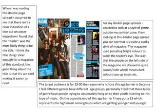
- 1. 16711453626070016711454682359The target audience is for 13-30 the reason why I chose this age barrier is because I feel different genres have different age groups, personally I feel that these types of genre have people trying to desperately hang on to their youth listening to this type of music. On the opposite end of this age barrier I have put a 13 which represents the high music social groups which are getting younger and younger. 00The target audience is for 13-30 the reason why I chose this age barrier is because I feel different genres have different age groups, personally I feel that these types of genre have people trying to desperately hang on to their youth listening to this type of music. On the opposite end of this age barrier I have put a 13 which represents the high music social groups which are getting younger and younger. -835572-536029When I was reading this double page spread it occurred to me that there isn’t a clear indication of a title but on closer inspection I found that the ‘’Radar’’ was the most likely thing to be the title. I think the title thing I clear enough for a magazine of this standard, the good thing about the title is that it’s san serif making it easier to read. 00When I was reading this double page spread it occurred to me that there isn’t a clear indication of a title but on closer inspection I found that the ‘’Radar’’ was the most likely thing to be the title. I think the title thing I clear enough for a magazine of this standard, the good thing about the title is that it’s san serif making it easier to read. 6027398472265For my double page spreads I decided to look at a style of genre outside my comfort zone. From looking at this double page spread you can see that it’s quite a punky style of magazine. The magazine used pulsating bright colours to catch the reader’s eye. The way that the people on the left side of the magazine are dressed is quite casual/indie which means dark colours lace up boots etc. 4000020000For my double page spreads I decided to look at a style of genre outside my comfort zone. From looking at this double page spread you can see that it’s quite a punky style of magazine. The magazine used pulsating bright colours to catch the reader’s eye. The way that the people on the left side of the magazine are dressed is quite casual/indie which means dark colours lace up boots etc. <br />