1. Font of title analysis
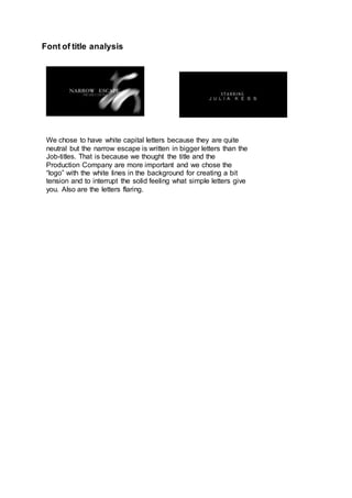
We chose to have white capital letters because they are quite
neutral but the narrow escape is written in bigger letters than the
Job-titles. That is because we thought the title and the
Production Company are more important and we chose the
“logo” with the white lines in the background for creating a bit
tension and to interrupt the solid feeling what simple letters give
you. Also are the letters flaring.