SlideShare ist ein Scribd-Unternehmen logo
1 von 8
5. How did you attract/address your audience?
Front Cover. “The masthead is very effective. It relates to other conventional magazines as the font is very simple and basic but still very eye-catching. The boldness stands out to the reader and emphasises the tone and texture of the background image.” “The cover image fits well into the genre of the magazine as the look is very seductive yet shows a lot of attitude. Her body language is very relaxed and the clothing choice fits well into the colour scheme. This shows consistency throughout the magazine as the same colours are used for the cover lines and masthead.  Her stance is very casual which shows confidence and this shows the use of a convention as you would find a similar image on other magazines. It attracts both males and females because females will see her as an idol and males will find her attractive. The image is very direct to the audience as she is looking straight at the camera.  This attracts a wider audience because of the image and colour scheme.”  “The background image works well with the genre of the magazine. It gives it a ‘rebellious’ and artistic effect. It emphasises the colour of the cover lines and makes the image stand out more. It challenges other conventions as you wouldn’t find an image like this as a whole background. This features attracts the audience as it is quite unusual instead of just having a plain background. It stands out instantly and fits in well with the colour palette.” “The topics of the cover lines attract my audience as they fit into the ‘rock’ genre and are massive in terms of music. By luring the audience in with lines like ‘new album special’ will make the audience want to look inside and read more information. The exclusive of the return of the artist also encourages the readers to read more as the large font and image complement each other and the layering effect works well as they link together.  These cover lines are similar to other conventional magazines because of the genre of the magazine. This will also attract my audience because if they enjoy rock music, bands of that genre will be included in the magazine.” “The font works well because it is very bold and eye-catching. Using two fonts is effective because it doesn’t take the focus off of any other features although creates an effective change to make it more interesting.  The layout of the cover lines is equally spread out and in order of subject so this makes it easier for the reader and informs them what they can expect inside the magazine. The play on words also works well underneath the large ‘Alex Storm’ as it just makes a difference from other magazines and challenges the convention. The different colours makes the font stand out as it creates a pattern.” “The barcode shows the use of other ‘common’ conventions and this makes it look more like a real magazine. Interesting cover lines such as ‘download lineup inside!’ attracts a wider audience as it makes them want to read the magazine.”
“The heading for the contents page is very effective as the black border emphasises the bold, white text. I like the layout of the masthead because it is very organised and the variety of colours works well. The information is just like other conventions as you would find this in other music magazine contents pages. The border sets a good layout for the whole page as it makes it look more organised and the ‘box’ effect is more consistent.”  “I like the font because it shows consistency from the front cover through to the contents page. This works well because it doesn’t take away the focus from any of the other conventions such as the images and cover lines themselves. It is also of a reasonable size – not too big and not too small.” “I think the larger image on the page is extremely effective because it stands out instantly to the reader and it is the first thing you look at. The image attracts the audience because it fits into the genre of the magazine and the pose is very appealing and unique. This challenges the conventions of other magazines as you might not find a similar image on their contents pages. The mid shot works well and the music equipment and accessories also shows consistency of the rock genre being made clear. The text box positioned on top of the image, in the corner shows the use of a convention as this is very common in other magazines. This addresses the information to the audience clearly and directly and shows that it  is related to the pictures.” “The topics that are included on the contents page fit into the rock genre really well. I like how organised each section is and the ‘box’ effect makes it relate to other conventional magazines.  The page attracts the audience because they can find specific information quickly and the font size is accurate and the images make the page more interesting.  The subheadings that are used would be found in any other music magazine such as Kerrang which creates the realistic aspect.  I like the idea of having a ‘quote of the week’ because the audience will be intrigued to what artists are saying each week. The colour scheme is also very appealing.” “The use of adverts is a good way of attracting audiences into the magazine itself. The image also works well because it shows what they could be a winner of and the information is made clear next to it on what they have to do so this attracts more readers. The picture is well cut out using software so this shows the use of conventions. Similar, good quality images would be found in other magazines.” “The subscriptions and smaller images are a good selling point of this contents page because they give the reader additional information without them having to read anything. The subscription also encourages them to read the ad and the images are a good way of filling in small spaces and making the page look more successful as a whole.” Contents Page.
Double Page Spread. “The heading and masthead follow conventions of a magazine as they are quite simple and basic but they stand out to the audience immediately. The colours work well together and the boldness of the text is emphasised from the plain, white background. I like how there is additional information at the beginning of the article so that the reader has a rough idea what the article is about before they read it. This attracts the audience as it cuts down the information for them.” “The image on this double page spread is extremely effective. It challenges other conventions of a magazine because it is very unique and different. The facial expressions and body language appeals to the audience as they can see the artists personality and can relate to it. The use of music equipment makes the rock genre consistent and the brick background once again makes her look more rebellious and has attitude. The image is very eye-catching and stands out to the audience immediately. This is effective as is attracts the audience and makes them want to read the article”.  “The little subheading layered on top of the large image shows the use of magazine conventions as this gives the audience a rough idea about what the article is about in just one phrase.” “The structure of the layout of the article is very appealing to the audience. It is very organised and the equal columns makes the article easier to read.  It is easy to see the link to other conventions of a music magazine as this is commonly used in other magazines. The change of the text colour between the question and answers also works well because it makes it clearer. I think the quote is effective and the reader will want to read this straight away so the larger font makes this easier for them. The article is also a good size and it is very detailed and interesting.” “I like the idea of having smaller boxed images at the bottom of the written article. It makes a clear link to the questions being asked. I also like the quality of the questions because they are very specific and are questions that the audience may be interested in asking them themselves. This is appealing to my audience because they find out the information of the artist that they wanted to hear about. The lines between each column is also effective and this challenges other conventions of magazines because they are not normally used a lot. The font is a good size and the small images create a good border between the end of the article and the information at the bottom of the page.”
Evaluation. For this section I have shown a range of people that fit into my  target audience to get feedback on what they think of each of my pages. This is so that I could find out how successful it was with fitting in with my target audience.  The people answered whether each convention and feature on my pages were attractive for their age range and social group or not. The feedback that I got was generally very successful and positive. By analysing each convention  I found out how iconography played a huge part in the process of making my magazine. I chose an artist who had a very ‘iconic’ appearance so this would attract a wider audience and appeals to both male and female. If the artist looked very boring and original, my magazine would not fit in with the rock genre and it wouldn’t have been as successful. After getting this feedback from people that fit into my target audience, it was easy to identify which features and conventions were the unique selling point of my magazine. People picked up on the effective layout, images, font and how well the magazine was written. Some even said how well it relates to other magazines which is a success as I took some conventions from different magazines, not just one. For example Kerrang, NME and Billboard.  During the process of making my magazine I asked similar questions to people who the magazine would appeal to so that I could put the features in as I went along.  I think this is why the magazine has done so well at attracting my audience because I took different conventions from different magazines and either developed or challenged them.  Each convention has a different effect at appealing to the reader whether its an image or even the text. This interview of the target interview has been successful as it has helped me identify how successful how each feature on the pages have attracted my audience and whether they liked it or not.
5.
5.
5.

Weitere ähnliche Inhalte

Was ist angesagt?

Textual analysis
Textual analysisTextual analysis
Textual analysis
gracesykes
 
Music Magazine Analysis: Lyrics
Music Magazine Analysis: LyricsMusic Magazine Analysis: Lyrics
Music Magazine Analysis: Lyrics
shehasnotime1135
 
BACKSTAGE Music Magazine Evaluation
BACKSTAGE Music Magazine EvaluationBACKSTAGE Music Magazine Evaluation
BACKSTAGE Music Magazine Evaluation
Sasha Ajodheea
 
Katys Evaluation
Katys EvaluationKatys Evaluation
Katys Evaluation
guest142200
 

Was ist angesagt? (20)

Market research
Market researchMarket research
Market research
 
Katys Evaluation
Katys EvaluationKatys Evaluation
Katys Evaluation
 
Q1 In what ways does your media product use, develop or challenge forms and ...
Q1  In what ways does your media product use, develop or challenge forms and ...Q1  In what ways does your media product use, develop or challenge forms and ...
Q1 In what ways does your media product use, develop or challenge forms and ...
 
Evaluation
EvaluationEvaluation
Evaluation
 
Textual analysis
Textual analysisTextual analysis
Textual analysis
 
Contents page anlysis
Contents page anlysisContents page anlysis
Contents page anlysis
 
Music Magazine Analysis: Lyrics
Music Magazine Analysis: LyricsMusic Magazine Analysis: Lyrics
Music Magazine Analysis: Lyrics
 
BACKSTAGE Music Magazine Evaluation
BACKSTAGE Music Magazine EvaluationBACKSTAGE Music Magazine Evaluation
BACKSTAGE Music Magazine Evaluation
 
Ocr AS Level Course work Exemplar
Ocr AS Level Course work Exemplar Ocr AS Level Course work Exemplar
Ocr AS Level Course work Exemplar
 
Textual analysis
Textual analysisTextual analysis
Textual analysis
 
Katys Evaluation
Katys EvaluationKatys Evaluation
Katys Evaluation
 
Analysis of professional contents page
Analysis of professional contents pageAnalysis of professional contents page
Analysis of professional contents page
 
As coursework school
As coursework schoolAs coursework school
As coursework school
 
Media evaluation
Media evaluationMedia evaluation
Media evaluation
 
Evaluation
EvaluationEvaluation
Evaluation
 
Research and planning
Research and planningResearch and planning
Research and planning
 
Contents Page Breakdown
Contents Page Breakdown Contents Page Breakdown
Contents Page Breakdown
 
Analysis of double page spread
Analysis of double page spreadAnalysis of double page spread
Analysis of double page spread
 
Media evalution q5
Media evalution q5Media evalution q5
Media evalution q5
 
Front Cover Analysis
Front Cover AnalysisFront Cover Analysis
Front Cover Analysis
 

Andere mochten auch (7)

Javascript Tlabs
Javascript TlabsJavascript Tlabs
Javascript Tlabs
 
Karma
KarmaKarma
Karma
 
Remus Cristian CV
Remus Cristian CVRemus Cristian CV
Remus Cristian CV
 
#09 designing program activities
#09 designing program activities#09 designing program activities
#09 designing program activities
 
How good is your Intranet?
How good is your Intranet?How good is your Intranet?
How good is your Intranet?
 
School kit drive
School kit driveSchool kit drive
School kit drive
 
Cloudera case study_experian
Cloudera case study_experianCloudera case study_experian
Cloudera case study_experian
 

Ähnlich wie 5. (20)

Contents Pages
Contents PagesContents Pages
Contents Pages
 
Evaluation
EvaluationEvaluation
Evaluation
 
Question 5
Question 5Question 5
Question 5
 
Question 5
Question 5Question 5
Question 5
 
Content page research
Content page researchContent page research
Content page research
 
Evaluation
EvaluationEvaluation
Evaluation
 
Written evaluation
Written evaluationWritten evaluation
Written evaluation
 
Evaluation
EvaluationEvaluation
Evaluation
 
Written Evaluation First Draft
Written Evaluation First DraftWritten Evaluation First Draft
Written Evaluation First Draft
 
Q5
Q5Q5
Q5
 
Self Reflection Front Cover
Self Reflection Front CoverSelf Reflection Front Cover
Self Reflection Front Cover
 
Mediapowerpoint 110316150607-phpapp02
Mediapowerpoint 110316150607-phpapp02Mediapowerpoint 110316150607-phpapp02
Mediapowerpoint 110316150607-phpapp02
 
Evaluation Q5
Evaluation Q5Evaluation Q5
Evaluation Q5
 
Magazine Analysis
Magazine AnalysisMagazine Analysis
Magazine Analysis
 
Task 9
Task 9Task 9
Task 9
 
Media Evaluation Question 3: What have you learnt from your audience feedback?
Media Evaluation Question 3: What have you learnt from your audience feedback?Media Evaluation Question 3: What have you learnt from your audience feedback?
Media Evaluation Question 3: What have you learnt from your audience feedback?
 
Evaluation Q5
Evaluation Q5Evaluation Q5
Evaluation Q5
 
Q5
Q5Q5
Q5
 
As media studies music magazine evaluation
As media studies music magazine evaluationAs media studies music magazine evaluation
As media studies music magazine evaluation
 
As media studies music magazine evaluation
As media studies music magazine evaluationAs media studies music magazine evaluation
As media studies music magazine evaluation
 

5.

  • 1. 5. How did you attract/address your audience?
  • 2. Front Cover. “The masthead is very effective. It relates to other conventional magazines as the font is very simple and basic but still very eye-catching. The boldness stands out to the reader and emphasises the tone and texture of the background image.” “The cover image fits well into the genre of the magazine as the look is very seductive yet shows a lot of attitude. Her body language is very relaxed and the clothing choice fits well into the colour scheme. This shows consistency throughout the magazine as the same colours are used for the cover lines and masthead. Her stance is very casual which shows confidence and this shows the use of a convention as you would find a similar image on other magazines. It attracts both males and females because females will see her as an idol and males will find her attractive. The image is very direct to the audience as she is looking straight at the camera. This attracts a wider audience because of the image and colour scheme.” “The background image works well with the genre of the magazine. It gives it a ‘rebellious’ and artistic effect. It emphasises the colour of the cover lines and makes the image stand out more. It challenges other conventions as you wouldn’t find an image like this as a whole background. This features attracts the audience as it is quite unusual instead of just having a plain background. It stands out instantly and fits in well with the colour palette.” “The topics of the cover lines attract my audience as they fit into the ‘rock’ genre and are massive in terms of music. By luring the audience in with lines like ‘new album special’ will make the audience want to look inside and read more information. The exclusive of the return of the artist also encourages the readers to read more as the large font and image complement each other and the layering effect works well as they link together. These cover lines are similar to other conventional magazines because of the genre of the magazine. This will also attract my audience because if they enjoy rock music, bands of that genre will be included in the magazine.” “The font works well because it is very bold and eye-catching. Using two fonts is effective because it doesn’t take the focus off of any other features although creates an effective change to make it more interesting. The layout of the cover lines is equally spread out and in order of subject so this makes it easier for the reader and informs them what they can expect inside the magazine. The play on words also works well underneath the large ‘Alex Storm’ as it just makes a difference from other magazines and challenges the convention. The different colours makes the font stand out as it creates a pattern.” “The barcode shows the use of other ‘common’ conventions and this makes it look more like a real magazine. Interesting cover lines such as ‘download lineup inside!’ attracts a wider audience as it makes them want to read the magazine.”
  • 3. “The heading for the contents page is very effective as the black border emphasises the bold, white text. I like the layout of the masthead because it is very organised and the variety of colours works well. The information is just like other conventions as you would find this in other music magazine contents pages. The border sets a good layout for the whole page as it makes it look more organised and the ‘box’ effect is more consistent.” “I like the font because it shows consistency from the front cover through to the contents page. This works well because it doesn’t take away the focus from any of the other conventions such as the images and cover lines themselves. It is also of a reasonable size – not too big and not too small.” “I think the larger image on the page is extremely effective because it stands out instantly to the reader and it is the first thing you look at. The image attracts the audience because it fits into the genre of the magazine and the pose is very appealing and unique. This challenges the conventions of other magazines as you might not find a similar image on their contents pages. The mid shot works well and the music equipment and accessories also shows consistency of the rock genre being made clear. The text box positioned on top of the image, in the corner shows the use of a convention as this is very common in other magazines. This addresses the information to the audience clearly and directly and shows that it is related to the pictures.” “The topics that are included on the contents page fit into the rock genre really well. I like how organised each section is and the ‘box’ effect makes it relate to other conventional magazines. The page attracts the audience because they can find specific information quickly and the font size is accurate and the images make the page more interesting. The subheadings that are used would be found in any other music magazine such as Kerrang which creates the realistic aspect. I like the idea of having a ‘quote of the week’ because the audience will be intrigued to what artists are saying each week. The colour scheme is also very appealing.” “The use of adverts is a good way of attracting audiences into the magazine itself. The image also works well because it shows what they could be a winner of and the information is made clear next to it on what they have to do so this attracts more readers. The picture is well cut out using software so this shows the use of conventions. Similar, good quality images would be found in other magazines.” “The subscriptions and smaller images are a good selling point of this contents page because they give the reader additional information without them having to read anything. The subscription also encourages them to read the ad and the images are a good way of filling in small spaces and making the page look more successful as a whole.” Contents Page.
  • 4. Double Page Spread. “The heading and masthead follow conventions of a magazine as they are quite simple and basic but they stand out to the audience immediately. The colours work well together and the boldness of the text is emphasised from the plain, white background. I like how there is additional information at the beginning of the article so that the reader has a rough idea what the article is about before they read it. This attracts the audience as it cuts down the information for them.” “The image on this double page spread is extremely effective. It challenges other conventions of a magazine because it is very unique and different. The facial expressions and body language appeals to the audience as they can see the artists personality and can relate to it. The use of music equipment makes the rock genre consistent and the brick background once again makes her look more rebellious and has attitude. The image is very eye-catching and stands out to the audience immediately. This is effective as is attracts the audience and makes them want to read the article”. “The little subheading layered on top of the large image shows the use of magazine conventions as this gives the audience a rough idea about what the article is about in just one phrase.” “The structure of the layout of the article is very appealing to the audience. It is very organised and the equal columns makes the article easier to read. It is easy to see the link to other conventions of a music magazine as this is commonly used in other magazines. The change of the text colour between the question and answers also works well because it makes it clearer. I think the quote is effective and the reader will want to read this straight away so the larger font makes this easier for them. The article is also a good size and it is very detailed and interesting.” “I like the idea of having smaller boxed images at the bottom of the written article. It makes a clear link to the questions being asked. I also like the quality of the questions because they are very specific and are questions that the audience may be interested in asking them themselves. This is appealing to my audience because they find out the information of the artist that they wanted to hear about. The lines between each column is also effective and this challenges other conventions of magazines because they are not normally used a lot. The font is a good size and the small images create a good border between the end of the article and the information at the bottom of the page.”
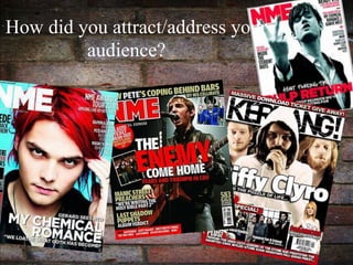
  • 5. Evaluation. For this section I have shown a range of people that fit into my target audience to get feedback on what they think of each of my pages. This is so that I could find out how successful it was with fitting in with my target audience. The people answered whether each convention and feature on my pages were attractive for their age range and social group or not. The feedback that I got was generally very successful and positive. By analysing each convention I found out how iconography played a huge part in the process of making my magazine. I chose an artist who had a very ‘iconic’ appearance so this would attract a wider audience and appeals to both male and female. If the artist looked very boring and original, my magazine would not fit in with the rock genre and it wouldn’t have been as successful. After getting this feedback from people that fit into my target audience, it was easy to identify which features and conventions were the unique selling point of my magazine. People picked up on the effective layout, images, font and how well the magazine was written. Some even said how well it relates to other magazines which is a success as I took some conventions from different magazines, not just one. For example Kerrang, NME and Billboard. During the process of making my magazine I asked similar questions to people who the magazine would appeal to so that I could put the features in as I went along. I think this is why the magazine has done so well at attracting my audience because I took different conventions from different magazines and either developed or challenged them. Each convention has a different effect at appealing to the reader whether its an image or even the text. This interview of the target interview has been successful as it has helped me identify how successful how each feature on the pages have attracted my audience and whether they liked it or not.