Growth Hacking - UX
•
4 gefällt mir•1,227 views

This document introduces Ketut Sulisytati, a customer experience consultant and founder of Somia Customer Experience. She provides an overview of user experience (UX) and growth hacking, explaining that poor UX is a common reason for customer drop-off rates. The document then outlines a 9-step process for conducting a DIY UX audit of a product or service to identify areas for improvement. These steps include understanding business goals and users, testing first impressions, analyzing the user journey, and inspecting design elements for ease of use, clarity, and usability.

Empfohlen
Weitere ähnliche Inhalte
Was ist angesagt?
Was ist angesagt? (20)
Andere mochten auch
Ähnlich wie Growth Hacking - UX
Ähnlich wie Growth Hacking - UX (20)
Kürzlich hochgeladen
Kürzlich hochgeladen (20)
Growth Hacking - UX
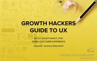
- 1. GROWTH HACKERS GUIDE TO UX KETUT SULISTYAWATI, PHD SOMIA CUSTOMER EXPERIENCE @tyawati @rarrisa @SomiaCX
- 2. HELLO! 2 Who Am I? • Customer Experience consultant • Indonesian – Balinese ;) • Lived in Singapore for 12 years • Bachelor in product design – NTU, Singapore PhD in Human Factors – NTU, Singapore Previously worked at • Dell Experience Design Group, Singapore • Hewlett-Packard Global Design Studio • Reading Room, Singapore Founded Somia Customer Experience in 2012 Hello! We are from SOMIA Risa Sulis
- 3. 3
- 4. 4 What is this app? Why should I download it?
- 5. 5 I just had a ride with GO-JEK and now I am spreading the Go-Jek love. I would recommend you to try it too! Get the app at http://go-jek.com/app Enter this code 525149342 and get Rp 50,000 free credit to your first booking Love, Aya
- 6. 6 Enter code Enter your email address REDEEM Woohooo! You’ve just got Go-Jek Love! Enter your code and get Rp 50,000 voucher
- 7. 7 Welcome to Go-Jek! Why don’t you send some love using your free credit Send a bouquet of flowers Send a box of chocolate
- 8. 8 Your driver is on his way. Track your delivery using Go-Jek App. Download Now
- 10. GROWTH = converting from non-users to become users 10
- 11. 11 1. People have abundance of choices 2. People are lazy 3. Attention is expensive
- 12. 12 So you buy traffic or hack people to come to your site. Let’s say they do visit. But they don’t “get” why they should try it. What happens next?
- 13. 13 Awareness à Consider à Sign up à First Use à Continue Using à Advocate For every conversion step, there is a possibility that the customer will drop off
- 14. 14 WHAT CAUSES THE DROP OFF?
- 15. 15 I don’t understand what this product is for I’m confused how to use this product The sign up process is too troublesome I don’t know what I should do next
- 17. 3/4/15 WHAT IS USER EXPERIENCE (UX) Every aspect of the user’s interaction with a product, service, or company that make up the user’s perceptions of the whole Usability Professional Association 17
- 20. 3/4/15 20 SPACE
- 21. 3/4/15 21 FORMS
- 26. 3/4/15 THERE’S NO SUCH THING AS GOOD OR BAD UX. IT DEPENDS ON THE CONTEXT. RELEVANT EXPERIENCE MATTERS. 26
- 27. Step 1 Identify Business Goals ● What does the business want to achieve by having this product? ● What are the indicators of success / KPI? ● What is the Unique Value Proposition? ● What do you want customers to say when they are talking about the product?
- 28. Step 2 Identify Users & Context ● Who are the target customers? ● What goals do they have? ● Why do they want to use the product? ● In what situation would they use the product?
- 29. Step 3 Test First Impression ● Does the product look inviting? ● Is it clear what the product is for and why it is relevant for the user? Tips: check against Unique Value Proposition ● Is it clear what the user can do?
- 30. Step 4 Walk The Journey List down the scenarios the user can do e.g.: compare products, see detailed information, submit application, make payment 1. _______________________________ 2. _______________________________ 3. _______________________________ _______________________________ _______________________________
- 31. Step 5 Inspect The Details Inspect the product elements against these principles: 1. Easy on the eyes 2. Clear message 3. Strong call to action 4. Consistent 5. Appropriate affordance 6. Visible status 7. Quick and easy access 8. Prevent & help to recover 9. Guided form
- 32. EASY ON THE EYE …and the fingers, nose, ears, and mouth. Aim for harmony among sensorial elements. Provide sufficient contrast for easy reading (texts are readable), wearing, carrying.
- 33. Avoid jargon. Speak the users' language, with words, phrases and concepts familiar to the user. Remember that the experience is about them (the customer), not you (the business). CLEAR MESSAGE
- 34. Provide strong primary call to action. Label and highlight the call to action. Positioned the call to action within easy and direct access. STRONG CALL TO ACTION
- 35. Navigational, interactions, design elements throughout the site must be consistent. Consistency implies stability. It helps users to learn and to predict how the site works. CONSISTENT
- 36. “Affordance” is when the user knows that some action is possible. Button looks like a button. Non-clickable link doesn’t look like a link. APPROPRIATE AFFORDANCE
- 37. Users don’t like to be left wondering. Inform users what is going on, through appropriate feedback and within reasonable time. VISIBLE STATUS
- 38. Make products quickly available: page loads quickly, immediate response of product interaction. Don’t forget about the content. They too, need to be made quickly accessible and easy to read. QUICK ACCESS
- 39. Error messages should be expressed: - In plain language - Precisely indicate the problem - Constructively suggest a solution PREVENT ERROR / GUIDE RECOVERY
- 40. Even though it is better if the system can be used without documentation, it may be necessary to provide help and documentation. PROVIDE HELP & DOCUMENTATION
- 41. 3/4/15 NOW, LET’S TRY IT! 41
- 42. DIY UX AUDIT 1. BUSINESS GOALS 2. USER & CONTEXT 3. FIRST IMPRESSION 4. WALK THE JOURNEY 5. INSPECT THE DETAILS 1. Easy on the eyes 2. Clear message 3. Strong call to action 4. Consistent 5. Appropriate affordance 6. Visibility of status 7. Quick access 8. Error prevention & recovery 9. Help & documentation Download for free at blog.somiacx.com or https://www.slideshare.net/somiacx/diy-ux-audit/
- 43. THANK YOU KETUT SULISTYAWATI, PHD @tyawati www.somiacx.com 43