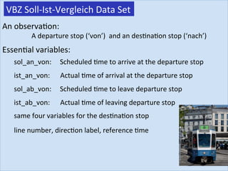
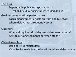
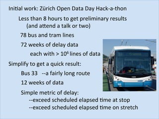
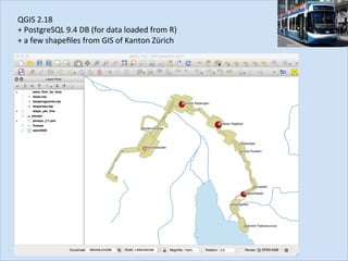
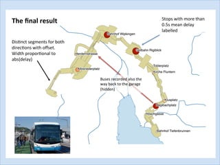
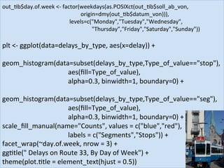
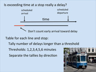
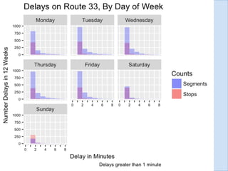
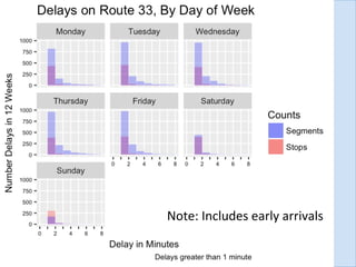
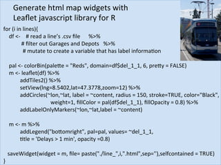
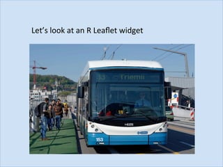
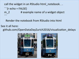
Visualizing	the	frequency	of	transit	delays	using	QGIS	
and	the	Leaflet	javascript	library	in	R	
Open	Data	Day	Zurich,	Hack-a-thon	2017	
Peter	B.	Pearman	
Thomas	Roth	
Open	Data	Day	Zürich		
sponsors:	
Master Program in Biostatistics
Our	open	tools:
VBZ	Soll-Ist-Vergleich	Data	Set	
An	observaJon:		
																	A	departure	stop	(‘von’)		and	an	desJnaJon	stop	(‘nach’)		
EssenJal	variables:	
sol_an_von:					Scheduled	Jme	to	arrive	at	the	departure	stop	
ist_an_von:						Actual	Jme	of	arrival	at	the	departure	stop	
sol_ab_von:					Scheduled	Jme	to	leave	departure	stop		
ist_ab_von:						Actual	Jme	of	leaving	departure	stop	
same	four	variables	for	the	desJnaJon	stop	
line	number,	direcJon	label,	reference	Jme
QuesJon:			
	 	Where	along	lines	do	delays	most-frequently	occur?	
	 	At	stops?	Along	segments	between	stops?	
The	Issue:		
	 	Dependable	public	transportaJon	=>		
	 	 	reliability	=>	reducing	unscheduled	delays		
Goal:	Improve	on-Jme	performance:	
	 	Focus	management	efforts	on	tram	and	bus	stops		
	 	where	delays	most	frequently	occur	
ObjecJve	or	Task:		
	 	Use	Sol-Ist-Vergleich	data	
	 	Visualize	for	each	line	the	locaJons	where	delays	occur
IniJal	work:	Zürich	Open	Data	Day	Hack-a-thon	
Less	than	8	hours	to	get	preliminary	results	
	(and	abend	a	talk	or	two)	
78	bus	and	tram	lines	
72	weeks	of	delay	data	
each	with	>	106	lines	of	data	
Simplify	to	get	a	quick	result:	
Bus	33			--a	fairly	long	route	
12	weeks	of	data	
Simple	metric	of	delay:		
	--exceed	scheduled	elapsed	Jme	at	stop	
	--exceed	scheduled	elapsed	Jme	on	stretch
delays	<-	funcJon(in.Jbble,out.Jbble,work.line,min_delay_seg_min,	
	 	 	 	min_delay_von_min){	
	delay2	<-	small_Jb	%>%		
	filter(linie	==	work.line)	%>%	
													
			 	mutate(soll_seg	=	soll_an_nach	-	soll_ab_von,												#delay	during	segments	of	the	line	
									 		ist_seg	=	ist_an_nach1	-	ist_ab_von,	
									 		delay_seg	=	ist_seg	-	soll_seg,	
										
									 		soll_at_von	=	soll_ab_von	-	soll_an_von,													#	delay	at	the	stop	(Haltstelle)	
									 		ist_at_von	=	ist_ab_von	-	ist_an_von,	
									 		delay_von	=	ist_at_von	-	soll_at_von)	
			
									delay3	<-	delay2	%>% 	 	 	 	 	 						#	filter	data	lines	lacking	at	least	one	
	 	mutate(delay_seg_min	=	floor(delay_seg/60),			#	delay	greater	than	the		
	 	delay_von_min	=	floor(delay_von/60))	%>%							#necessary	minimum	
		 					 	 		
	 	filter(delay_seg_min	>=	min_delay_seg_min	|	delay_von_min	>=	min_delay_von_min)		
	return(delay3)	
}	
library(Jdyverse)	
library(lubridate)
out_Jb	<-	Jbble()	
temp=list.files('../data/fahrzeiten_data')	
work.line	<-	33	
data_set=0	
num_datasets	=	12	
min_delay_seg_min	=	0	
min_delay_von_min	=	0	
	
for	(i	in	temp){	
		data_set	<-	data_set	+	1	
		print(i)	
		delay1	<-	read.csv(paste('../data/fahrzeiten_data/',i,sep=""),stringsAsFactors	=	FALSE)	
		out_Jb	<-	delays(delay1,out_Jb,work.line,min_delay_seg_min,min_delay_von_min)	
		if	((data_set>=num_datasets)==TRUE)	break()	
}	
	
#	make	an	index	for	QGIS	plorng	
out_Jb$index	<-		
							paste(out_Jb$linie,'-',out_Jb$halt_punkt_id_von,'-',out_Jb$halt_punkt_id_nach,sep='')	
```
QGIS	
QGIS	2.18	
+	PostgreSQL	9.4	DB	(for	data	loaded	from	R)	
+	a	few	shapefiles	from	GIS	of	Kanton	Zürich
QGIS	
Buses	recorded	also	the	
way	back	to	the	garage	
(hidden)	
DisJnct	segments	for	both	
direcJons	with	offset.	
Width	proporJonal	to	
abs(delay)	
Stops	with	more	than	
0.5s	mean	delay	
labelled	
The	final	result
ObservaJons	on	Hackathon	AcJvity		
•  EssenJally	glad	to	have	a	small	result	at	the	end	of	the	
Hackathon	J	
•  Lots	of	fun!	
•  Much	of	the	effort	spent	with	the	DIVAesque	nature	of	the	data	
and	the	interface	(the	segment	key)	between	the	Calc-	and	the	
VisualisaJon	team	
•  NB:	Some	effort	went	into	having	the	correct	line	color:	who	
cares	with	only	the	line	33	displayed?	
•  Not	enough	Jme	to	verify	the	actual	visualizaJon	data
Delays	at	stops	 >	<	 Delays	along	segments	
?	
How	about	all	those	delays	of	<	1	minute?
plt	<-	ggplot(data=delays_by_type,	aes(x=delay))	+		
		
geom_histogram(data=subset(delays_by_type,Type_of_value=="stop"),	
																																							aes(fill=Type_of_value),	
																																							alpha=0.3,	binwidth=1,	boundary=0)	+	
	
geom_histogram(data=subset(delays_by_type,Type_of_value=="seg"),	
																																							aes(fill=Type_of_value),	
																																							alpha=0.3,	binwidth=1,	boundary=0)	+	
scale_fill_manual(name="Counts",	values	=	c("blue","red"),	
																																							labels	=	c("Segments","Stops"))	+	
facet_wrap(~day.of.week,	nrow	=	3)	+	
ggJtle("	Delays	on	Route	33,	By	Day	of	Week")	+	
theme(plot.Jtle	=	element_text(hjust	=	0.5))	
out_Jb$day.of.week	<-	factor(weekdays(as.POSIXct(out_Jb$soll_ab_von,	
	 	 	 	 	 	 	origin=dmy(out_Jb$datum_von))),	
	 	 	 	 	 	levels=c("Monday","Tuesday","Wednesday",	
	 	 	 	 	 	 	 	"Thursday”,"Friday","Saturday","Sunday"))
Is	exceeding	Jme	at	a	stop	really	a	delay?	
Table	for	each	line	and	stop:	
Tally	number	of	delays	longer	than	a	threshold		
Thresholds:	1,2,3,4,5,6	minutes	
Separate	the	tallies	by	direcJon	
scheduled		
arrival	
Jme	
scheduled	
departure	
Don’t	count	early	arrival	toward	delay
Note:	Includes	early	arrivals
R	interface	for	the	Leaflet	javascript	library:	
interacJve	maps	
Leaflet	for	R	
hbps://rstudio.github.io/leaflet/
Generate	html	map	widgets	with		
Leaflet	javascript	library	for	R		
for	(i	in	lines){	
				df	<-				#	read	a	line’s	.csv	file						%>%	
						#	filter	out	Garages	and	Depots			%>%	
														#	mutate	to	create	a	variable	that	has	label	informaJon	
	
				pal	<-	colorBin(palebe	=	"Reds",	domain=df$del_1_1,	6,	preby	=	FALSE)	
				m	<-	leaflet(df)	%>%	
												addTiles2()	%>%	
												setView(lng=8.5402,lat=47.3778,zoom=12)	%>%	
												addCircles(~lon,~lat,	label	=	~content,	radius	=	150,	stroke=TRUE,	color="Black",	
																																		weight=1,	fillColor	=	pal(df$del_1_1),	fillOpacity	=	0.8)	%>%	
												addLabelOnlyMarkers(~lon,~lat,label	=	~content)	
					
				m	<-	m	%>%	
												addLegend("bobomright",	pal=pal,	values=	~del_1_1,		
					Jtle	=	'Delays	>	1	min',	opacity	=0.8)	
	
			saveWidget(widget	=	m,	file=	paste("./line_",i,".html",sep=''),selfcontained	=	TRUE)	
}
Let’s	look	at	an	R	Leaflet	widget
call	the	widget	in	an	RStudio	html_notebook….	
```{r	echo	=	FALSE}	
m_2	 	 	 		#	example	name	of	a	widget	object					
```	
Render	the	notebook	from	RStudio	into	html	
See	it	all	here:	
			github.com/OpenDataDayZurich2016/visualizaJon_delays
Thank	You	
github.com/OpenDataDayZurich2016/visualizaJon_delays

Visualizing the frequency of transit delays using QGIS and the Leaflet javascript library in R