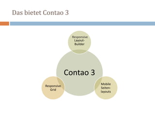
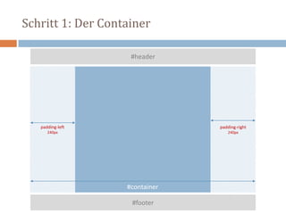
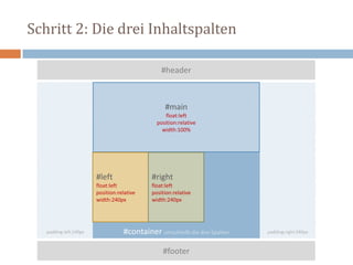
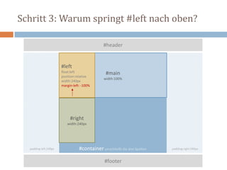
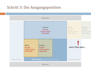
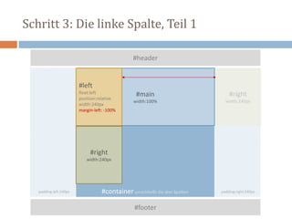
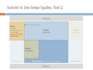
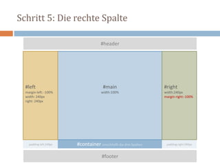
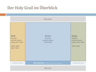
RESPONSIVE CONTAO
Teil 1: Layout-Builder und mobile Seitenlayouts
Thomas Weitzel think-contao.de
Peter Müller pmueller.de
道
10. Mai 2013
von 9.00 bis 10.00 Uhr
think-contao.de
pmueller.de
Wer wir sind
Was wir in Teil 1 vorhaben
3
1. Responsive Webdesign und Contao
2. Das CSS-Framework von Contao 3
3. Der Layout-Builder (mit Holy Grail)
4. Mobile Seitenlayouts
6. Fazit
Das Contao Responsive Grid wird in Teil 2 vorgestellt
Die Entwicklung des Webdesign – Übersicht
ab 1996 Layouten mit HTML-Tabellen
ab 2001 Webstandards: Designing with CSS
ab 2006 CSS-Layouts werden normal
ab 2008 CSS-Grid-Frameworks (960.gs & Co)
ab 2010 »responsive« und »mobile«
4
2010: Responsive Web Design – der Artikel
alistapart.com/article/responsive-web-design
2011: Responsive Web Design – das Buch
 RWD ursprünglich
 Fluid Grid-Layout
 Flexible Images
 Media Queries
 Beispielsites
 responsivewebdesign.com/robot/
 bostonglobe.com
abookapart.com/products/responsive-web-design
twitter.com/Malarkey/status/113221032634093569
Begriffschaos: Zeldman definiert
… any approach that delivers
elegant visual experiences
regardless of the size of the
user's display and the
limitations or capabilities of the
device.
zeldman.com/2011/07/06/responsive-design-i-dont-think-that-word-means-what-you-think-it-means/
Responsive Webdesign = 1x HTML
1x
HTML
CSS
CSSCSS
 1x HTML für alle
 diverse CSS Anpassungen
 Grundprinzipien
 Kein starres Layout
 Flexible Images
 Media Queries
 potenzielle Probleme
 Performance
 Anordnung des Quellcode
 Inhaltsmenge
One size fits all.
Meistens.
Responsive Webdesign = 1x HTML
Das bietet Contao 3
Contao 3
Layout-
Builder
Mobile
Seiten-
layouts
Responsive
Grid
Responsive
Backend und Layout-Builder
Das CSS-Framework
Das CSS-Framework im Backend
Das CSS-Framework – die Dateien
Komponente Pfad und Dateiname
Layout-Builder (»Holy Grail«)
fe_page
assets/contao/css/layout.css
CSS-Reset assets/contao/css/reset.css
Responsive Grid (960px, 12 Spalten) assets/contao/css/responsive.css (grid.css)
Formulare assets/contao/css/forms.css
TinyMCE-Stylesheet files/tinymce.css
Der (responsive) Layout-Builder
 HTML
 fe_page
 setzt Meta-Viewport-Tag
 CSS: assets/contao/css/layout.css
1. Standardize some basic elements
2. Viewport > 767px: Apply the holy grail CSS layout
3. Viewport < 768px: Display all columns underneath each other
4. Flexible Images: img {max-width:100%;height:auto;}
5. Format the Contao image galleries
6. Clear floats, hide elements and custom layout sections
Reihenfolge im Quelltext und am Bildschirm
Der Holy Grail: Einführung
Quelltext: Das Wichtigste zuerst
#container umschließt die drei Spalten
#footer
#header
#main
#left
#right
1
2
3
Bildschirm: Das Wichtigste in der Mitte
#container umschließt die drei Spalten
#footer clear:both
#header
#main
width:100%
#left
width: 240px
#right
width: 240px
12 3
Lösung: Der Holy Grail
 Artikel "In Search of the Holy Grail"
 Matthew Levine im Januar 2006
 alistapart.com/article/holygrail
 Der »Holy Grail«erfüllt fünf Bedingungen
1. have a fluid center with fixed sidebars
2. allow center column to appear first in the source
3. allow any column to be the tallest
4. require only a single extra <div>
5. require very simple CSS
Schritt für Schritt zum heiligen Gral
Der Holy Grail im Detail
Schritt 1: Der Container
#container
#footer
#header
padding-left
240px
padding-right
240px
Schritt 2: Die drei Inhaltspalten
#container umschließt die drei Spalten
#footer
#header
#main
float:left
position:relative
width:100%
#left
float:left
position:relative
width:240px
#right
float:left
position:relative
width:240px
padding-left:240px padding-right:240px
Schritt 3: Warum springt #left nach oben?
#container umschließt die drei Spalten
#footer
#header
#main
width:100%
#left
float:left
position:relative
width:240px
margin-left: -100%
#right
width:240px
padding-left:240px padding-right:240px
Schritt 3: Die Ausgangsposition
#container umschließt die drei Spalten
#footer
#header
#main
float:left
position:relative
width:100%
#left
float:left
position:relative
width:240px
#right
float:left
position:relative
width:240px
padding-left:240px padding-right:240px
#left
float:left
position:relative
width:240px
#right
float:left
position:relativ
width:240px
wenn Platz wäre...
Schritt 3: Die linke Spalte, Teil 1
#container umschließt die drei Spalten
#footer
#header
#main
width:100%
#left
float:left
position:relative
width:240px
margin-left: -100%
#right
width:240px
#right
width:240px
padding-left:240px padding-right:240px
Schritt 4: Die linke Spalte, Teil 2
#container umschließt die drei Spalten
#footer
#header
#main
width:100%
#left
float:left
position:relative
width:240px
margin-left: -100%
right: 240px
#right
width:240px
#right
width:240px
padding-left:240px padding-right:240px
Schritt 5: Die rechte Spalte
#container umschließt die drei Spalten
#footer
#header
#main
width:100%
#left
margin-left: -100%
width: 240px
right: 240px
#right
width:240px
margin-right:-100%
padding-left:240px padding-right:240px
Der Holy Grail im Überblick
#container umschließt die drei Spalten
#footer
#header
#main
float:left
position:relative
width:100%
#left
float:left
position:relative
margin-left: -100%
---
width: 240px
right: 240px
#right
float:left
position:relative
margin-right:-100%
---
width:240px
padding-left:240px padding-right:240px
Das Fazit zum Holy Grail
 Ziel
 Inhalt im Quelltext zuerst
 Inhalt am Bildschirm als mittlere Spalte
 Methoden
 negativer Margin
 relative Positionierung
 Einschränkungen
 #main, #left und #right ohne padding, border, margin
 Sidebars nur mit fester Pixelbreite zuverlässig berechenbar
 Hauptnavigation in #left nur begrenzt sinnvoll
 Minimale Breite #container: 2x #left plus 1x #right
Holy Grail < drei Spalten
Contao: zweispaltig, Sidebar rechts
#container umschließt die beiden Spalten
#footer
#header
#main
float: left
position:relative
width:100%
#right
float:left
position:relative
margin-right:-100%
---
width:240px
padding-right:240px
Contao: zweispaltig, Sidebar links
#container umschließt die beiden Spalten
#footer
#header
#main
float: left
position:relative
width:100%
#left
float: left
position:relative
margin-left: -100%
---
width: 240px
right: 240px
padding-left:240px
Contao: einspaltig
#container umschließt #main
#footer
#header
#main
float: left
position:relative
width:100%
Auf kleinen Bildschirmen kein Holy Grail
Der Layout-Builder < 768px
Der Layout-Builder >767px: Mit Holy Grail
Der Layout-Builder wird responsive
/* Viewport < 768px: Display all columns underneath each other */
@media (max-width:767px) {
#wrapper { margin:0; width:auto; }
#header, #footer { height:auto; }
#container { padding-left:0; padding-right:0; }
#main, #left, #right { float:none; width:auto; }
#left { right:0; margin-left:0; }
#right { margin-right:0; }
}
Der Layout-Builder < 768px: ohne Holy Grail
Der Layout-Builder – Zusammenfassung
 Layout
 Normal: Mehrspaltig, feste Breite 960px plus evtl. 2x10px padding
 Nachteil: Horizontaler Rollbalken zwischen 768px und ca. 960px
 Flexibler: #wrapper { width:90%; max-width:960px; }
 Flexible Images
 img { max-width:100%; height: auto; }
 Media Query < 768px
 Layout wird einspaltig
 Fazit
 Das Layout ist "responsive" und auch auf "mobile" nutzbar
 Auch ohne ein "mobiles Seitenlayout"
"RESS" ist bei Contao schon mit drin...
Seitenlayouts für mobile Seiten
„RESS“: RESponsive plus Serverside
 HTML unterschiedlich
 andere Frontend-Module
 andere Inhalte
 diverse CSS-Anpassungen
 Grundprinzipien
 optimierter Quelltext
 optimierte Bilder
 optimierte Inhalte
 potenzielle Probleme
 Was ist »mobile«?
 Was heißt »optimiert«?
 viele Annahmen ("ass-u-me")
HTML
full site
CSS
CSSCSS
HTML
mobile
CSS
CSSCSS
Seitenlayout für mobile Seiten
 Spezielle Seitenlayouts für mobile Seiten
 Zuerst ein spezielles Seitenlayout erstellen
 Dann in der Seitenstruktur das Layout für mobile Seiten zuweisen
 Ist nicht Teil des CSS-Framework
 Der Umschalter: {{toggle_view}}
 Schaltet um zwischen "Desktop" und "Mobile"
 URL-Parameter ?toggle_view=desktop bzw. mobile
 Ideal zum Testen der Mobilversion auf dem Desktop
 Lässt dem Benutzer die Wahl
UA-Sniffing: Wie Contao mobile Geräte erkennt
system/config/agents.php
Beispiel: Button "Jetzt anrufen"
<a href:“tel:004924146361877“>Jetzt anrufen!</a>
Fazit: Responsive Contao
1. Layout-Builder ermöglicht responsive Webdesign
 basiert auf "Holy Grail"
 Viewport <768px – einspaltiges Layout mit automatischer Breite
 reicht für viele Websites völlig aus
2. Mobiles Seitenlayout
 Entscheidung "mobile = true" über UA-Sniffing (agents.php)
 ermöglicht anderes HTML für mobile Geräte (Frontend-Module)
 Spezielle Stylesheets nur für mobile Geräte
3. Contao Responsive Grid (kommt in Teil 2 dieser Präsentation)
 Viewport >980px – Grid mit 960px und 12 Spalten
 Viewport <980px – Grid mit 744px und 12 Spalten
 Viewport <768px – einspaltiges Layout mit automatischer Breite
Kurze Pause.
Danach geht's weiter mit Teil 2
"Das Contao Responsive Grid"

Contao Konferenz 2013 - Workshop "Responsive Contao" - Teil 1

  • 1.
    RESPONSIVE CONTAO Teil 1:Layout-Builder und mobile Seitenlayouts Thomas Weitzel think-contao.de Peter Müller pmueller.de 道 10. Mai 2013 von 9.00 bis 10.00 Uhr
  • 2.
  • 3.
    Was wir inTeil 1 vorhaben 3 1. Responsive Webdesign und Contao 2. Das CSS-Framework von Contao 3 3. Der Layout-Builder (mit Holy Grail) 4. Mobile Seitenlayouts 6. Fazit Das Contao Responsive Grid wird in Teil 2 vorgestellt
  • 4.
    Die Entwicklung desWebdesign – Übersicht ab 1996 Layouten mit HTML-Tabellen ab 2001 Webstandards: Designing with CSS ab 2006 CSS-Layouts werden normal ab 2008 CSS-Grid-Frameworks (960.gs & Co) ab 2010 »responsive« und »mobile« 4
  • 5.
    2010: Responsive WebDesign – der Artikel alistapart.com/article/responsive-web-design
  • 6.
    2011: Responsive WebDesign – das Buch  RWD ursprünglich  Fluid Grid-Layout  Flexible Images  Media Queries  Beispielsites  responsivewebdesign.com/robot/  bostonglobe.com abookapart.com/products/responsive-web-design
  • 7.
  • 8.
    Begriffschaos: Zeldman definiert …any approach that delivers elegant visual experiences regardless of the size of the user's display and the limitations or capabilities of the device. zeldman.com/2011/07/06/responsive-design-i-dont-think-that-word-means-what-you-think-it-means/
  • 9.
    Responsive Webdesign =1x HTML 1x HTML CSS CSSCSS  1x HTML für alle  diverse CSS Anpassungen  Grundprinzipien  Kein starres Layout  Flexible Images  Media Queries  potenzielle Probleme  Performance  Anordnung des Quellcode  Inhaltsmenge
  • 10.
    One size fitsall. Meistens. Responsive Webdesign = 1x HTML
  • 11.
    Das bietet Contao3 Contao 3 Layout- Builder Mobile Seiten- layouts Responsive Grid Responsive
  • 12.
  • 13.
  • 15.
    Das CSS-Framework –die Dateien Komponente Pfad und Dateiname Layout-Builder (»Holy Grail«) fe_page assets/contao/css/layout.css CSS-Reset assets/contao/css/reset.css Responsive Grid (960px, 12 Spalten) assets/contao/css/responsive.css (grid.css) Formulare assets/contao/css/forms.css TinyMCE-Stylesheet files/tinymce.css
  • 16.
    Der (responsive) Layout-Builder HTML  fe_page  setzt Meta-Viewport-Tag  CSS: assets/contao/css/layout.css 1. Standardize some basic elements 2. Viewport > 767px: Apply the holy grail CSS layout 3. Viewport < 768px: Display all columns underneath each other 4. Flexible Images: img {max-width:100%;height:auto;} 5. Format the Contao image galleries 6. Clear floats, hide elements and custom layout sections
  • 17.
    Reihenfolge im Quelltextund am Bildschirm Der Holy Grail: Einführung
  • 18.
    Quelltext: Das Wichtigstezuerst #container umschließt die drei Spalten #footer #header #main #left #right 1 2 3
  • 19.
    Bildschirm: Das Wichtigstein der Mitte #container umschließt die drei Spalten #footer clear:both #header #main width:100% #left width: 240px #right width: 240px 12 3
  • 20.
    Lösung: Der HolyGrail  Artikel "In Search of the Holy Grail"  Matthew Levine im Januar 2006  alistapart.com/article/holygrail  Der »Holy Grail«erfüllt fünf Bedingungen 1. have a fluid center with fixed sidebars 2. allow center column to appear first in the source 3. allow any column to be the tallest 4. require only a single extra <div> 5. require very simple CSS
  • 21.
    Schritt für Schrittzum heiligen Gral Der Holy Grail im Detail
  • 22.
    Schritt 1: DerContainer #container #footer #header padding-left 240px padding-right 240px
  • 23.
    Schritt 2: Diedrei Inhaltspalten #container umschließt die drei Spalten #footer #header #main float:left position:relative width:100% #left float:left position:relative width:240px #right float:left position:relative width:240px padding-left:240px padding-right:240px
  • 24.
    Schritt 3: Warumspringt #left nach oben? #container umschließt die drei Spalten #footer #header #main width:100% #left float:left position:relative width:240px margin-left: -100% #right width:240px padding-left:240px padding-right:240px
  • 25.
    Schritt 3: DieAusgangsposition #container umschließt die drei Spalten #footer #header #main float:left position:relative width:100% #left float:left position:relative width:240px #right float:left position:relative width:240px padding-left:240px padding-right:240px #left float:left position:relative width:240px #right float:left position:relativ width:240px wenn Platz wäre...
  • 26.
    Schritt 3: Dielinke Spalte, Teil 1 #container umschließt die drei Spalten #footer #header #main width:100% #left float:left position:relative width:240px margin-left: -100% #right width:240px #right width:240px padding-left:240px padding-right:240px
  • 27.
    Schritt 4: Dielinke Spalte, Teil 2 #container umschließt die drei Spalten #footer #header #main width:100% #left float:left position:relative width:240px margin-left: -100% right: 240px #right width:240px #right width:240px padding-left:240px padding-right:240px
  • 28.
    Schritt 5: Dierechte Spalte #container umschließt die drei Spalten #footer #header #main width:100% #left margin-left: -100% width: 240px right: 240px #right width:240px margin-right:-100% padding-left:240px padding-right:240px
  • 29.
    Der Holy Grailim Überblick #container umschließt die drei Spalten #footer #header #main float:left position:relative width:100% #left float:left position:relative margin-left: -100% --- width: 240px right: 240px #right float:left position:relative margin-right:-100% --- width:240px padding-left:240px padding-right:240px
  • 30.
    Das Fazit zumHoly Grail  Ziel  Inhalt im Quelltext zuerst  Inhalt am Bildschirm als mittlere Spalte  Methoden  negativer Margin  relative Positionierung  Einschränkungen  #main, #left und #right ohne padding, border, margin  Sidebars nur mit fester Pixelbreite zuverlässig berechenbar  Hauptnavigation in #left nur begrenzt sinnvoll  Minimale Breite #container: 2x #left plus 1x #right
  • 31.
    Holy Grail <drei Spalten
  • 32.
    Contao: zweispaltig, Sidebarrechts #container umschließt die beiden Spalten #footer #header #main float: left position:relative width:100% #right float:left position:relative margin-right:-100% --- width:240px padding-right:240px
  • 33.
    Contao: zweispaltig, Sidebarlinks #container umschließt die beiden Spalten #footer #header #main float: left position:relative width:100% #left float: left position:relative margin-left: -100% --- width: 240px right: 240px padding-left:240px
  • 34.
    Contao: einspaltig #container umschließt#main #footer #header #main float: left position:relative width:100%
  • 35.
    Auf kleinen Bildschirmenkein Holy Grail Der Layout-Builder < 768px
  • 36.
  • 37.
    Der Layout-Builder wirdresponsive /* Viewport < 768px: Display all columns underneath each other */ @media (max-width:767px) { #wrapper { margin:0; width:auto; } #header, #footer { height:auto; } #container { padding-left:0; padding-right:0; } #main, #left, #right { float:none; width:auto; } #left { right:0; margin-left:0; } #right { margin-right:0; } }
  • 38.
    Der Layout-Builder <768px: ohne Holy Grail
  • 39.
    Der Layout-Builder –Zusammenfassung  Layout  Normal: Mehrspaltig, feste Breite 960px plus evtl. 2x10px padding  Nachteil: Horizontaler Rollbalken zwischen 768px und ca. 960px  Flexibler: #wrapper { width:90%; max-width:960px; }  Flexible Images  img { max-width:100%; height: auto; }  Media Query < 768px  Layout wird einspaltig  Fazit  Das Layout ist "responsive" und auch auf "mobile" nutzbar  Auch ohne ein "mobiles Seitenlayout"
  • 40.
    "RESS" ist beiContao schon mit drin... Seitenlayouts für mobile Seiten
  • 41.
    „RESS“: RESponsive plusServerside  HTML unterschiedlich  andere Frontend-Module  andere Inhalte  diverse CSS-Anpassungen  Grundprinzipien  optimierter Quelltext  optimierte Bilder  optimierte Inhalte  potenzielle Probleme  Was ist »mobile«?  Was heißt »optimiert«?  viele Annahmen ("ass-u-me") HTML full site CSS CSSCSS HTML mobile CSS CSSCSS
  • 42.
    Seitenlayout für mobileSeiten  Spezielle Seitenlayouts für mobile Seiten  Zuerst ein spezielles Seitenlayout erstellen  Dann in der Seitenstruktur das Layout für mobile Seiten zuweisen  Ist nicht Teil des CSS-Framework  Der Umschalter: {{toggle_view}}  Schaltet um zwischen "Desktop" und "Mobile"  URL-Parameter ?toggle_view=desktop bzw. mobile  Ideal zum Testen der Mobilversion auf dem Desktop  Lässt dem Benutzer die Wahl
  • 43.
    UA-Sniffing: Wie Contaomobile Geräte erkennt system/config/agents.php
  • 44.
    Beispiel: Button "Jetztanrufen" <a href:“tel:004924146361877“>Jetzt anrufen!</a>
  • 45.
    Fazit: Responsive Contao 1.Layout-Builder ermöglicht responsive Webdesign  basiert auf "Holy Grail"  Viewport <768px – einspaltiges Layout mit automatischer Breite  reicht für viele Websites völlig aus 2. Mobiles Seitenlayout  Entscheidung "mobile = true" über UA-Sniffing (agents.php)  ermöglicht anderes HTML für mobile Geräte (Frontend-Module)  Spezielle Stylesheets nur für mobile Geräte 3. Contao Responsive Grid (kommt in Teil 2 dieser Präsentation)  Viewport >980px – Grid mit 960px und 12 Spalten  Viewport <980px – Grid mit 744px und 12 Spalten  Viewport <768px – einspaltiges Layout mit automatischer Breite
  • 46.
    Kurze Pause. Danach geht'sweiter mit Teil 2 "Das Contao Responsive Grid"