call girls in Kaushambi (Ghaziabad) 🔝 >༒8448380779 🔝 genuine Escort Service 🔝...
Creative Portfolio
1.
2. corporate identity: logo
This logo was created as part of a foundation upon which I have formulated a series
of works that encompass a portfolio of graphic design and photography components.
My intention is to deliver a unique perspective on specified subjects by forming a new
system of visual and conceptual thought, based on the word ‘Revelnation,’ a term
that represents the cohesive relationship between religion and club culture.
By exploring certain elements of club culture as a subculture, and its corresponding
associations to religion, this subsequently provided the framework to my production
methods for the course of my final year studies.
3. corporate identity: letterhead, envelope & compliment slip
The text that appears in the letterhead was applied as if it were a verse from a bible,
however, its content taking on the form of a calendar. Its purpose is informative in
nature, whilst simultaneously having direct relations to the Bible as well as taking on
the form of a bookmark.
A similar layout and reoccurrence of font is extended through the envelope and
compliment slip to create an overall feel of clarity and purity and to keep consistent
with the theme at hand.
4. calendar: club flyers continued
In Catholicism, the liturgical year is divided into seasons based on certain Biblical
events. Each period is represented by a colour, symbolizing Jesus’ life at the time. The
colours that each period is distinguished by would subsequently be represented by
the corresponding colour of a flyer. This led to the arrangement of however many
flyers were needed within each month, and each flyer would be positioned based
on the colour represented in the church during that time.
Having changed the original dates on the pre-existing flyers to consecutive dates
that follow each other, the calendar would thus take on the function of providing
information of a club event on a daily basis.
5. calendar: club flyers
A magazine was consequently chosen for the calendar to appear in, that being SL,
a student-oriented publication focusing a large amount on nightlife and events.
The calendar is strategically placed towards the back of the magazine, in between
pictures of various parties that occurred the month before. Having been printed on
a high-quality gloss paper, the edges of each flyer would be perforated, effectively
allowing them to be torn off.
6. packaging: holy
Whilst thinking of consumable objects that are represented in a church and a club,
the idea of wine and water initially came to mind. This was developed further into a
collection of three products, Holy Water, Holy Communion (wine) and Holy Spirit
(whiskey), and together called the Holy Trinity. This is carried through in the design of
the labeling and packaging, which is clean, pure and simple.
In no way is this meant to ridicule Christian faith, but merely making an observation
into the media and money driven churches we see on TV and the web, hosted by
the likes of Ray Macaulay and Benni Hinn. The idea of creating an actual product
and naming it after actual practices carried out in the Christian faith is purely
intended to raise an awareness of how these evangelical churches focus a lot of
their attention on wealth and financial freedom.
7. 1
alphabet design: auditory & visual
Having firstly completed an auditory component of this alphabet, whereby a number of different
audio samples are paired accordingly to a letter of the alphabet, in this case, to each of the
letters in the word ‘Revelnation.’ This ultimately results in the formation of a full audio track. There
was then an additional need to create a visual element to complement it.
The actual visual format of certain phases of a track includes sound waves and sound bars that
appear on a grid formation. The idea was to create a grid on which a number of sound bars of
different sizes would take the shape of each letter of the alphabet. The completed alphabet
would run from left to right, and each letter can be applied individually.
The accompanying Flash document shows this full interactive process, however, is subject to certain computers that
run this particular program.
8. photography: aftermath
As part of the photographic component of this series, this shoot was carried out in the
early hours of the morning once everyone had left this particular nightclub. The
technical aspect included the use of medium format, 120 roll film shot on a Mamiya.
This resulted in extreme detail, sharp focus and rich colours throughout each of the
compositions.
The theme brings ones attention to the actual physical space and more importantly,
the state of a nightclub once everyone has left, and in particular the mess and dirt
left behind. On viewing the images, one could initially mistaken them for an empty
nightclub awaiting a crowd, however, on investigating more carefully, it becomes
evident that a crowd has already been present.
9. photography: studio
The above images were each taken in a photographic studio, with the focus being
product photography shot in digital format. The Hugo Boss advert involved a three-step
process, beginning by photographing the actual fragrance, followed by the addition
of a human element that best captured the product, and finally incorporating the
two together to form a successful advert.
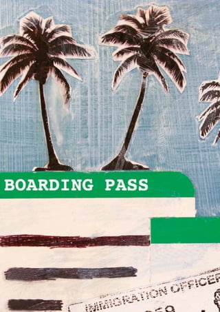
10. illustration: journey
The process of this illustration project began by applying a variety of techniques and
materials to 4 hardwood boards, each with its own theme. Utilizing a number of items
collected over years of traveling, such as ticket stubs, maps and pictures; these were
layered and worked upon until each boards identity appeared uniquely different.
The next step involved scanning the boards and creating a 12-page booklet that
most effectively communicated the chosen subject. Having settled upon the theme
of my personal journeys and experiences encountered whilst traveling and living
abroad, it was decided that the overall format would be represented in the form of
a passport, while each illustration would be accompanied by a brief story appearing
on the opposite page.