

Empfohlen
Weitere ähnliche Inhalte
Was ist angesagt?
Andere mochten auch
Ähnlich wie Caldecott Analysis
Ähnlich wie Caldecott Analysis (20)
Kürzlich hochgeladen
Kürzlich hochgeladen (20)
Caldecott Analysis
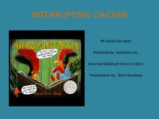
- 1. INTERRUPTING CHICKEN BY David Ezra Stein Published by: Scholastic Inc. Received Caldecott Honor in 2011 Presentation by: Shari Shockney
- 2. STYLE and MEDIA The most obvious style Stein used in his illustrations is the comic or cartoon art style. A few of the cartoon elements are listed below. • • • Top picture: The chickens live in a house, have exaggerated features, and have a human quality to their expressions. They also wear pajamas, which will be seen in later pictures. Middle picture: Hansel and Gretel are nearly all circles and ovals, the witch’s face is mostly nose, and a cartoon text bubble is used for Chicken when she jumps in to interrupt the story Bottom picture: The characters are illustrated to represent Chicken’s illustrations of her own story. The comic, or cartoon, element may still be seen in Papa’s facial expression. Stein used several different painterly media to accomplish his work; water color, water soluble crayon, china marker, pen, opaque white ink, and tea. In doing so he manages to show off his comic style in three completely different ways.
- 3. STYLE CONTINUED Though the comic style is the most obvious in Stein’s illustrations, there also appears to be some impressionism happening. In the above illustration of Chicken’s room the use of warm yellow gives the appearance that the bedside lamp is casting a warm glow over the room, yet some of the room is still left in deep shadows. The objects in the room are distinguishable as furniture, pictures, curtains and so on, but they have no sharp lines or distinct patterns. All of this lends a sleepy, bedtime feeling to the room. The oversized books, which bear no titles one may read, give the impression that bedtime stories are a big deal in the Chicken household.
- 4. LINE In this illustration, Stein uses line to draw the reader’s attention to a wordless exchange between Chicken and Papa. As Papa stands on his reading stool the diagonal slant and triangular shape of his body, as well as the lines in his robe, draw the eye toward his face and the accusing look he is giving Chicken. From there one’s eye easily moves past the glasses to the end of his beak which is pointing toward Chicken and the “Oops, I’m busted” look on her face. The eye is also able to draw an invisible line from Papa’s eyes to Chicken’s and so may easily catch the reader up in this exchange of looks.
- 5. Shape For the most part Stein uses shape as most illustrators would. The majority of shapes used to illustrate Chicken and Papa, the storybook characters, and backgrounds such as the woods in Little Red Riding Hood are all nicely rounded to represent the organic element while books, picture frames, walls, and the wolf’s walking stick are for the most part straighter and more angular to show objects that have been crafted. An exception to the rule of organic figures primarily being made up of curved lines is found in the illustrations that represent Chicken’s illustrations of her own story. Here, the figures of Papa and Chicken are made to look like a child’s drawings which are often made up of basic lines and shapes, many of them without curves where curves should be.
- 6. Color Stein makes excellent use of color in his illustrations. The colors used for Papa and Chicken are warm and vibrant. Their surroundings, while a little more muted, still have the warm yellow glow to them. The illustrations for the storybooks are of a much duller hue. They are done primarily in black and dull brown with only one primary or secondary color, also of a dull hue. All of this is on a background the color of a tea stain. This may seem very uninteresting for what is supposed to be a child’s storybook, but the effect is very striking when bright and colorful Chicken jumps into the scene to save the day for her favorite characters. The use of color in the illustrations of Chicken’s story was well thought out by Stein. The colors are all of the same bright hue one would find in a basic crayon box. The shapes are drawn with the crayons, but the figures are outlined with color for the most part rather than being colored in. The effect reminds me of some of my grandchildren’s first attempts at drawing.
- 7. TEXTURE There are several examples of texture on this two page spread, though they are not as easily seen here as in the book. Because of the mixed media Stein used he was able to create a look to Papa’s pajamas that suggests a fuzzy flannel. Saturated color with highlights and smooth brush strokes give Papa’s tail feathers a sleek and shiny appearance. The curved lines and shading in the blanket make it seem to fall in soft folds from Papa’s hand down across the bed.
- 8. Composition There are several ways in which Stein has used composition to balance illustration elements in this story. • Asymmetrical Balance The illustration above is not balanced in the middle of the two page spread. The center of balance is achieved in two ways: First, the brightness of the bedside lamp draws the reader’s eyes to that portion of the illustration and helps focus them on the faces of the two characters. The second part of the balancing act is achieved by the placement of objects and characters. Even though Papa and the huge storybooks take up most of the space in the illustration, Chicken, all of the furniture, and the picture on the wall take up the rest of the space so that the illustration does not seem weighed down on Papa’s side. • Symmetrical Balance Symmetrical balance is achieved here with the placement of characters. As Chicken jumps into the middle of the story to save the day, she is symmetrically balanced by the placement of a startled storybook character on either side of her.
- 9. Composition Continued • Balancing Illustration with Text Here Stein used text in combination with the illustration in order to balance out the page. The text is centered down the middle of the page and most of the illustration is contained in an oval. There is text both above and below the illustration that further accomplishes balance.