
Empfohlen
Weitere ähnliche Inhalte
Was ist angesagt?
Was ist angesagt? (15)
Ähnlich wie Comparing & contrasting a magazine:Question 7
Ähnlich wie Comparing & contrasting a magazine:Question 7 (20)
Kürzlich hochgeladen
Kürzlich hochgeladen (20)
Comparing & contrasting a magazine:Question 7
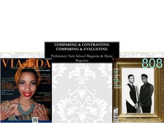
- 1. Preliminary Task-School Magazine & Music Magazine COMPARING & CONTRASTING COMPARING & EVALUATING
- 2. From looking at my art & fashion academy magazine now there are few things I would change, I would move the image down so that the header text appears visibly on the magazine, I would also move the text around so that it doesn’t appear on top of the image. With my music magazine, I wouldn’t change a thing because it looked exactly as I wanted it to, simple, minimal, artistic, subtle and different, was a mixture between my two inspirations-the gentlewoman and THE SOURCE magazine. My music magazine title is also different from that of my Academy magazine, my music magazine has smaller text, is sans-serif and has been right aligned, while the Academy magazine is serif, and covers the whole page, they are however similar in some ways, they are both bold, match with the home style and are clearly visible. FRONT COVER
- 3. Both of my content pages, I would say I prefer that of my Academy magazine, though they have a different point of perspective and look good. With my music magazine, I feel it still needs something to create harmony within each other. While my Academy magazine, looks more harmonious and fulfilling for me. They both have a good layout and look professional I think they both look attractive, but VIA-FDA contents page looks more attracting and the audience would appreciate that more, it's more eye catching because it has more colours that are attractive and complementary, while 808-THE SCHEDULE is more simplistic, which is however what I was aiming for. I wouldn’t change anything on my contents page for my VIA-FDA magazine, I might change the colour so that it would appear more visible. For my music magazine 808-THE SCHEDULE, I was inspired by RESPECT, VIBE & THE SOUCRE magazine. If I was to change anything on the contents page, I would try to make it look more harmonious and try linking the design and layout to each other, that’s between the text, shapes, and images. CONTENT PAGE
- 4. CULTURAL KNOWLEDGE For the music magazine, the images-two shots, mid-shot used were simplistic, and subtle, because I that’s what I was aiming for, something unique, creative, and original, when the images are seen, I wanted the audience to see it as different, interesting, creative and authentic. Like at first when people see it, they pick it up because it looks different and stylish-because it does not look like nearly every music magazine out there. The images-close up & long shots which I used for the school magazine were taken and selected to attract the audience into the school, and make them consider going to the school, the information which I used on the magazine was to convince the audience, especially possible students into joining the school, so as they read the front cover they would want to learn a lot more on the school and be in the school. The images and text are also to motivate parents into their child’s education and looking out for them, so when they see and read the magazine they learn of the academy’s excellent work.
- 5. INTERTEXTUAL UNDERSTANDING These are the main images and magazines I got my idea from for my Academy’s front cover and contents page, here, you are able to see some similarities between them and my magazine.
- 6. INTERTEXTUAL UNDERSTANDING These are the various images and magazines I got my idea from for my music front cover and contents page, here you are able to see various sections from the images and magazines that I used to link up with my magazine, I have to say, creating my music magazine’s front cover and contents page was more tasking, both creatively and logically, because there were so many things I had to think of and consider with the ideas running through my head it was however worth it and a great experience.
- 7. AESTHETIC COMPETENCE The various images which I selected to create my magazine were taken and selected carefully to meet my target audience and appeal well to them, also to fit in with the basis of the magazine. For my preliminary task, the academy magazine: VIA-FDA, I used an attractive image with complimented well with the magazine’s house colour, the model/student which I used relates to the target audience as she’s also a student, the information which is on the magazine appeals to my target audience-parents and teenagers mainly-motivates & attracts them. For my final product, the music magazine: 808, here I used a simple image which fits in well with the well detailed gold frame and the minimal text, compliments well with each other and the house colour to give an overall subtle, simplistic, and stylish effect. The model/artists which I used would both appeal to the male gender-from teenagers upwards who could look up to them and the female gender-from teenagers upwards who might find them attractive, so does the information provided on the magazine.