Responsive Design and Information Architecture with Oracle Web Center Content - Introduction and Best Practices
•Als PPTX, PDF herunterladen•
3 gefällt mir•1,706 views

This whitepaper provides understanding of Responsive Design principles (RDP) and how they apply to your Oracle Content Management system. It also introduces the basic principles of Information Architecture and User Experience Management and shows real world examples of the impact of implementing the RDP. It’s here to help Oracle professionals to quickly identify areas of sub-standard performance and sub-par user experience in their WebCenter implementation and provide practical recommendations to designers and administrators on boosting user productivity.

Empfohlen
Weitere ähnliche Inhalte
Was ist angesagt?
Was ist angesagt? (20)
Andere mochten auch
Andere mochten auch (20)
Ähnlich wie Responsive Design and Information Architecture with Oracle Web Center Content - Introduction and Best Practices
Ähnlich wie Responsive Design and Information Architecture with Oracle Web Center Content - Introduction and Best Practices (20)
Kürzlich hochgeladen
Kürzlich hochgeladen (20)
Responsive Design and Information Architecture with Oracle Web Center Content - Introduction and Best Practices
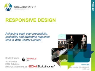
- 1. REMINDER Check in on the COLLABORATE mobile app RESPONSIVE DESIGN Dmitri Khanine Sr. Architect ECM Solutions http://ECMSolutions.ca Achieving peak user productivity, scalability and awesome response time in Web Center Content
- 2. Welcome to Session 606! ■ Responsive Design ▪ What is it ▪ Principles ▪ How to use with WebCenter ■ Information Architecture ▪ What is it ▪ Principles ▪ How to use with WebCenter ■ User Experience ▪ Case Study
- 3. Responsive Design ■ What does it mean? ▪ Is this the design that responds to user needs? ▪ Or it assures fast response times? ▪ Or it‘s a variant of Ajax?
- 4. What is Responsive Design? ■ It‘s an approach to designing HTML apps that work well on a variety of different screens
- 5. Responsive Design - Introduction ■ It‘s an approach, not a technology ■ Also known as ―Responsive Design Principles or RDP‖ ■ Ever growing number of implementations ■ Makes Sense! ■ Often contrasted to Adaptive Web Design
- 6. Adaptive vs. Responsive ■ Adaptive = mobile + desktop ▪ Browser Detection is key ▪ Mobile site fits mobile ▪ Desktop site fits desktop ■ Responsive = one site that responds to it‘s environment ▪ Screen Size is key ▪ Works well on all devices
- 7. Adaptive Design - Demo ■ Mobile Site on a tablet:
- 8. Adaptive Design – Demo (contd.) ■ Desktop site on a phone:
- 9. Responsive Design - Demo ■ Jyske Bank – Denmark: Phone Tablet Desktop
- 10. Key Principles ■ Key Principles of RDP:
- 11. Browser as the reason for the design ■ ―Stop Thinking in Pages. Start Thinking in Systems.‖ Jeremy Keith ▪ Start with the needs of each browser — Mobile — Tablet — Desktop ▪ Factor in connection speeds and scripting abilities
- 12. ‘Mobile First’ principle ■ Why? ▪ 28% of all traffic in 2013 was mobile ■ Design your mobile experience first ■ Add new elements as capabilities increase
- 13. Progressive Enhancement Principle ■ Start with ‗Mobile First‘ ■ Add features and elements as capabilities increase ■ Think ‗Break Points‘ – screen sizes where you add functionality
- 14. Break Points Example ■ Jyske Bank‘ Site ▪ Product Buttons are replaced by the product shelf at 450px ▪ Left feature on the top is added at 500px ▪ Search box replaces the search button at 750 px, ▪ Feature image is added at 850 px, ▪ Full top menu replaces a menu button at 550px, ▪ Two lines of Product Shelf joins into one at 1000 px
- 15. Break Points Example (contd.)
- 16. Graceful Degradation Principle ■ Opposite of Progressive Enhancement ■ Starts with your Desktop Site and takes away features to make it work on smaller screens ▪ Resize, reposition, hide or replace heavy graphics and JavaScript ■ Important features may disappear as User Experience is designed based on desktop capabilities
- 17. Graceful Degradation Principle - Example
- 18. The Fluid Grid ■ Use percentage sizing instead of pixels ■ No tables used for layout ▪ Use CSS positioned DIVs ■ Do not use absolute positioning. Use CSS float instead
- 19. Media Queries ■ CSS construct that allows page to adjust to the type of output device ▪ Hide background and some graphics when printing ▪ Resize objects based on screen size ■ @media screen and (max-width: 480px){ .header { background: url('img/bkg_small.jpg');} } ■ @media screen and (min-width: 481px) and (max-width: 600px){ .header{ background: url('img/bkg_med.jpg');} } ■ @media screen and (min-width: 601px){ .header{ background: url('img/bkg_lg.jpg');} }
- 20. Client – Server Interaction ■ Hiding objects with CSS will not make the page load faster ▪ To tailor page to screen size use cookies or Ajax calls to set session values
- 21. Using RDP with WebCenter Practical insights and Observations Practical insights and Observations
- 22. WebCenter Sites Mobility Server ■ Automatically formatting your site's content to fit the end user's device
- 23. Digital Asset Manager (DAM) ■ Automatically generate various resolution sets for all types of images ■ Have them ready for use in your design ■ Video Manager converts videos to streaming format ▪ Generates storyboard thumbnails
- 24. RDP with ADF ■ Can be tricky as ADF is driven by custom tags ▪ Custom tags controlled by rederkit ■ Check out John Sim‘s template for using Fluid Grid with ADFL ▪ Google for ―Fishbowl Responsive Design‖ (http://cfour.fishbowlsolutions.com/2012/08/16/webcenter-portal- spaces-boilerplate-template-and-guide-to-responsive-design/ )
- 25. RDP with Site Studio ■ No serious limitations on your code ■ Do not to use Design Mode in Site Studio Designer as it may break your code
- 26. Basic Principles of Information Architecture
- 27. Information Architecture (IA) ■ Deals with the structure of information ■ Before designing IA answer these questions: ▪ What types of information assets are you managing ▪ What are your high level Use Cases
- 28. Basic Principles
- 29. Affinity to Growth ■ Design so it will continue to work when your content multiplies by factor of 10 and more ▪ Cost of storage goes down ▪ More content comes in then gets disposed
- 30. Content as an Object ■ Content is a living thing ▪ Lifecycle – expiry, seasonal etc ▪ Attributes ■ Think content types and relationships
- 31. The choice dilemma ■ Large number of choices make it hard for us to decide ■ (Small, focused lists are the answer)
- 32. Gradual Disclosure ■ Only show enough information for people to understand what comes next and make a decision ■ Think layers ▪ Start with a list of short descriptions or snippets ▪ These will lead to the item ■ Google is a perfect example
- 33. Show by example ■ "Describe the content of categories by showing examples of content― Dan Brown
- 34. Arbitrary point of entry ■ Assume that 50% of your visitors will NOT use your home page ▪ Your site template have all required navigation ▪ Every page needs to show what other content is also available ■ Home page should not be the do all page ▪ Focus on welcoming and properly introducing new users
- 35. DIVERSE CLASSIFICATION ■ People use different ways when they‘re looking for information ▪ Gmail has moved away from folders and uses labels ▪ Think online store – browse by size, color and type. ■ Taken too far - may overwhelm and confuse your users
- 36. Rethink your nav ■ Most shops refer to navigation elements by location ▪ Names like Top Nav, Left Nav make you miss the purpose ▪ Try using — ‗Department Nav‘ instead of the ‗Top Nav‘ — ‗Topic Nav‘ instead of the ‗Left Nav‘
- 38. User Experience Management (UEM) ■ An overarching topic – including ▪ Information Architecture ▪ Your design ▪ Information flows ▪ Usability ■ Start with your Use Cases!
- 39. Case Study: Improving User Experience with Oracle Content Server ■ Content Server UI is a frequent target for end user complaints...
- 40. Our findings ■ We began by studying Use Cases ▪ Main information flow: Search > Content Information > Document Preview ■ Main problem – a lot of waiting: ▪ Click on the link and wait ▪ Then go back and wait for results to load again ▪ Find the row you just clicked on and click on the next one
- 41. Screen Layout ■ Use of screen real estate can be greatly improved ▪ 20 rows per screen and nothing else:
- 42. Pagination ■ May work well on a web site, but problematic in a web app ▪ Going to the next page involves waiting. ▪ Mass update operations that span multiple pages have to be performed multiple times (for each page) ▪ Risk of error – as you have to repeat update instructions for every page
- 43. New UI ■ More information on the screen means less waiting:
- 44. New features ■ Seamless scroll with lazy load ■ Almost twice as many rows on the screen without feeling crowded ■ Document Preview and Content Information without leaving Search Results
- 45. Checkboxes – be gone! ■ Windows style selection: ▪ Ctrl and Shift allows multiple selection
- 46. Context Sensitive Menus ■ Context Menu changes based on the number of items and type of items selected:
- 47. Iteratively refinement of search criteria: ■ Allows users to tweak their criteria without leaving the form:
- 48. New Content Server Web UI ■ Why didn‘t we use the new Web UI? ▪ Web UI requires 11g ▪ Project took place before Web UI was available ▪ Our UI still works better for the type of information they managing:
- 49. Conclusion
- 50. Conclusion ■ Mobile browsing becomes mainstream ▪ Consider using Responsive Design on your sites ▪ Information Architecture becomes more critical as amounts of information grows ▪ Think Use Cases and Information Flows before designing your site or your web app
- 51. About Us ■ ECM Solutions does ▪ Oracle WebCenter Implementation, Support and Training ■ We also ▪ Help you ―Awe Your Business Users‖ with Dynamic User Interfaces ■ Check www.ecmsolutions.ca for real life user stories
- 52. Please complete the session evaluation on the mobile app We appreciate your feedback and insight This box will have simplified instructions about how to complete the session evaluation online