
Empfohlen
Weitere ähnliche Inhalte
Was ist angesagt?
Was ist angesagt? (19)
Andere mochten auch
Andere mochten auch (14)
Ähnlich wie Hierarchy
Ähnlich wie Hierarchy (20)
Mehr von sarahwalley
Mehr von sarahwalley (20)
Hierarchy
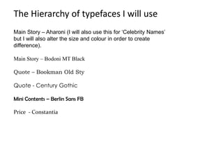
- 1. The Hierarchy of typefaces I will use Main Story – Aharoni (I will also use this for ‘Celebrity Names’ but I will also alter the size and colour in order to create difference). Main Story – Bodoni MT Black Quote – Bookman Old Sty Quote - Century Gothic Mini Contents – Berlin Sans FB Price - Constantia
- 2. Masthead This has the formalities of an adult music magazine with directional effects which make the magazine appear edgy and up to date ,the curves of the letters add femininity to the masthead in order for it to convey its appeal to both sexes. The Dead Saloon by gwizsk This heading looks like metal which represents the genre of music I wish to use in the creation of my magazine, the sharpness and boldness of this masthead instantly attract you to read. Looks like an old street sign that’s been worn away ,this could look like the talent in this magazine will live on forever this also shows passion for the music due to poor media influence within small towns.
- 3. This title looks like someone's doodle which could convey the individuality of the music contained within the whole magazine. This title makes you feel like your part of an investigation into the discovery of the latest songs singers and band, created using newspaper letterings.