
Empfohlen
Weitere ähnliche Inhalte
Was ist angesagt?
Was ist angesagt? (18)
Ähnlich wie Print work - TV Choice Mark
Ähnlich wie Print work - TV Choice Mark (14)
Mehr von salesian2015a2
Mehr von salesian2015a2 (18)
Kürzlich hochgeladen
Kürzlich hochgeladen (20)
Print work - TV Choice Mark
- 1. Print Work - Magazine TV Choice
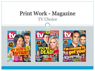
- 2. TV Choice Analysis Bold Headline – stand out from all the others on the shelf Clear bold branding of logo with customised date published at the top Side story for continuous running soaps situated in a cut off box Clear pricing displaying how cheap it is Side story cut away from main picture using custom shape Bright and Bold colours used throughout, it will easily stand out to the buyer on the stand Two main pictures taken separately and edited together adding light from the same direction
- 3. My Cover I have drawn out roughly how I would like my magazine cover to look like. Clear and recognisable TV choice logo featuring date of publication Price displayed clearly Side stories of other possible TV listings – pictures are my own Exclusive Behind the scenes of Heartbreak United, featuring pictures I took when we were filming. Two main images are of Tony Brown our manager and Johnny our star striker. Coming soon – introducing the new series and when its going to be
- 4. Key Things I need to Include Date Price Bold writing and colours throughout to attract peoples eye on the magazine stand Barely any blank space Need to follow and keep on looking back at other TV choice magazines and comparing mine to that and see the similarities and differences and whether it fits into their style.