SlideShare ist ein Scribd-Unternehmen logo
1 von 17
In what ways does your media product use, develop or challenge forms and conventions of real media products? This is my completed magazine front cover and contents page. I am pretty pleased with the final results and feel as though they look authentic and have many aspects of conventional music magazines, along with elements that make it original that I feel have put my own take onto it.
Initially it looks very typical of a regular magazine as it has a similar layout to magazines such as NME which I have based my magazine upon. It has a typical form of title and it is on the left hand side like the majority of magazines on the market today.  This is the title on NME magazine, compared to the title on my magazine. I feel that it fits the conventions of typical magazines as it has the same 3 letter abbreviations, in similar colours on the same side as the original magazine, I even adapted the “New Musical Express” that is on NME and made my AMP into “Acoustic Music Productions” I think it looks effective and authentic and would pass as an original magazine if against them. For the image on my front cover I used the plain background of the photography studio as, not only is it similar to the white background used for magazines such as NME. Furthermore, the plain background meant that there was no distractions in the mis-en-scene to draw the attention away from the models that I have used. I adjusted the contrast and the brightness on photoshop for the final image to make the background whiter and more fresh. The models I have used, Shona and Josh, I feel fit into the quirky and indie image that I was looking for and basing my magazine upon. They are looking directly at the camera at the audience, attracting people to buy it. They are quite young and would therefore appeal to my target audience of late teens, as they are a similar age to the audience that I am aiming for, and therefore would be able to relate to it. I also used pictures of Josh and Shona for my double page spread.
For the page before my double page spread, I particularly liked this photo of the pair hiding behind the cushions. I feel that it looks individual and the writing on the cushions that I have used as props is different to what is normally used on the double page spreads in magazines. This is a screenshot of part of my double page  spread as an example of the text that I used on  my double page spread, it has the conventions  of a typical magazine, as it is in columns, and also  has a quote in larger font, similar to normal  magazines, and has a picture which includes a  quote, which is again, a typical example of what is used in many of the magazines.
The main texts that I used for my title were from the website www.dafont.co.uk, and then adapted it so that it could be used on photoshop. Acid Label was used for the main title of the magazine. Then I changed things on photoshop, such as the stroke and drop shadow of the text, to make it stand out more on the page. The other font that I used quite a lot on my front cover and contents page was VeteranTypewriterand here is an example of it being used for my header on my magazine
2: How does your media product represent particular social groups? I used a mixed gender, so that it would appeal to a wider audience, and I made them look like  the indie culture yet with a slight poppy edge. They are smiling and looking happy which  Is slightly different to conventional magazines that go for a harder edge.
For this model I tried to bring across, again the indie culture and went for a form of “bad girl” image. Also, attempted to have a mix of gender. Before choosing my final images for my contents page, I was going to use the one on the left, however I thought that the model looked too young poppy for the image of my magazine.
For this photo I tried to create an authentic band feel as I wanted my magazine to look like it had found new artists or really been to gigs that they had played at. The majority of my models fit into the new indie generation, as I felt that was a large and wide target audience, I tried to use a mixed gender to attract both male and female, and also kept the models at around 18 onwards, so that it was clear what age group my magazine was being targeted at.
3: What kind of media institution might distribute your media product and why? By researching about magazines and the costs included, I realised that advertisements are a key way of funding the music magazine industry. I feel as though I should have included more adverstiments in my magazine, as that would have made it look more effective and realistic.  I found much of my research for costings on the site; http://www.isubscribe.co.uk I researched distributors responsible for NME, Blender, Kerrang! and Q.Dennis media, is the production company for the magazine, Blender.
Bauer Media Group produce Q, NME, MOJO and Kerrang!. I would let Bauer distribute AMP, as it is european and from the amount of  magazines they advertise they are reliable and successful. Furthermore, it  produces the type of magazines that I have based mine upon, so feel that they would be the most likely to gain my magazine an appropriate audience.
4: Who would be the audience for your media product? This would be the type of audience for my magazine. They are a mixture of male and females all around the same age and interested in the same sort of music. They are open minded in music and television and such things, so would be willing to adapt to new bands, which was a major point of my magazine.
5: How did you attractddress your audience? This is a way that I have attracted my target audience, as I know that the majority of them are interested and like to attend music festivals, so mentioning them would attract their attention.
6: What have you learnt about technologies from the process of constructing this product? The technologies that I have used are firstly; Adobe photoshop  I used this, mainly because it was the most accessible design programme available in college. I had never used Photoshop before, and it took me quite some time to get used to the techniques and effects used to make my magazine. I used Microsoft Publisher to do my double page spread, as it was easier to make the columns for my text and move the pictures and quotes around.  I used an SLR camera for my photoshoot.
7: Looking back at your preliminary task (the school magazine task), what do you feel you have learnt in the progression from it to full product?
Looking back at the preliminary task, I feel as though I have learnt a lot from the process.
Media example
Media example

Weitere ähnliche Inhalte

Was ist angesagt?

Sasha Hodjati AS media evaluation
Sasha Hodjati AS media evaluationSasha Hodjati AS media evaluation
Sasha Hodjati AS media evaluationAnne Horne
 
AS Media Studies: Evaluation Question 7
AS Media Studies: Evaluation Question 7AS Media Studies: Evaluation Question 7
AS Media Studies: Evaluation Question 7_arlindm1
 
Question (7)
Question (7)Question (7)
Question (7)rjenkinss
 
As media evaluation
As media evaluationAs media evaluation
As media evaluationrjenkinss
 
Georgia Everitt AS media evaluation
Georgia Everitt AS media evaluationGeorgia Everitt AS media evaluation
Georgia Everitt AS media evaluationAnne Horne
 
Ramarna's Media Evaluation
Ramarna's Media EvaluationRamarna's Media Evaluation
Ramarna's Media Evaluationramarnax
 
Evaluation new
Evaluation newEvaluation new
Evaluation newbhavzz03
 
Katys final evaluation
Katys final evaluation Katys final evaluation
Katys final evaluation Katy-Kyle
 
Evaluation
EvaluationEvaluation
EvaluationPCaudy
 

Was ist angesagt? (19)

Sasha Hodjati AS media evaluation
Sasha Hodjati AS media evaluationSasha Hodjati AS media evaluation
Sasha Hodjati AS media evaluation
 
AS Media Studies: Evaluation Question 7
AS Media Studies: Evaluation Question 7AS Media Studies: Evaluation Question 7
AS Media Studies: Evaluation Question 7
 
Question (7)
Question (7)Question (7)
Question (7)
 
Evaluation
EvaluationEvaluation
Evaluation
 
As media evaluation
As media evaluationAs media evaluation
As media evaluation
 
Question 1 completed
Question 1 completedQuestion 1 completed
Question 1 completed
 
Georgia Everitt AS media evaluation
Georgia Everitt AS media evaluationGeorgia Everitt AS media evaluation
Georgia Everitt AS media evaluation
 
Magazine Evaluation
Magazine EvaluationMagazine Evaluation
Magazine Evaluation
 
Evaluation
EvaluationEvaluation
Evaluation
 
Evaluation
EvaluationEvaluation
Evaluation
 
My Evaluation
My EvaluationMy Evaluation
My Evaluation
 
Evaluation
Evaluation Evaluation
Evaluation
 
Evaluation2
Evaluation2Evaluation2
Evaluation2
 
Question 2
Question 2Question 2
Question 2
 
Ramarna's Media Evaluation
Ramarna's Media EvaluationRamarna's Media Evaluation
Ramarna's Media Evaluation
 
Evaluation new
Evaluation newEvaluation new
Evaluation new
 
Katys final evaluation
Katys final evaluation Katys final evaluation
Katys final evaluation
 
Evau
EvauEvau
Evau
 
Evaluation
EvaluationEvaluation
Evaluation
 

Ähnlich wie Media example

Ähnlich wie Media example (20)

Evaluation presentation
Evaluation presentationEvaluation presentation
Evaluation presentation
 
Media - Evaluation
Media - EvaluationMedia - Evaluation
Media - Evaluation
 
Rosie's Evaluation 2010
Rosie's Evaluation 2010Rosie's Evaluation 2010
Rosie's Evaluation 2010
 
Evaluation
Evaluation Evaluation
Evaluation
 
Greg As Media Production
Greg As Media ProductionGreg As Media Production
Greg As Media Production
 
Evaluation
EvaluationEvaluation
Evaluation
 
Evaluation
EvaluationEvaluation
Evaluation
 
Evaluation
EvaluationEvaluation
Evaluation
 
Evaluation
Evaluation Evaluation
Evaluation
 
Evaluation
Evaluation Evaluation
Evaluation
 
Evaluation
EvaluationEvaluation
Evaluation
 
Evaluation[1]
Evaluation[1]Evaluation[1]
Evaluation[1]
 
Evaluation
EvaluationEvaluation
Evaluation
 
Evaluation
EvaluationEvaluation
Evaluation
 
Evaluation
EvaluationEvaluation
Evaluation
 
Evaluation
EvaluationEvaluation
Evaluation
 
Evaluatio1
Evaluatio1Evaluatio1
Evaluatio1
 
Harry seager
Harry seagerHarry seager
Harry seager
 
Media evaluations
Media evaluationsMedia evaluations
Media evaluations
 
Harry seager
Harry seagerHarry seager
Harry seager
 

Media example

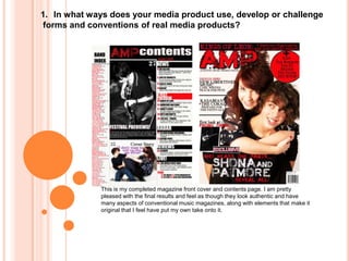
  • 1. In what ways does your media product use, develop or challenge forms and conventions of real media products? This is my completed magazine front cover and contents page. I am pretty pleased with the final results and feel as though they look authentic and have many aspects of conventional music magazines, along with elements that make it original that I feel have put my own take onto it.
  • 2. Initially it looks very typical of a regular magazine as it has a similar layout to magazines such as NME which I have based my magazine upon. It has a typical form of title and it is on the left hand side like the majority of magazines on the market today. This is the title on NME magazine, compared to the title on my magazine. I feel that it fits the conventions of typical magazines as it has the same 3 letter abbreviations, in similar colours on the same side as the original magazine, I even adapted the “New Musical Express” that is on NME and made my AMP into “Acoustic Music Productions” I think it looks effective and authentic and would pass as an original magazine if against them. For the image on my front cover I used the plain background of the photography studio as, not only is it similar to the white background used for magazines such as NME. Furthermore, the plain background meant that there was no distractions in the mis-en-scene to draw the attention away from the models that I have used. I adjusted the contrast and the brightness on photoshop for the final image to make the background whiter and more fresh. The models I have used, Shona and Josh, I feel fit into the quirky and indie image that I was looking for and basing my magazine upon. They are looking directly at the camera at the audience, attracting people to buy it. They are quite young and would therefore appeal to my target audience of late teens, as they are a similar age to the audience that I am aiming for, and therefore would be able to relate to it. I also used pictures of Josh and Shona for my double page spread.
  • 3. For the page before my double page spread, I particularly liked this photo of the pair hiding behind the cushions. I feel that it looks individual and the writing on the cushions that I have used as props is different to what is normally used on the double page spreads in magazines. This is a screenshot of part of my double page spread as an example of the text that I used on my double page spread, it has the conventions of a typical magazine, as it is in columns, and also has a quote in larger font, similar to normal magazines, and has a picture which includes a quote, which is again, a typical example of what is used in many of the magazines.
  • 4. The main texts that I used for my title were from the website www.dafont.co.uk, and then adapted it so that it could be used on photoshop. Acid Label was used for the main title of the magazine. Then I changed things on photoshop, such as the stroke and drop shadow of the text, to make it stand out more on the page. The other font that I used quite a lot on my front cover and contents page was VeteranTypewriterand here is an example of it being used for my header on my magazine
  • 5. 2: How does your media product represent particular social groups? I used a mixed gender, so that it would appeal to a wider audience, and I made them look like the indie culture yet with a slight poppy edge. They are smiling and looking happy which Is slightly different to conventional magazines that go for a harder edge.
  • 6. For this model I tried to bring across, again the indie culture and went for a form of “bad girl” image. Also, attempted to have a mix of gender. Before choosing my final images for my contents page, I was going to use the one on the left, however I thought that the model looked too young poppy for the image of my magazine.
  • 7. For this photo I tried to create an authentic band feel as I wanted my magazine to look like it had found new artists or really been to gigs that they had played at. The majority of my models fit into the new indie generation, as I felt that was a large and wide target audience, I tried to use a mixed gender to attract both male and female, and also kept the models at around 18 onwards, so that it was clear what age group my magazine was being targeted at.
  • 8. 3: What kind of media institution might distribute your media product and why? By researching about magazines and the costs included, I realised that advertisements are a key way of funding the music magazine industry. I feel as though I should have included more adverstiments in my magazine, as that would have made it look more effective and realistic. I found much of my research for costings on the site; http://www.isubscribe.co.uk I researched distributors responsible for NME, Blender, Kerrang! and Q.Dennis media, is the production company for the magazine, Blender.
  • 9. Bauer Media Group produce Q, NME, MOJO and Kerrang!. I would let Bauer distribute AMP, as it is european and from the amount of magazines they advertise they are reliable and successful. Furthermore, it produces the type of magazines that I have based mine upon, so feel that they would be the most likely to gain my magazine an appropriate audience.
  • 10. 4: Who would be the audience for your media product? This would be the type of audience for my magazine. They are a mixture of male and females all around the same age and interested in the same sort of music. They are open minded in music and television and such things, so would be willing to adapt to new bands, which was a major point of my magazine.
  • 11. 5: How did you attractddress your audience? This is a way that I have attracted my target audience, as I know that the majority of them are interested and like to attend music festivals, so mentioning them would attract their attention.
  • 12. 6: What have you learnt about technologies from the process of constructing this product? The technologies that I have used are firstly; Adobe photoshop I used this, mainly because it was the most accessible design programme available in college. I had never used Photoshop before, and it took me quite some time to get used to the techniques and effects used to make my magazine. I used Microsoft Publisher to do my double page spread, as it was easier to make the columns for my text and move the pictures and quotes around. I used an SLR camera for my photoshoot.
  • 13. 7: Looking back at your preliminary task (the school magazine task), what do you feel you have learnt in the progression from it to full product?
  • 14.
  • 15. Looking back at the preliminary task, I feel as though I have learnt a lot from the process.