Diseño Responsivo en Drupal: ¿Qué hay de Nuevo?
•Als PPT, PDF herunterladen•
0 gefällt mir•537 views

Aprende sobre las últimas tendencias en diseño responsivo usando Drupal. Diseña tu sitio web en minutos usando uno de los temas recomendados.

Empfohlen
Weitere ähnliche Inhalte
Was ist angesagt?
Was ist angesagt? (20)
Andere mochten auch
Ähnlich wie Diseño Responsivo en Drupal: ¿Qué hay de Nuevo?
Ähnlich wie Diseño Responsivo en Drupal: ¿Qué hay de Nuevo? (20)
Kürzlich hochgeladen
Kürzlich hochgeladen (20)
Diseño Responsivo en Drupal: ¿Qué hay de Nuevo?
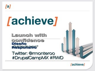
- 1. Launch withLaunch with confidenceconfidence DiseñoDiseño ResponsivoResponsivo¿Qué hay de nuevo?¿Qué hay de nuevo? Twitter: @rmonterooTwitter: @rmonteroo #DrupalCampMX #RWD#DrupalCampMX #RWD
- 2. RobMontero- AchieveInternet Rob is un ingeniero senior para Achieve Internet. Más de 10 años de experiencia haciendo desarrollo web y 4+ haciendo Drupal exclusivamente. Achieve Internet es una empresa líder en el desarrollo avanzado de plataformas web y móvil. Construímos arquitectura sólida y lo hacemos bien para que puedas lanzar con confianza. Trabajamos para sitios de alta demanda, plataformas y ambientes estrictos.
- 3. Agenda • ¿Qué es el RWD? • Ejemplos • ¿A mano o theme? • ¿Lo necesito? • Relevancia • Los buzzwords • Nuevos juguetes • ¿Qué hay de nuevo? • Themes • <picture> • FlexSlider • Bgstretch • Para llevar • Preguntas
- 5. DiseñoWebResponsivo RWD es el concepto de desarrollar un sitio web de una manera que permite que el diseño se ajuste de acuerdo con la resolución de pantalla
- 9. ¿Quéesel¿Quéesel RWD?RWD? Si tienes una laptop, tablet o smart phone puedes ver de lo que hablo dirigiéndote a estas direcciones: •http://achv.in/rwdrob •http://mattkersley.com/responsive/? {website_url}
- 10. SimonCollison
- 11. FoodSense
- 13. FlexSlider
- 15. Lagranpregunta ¿Construyo el tema (theme) HTML + CSS + JS a mano - O - -uso un tema contrib?
- 16. Thebigquestion
- 17. ¡OK!¡OK! ¡Entienden el¡Entienden el punto!punto! Para más ejemplos:Para más ejemplos: http://designmodo.com/http://designmodo.com/ responsive-design-examplesresponsive-design-examples
- 18. ¿Quién necesita el RWD? Necesitas RWD si: •Estás empezando de cero •Quieres cortar costos •Quieres que funcione aún si lanzan nuevos dispositivos
- 19. ¿Por qué es relevante? •1.8 billiones de conexiones a internet en el mundo hoy. •6.8 billiones de gente en el mundo hoy. •3.4 billiones de gente con dispositivos móviles en el mundo hoy. ( por ahí de la ½ de la población mundial )
- 20. ¿Por qué es relevante? Se trata de la gente, no de los
- 21. ¿Por qué es relevante? •1.3 billiones de usuarios móviles en el mundo hoy. ( Incluye WAP y “la web común” ) •1/3 de los usuarios de internet acceden únicamente por via móvil
- 22. ¿Por qué es relevante? El futuro
- 23. ¿Por qué es relevante? Es muy conven iente
- 24. ¿Por qué es relevante? RWD nos permite ajustar el diseño y mostrar solo la información relevante primero: •Horario de operación •Teléfono •Dirección con enlace a tu app de nav. •Un link para ver el menú. Lo demás puede esperar / ahorra bandwidth.
- 25. ¿Por qué es relevante? Ya en tu escritorio puedes ver todo lo no esencial sobre este restaurante. •Fotos exquisitas. •Te hacen la boca agua •Todo eso tan importante que la agencia de mercadeo recomendó. •El perfil del chef y sus premios, etc…
- 26. • Evita el keyhole browsing. • No deberías necesitar una lupa para navegar deste tu teléfono ¿Por qué es relevante?
- 27. Hola Media Queries y CSS3 In its essence a media query consists of a media type and an expression to check for certain conditions of a particular media feature. The most commonly used media feature is width.
- 28. CSS3 & Media Queries La ausencia de soporte para @media queries es de hecho el primer @media query.
- 29. CSS3 & Media Queries En tu CSS: @media screen and (min-width: 480px) { .content { float: left; } .social_icons { display: none } // y así consecutivamente... }
- 30. CSS3 & Media Queries O en los encabezados de tu sitio: <link rel="stylesheet" href="this.css" media="(min-width: 960px)">
- 31. CSS3&MediaQueries Al restringir las reglas de CSS al tamaño de la pantalla donde se despliega podemos ajustar a la medida la presentación de la misma únicamente para dicho tamaño.
- 33. ¿CómodiseñamosparaRWD? Simple: Usa el Mobile First Approach y favorece el Progressive Enhancement en lugar del tradicional Graceful Degradation
- 36. Graceful Degradation • Se enfoca en la construcción de la página web para los buscadores más avanzados / capaces. • Se espera que los navegadores más antiguos tengan una mala experiencia, pero pasable. • Se pueden hacer ajustes para browsers particulares ( no son lo principal )
- 37. ProgressiveEnhancement • Se enfoca en el contenido. ( no los navegadores ) • Piensa del contenido hacia afuera. ( M&M maní ) – Cacahuate: Contenido, con (x)html rico y semántico – Cubierto de una rica y cremosa capa de CSS – JS es la coraza dura dulce
- 38. ProgressiveEnhancement Progressive Enhancement consiste de los siguientes fundamentos: •El contenido básico y su funcionalidad debe ser accesibleen todos los navegadores. •El markup semántico y liviano contiene todo el contenido. •Diagramación avanzada CSS externo. •Funcionalidad avanzada JavaScript externo. •Repetar las preferencias de navegación del usuario final.
- 39. Progressive Enhancement Beneficios: •Accesibilidad: Las páginas con PE son más accesibles por su naturaleza. •SEO: Ya que el contenido básico siempre está accesible. •Desempeño: Responsive = Rápido
- 40. Juguetes nuevos para tu cajón http://lab.maltewassermann.com/viewport- resizer/
- 41. Juguetes nuevos para tu cajón http://respondr.webhoard.net/
- 42. Juguetes nuevos para tu cajón http://designmodo.com/responsive-test/
- 43. Media Query DebuggerMedia Query Debugger http://johanbrook.com/design/chttp://johanbrook.com/design/c ss/debugging-css-media-ss/debugging-css-media- queriesqueries
- 44. peroy… ¿quéhaydenuevo? RWD ha estado alrededor por un buen tiempo, pero no ha pasado de moda.
- 45. peroy… ¿quéhaydenuevo? Éstos son algunos de los desarrollos nuevos favoritos en Diseño Web Responsivo
- 46. peroy… ¿quéhaydenuevo? Zen & Zenstrap Bootstrap Zurb-Foundation Boilerplate Omega
- 47. peroy… ¿quéhaydenuevo? La etiqueta <picture> y por lo tanto el módulo Picture. Vs: adaptive-image, ais cs_adaptive_image, responsive_images and resp_img, rwdimages
- 48. peroy… ¿quéhaydenuevo? FlexSlider Como views_slideshow pero responsivo y con capacidad de responder al taco. Y soporta el módulo picture, además
- 49. peroy… ¿quéhaydenuevo? • fit_text • fitvids • responsive_embeds • backstretch *
- 50. Parallevar 1. HTML5 Boilerplate (http://h5bp.com) 2. Design Sketch Sheets (http://jeremypalford.com/arch- journal/responsive-web-design-sketch- sheets) 3. GoldenGridSystem.com 4. Foldy960 (http://github.com/davatron5000/Foldy960) 5. FitText (http://fittextjs.com/)
- 51. Parallevar 6. 320 and up (http://stuffandnonsense.co.uk/projects/3 20andup) 7. Gridless (http://thatcoolguy.github.com/gridless- boilerplate) 8. Skeleton (http://www.getskeleton.com/) 9. ResizeMyBrowser.com 10.Responsive Design Testing (http://mattkersley.com/responsive)
- 52. Tarea • http://www.w3.org/TR/css3-mediaqueries. • https://developer.mozilla.org/en/CSS/Media_q ueries • https://github.com/fourkitchens/train-rwd (via @FourKitchens’ @rupl) • http://www.leveltendesign.com/blog/mark- carver/responsive-drupal-theming-done-right- way-least-now-anyway
- 53. Créditos •Mi primera clase de RWD fue en un taller impartido por Four Kitchens •Revisen sus programas de entrenamiento. •http://fourkitchens.com
- 54. Rob Montero • dgo.to/@rmontero • @rmonteroo • /in/rmontero Email: rob@achieve.la ¿Preguntas o Comentarios?
- 55. ¡Los esperamos!
- 57. Demo Time! We will be demoing a couple of examples, one will be plain HTML5 + CSS using h5bp and the other will be similar but using Drupal. If you want to play with this at home, feel free to download the resources at: https://github.com/fourkitchens/train-rwd
Hinweis der Redaktion
- Take SONY.com. Wouldn&apos;t it be wonderful if that beautiful site would render correctly no matter what screen size it&apos;s being viewed on?
- It does: http://mattkersley.com/responsive/?http://sony.com
- It does: http://mattkersley.com/responsive/?http://sony.com
- YOU’RE STARTING FROM SCRATCH Developing a whole new website or web application is a challenging process. You won’t know if the site will be successful until it’s live and in the world, so creating a separate mobile site or a mobile app in tandem with a website project could be a big waste time and money. It’s more efficient to get your new site performing well before you create an additional mobile site or application. YOU WANT TO KEEP COSTS LOW Solid responsive solutions require additional design and front-end development time, but doesn’t too heavily impact application development. It could take around 20-30 per cent longer to develop a responsive site, but it’s still faster than creating an additional mobile site or app. Developing a site this way also means that you only need to develop, manage, and maintain the one site, so it can reduce these costs too. YOU WANT IT TO WORK EVEN WHEN NEW DEVICES ARE RELEASED A mobile site needs to be able to recognize the user’s device; when new devices are released, the site needs to be updated. As the responsive solution only recognizes the browser’s width, no new updates would need to be made. This means it’s much more future-proof and scalable.
- Yes your iPhone goes to great lengths to facilitate browsing full sites, but technology should be available to everyone, even those without smart phones. The most popular devices aren’t necessarily the most used devices.
- Babies have an easier time interacting with an iPad than with a magazine. To them a print magazine is just like a broken iPad. Websites are not limited to laptops only.
- You’re not at your desk, you are hungry. In your email you have a coupon to this cool new restaurant. You pull up your phone, click on the link and… What would you expect to see? &gt;&gt;
- RWD allows us to rearrange or tweak the layout in ways that are meaningful for the current viewport. A small smart phone screen should have just enough room to show the fundamentals: hours, phone number, directions and perhaps a link to the menu.
- Meanwhile back at your desk, the restaurant’s page has all the bells and whistles you didn’t care for while browsing on your phone.
- RWD allows us to rearrange or tweak the layout in ways that are meaningful for the current viewport. A small smart phone screen should have just enough room to show the fundamentals: hours, phone number, directions and perhaps a link to the menu. Meanwhile back at your desk, the restaurant’s page has all the bells and whistles you didn’t care for while browsing on your phone.
- Using a series of media queries like this, we can work our way up towards larger resolutions. http://MediaQueri.es
- Using a series of media queries like this, we can work our way up towards larger resolutions. http://MediaQueri.es
- Recommended pixel sets: 320px, 480px, 600px, 768px, 900px, 1200px
- THE GRACEFUL DEGRADATION PERSPECTIVE Graceful degradation focuses on building the website for the most advanced/capable browsers. Testing in browsers deemed “older” or less capable usually takes place during the last quarter of the development cycle and is often restricted to the previous release of the major browsers (IE, Mozilla, etc.). Under this paradigm, older browsers are expected to have a poor, but passable experience. Small fixes may be made to accommodate a particular browser. Because they are not the focus, little attention is paid beyond fixing the most egregious errors.
- THE PROGRESSIVE ENHANCEMENT PERSPECTIVE Progressive enhancement focuses on the content. Note the difference: I didn’t even mention browsers. So how does it work? Getting into the progressive enhancement mindset is quite simple: just think from the content out. The content forms the solid base on which you layer your style and interactivity. If you’re a candy fan, think of it as a Peanut M&M: Start with your content peanut, marked up in rich, semantic (X)HTML.Coat that content with a layer of rich, creamy CSS.Finally, add JavaScript as the hard candy shell to make a wonderfully tasty treat (and keep it from melting in your hands).
- &quot;Progressive Enhancement&quot; was coined by Steven Champeon of hesketh.com in a series of articles and presentations for Webmonkey and the SXSW Interactive conference between March and June 2003. Progressive Enhancement consists of the following core principles: basic content should be accessible to all web browsers basic functionality should be accessible to all web browsers sparse, semantic markup contains all content enhanced layout is provided by externally linked CSS enhanced behavior is provided by unobtrusive, externally linked JavaScript end-user web browser preferences are respected
- Benefits for accessibility Web pages created according to the principles of PE are by their nature more accessible, because the strategy demands that basic content always be available, not obstructed by commonly unsupported or easily disabled scripting. Additionally, the sparse markup principle makes it easier for tools that read content aloud to find that content Benefits for search engine optimization (SEO) Improved results with respect to search engine optimization is another side effect of a PE-based Web design strategy. Because the basic content is always accessible to search engine spiders, pages built with PE methods avoid problems that may hinder search engine indexing
- Great for working with you
- Great for showing to clients.
- Great for showing to clients.
- HTML5 Boilerplate Before you start with building your site, it&apos;s best to sketch out how the elements on the page will adapt to fit the different browser sizes of the various devices that they will be viewed upon, and to avoid the disconnect that often comes from thinking primarily about the desktop design and the rest of the responsive iterations as an afterthought.[http://jeremypalford.com/arch-journal/responsive-web-design-sketch-sheets] Joni Korpi, who also developed Less Framework, has recently released this new version of a reliable grid system for responsive design. Deemed &quot;folding&quot; as it easily adapts from 16, to eight, to four columns, the Golden Grid System also features a small browser overlay that exposes the grid on your pages for testing.[http://goldengridsystem.com/] Foldy960: The talented gents at Paravel, Inc. have released the modified 960.gs grid that they use as the basis for their responsive projects.[http://github.com/davatron5000/Foldy960] FitText: Yet another gem from Paravel, Inc is FitText.js, a jQuery plug-in to make headline web type responsive to the design and the device.[http://fittextjs.com/]
- 6. 320 and up Andy Clarke developed 320 and up to work as an extension to the HTML Boilerplate or a standalone kit. The default stylesheet targets smaller screens while styles for larger device widths are added through media queries. [http://stuffandnonsense.co.uk/projects/320andup/] 7. Gridless is an HTML5 and CSS3 boilerplate that can serve as the basis for your responsive designs, with focus on typography and baked-in cross-browser compatibility. [http://thatcoolguy.github.com/gridless-boilerplate/] 8. Unlike the previous two boilerplates, whose starting point is with the smallest resolution, the Skeleton development kit, created by Dave Gamache, is based on the 960.gs grid system and scales down to mobile. Skeleton also boasts a great style framework for developers to build styles on top of. [http://www.getskeleton.com/] 9. resizeMyBrowser, by front-end developer Chen Luo, has several preset dimensions for your browser window to test responsively designed pages or create a new preset if you can&apos;t find the one that fits your needs. [http://resizemybrowser.com/] 10. An incredibly useful tool by designer and developer Matt Kersley: simply enter the URL of your responsive site in Responsive Design Testing to see how it renders at various browser sizes. [http://mattkersley.com/responsive/] Bonus: http://johanbrook.com/design/css/debugging-css-media-queries/
- Todd Ross Nienkerk
- Demo Time Here we make a pause and switch to demo the pre/made html and Drupal examples.